The One-Woman Dev Team Diaries logo

The One-Woman Dev Team Diaries

Subscribe
Archives
August 25, 2025

The One-Woman Dev Team Diaries #205

A redesign of the redesign, pieces to camera on Instagram, and slow and steady UI improvements.

Redesign of the Redesign

Saron (bestie, co-founder Rob’s wife) texted me the other day:

A screenshot of The StoryGraph’s Reading Stats page with dropdowns for filtering and buttons for viewing wrap-ups. Overlaid is a grey text bubble that says: “Small thing, but it drives me nuts that I have to scroll on this page to see how many books I read. Feels like that should be at the top.” A red heart reaction appears below. Beneath it, a blue text bubble reply reads: “I believe on the redesign you won’t have to!” followed by a  reaction of a party hat and blower emoji..

Then I dug out the upcoming page to show her:

A redesigned StoryGraph “Your Reading Stats” section with the key numbers shown immediately at the top. Bold text reads “You read 3 books and 1,689 pages.” Beneath, it notes the average time per book and a reading streak tracker with “Current 30” and “Longest 512.” The design highlights book and page counts prominently without scrolling, addressing user feedback.

Saron, who has previously helped me with StoryGraph’s design, asked if she could have a stab at reworking the screen. She had thoughts given she’d been using the page a lot more.

I was wary. Yeji had completed a series of cohesive designs for the whole app, with a lot of thought and input from me based on our years of customer research. I didn’t want to start a project that was a redesign of the redesign. I was finally in implementation mode.

I was prepared to tell Saron to hold off on our next catch-up call, which she wholeheartedly respected, but I found out that she’d already had a lil’ attempt at a mockup and I couldn’t resist taking a look:

Five side-by-side StoryGraph “Your Reading Stats” redesign mockups, each showing book and page counts, average time per book, and streak stats in card-style boxes. All designs use the same layout but differ in accent colors and border treatments:  The first has pale turquoise borders with thin outlines.  The second uses slightly darker turquoise cards without borders.  The third has light blue shaded cards with turquoise outlines.  The fourth introduces purple and green outlines for variation.  The fifth combines multicolored outlines—turquoise, purple, green, and orange—for each section.
Some variations, playing with structure and colour

I was indeed a fan of the dashboard/card approach! The salient info was accessible at a glance and I immediately had visions of cute screenshots and shareable graphics…

So, when I eventually get to the stats page redesign, expect to see something closer to Saron’s vision!

Pieces To Camera

It’s always my intention to do regular pieces to camera over on The StoryGraph’s Instagram stories. But I go through phases…

Last week I decided to pick it up again, filming a short video explaining my plans for the day and saying that I’ll have to see how far I get as I was on my way to the gym and had a hair appointment afterwards…

I was told my hair appointment would take two hours max…so I budgeted for four. It took six. 😩

That ate into my coding time and I went back online that night to explain my lack of progress to everyone.

This was one of the responses:

A screenshot of an Instagram story reply. At the top is a photo of Nadia, wearing a green tank top with her long straight hair down, smiling slightly at the camera. Below, the reply message reads: “Your hair looks beautiful! And the fact that you came on here to give that update shows how much you care about your users and your app! Love Storygraph even more now!! 🥰😍”. There's a red heart emoji reaction.
And there were several more like this!

There I was worried that people would be let down and instead I was getting praise.

Over the next couple of days, I continued to give daily updates and the lovely replies kept coming in:

A screenshot of an Instagram story reply. At the top is a photo of Nadia wearing a red tank top and large black headphones, her long hair draped over one shoulder. Below, the reply message reads: “I love how transparent you are about updates, issues and the process. Normally I don't have a lot of patience for glitches but for Storygraph I will always give the benefit of the doubt and be patient because I have so much respect for you and how hard your working to take on the big tech guys.” At the bottom, there is a red heart emoji reaction.

A screenshot of an Instagram story reply. At the top is a photo of Nadia wearing a red tank top and large black headphones, her long hair over one shoulder. Below, the reply message says: “This is one of the myriad of reasons why you and storygraph will forever have my loyalty. Not only is the app amazing and everything I need in a reading tracker, but your open communication and quick responses to bugs is phenomenal. As someone who also works in IT, I totally understand that prod issues can be so hectic and you all always handle everything with grace! Thanks for being awesome!!” At the bottom, there is a red heart emoji reaction.

A screenshot of an Instagram story reply. At the top is a photo of Nadia wearing a dark tank top and headphones, speaking outdoors with greenery in the background. Below, the reply message says: “I don’t understand the work you do but you are so kind and responsive to your users. Thank you for all you do and for creating such a fantastic app. ❤️”

These videos are such low effort for me, but they clearly have a huge impact on our followers, so I really gotta keep doing them.

If you follow us on Instagram, and you don’t see my face in stories after a few days, drop me a DM to spur me back into action. 👀 😆

YouTubing

My new YouTube channel has been slowly building up:

A YouTube channel page for Nadia Odunayo. The banner at the top features a collage of five images of Nadia in different contexts: lifting dumbbells while reading a book, speaking in a red outfit, smiling in a yellow dress, giving a talk at a podium, and dancing in a black top and red shorts. The banner text reads “NADIA ODUNAYO” with the tagline “TECH. BOOKS. FITNESS. MOTIVATION.” Below, her profile photo shows her smiling in a white top. The channel has 312 subscribers and 7 videos. Two video thumbnails are visible: one titled “10 Year Dance Anniversary 🎊” showing Nadia stretching on the floor, and another of her interview on NBC’s TODAY show about building The StoryGraph.
A row of YouTube video thumbnails from Nadia Odunayo’s channel. The first shows Nadia dancing in a studio with the caption “Practice practice practice” and is titled “10 Year Dance Anniversary BTS 🎥.” The second shows her holding up a book with the caption “Unboxing Nino Haratischwili’s The Lack of Light.” The third and fourth both feature Nadia in sunglasses balancing on dumbbells while reading and lifting weights, part of the “#nickiminajchallenge.” The final thumbnail shows a TV screen displaying her NBC TODAY show appearance, with Nadia watching from London. Titles and view counts are visible below each video.

This week we’ll be releasing videos on the topics of productivity, StoryGraph in the media, and weightlifting! 🏋🏾‍♀️

In a couple weeks we’ll also be filming a fun Ask Me Anything interview.

Screenshot of a calendar event at 11am on an unspecified day. The title of the event is: AMA filming in Canada while Nadia does her rotation of tricks.

Jacinda (bestie, my YouTube/TikTok manager) and I are not going to Canada to film this interview. We haven’t hit the big time yet. Rather, it’s the name of a studio in our gym. 😆

As to what my “rotation of tricks” are? Well, you’ll have to subscribe and watch the video to find out. 😌

Since Last Time…

While my productivity has still not quite reached the heights of my Paris workation, I did manage to pick up my output in the last couple weeks, my main deliverables being:

  • More work on V1 of Favorites, including the ability to add from any book’s page:

    A StoryGraph book page for Say Nothing: A True Story of Murder and Memory in Northern Ireland by Patrick Radden Keefe. Below the main book details, there is a light gray button with a star icon and the text “added to favorites,” indicating the book has already been marked as a favorite.

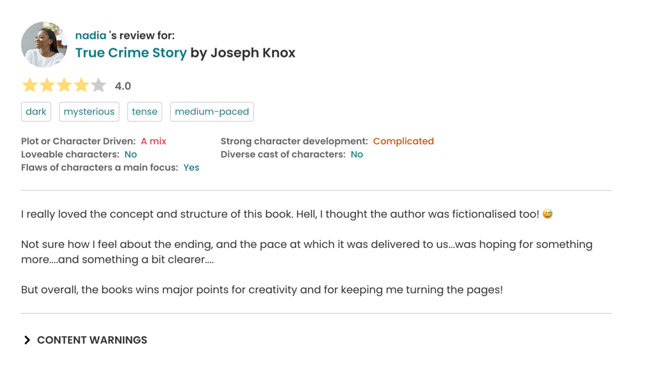
  • The redesign on individual review pages:

    A StoryGraph book review page with a clean, modern design. The layout features the reviewer’s profile photo and name on the left, with the book title and author beside it. A row of colored tags in blue and red highlight moods, pacing, and themes. Ratings and attributes are aligned neatly in two columns, with contrasting colors—red for “complicated” and “a mix,” blue for positives, and black for “no.” The text review appears below in a simple black font, with a horizontal divider separating it from a bold “Content Warnings” dropdown link at the bottom. The overall design is structured, color-coded, and easy to scan.

  • Pagination of the Created Reading Challenges section:

    A StoryGraph interface section titled “Challenges you’ve created (19).” Three challenge cards are displayed side by side, each in a rounded white box with subtle shadows. Each card includes small green labels reading “Live” and “Public” at the top, followed by bold black challenge titles, the year, and supporting details in smaller grey text about prompts, participants, and books added. A rounded grey “Load more…” button sits centered below the row. The overall design is minimal, with clean typography and consistent spacing, giving a modern card-based layout.
    Someone had created 160 challenges and their dashboard refused to load. 😅

  • Upgrade of Android Target Version

    A Google Play Store “What’s new” update section for The StoryGraph app. At the top, a row of five phone mockups displays different app screens, each paired with teal-blue captions in bold: “Track your reading,” “Discover insights about your reading,” “See how your reading changes over time,” “Get recommendations based on your mood and favorite topics,” and “Filter your TBR pile by mood, genre, and…” (partially cut off). Below, text under the heading “What’s new in v.1.27?” explains a bug fix: “Fix edge-to-edge padding issue – leading to a misplaced search bar on some devices — after Android software upgrade.”


    I didn’t realise that incrementing a Target Version could cause layout changes. It never had done previously. So…I didn’t test on my physical device… Only the Android Studio simulator. Never again. 🤦🏾‍♀️

Amsterdam

I’m going to be in Amsterdam for a few days in early September and so am looking for recommendations for lovely cafés to read and work in.

A row of tall, narrow buildings in Amsterdam, their colorful facades—brown, red, cream, and orange—lined up along a canal. The water reflects the buildings in rippled patterns, and the sunlight glints off the windows of one building. The sky is clear and blue, adding to the bright, picturesque scene.
I’ve never been to Amsterdam, except for the airport, even spending a night there once. 😅

I don’t have a lot of free time while there, but if you have a favourite bookstore or one must-do touristy recommendation, then please do send it my way!

What I'm reading

Two books for two different book clubs.

First, I’m listening to Braiding Sweetgrass by Robin Wall Kimmerer for The Stacks Book Club and it’s a good book but I’m struggling to stay engaged (and I feel bad about that). 🙈

A StoryGraph book pane for Braiding Sweetgrass by Robin Wall Kimmerer. The book cover shows the title in green text above an illustration of braided sweetgrass on a yellow background. To the right, the title and author appear in bold text, with details noting "16 hours, 44 minutes · audio · 2013." A green progress bar shows 67% complete. Below are colorful tags such as “nonfiction,” “essays,” “nature,” “science,” “informative,” “inspiring,” “reflective,” “slow-paced,” “august-tbr,” “stackspod-book-club,” and “stackspod-ep.” On the right side, it shows the book was started on August 23, 2025, with a dropdown menu marked “currently reading,” an option to mark as finished, and buttons labeled “owned” and “buy.”

I’m also reading Conclave by Robert Harris for the Movie Book Club I have with my sister. I’m excited to watch the film with her Wednesday night over takeout and popcorn! 🍿

A StoryGraph book pane for Conclave by Robert Harris. The red-toned cover shows rows of cardinals in red robes surrounding a central figure, with the title in bold white text at the bottom. To the right, the title and author are displayed with details: “288 pages · digital · 2016.” A green progress bar at the top shows 20% complete. Colorful tags underneath include “fiction,” “thriller,” “mysterious,” “tense,” “fast-paced,” “august-tbr,” and “zee-book-movie-club.” On the right side, it notes the book was started on August 23, 2025, with a dropdown set to “currently reading,” along with options to mark as finished or view buddy read. Buttons labeled “owned” and “buy” sit below.
Oh, I started both books on the same day. Fun!

Please don’t share your opinions with me about the book or film until after Wednesday. Thank you! 🙏🏾

Have a great week,

Nadia

Read more:

  • #138 - Phase 1 Complete!

    On the reasoning behind our redesign, the launch of our redesign, and the reception to our redesign... 😁

  • The One-Woman Dev Team Diaries #184

    Contingency time for (self-imposed) deadlines, an upgrade nightmare, a video podcast interview, and some design sneak peeks. 👀

Don't miss what's next. Subscribe to The One-Woman Dev Team Diaries:
Bluesky Threads X Bookshop.org LinkedIn Instagram Personal Website
Powered by Buttondown, the easiest way to start and grow your newsletter.