Semantics, worst enemies, and more
Welcome to this edition of the newsletter
I've been talking about semantics a lot. And had a sudden stroke of inspiration - came up with a new analogy to explain the importance of semantics. Hopefully it's not something I saw somewhere and forgot about!
I revisit an old discussion I had with Eric Bailey about the conflict between "mere technical curiosity" and actually fixing things for people.
And I ponder how organizations are often their own worse enemy!
Let's dive in.
In this newsletter
- Semantics do matter
- From the old podcast
- From the old blog: False admiration
- Your own worse enemy
- Wrapping up
Semantics do matter.
Developers often use a <div> styled to look like a button. With a bit of styling, it has the right color, the right shape, and hover effects. But it isn't a button. And disabled users pay the price for that mistake.
Imagine pouring yellow food dye and alcohol into a bottle of sparkling water. You now have a fizzy, yellowish, mildly alcoholic drink. You still don't have beer.
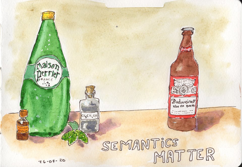
For the record, that bottle in my sketch is a Budweiser. Not my first choice of beer. I tried the original Czech Budvar once and it's genuinely good, which makes the American version all the more puzzling. But the Bud bottle has that satisfying shape with a short neck and a simple label, and it was easy to draw. Artistic integrity demanded it. We move on.
What makes beer beer?
Beer isn't just colored sparkling water with alcohol added. It's the product of fermentation. That biological process creates specific flavor compounds, aroma, mouthfeel, and head retention. You can't replicate those by combining ingredients after the fact.
A brewer spots the fake immediately. A lot of people would spot the fake, actually. A casual drinker in a dim bar might not notice, after a few. But the people who understand what they're working with know instantly when something is wrong.
HTML semantics work exactly the same way.
What a <button> actually is
A <button> element isn't just a rectangle with a label. The browser gives it native semantics that communicate its role to assistive technologies. It receives keyboard focus automatically. Users can activate it with both Enter and Space. Screen readers announce it as a button without any extra code.
That's not a visual feature. It's structural. It exists in the code whether the user can see it or not.
A styled <div> has none of that. It looks like a button to a sighted mouse user. To a screen reader, it has no meaningful role. It shows up as a generic container, typically ignored during navigation. It's Perrier with food dye.
To make a <div> behave like a real button, you'd need role="button" to give it a semantic role, tabindex="0" to make it focusable, keydown event listeners for Enter activation and keyup for Space (because native <button> fires on keyup for Space, and getting that wrong breaks expected behavior), visible focus styles, and state attributes like aria-pressed or aria-expanded where appropriate. That's a lot of ingredients for something the browser already provides for free.
Buttons aren't the only example
Developers reach for a <div> or <span> when a semantic element already exists and works better.
A clickable <div> used as a link doesn't behave like an <a> by default. Screen reader users can pull up a list of all links on a page to navigate quickly. A <div> without role="link" doesn't appear in that list. You can add the role and wire up keyboard handling. But that gets you back to rebuilding behavior the browser gives you for free, and you'll almost certainly miss something.
Styled text that looks like a heading but uses a <p> or <span> isn't a heading. Blind users frequently navigate by headings to scan a page's structure. A bold, oversized <p> tells assistive technologies nothing about page structure. It's decorative noise.
A <div> styled to look like a form field lacks built-in input behavior. It can't be programmatically associated with a <label>. Screen readers won't announce what the field is for. Users relying on voice control can't target it by label name.
Custom dropdown menus built from <div> elements are one of the most common offenders. A real <select> gives you keyboard navigation, screen reader announcements, and mobile-native picker interfaces for free. To fake it, you need a trigger element with aria-haspopup="listbox" and aria-expanded, a popup container with role="listbox", role="option" on every item, aria-selected to track the current choice, and full keyboard support for arrow keys, Enter, Escape, Home, and End. If you need a true combobox with a text input, the ARIA pattern is more complex still. Get any one of those wrong, and disabled users are stuck.
Who gets fooled?
Sighted mouse users often never notice. The page looks right. The interaction feels fine.
Disabled users immediately hit a wall.
A keyboard-only user tabs through the page and skips right past an unstyled fake button. Without tabindex, it doesn't receive focus. They can't activate it. A screen reader user gets no role announcement. No indication the element does anything at all. A voice control user tells their software to "click Button" and will often get no response, because many voice control systems rely on the element's semantic role to identify targets.
None of these are edge cases. Each of those groups represents a significant portion of your users. You're not designing for a rounding error.
The cost of faking it
Some developers try to patch it with ARIA — adding all the ingredients listed above. That's a significant amount of effort to rebuild what <button> provides for free.
And they often still miss something. Space bar behavior gets forgotten. State attributes need careful maintenance. Focus management in complex widgets gets complicated fast.
Use the right element
Use semantic HTML elements for what they were designed to do.
<button> for buttons. <a> for links. <nav> for navigation. <main> for your primary content area. Use them, and you give browsers, assistive technologies, and disabled users the meaning they depend on.
I like Perrier. It's a perfectly good drink, but not when I expect a beer. <div> elements are useful too. Layout, grouping, styling hooks. There's a genuine place for them. The problem is reaching for one when a semantic element already exists and does the job properly.
A <div> is Perrier. A <button> is beer. You cannot fake fermentation. You cannot fake semantics.
Some developers might say "but I don't like beer." Fair enough. The analogy isn't the point. If you don't like beer, you have options. Wine, cider, juice, soda, sparkling water. You get to choose. Disabled users don't have that luxury. A blind user can't choose assistive technology that doesn't depend on semantic HTML. A keyboard-only user, sighted or not, can't opt out of needing focusable elements. They rely on assistive technologies, and those technologies depend on semantically meaningful HTML. There is no other option on the menu.
Start with the right ingredients if you want your product to work for disabled users.
Technical curiosity
In a conversation I had with Eric Bailey on the A11y Rules, he was speaking about accessibility often being treated as technical curiosity. Someone finds an accessibility barrier. They write a blog post about it. They move on. But they haven't addressed the issue - there's still a failure. Or at least, a recipe for the next time around being a failure.
Because accessibility is about people. It's not just some technical curiosity to be sated.
You can listen to the whole episode on the podcast website Or if you prefer, you can read the whole interview with the (human edited) transcript, on the same page.
False admiration
I use a wheelchair. At least once a week I overhear comments from well-meaning, but ignorant people about me. They express admiration at the fact I am doing mundane things such as grocery shopping or exercising. I’m tired of this misplaced "respect" or "admiration".
These people’s world-view appears to be that people with disabilities are helpless and merit admiration & respect merely for doing everyday things. If you admire us for going on about our lives, you’re saying that we’ve exceeded your expectations of us. This directly implies that you expected very little from us in the first place. That is the part that really annoys. Because we have a disability, we are not expected or even capable to do everyday activities. That message is dangerous and destructive.
It would be completely different if you admired someone working on their fitness because it’s the good and healthy thing to do, regardless of ability or impairment. Don’t admire them "despite" or "because" of the wheelchair.
Read the whole post on my old blog: When admiration reflects low expectation
We Are Our Own Worst Enemy: How Organizations Sabotage Their Accessibility Work
Organizations often complain about accessibility being expensive and complicated. Meanwhile, we're the ones making it that way. The barriers aren’t external. We’re building them ourselves.
The self-inflicted problems
- We skip testing with disabled users and ignore their feedback. We pass WCAG audits, yet disabled people still can’t complete basic tasks because we never asked what they needed. Users report barriers after launch. We file tickets. Nothing changes for months. Eventually, they stop reporting because we’ve shown we don’t care.
- We treat accessibility as a compliance checkbox. We chase conformance, not usability. That guarantees technically correct products that disabled people still can’t use.
- We silo accessibility to one person or team. That person becomes the bottleneck. No specialist can design, develop, test, and audit everything alone. Designers ignore guidance. Developers ship inaccessible code. Then we blame the specialist. The failure is structural, not individual.
- We take months to address audit findings. An audit flags barriers in March. We get the report in April. Nothing happens until December. By then, users have left. The barrier was our response time, not the audit.
- We claim we don’t have time or budget. But we have time for redesigns and budget for new features. We chose not to prioritize accessibility. That’s a decision, not a constraint.
- We start accessibility too late. We build the product, then ask for fixes. Retrofitting costs far more than building it right the first time. This is self-inflicted.
- We separate accessibility from product design. Accessibility is not a feature. It's how we should build. Treating it as separate guarantees exclusion, then a scramble to catch up.
- We don’t include disabled people on our team. We design their experiences without them, then act surprised when solutions fail.
The path forward
Make different choices. Include disabled users. Test with them regularly. Act on feedback quickly. Prioritize usability alongside conformance. Integrate accessibility into every role.
Our accessibility problems aren’t happening to us. We’re creating them. Which means we can fix them.
Wrapping up
That's it for now! I hope you enjoyed the newsletter. I'd love to get feedback - What was good? What could be improved? What topic would you like me to talk about? I'm not making any promise, but if a topic you suggest catches my fancy, I'll share my opinion on it.
Just hit reply to this email, or send an email at info@nicolas-steenhout.com. I read every response.
And a reminder that my content is Human Generated Content #HumanGeneratedContent