Issue 2: Graphic Design Origin Story

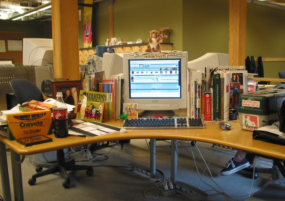
I no longer call myself a graphic designer, but that’s where my history of study lies. Today, my 9 to 5 (outside of my illustration work) is graphic design-adjacent, but I wouldn’t call on me to lay out your annual report. I’m also not your guy for intricate typesetting that involves tabs—get me to do that, and I’d be cosplayin’.
Here’s a Coles’ Notes1 version of how I got here…wherever “here” is. We’re gonna bounce all over the timeline, so bear with me.
2000
This is two years after leaving the best job I ever had (in retrospect). I spent over two years working at Musiplex, probably the best record store in Western Canada. And just before that, I completed my studies at Robertson College for a career in radio broadcasting that was not to be.
My homie J.W. completed his Graphic Design (then called “Advertising Art”) diploma education at RRC and it got me thinking about my own future.
Well, fuck, I can draw, I said to myself, and I applied.
I recently saw my entrance portfolio, buried deep in my mom’s storage closet. I’m tellin’ you right now…I wouldn’t have let me in. That said, I appreciate their grace in admitting me.
At the same time, I got inspired to do gig posters for shows because of the ArtRock catalogues2 I got mailed to me for free. My first poster was for The Murder City Devils, a Sub Pop act. Not a bad way to debut!
1980-1985
There were signs that I’d be an illustrator and graphic designer pretty early. I started drawing around the age of five or six, and I’d consider Charles Schulz as my first artistic influence. He showed me that eyes could be drawn like this: (• •), and that opened my world up.
I also loved going grocery shopping in Eaton’s basement downtown3 with my mom (not only because of the aroma of the prepared chicken and pork chops) to be mesmerized by the various packaging designs and logos on display. I, of course, didn’t have the language to fully appreciate what I was seeing, but that came with time and education.
Because of the logos, I became obsessed with the registered trade mark symbol (®). I had no idea what it meant, but I saw it as some sort of mark of excellence. In my drawings, I’d place it everywhere. Another obsession at this age: the Warner Communications logo by Saul Bass. It was on everything from DC Comics to every Atlantic, Reprise, Elektra record in the ‘80s. Such an appealing design to this very day, man.
I figure it was 1983 when I came across Maurice Horn’s World Encyclopedia of Cartoons4, a giant one volume (also as six separate books at one point) directory of international cartoons, cartoonists, animators, and more. That cracked my head open, y’all. I suddenly wanted to be a syndicated cartoonist AND an animator, not realizing that some of the folks in that book went from one career to another and often didn’t do them simultaneously.
But hey, I was eight.
Another obsession hit me when ‘85 came around: pro wrestling. It was enjoying a popularity that it hadn’t seen since the ‘50s, and like a lot of kids, I was a huge mark5 for Hulk Hogan (yeah, I know). After that, I wanted to be a wrestling announcer and I couldn’t be swayed from this direction.
April 21st, 1992
The release date of Beastie Boys’ Check Your Head. You know how folks stared at Roger Dean’s Yes album artwork back in the day? That’s how I treated Eric Haze’s layout and handstyles for this record. I have a hard time putting a finger on it, but his writing spoke to me. It was clean and legible, but you could see the style of a graffiti OG in every stroke. In some way, every thing I’ve done design-wise has me channeling this album’s artwork.
September 17th, 2001
The above date is when I became a registered member of gigposters.com6. A life-changing website. The forums were daily sessions under the learning tree. I could ask questions of folks like Art Chantry and Frank Kozik (RIP), and they’d answer me! GP augmented my RRC education stints (I flunked out twice) because they tempered my lessons with reality. It’s a shame that social media and the site’s forum spam fucked things up for everyone.
Today
Long story short, my graphic design education stoked the fire of my childhood obsessions, and I’m glad it did. Although I have questions about some of the moves I’ve made and where I landed in this world, I have no regrets. I’ve made lifelong friends because of this journey.
Now you know a lil’ more about this guy. Thanks for indulging me. Future issues won’t be as long as this.
If you’re American, you’re familiar with CliffsNotes. However, this is a Canadian newsletter. ↩
I’m pretty sure I got on ArtRock’s mailing list via Juxtapoz magazine. ArtRock is now closed, but its successor D.King Gallery is still around. ↩
The Manitoba Historic Society has a stat sheet on the Eaton’s building where Canada Life Centre now stands. ↩
I’m pretty sure this is out-of-print. I’d hit up the Internet Archive to flip through it. ↩
A wrestling or “carny” term in reference to fans. “Marks” are people that are not in on the “work” that is pro wrestling. “Smart marks” are in on it. Pretty much everyone is a smart mark now. ↩
What’s at this URL today is a farce. Don’t bother going there. ↩


Add a comment: