MINIMALISSIMO EDITED
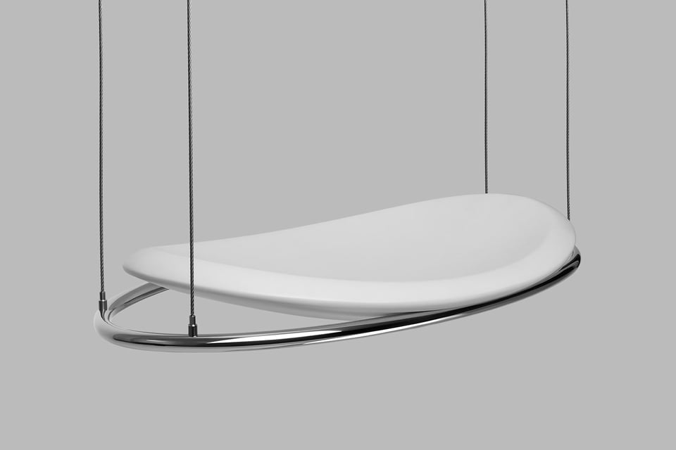
This newsletter is supported by aprile, the hanging chair
Empty space does not mean emptiness of information. On the contrary, it is an expressive element and I consider it as important as the full space. And sometimes even more, for example when it represents a pause, an interruption, or time to reflect.
– A G Fronzoni
What's happening?
Summer is in full swing. Here (in Scotland), I think we've enjoyed around 7 days of beautiful weather (for me, that's anything above 18ºC) over the last couple of months. So I can't complain. And in summer, projects, businesses, and stresses tend to slow down a little. As they should. It's great to see people afford themselves the luxury of taking time off from the grind of everyday life. Taking trips locally or internationally, rediscovering hobbies once enjoyed, experiencing family time outside of rigid routines... whatever it may be to put their health and relationships first. Sure, it can be frustrating for others if someone or something is needed during this time, but so what? Be patient. The world is filled with inconveniences. So I'm trying to do the same. Not necessarily taking time off. Just changing pace for a few weeks.
– Carl
Features
FORMS OF SCOTT BURTON
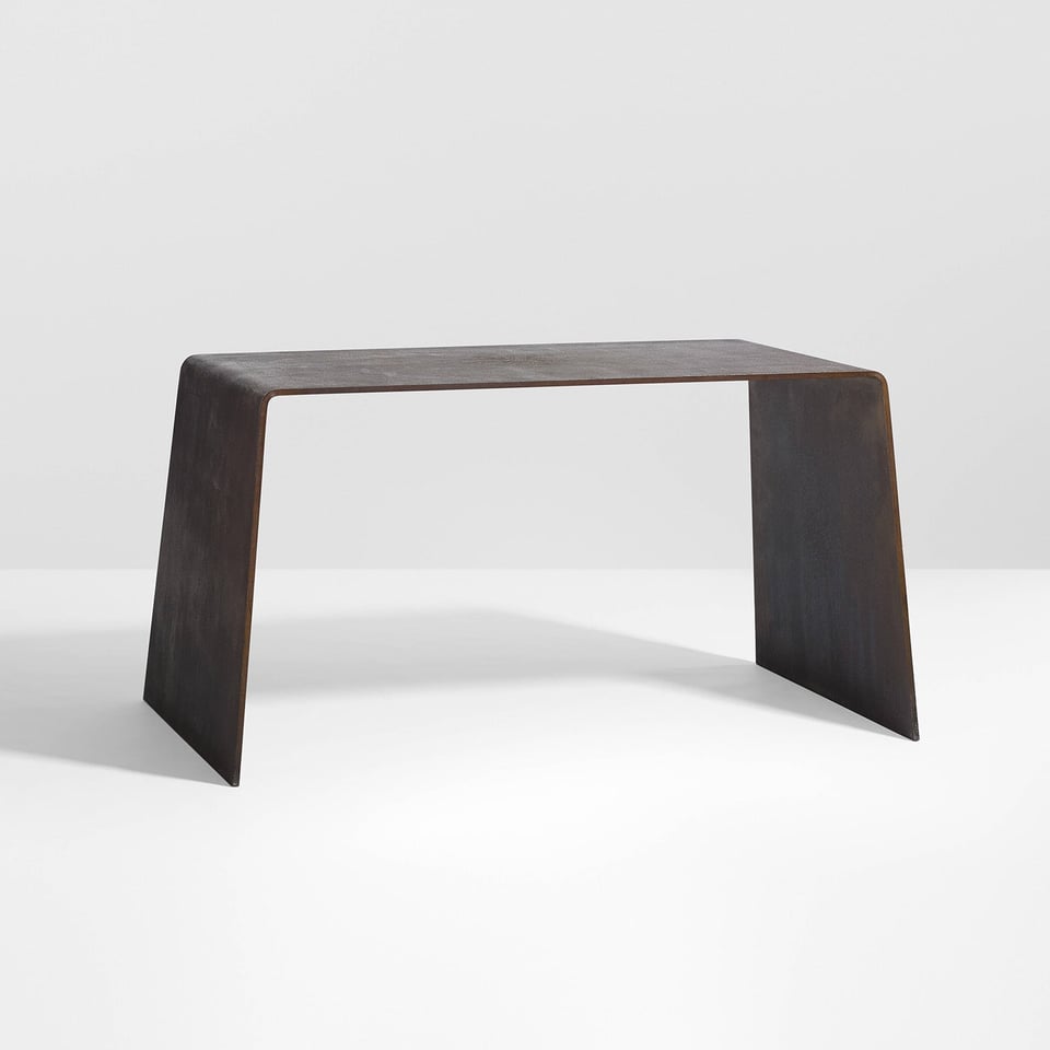
American sculptor and performance artist Scott Burton (1939–1989) ingeniously blurred boundaries between sculpture, furniture, and performance, creating minimalist works that continued to be celebrated and studied today. Burton considered his art as pragmatic sculpture where his furniture evolved from his performances. We explore some of Burton's most striking and minimalist furniture designs.
E1
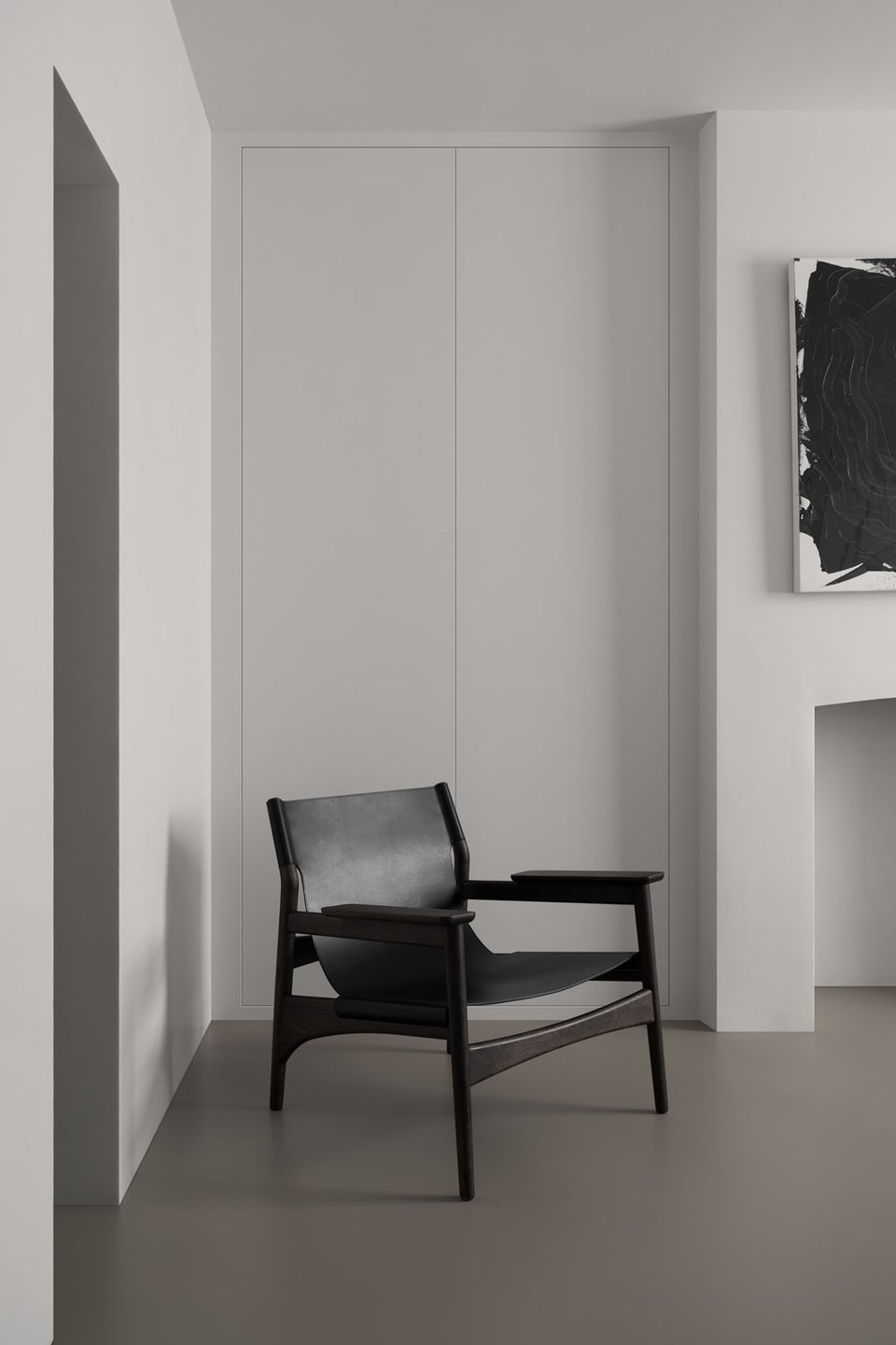
Studio Hazeldean's latest interior design is a strikingly minimal gallery-like space, in a listed building, referencing the tanneries of Dickensian London. Designed in 1864 by pioneering architect Henry Roberts and now Grade 2 listed, the lodge gives a rare insight into architecture now scarce in east London. The resulting redesign is deceptively simple. A restrained palette, pared back, with no ornamentation. Using as few textures as possible.
SHADES OF SHIGERU UCHIDA
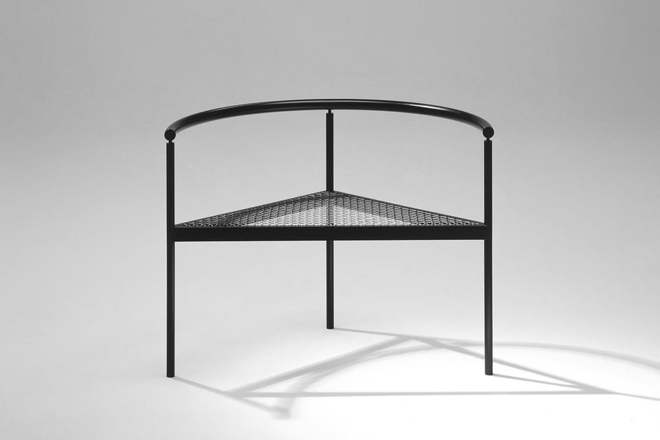
As a leading Japanese designer, Shigeru Uchida (1943–2016) engaged in diverse design projects worldwide from architectural interior, furniture, and industrial design to urban planning. In 1970 he established the Uchida Design Institute with a small team who have inherited his thoughts and design principles, continuing the exceptional work he produced over the 70s, 80s, and 90s. Here, we showcase just a handful of some of his (and his studio's) most iconic designs with minimalist aesthetics.
IN SUBSTANCE
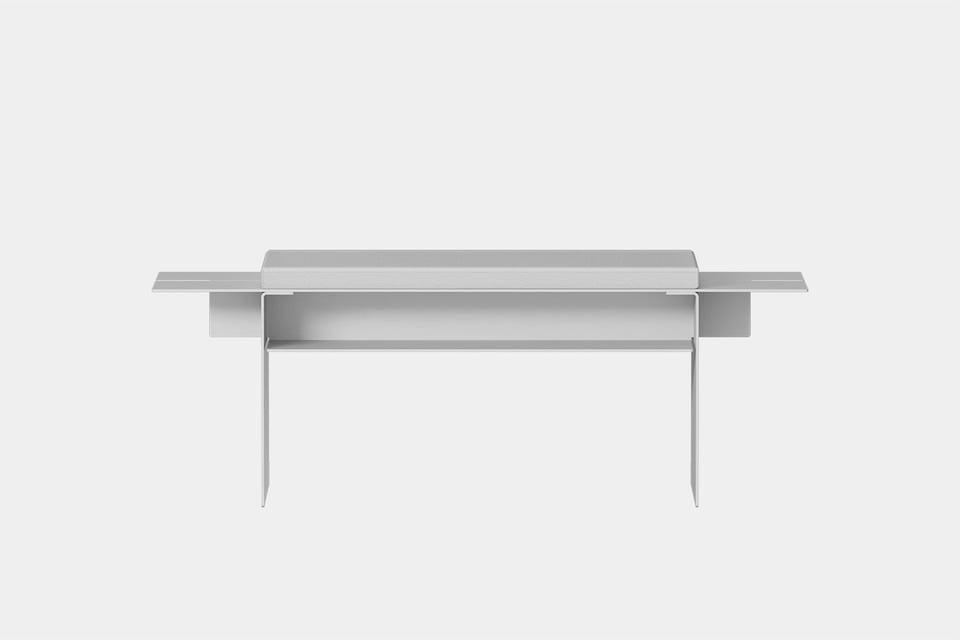
A forward-thinking furniture brand based in Germany, IN SUBSTANCE blurs the lines between fashion and furniture. The brand has produced a collection of minimalist pieces that not only fulfil their functional purpose, but also reflect your unique personality, adding a personal touch to your living space. The current collection includes a side table, bench, chair, stool, wall shelf, and a table. All available in a wide variety of colours to suit your interior space.
LA CUBICA
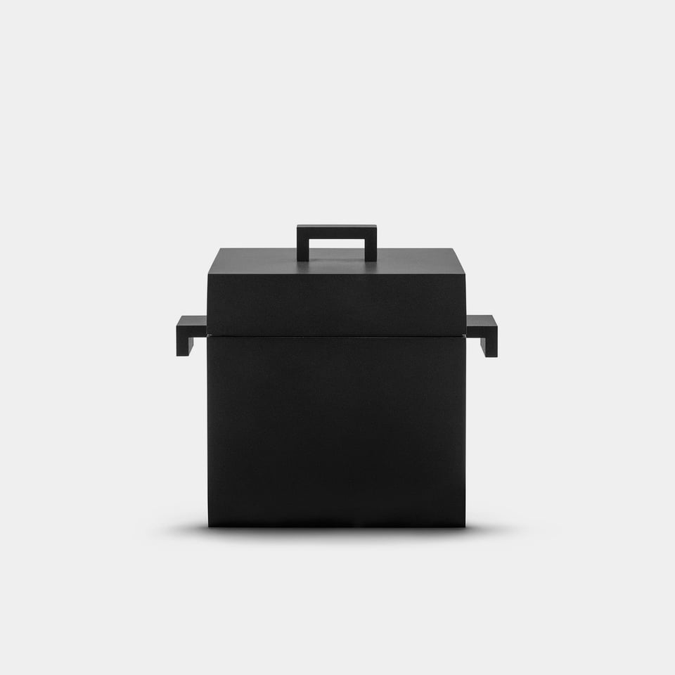
Dedicated to those who love Aldo Rossi's undisputed talent for translating his architectural language into small works of design, the La Cubica cocotte is an extraordinary object originally designed in 1991. Made for Italian kitchenware brand ALESSI, the casserole pot's form is that of a simple square volume. La Cubica finds its place in ALESSI's 100 Values Collection to mark the brand's centenary. A collection of unpublished objects to celebrate 100 years of research in the field of applied arts and the beginning of a new century of experimentation.
CASA LLOR
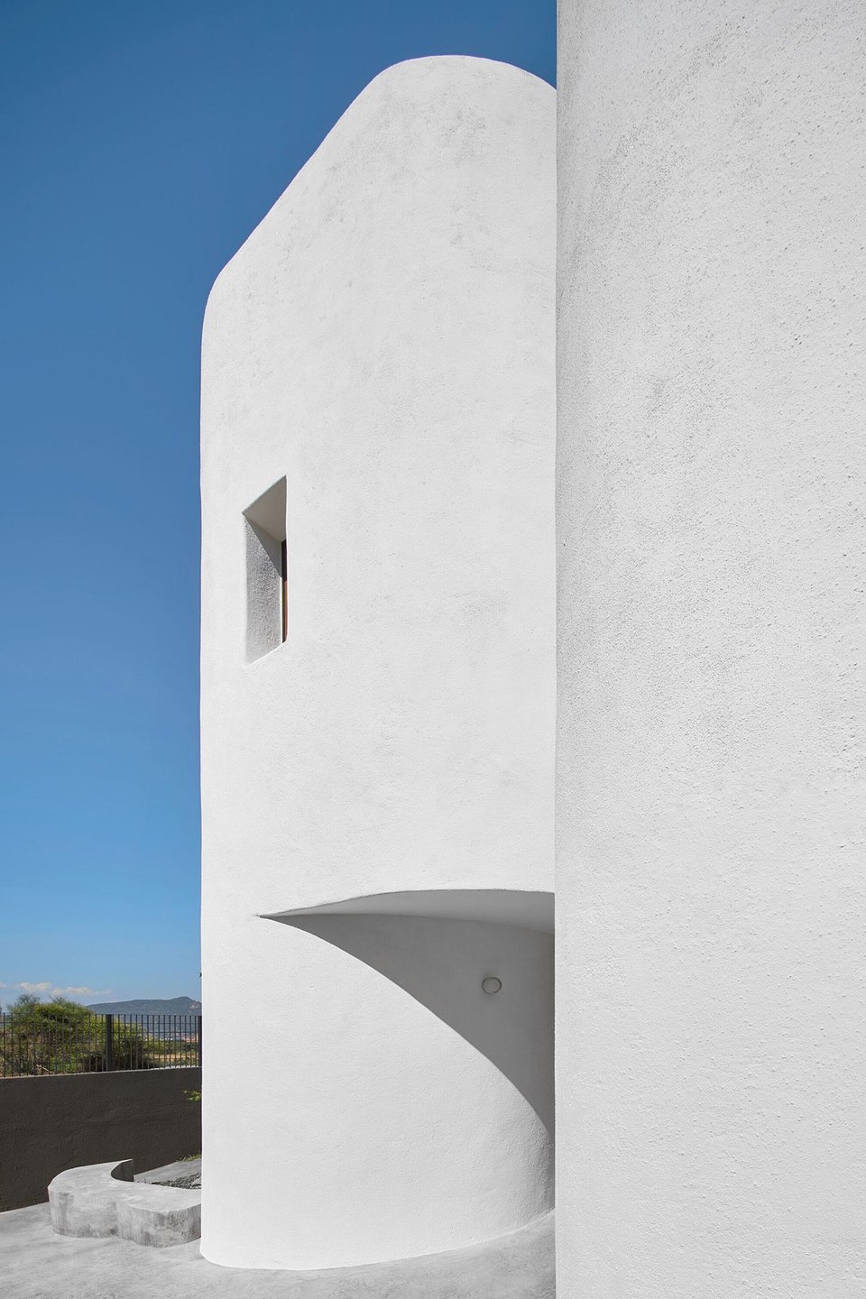
This family house, located in Sant Boi de Llobregat, is conceived from a simple premise: to protect and enclose itself from neighbours and to maximise sunlight. The house, designed by Jorge Vidal Studio, is deployed on the plot forming three closed volumes of white organic forms, while the other two remaining facades are much more permeable and Cartesian.
Supply spotlight
minimal product design made to own (and made by us):
M–MIMOTYPE
A minimal, no-code typography focused blog theme powered by Notion and Super. Simple and lightweight with a strong focus on the beauty of typography, Mimotype is a customisable blog template.
Where next?
Discovery
other things for you to read, explore, and maybe even admire:
the web I want: strong + concise post on the how the web needs to change by Manu
create slowly: it's time to change the velocity in which we engage and design
the limbo of future: being content with the present by Blank
thieves made me save the elephant by Allen Rubió Sandico
