Another attempt at painting
The next brief, also done over one week, was to create a series of responses to a piece of art, or music, such that they might have a dialogue with the original. I decided to select a piece from Brian McGuire, who’s exhibition last year showed me an example of how to paint figurative subjects with elements of abstraction (a balance I suspect I would want to have), and with a limited color palette (something that I feel I could do in painting). Many of his pieces are landscapes with a big open feeling, done over an expansive canvas, so I selected then a still life of a plant.
While not my favorite of his paintings, or a favorite color palette, it illustrates what he does that I might want to include in my paintings: He uses max three colors (probably straight from the tubes) plus white, it’s not a literal reproduction of the plant but there’s complexity and movement there, and he uses pencil drawing on top of the painting to further add movement and definition.
With just these elements, the painting has a full dynamic range of lights and darks. I still often do the beginner mistake of just rendering everything in grey, forgetting to add deep deep darks and light lights to the image.
So how did I do? I don’t know. I made three attempts at painting my house plants.

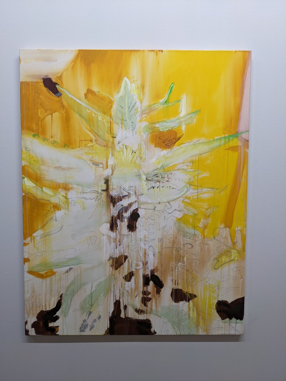
For my painting of the alocasia, I stuck with the color palette of the Brian McGuire painting. You can see me trying to broaden the dynamic range, leaving bits unpainted, with a streaky background of yellow ochre. It’s still very literal, not very abstract, and I don’t love the color palette - it’s kinda garish.
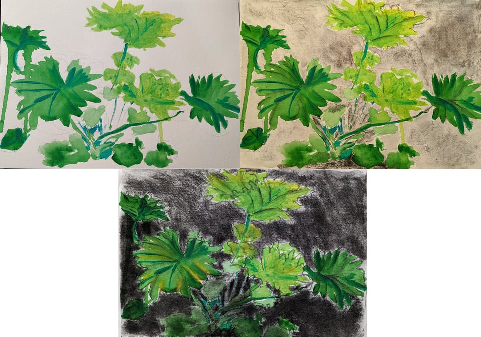
I tried again with my philodrendron. Tried to be more loose. Thought the greens would pop with a dark background, and just went for it with charcoal. I liked this least because it looked so messy, but let this be a lesson to you to bring all the things for crits: the tutor said it was very successful - perhaps because of the movement and looseness. It does have the most personality of these paintings.
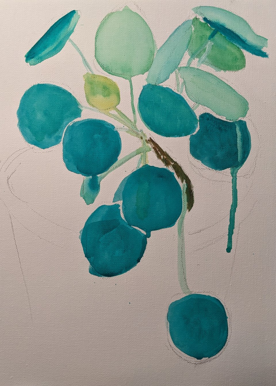
In this last attempt, I tried to get away from a literal translation of the color - with the dark mature leaves tinted blue, and the softer tender leaf more yellow. I actually kinda like this one. I think it’s pretty. But it’s still very literally inspired by the shape of the plant.
I’m glad for this work - compared to my paintings last year, which was my first time painting. I think I’m improving. Note to self, be looser, quicker.