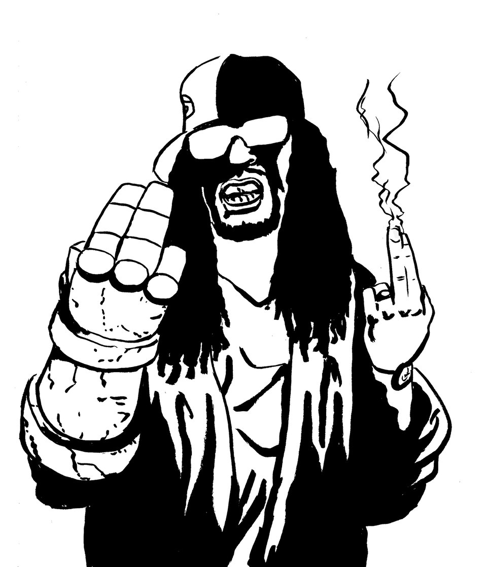
Lil Jon Says Hell Boiii! (Guts N' Gutters #15, December 2025)
Hellboy and Lil Jon Collide and What's Happening In 2026?
TL;DR (Too Long, Don’t (Wanna) Read)
- Letters from the Void Updates!
- Crit One Holiday Special Funded!
- Crit One 4 in Pre-Launch!
- A Fishy Comic Surfaces
- What’s Coming Next Year?
- Into the Gutters: Mignola Covers, Crunk Music & The Depth of Simplicity
-
Gutter Buds!
- Something Old: Ivanhoe
- Something New: Go back Slice of Life #1-8, Frost Bitten & Tales from Toxic Pond #1-5 on Kickstarter!
- Something Borrowed: Sonic the Hedgehog: Bad Guys
- Something Blue: Captain Planet
WHAT’S THE WORD?
Minute - very small, of small importance, marked by close attention to details
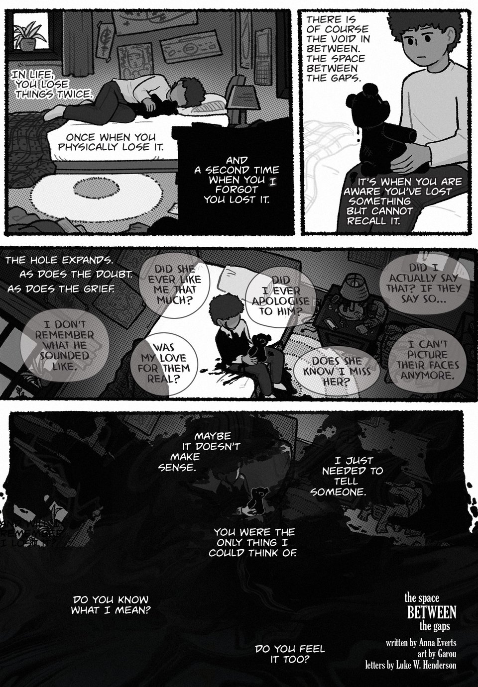
The Space Between the Gaps is complete, and I am working on lettering the remaining pages for Letters from the Void. We should be sending the book to print in January and then shipping it in February as planned!
Crit One Holiday Songbook Funded
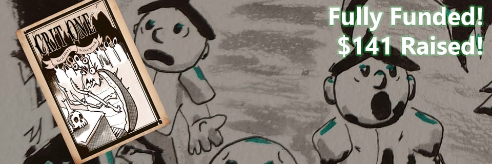
Thanks to everyone who supported this short and easy campaign. If you missed out, copies will be available during Crit One 4’s campaign!
Crit One Four (The FINAL Issue) In Prelaunch!
After 3 years, the Crit One series will be coming to an end. It’s been amazing running these zines and seeing all of the creativity of its contributors, but it is time to move on. As I’ll talk about more in the next section, I feel it’s time to take the next step in my writing career, so Crit One 4, I’ll be focusing more on those kinds of projects.
Thank you to everyone who has supported the series year after year and gotten us to 4 issues!
I hope this one will be our best campaign yet and send Crit One into the sunset with a bang.

Coin-Operated Press’ Fish Zine Now Available!
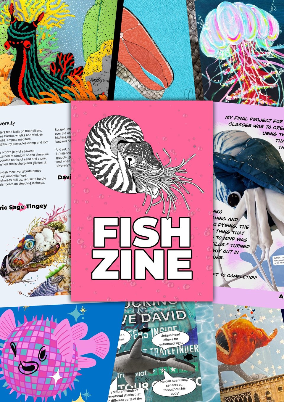
I submitted an old Comic Jam comic by Fern Lamb and me to this zine, and it was accepted! The book is now available to buy in digital or physical format.

2026 Plans
Crit One 4
We will launch in February for Kickstarter’s ZineQuest event!
Rise of the Flightless PHYSICAL EDITION!
We are bringing our anthology of penguins kicking robot tuckus to Kickstarter summer of 2026. The book will be much bigger and feature new stories from some of indie comics’ biggest names, who have graciously donated their time to this book. Like last time, every dollar not spent on printing and shipping will be donated to the Antarctic Science Foundation.
I felt this book was too good to remain digital-only, and I want my contributors and fans to have something to commemorate their work. So, to Kickstarter this book shall go.
The Dreamlands, Vol. 2
My pitch with artist Luce Northstar, colorist Yasmine Pond, and letterer Kevin Lintz for Warden Comics Dreamlands Anthology was accepted, and we are in the process of making the comic. The Kickstarter campaign should be running sometime next summer, possibly at the same time as Rise of the Flightless. Stay tuned!
Future Series(es?)
So here we are. Now that I’ve been writing short comics and running anthologies/zine projects for four years, I’ve been asking myself, “what is the next step?” When I started writing comics, I for sure wanted to write for Marvel or DC, but I knew I had to build up my writing chops and start making a name for myself. But then I discovered how much I liked lettering, I learned more about comics history, and other avenues of comics making, and I find I don’t want that anymore.
However, I still want to be traditionally published, and I want to do that regularly. I don’t think superheroes are my cup of tea, and I’m fine with that. My name may never make it on CJ Hudson’s famous list of 100 greatest comics writers (if you know you know), but I can at least find my niche in the indie and publisher spheres.
So, I’m making a big push to finally get a series going either via Kickstarter or a publisher. I’ve teased a couple in the past that haven’t moved forward (some have moved backward), but I want to change that. After Crit One 4 and the Rise of the Flightless campaigns are done, I will likely move away from running my own anthologies outside of Letters from the Void.
So, what’s rattling around in the old noggin?
Project Kaiju Husband and Project Spielberg Foundation are still on the table, but may need to be reworked/reorganized before they’re ready to get pages made. Both of these series have the first issue written, but no art yet, outside of concepts.
But also…
A queer slasher comic series about a trio of asexual trans burlesque dancers (who have a Motown-themed act) whose coworkers start getting murdered by a serial killer who dresses as a pop star.
A nonbinary Little Mermaid-type story featuring hidden sunken cities, prophecies and a millennia-long conspiracy that’s outlined, but still needs edits and an artist attached.
A middle-grade graphic novel about an alien who is meant to observe humanity (disguised as a foreign exchange student) in the year 2025, but accidentally gets sent to 2005 and loses contact with her homeworld. She has to hide her identity from her host (who is questioning their gender and has few friends) while also attempting to find a way home.
None of these will launch on Kickstarter next year, but I wanted to give my subscribers some behind-the-scenes info as a treat and to let you know what’s next in my career.
INTO THE GUTTERS
Simple Doesn’t Mean Easy
Though I’m not a Swifty by any stretch, I do enjoy Taylor Swift’s music occasionally. Her latest album, The Life of a Show Girl, certainly wasn’t my favorite, and I thought it was a step backward artistically. Critics seemed to agree that it didn’t have the juice compared to her other work over the past 5 years and lacked that lyrical charm and personality that is key to her style.
And then I listened to the version of the album with commentary before each song. Most of it was interesting, but it didn’t enhance my enjoyment much outside of the song “Opalite”. Swift explained that an opalite is a manmade opal, and the song is about how one has to create their own happiness in dark times. I appreciate the metaphor and delighted in how it was simple, but still carried some rich emotional content.
These days, I feel like simplicity is often mistaken for being amateur, cheap, or something for children. Regarding kids’ media, many people act as if it’s almost inevitable that stories made for the young will be all flash and no pan because anything too complex will turn them off. Two years ago, I wrote an essay on this idea, using Home Alone as an example of a children’s movie that is excellently written with meaningful cinematography, but is not a complicated tale. Because John Hughes takes his child characters seriously and Chris Columbus is a thoughtful director, the film has been a holiday favorite for decades.
Despite this, I think the value of simplicity is severely neglected, and it isn’t always apparent how much thought and care go into something that appears simple. While Swift’s Opalite is fairly straightforward, but has an interesting metaphor; other simple works contain loads of history and decision-making that are the roots for their brilliant, artistic flowers.
To explore this, I want to smash two of my favorite things together and demonstrate how they each wear the dress of ease, but have quite deliberate undergarments.
The Hellboy Covers of Mike Mignola
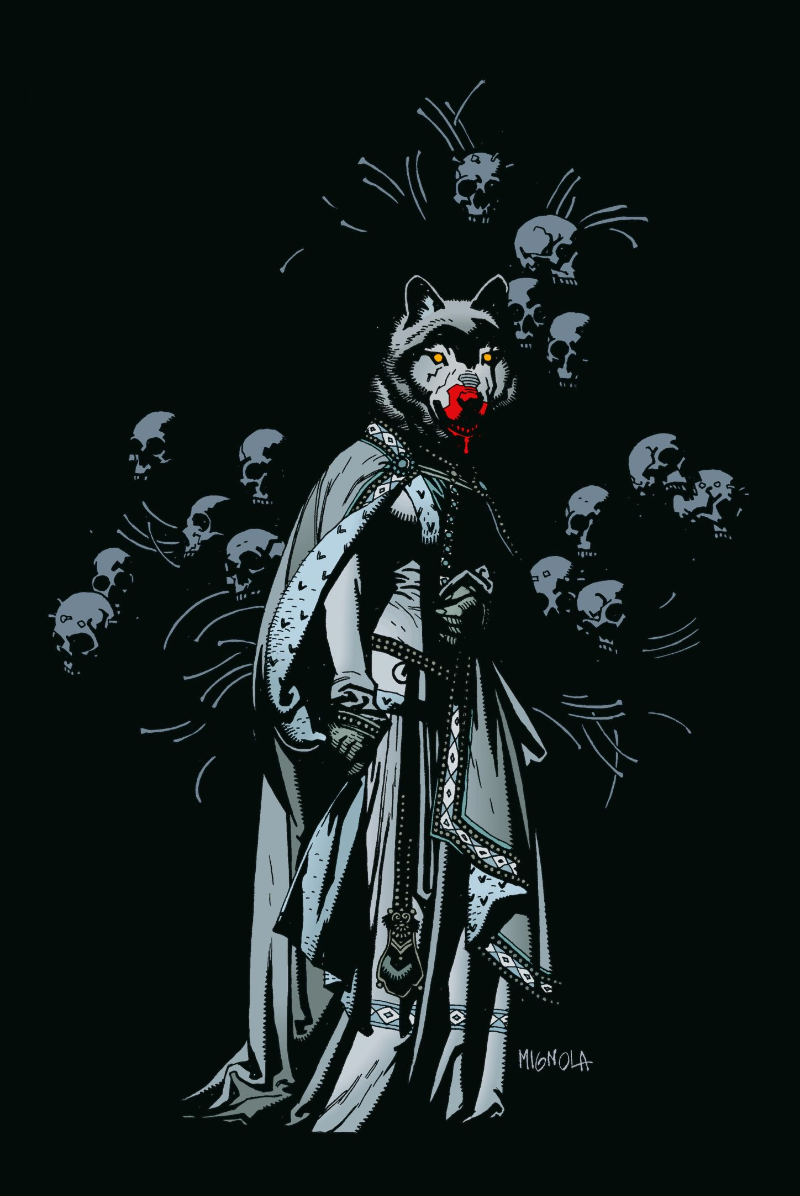
Mike Mignola’s art is instantly recognizable. It’s been called impressionistic and minimalist, and because of that, it can seem easy to imitate. However, its simplicity disguises the deliberate, meticulous decisions that Mignola makes with all of his art, but especially his covers.
In the introduction to Hellboy: 25 Years of Covers, Mignola explains that he’s always approached his art as more of a designer than a director, constructing his actors via pencil. Following this thought, he further explains, “I do tend to do more symbolic covers rather than action covers. Usually I’m trying to give a suggestion of the story–or maybe a hint or tease as to what the story is about, rather than show some very specific scenes from the story.” His approach to cover art could almost be described as a type of tableau vivant, a performance art in 19th-century France where actors would dress in costumes, use dramatic lighting, and pose within sets to craft still images (a macabre version of this was used by Sander Cohen in BioShock). Like these performers, Mignola places characters and elements in such a way as to evoke a specific tone in one shot. Being a master craftsman, he knows that less is more and having a few pieces used to their maximum ability can convey much.
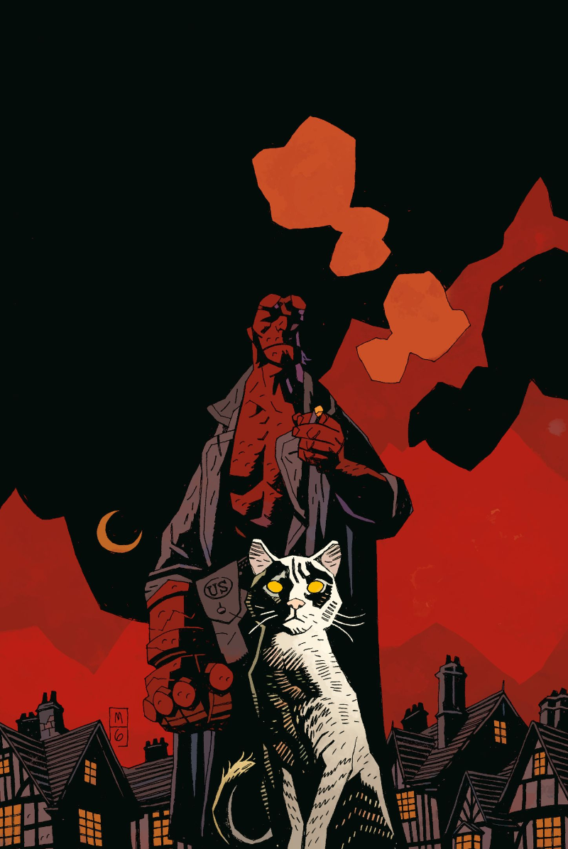
Everything starts with Mignola’s composition, both in line art and inking. A Frazetta fanboy, he loves to use the triangle as his guiding shape and has an almost religious adherence toward it. The great thing about arranging art in a triangle is that it instantly conveys motion and tension. Hellboy is almost always off-center, hunched over, and has some sort of melancholy scowl. But, Mignola explains that it’s often the elements around Hellboy that are more important. His covers disguise the layout with crossing pillars, an oddly angled bone, or a little demon boy facing against the flow of the art. This adds to the tension by preventing the piece from feeling too smooth, too orderly. Without much background art, the five or six elements in a Mignola cover have to be in harmony.
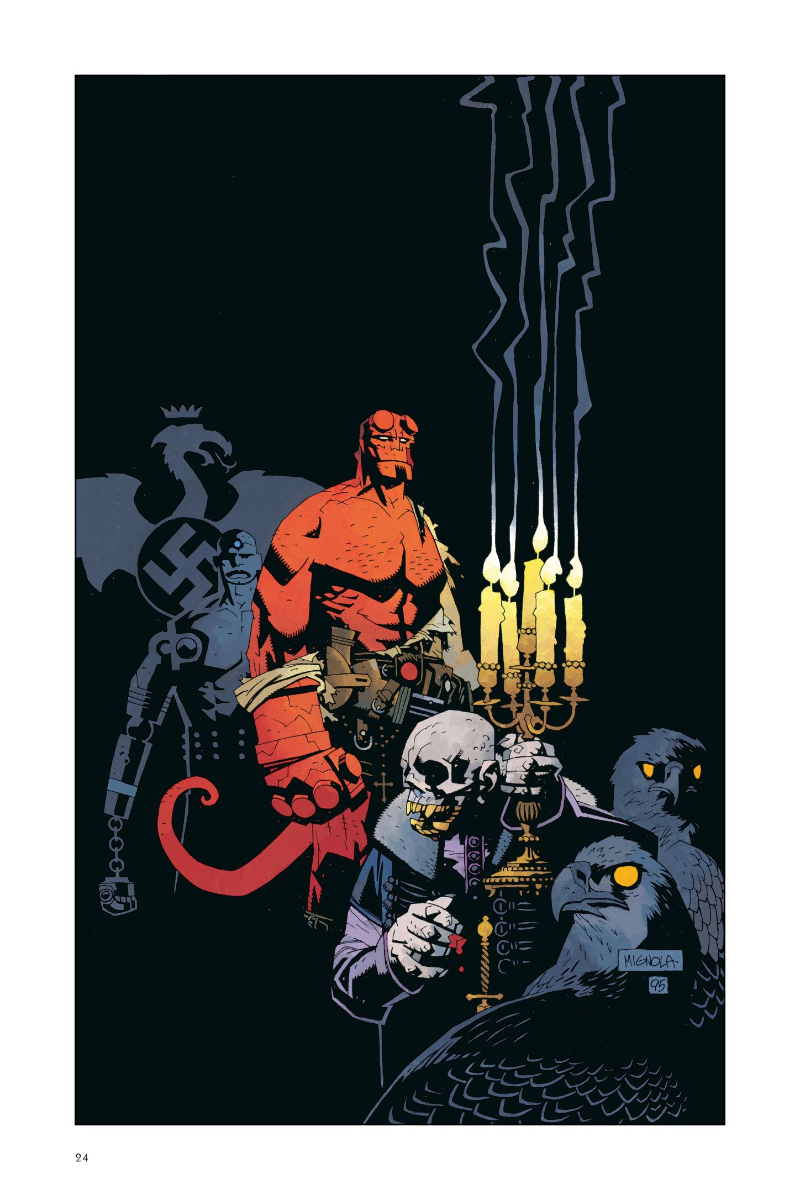
Tying everything together is the coloring provided by the likes of Mark Chiarello and Dave Stewart. It’s clear that Mignola has a heavy hand in color direction since his covers almost always follow similar palettes and patterns. Stunningly, these covers typically only use variants of the primary colors: red, yellow, and blue. Across the covers, that previous order establishes a sort of hierarchy for the reader's eyes. Crimson Hellboy is most prominent, followed by something yellow (even something small) and then something blue. What’s really cool is how this hierarchy plays with the depth of the piece. While most comics typically follow the order of foreground, midground, and background to frame what’s important for the reader, the colors of Mignola’s covers play with this. Sometimes, the background is what’s most noticeable, sometimes the midground, and rarely, the foreground. This gives each cover a unique sense of depth despite it being “minimalist” in style.
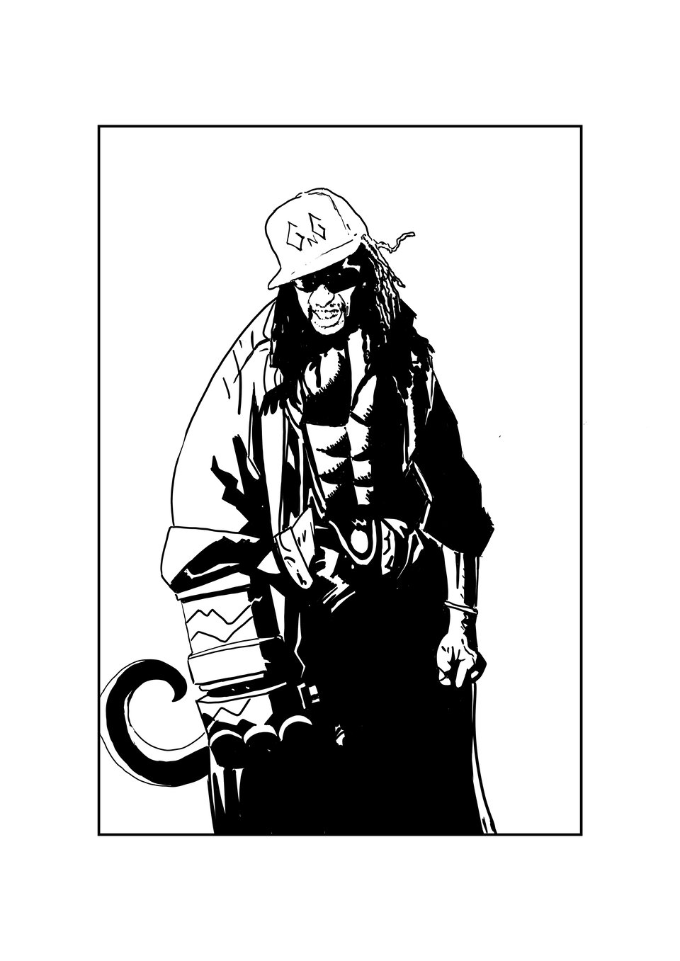
This careful placement and consideration of seemingly simple things is what makes Mignola’s covers so distinct. How they are constructed reminds me of how another art form, one I’m sure will seem out of left field: the music of one, Jonathan H. Smith, known by most as Lil Jon.
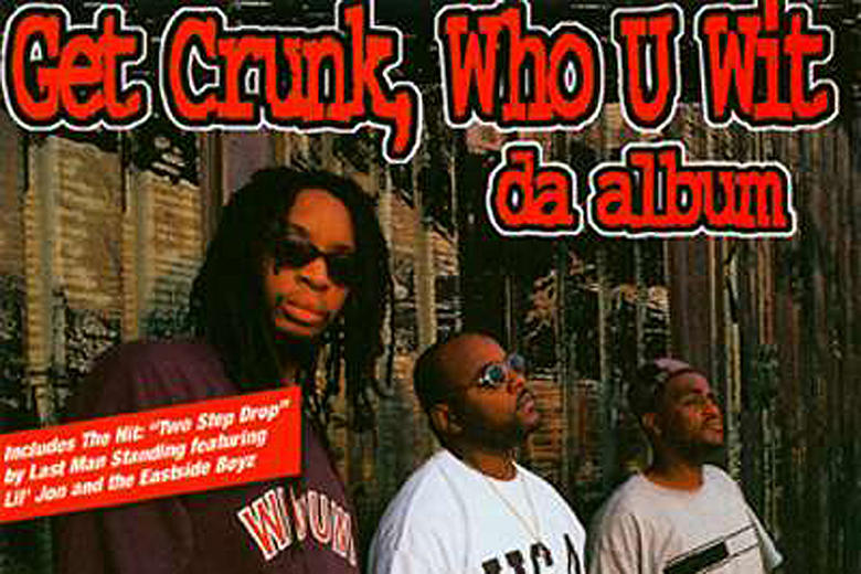
The Crunk Music of Lil Jon
What millennial doesn’t remember shouting “three, six, nine, damn you fine, hoping she can sock it to me one more time, get low, get low, get low TO THE WINDOOOOW!” at their middle school dance? Anyone who denies this is either a liar or had a sheltered upbringing. I don’t make the rules.
Crunk music was one of the pivotal sounds of the early 2000s, and was often decried for it’s crude language and form. After all, anyone with a catchy synthesizer line, some gang-vocal chorus about butts or getting drunk, and a few catchy verses (that no one listened to anyway) could write this, right? Mix these together, and you’d have a banger that’d make every ass shake in the club. However, what most don’t realize is that this was the goal all along. Crunk is very intentional, designed even.
In interviews, Lil Jon has described crunk as being “primal”. It’s music for the body, not the mind. Few sit down and critically listen to crunk (unless you’re a weirdo like me) because it’s music meant for dancing and releasing inhibitions. In a way, crunk is a kind of response to the gangsta rap of the 90s, which promoted political consciousness, clever wordplay, and a journalistic approach to storytelling.
Crunk said, “fuck that” and called back to 1970s hip-hop, where the emcees wanted to get people on the dance floor and have a good time. In these early days, the emcee would interact with the audience, doing call-and-response routines, getting the crowd to “clap your hands, everybody and everybody clap your hands” etc. What is crunk if not a more vulgar version of invoking audience participation, calling on everyone to “shake yer ass” or “get the fuck out the club” if you aren’t having fun.
So, how did Lil Jon craft music that seems perfect for this one particular purpose? Let’s look at one of his earlier and lesser-known songs, “Bia’ Bia’”, to demonstrate.
It all starts with the construction of the beats. What makes crunk so interesting to me is how the beats feel timeless, not in the sense that they don’t age, but that the tempo is a bit nebulous. While the most common tempo of music is 120 beats per minute (BPM), hip-hop tends to be on the slower end, but crunk is often even slower (technically). Most of Lil Jon’s beats fall between 80-100 BPM, but they don’t feel like it. “Bia’ Bia’” is one of these songs that trudged along at 80, but because of what happens within the beat, it seems anxious and chaotic.
Crunk music focuses more on juxtaposition than synthesis. Hip-hop is no stranger to polyrhythms and placing samples with different times or tempos together, but most producers try to blend them so they sound like a unified piece. Most beats are like a casserole: many ingredients may be mixed in, and their separate flavors hinted at, but for the most part, the taste is blended together. Crunk is more like a salad where each ingredient is present on the plate, and the flavor depends on where you fork a mouthful. Each sample and synthesizer tag almost feels like they’re competing with each other for the listener’s attention.
In “Bia’ Bia’” it starts with a two-note bassline and kick drum that is in threes while the rest is in twos, creating a polyrhythm. Then comes a piano lick on each upbeat. It starts in little pairs of notes, but slowly becomes continuous before looping again. A bell-like field of noise covers the rest of the background, along with some orchestral sounds, and then the chorus gang vocals actually begin on the upbeat of beat 4. Depending on the version one listens to (there are 3 different versions), there could be gong sounds that play another polyrhythm or another background vocal going “push ‘em off” that fills in the other beats left open by the “bia’ bia’”s.
All of these things slammed on top of each other make it so almost any rhythm or flow goes well with it. This is why Ludacris’ extremely syncopated raps and Too $hort’s more steady flow both feel at home in this song. Likewise, the music doesn’t demand much from the audience. The rhythms don’t imply any specific movement or steps like jazz or rock often do. The listener could flail their arms like a rhythmless windmill or slowly bob and weave to this song.
Crunk has many parts, but it isn’t complicated. However, when you break it down, it’s clear that thought was put into it. Every chorus, piano lick, sample, or growling bassline is carefully placed for pure entertainment value and fun. That may seem counterintuitive to what’s considered “good” music or art, but Lil Jon accomplishes exactly what he aimed for and does it better than anyone else. His simplicity is not a bug, but a feature of the craft of crunk.
Conclusion
Simplicity can often be harder than complexity. It’s a slower process, requires intense focus, and ensures that every piece is exactly what the artist desires. It takes just as much care to craft a perfect circle as it does to build a scale diorama of the Sydney Opera House. Mignola’s artwork and Lil Jon’s demonstrate this. While anyone could make pieces similar to these two, only those with intense deliberation and passion to reach a certain goal, value, or aesthetic can make the simple become great. The key is making it look easy, tricking the audience into believing they could also do it, while the layers underneath await the digging enthusiast. If an artist does that, then they’ve accomplished more than just a piece of art.
GUTTER BUDS
SOMETHING(S) OLD
Ivanhoe
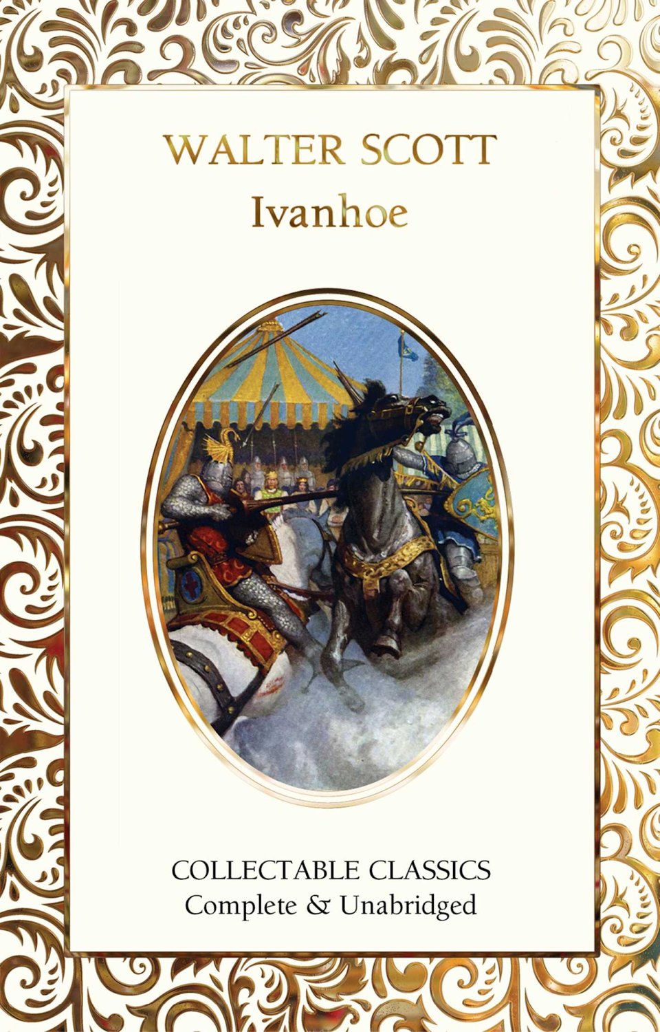
I’ve started doing some amateur genealogy work on my family’s history, so been digging deep into Irish and Scottish history. Sir Walter Scott is one of Scotland’s most famous writers, and I hadn’t read Ivanhoe outside of a VERY abridged kids' version in elementary school. I was surprised by how much I enjoyed this book and want to read more of Scott’s works, particularly those that have Scottish heroes and heroines. I would almost compare Ivanhoe to Superman in how he is written, for he doesn’t get a ton of character growth, but focuses on how his honor and dedication to good morals affect those around him. My favorite character ended up being Rebecca because of her tenacity and loyalty to her heritage, but I also enjoyed the tragedy of Brian de Bois-Guilbert.
SOMETHING(S) NEW
I’m only backing one Kickstarters right now that is still ongoing because it was December and there tend to be fewer of them anyway, but here's the one campaign and a few I thought looked interesting:
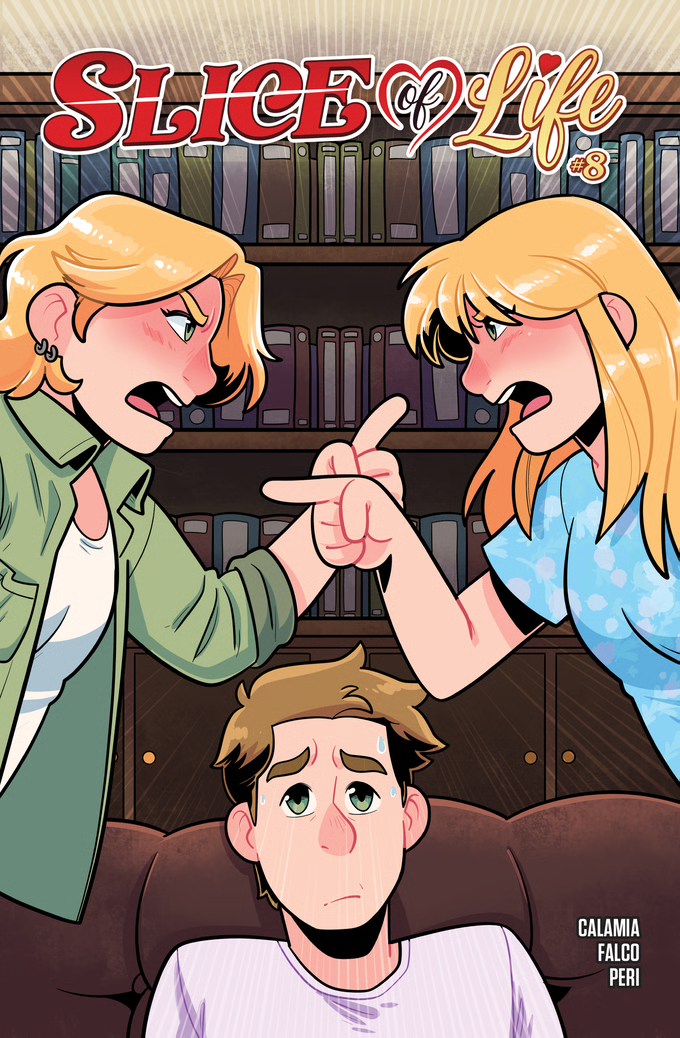
Have you ever just wanted your favorite tortured fictional character to just go to therapy already? That's exactly what happens here! Slice of Life #8 takes a deep dive into Ravyn and her family's communication issues, Beck and Lucy's softball rivalry, Kris and Ravyn's blossoming friendship, and Yuriko makes a life altering decision.
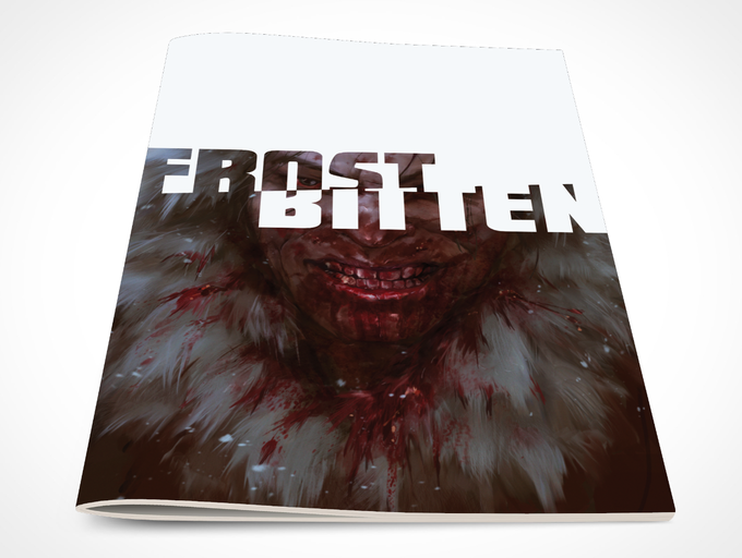
It was long believed that the people of Northern Canada were named after a term meaning “eater of flesh”. While the word itself is no longer used, this story explores the idea that the term wasn’t referring to them at all… An isolated town in Nunavut discovers the true origins when a stranger arrives and they are overrun by cannibalistic, supernatural creatures. Along with the help of some locals, the town's police officer and his pregnant wife must do anything they can to get out alive.

Greetings, folks, and welcome to Toxic Pond! Tales From Toxic Pond is an ongoing comic book series with standalone collections of ghost stories and parables woven together into a collected tapestry of horror and human longing. Our stories are presented in the spirit of the greatest episodes of Twilight Zone never made. SOMETHING(S) BORROWED
Sonic the Hedgehog: Bad Guys
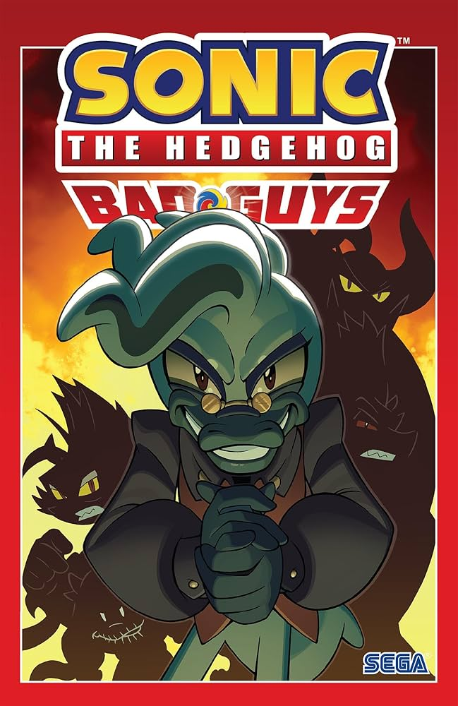
Most of the things I’ve been borrowing from the library have been books on Irish, Scottish, and American history or genealogy, so my comics and other books to choose from were limited. I’ve been trying to catch up on the Sonic the Hedgehog comics (did I mention I like Sonic?) and this one, in particular, was a satisfying villain tale. I think most people view character growth as moving toward being a better person, but that isn’t always the case. This story does an excellent job of using Dr. Starline (the duck guy in the center) and his devotion to Dr. Eggman to show a journey of questioning one’s idols and the perils of ego. Yeah, it’s the silly series with animals doing cartoon nonsense, but I’m continually impressed with how Ian Flynn and co. manage to weave great stories inside of that box.
SOMETHING(S) BLUE
Captain Planet by David Pepose, Emmanuel Casallos, Jorge Sutil & Jeff Eckleberry
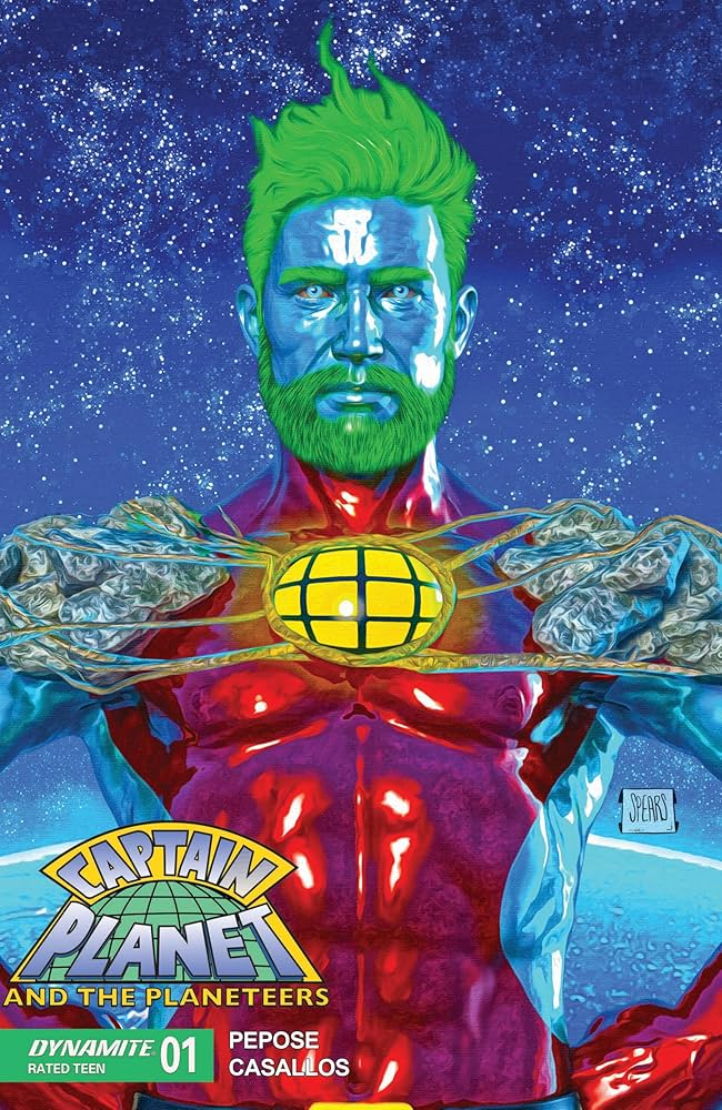
I didn’t think I’d enjoy a comic about Daddy–I mean–CAPTAIN Planet, but this series really surprised me. Like the Power Rangers comics, I enjoyed that the first issues explore who the Planeteers are as people and give the reader the chance to see their relationships grow as they navigate their new powers. The story masterfully balances a fine line between gritty reimagining and the colorful camp everyone loves about the original show. So, yeah, go read this hunky blue boy save the planet!