Guts N' Gutters #7 (April 2025)
Upcoming campaigns and how poetry and comics intersect in this month's newsletter!
TL;DR (Too Long, Don’t (Wanna) Read)
Zona Del Male updates
Grow In Grow Out launches May 20th!
Punch A Nazi Anthology is live!
New Anthology: Rise of the Flightless
Into the Gutters: Poetry & Comics
Go support Tyrant Fall # 1 – 3 & Blood Valkyrie in Vegas on Kickstarter and Invisible Illness - Lupus Awareness!
WHAT’S THE WORD?
Rhythm - an ordered recurrent alternation of strong and weak elements in the flow of sound and silence in speech.
Zona Del Male
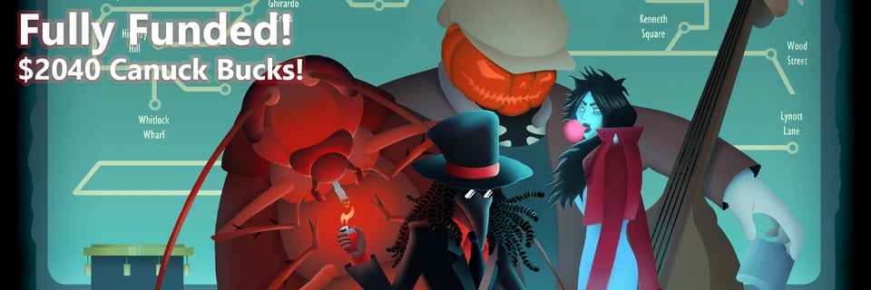
Thank you to everyone who supported Zona Del Male! The book should be mailed out in July so stay tuned.
Grow In Grow Out
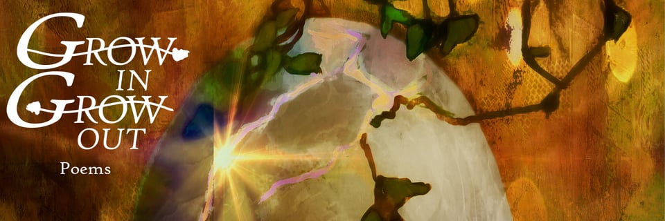
Grow In Grow Out comes to Kickstarter May 20! My goal is to get this book made and wrapped up within a month and a half, so the campaign will be short and fulfillment swift. Following the campaign is the only way to ensure you don’t miss it.

If you want a preview of some of the poems, be sure to check out the earlier announcement (and be sure to read this month’s article wink wink).
Grow In Grow Out Coming Soon to Kickstarter!
Punch a Nazi Anthology

Support the Punch A Nazi Anthology! All proceeds go to the Trevor Project plus you get a comic by Cy and me.

Rise of the Flightless: A Penguins vs. Robots Charity Anthology
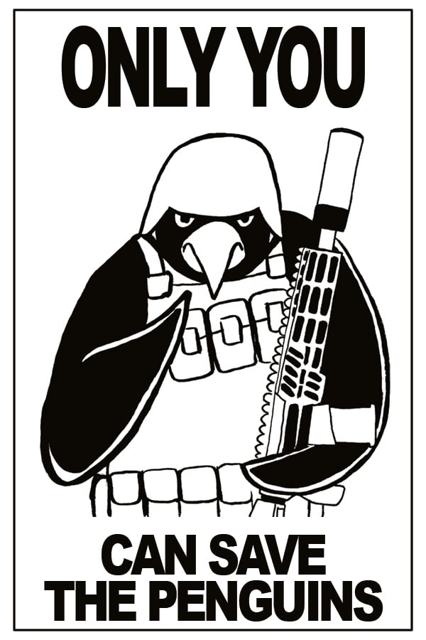
My wife and have decided to launch a charity anthology this summer to raise money for the Antarctic Science Foundation to assist in their climate efforts (and so the penguins can pay their tariffs). Every comic submitted that meets our requirements will be published, so be sure to grab a friend and make some penguin buttkicking goodness!

INTO THE GUTTERS
Poetry & Panels
In my undergraduate degree (Music), my euphonium professor would often playfully jab at my refusal to focus on one instrument or aspect of music. In addition to euphonium, I played string bass in orchestra and jazz ensembles and studied music composition, so I can’t say it was unwarranted when he’d say:
“Adept at many, but master of none.”
I would have been a better euphonium player had that been my sole focus, but I don’t think it would have made me a better musician overall. Plus, that phrase is, in reality, only half of it. It really reads:
“Jack of all trades is a master of none, but oftentimes better than a master of one.”
In the end, it doesn’t even matter (RIP Chester), and I don’t think it necessarily makes a creator better than anyone. It all depends on one’s goals. If someone strives to be the best painter in the world, then it might make sense to focus only on painting. But overall, I don’t think it hurts to be familiar with many different aspects of creation.
I’ve always been interested in how different things connect and how they can be incorporated to make something new. So, I dabble in a lot of things. For this month’s article, I want to dig into how being adept at two of these seemingly disconnected things, comics and poetry, helps me be better at both.
Visual Language
I don’t need to explain that comics are a visual medium, but some may not have considered that poetry is also a visual medium. Which words come before a line break, or how punctuation is placed, can vastly change the meaning of a sentence or phrase.
Consider this last section from the first of Rainer Maria Rilke’s Duino Elegies (translated by Vita Sackville-West):
For Linos, through the barren stupor burst
Music, audacious, new–and space aghast
Suddenly and eternally invaded
By youth well-nigh divine, first trembled
To that vibration of emptiness
Which draws us still, and comforts us, and helps us.
How did this sound in your head? Did you read each line break as a pause, or continue until the next punctuation mark? Did your mind even pause at spots where there was punctuation? Were certain words emphasized more when you read?
I love these last lines because Rilke uses space and punctuation to recreate the images he describes. For example, the em dash before “and space aghast” creates physical space between the letters, and it created space in my mind as I read. In addition, it forces a breath before “aghast” to mimic the sensation. I also adore how “Suddenly” is capitalized and placed at the beginning of the line, so that it feels sudden and sneaks up on the reader. All are clever bits of text painting.
Or how about this stanza from Anne Carson’s translation of Sappho?:
Sappho, I swear, against my will I leave you.
And I answered her:
Rejoice, go and
remember me. For you know how we cherished you.
But if not I want
to remind you
]and beautiful times we had.
For context, the ] indicates a part of the poem that is lost or indecipherable. So, it was not a conscious choice of Sappho’s but one by Carson. She explains in her introduction that she left the gaps because they are a part of the drama, and she also took liberties with line breaks to make the poems feel more songlike (since Sappho’s poetry was written to be sung).
To me, that space between “you” and “]and” feels enormous and devastating. The reminder Sappho wants to give this girl she’s speaking with is lost, and I experienced it like a gap in an important memory, one desperately wanting to be remembered. This couldn’t have happened without Carson’s decision to leave that space at the end of one line and the beginning of the other.
For a final example, let’s look at a poem from my upcoming chapbook:
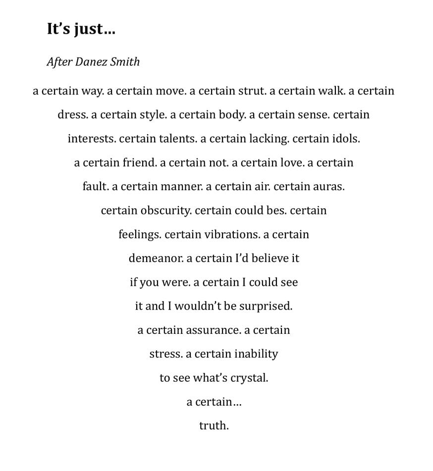
This poem was inspired by that feeling when friends and family know something about you that you’re oblivious toward. I shaped the poem this way to heighten the tension as the protagonist gets closer and closer to “truth”. I also enjoy how the line breaks shift the rhythm of “a certain” so it’s emphasized in different spots, creating a bit of disorientation like the feeling I hope to imitate.
I hope I’ve demonstrated that the look of the poem is just as important as the words. So, the question you might ask is, “How do I use this for comics”?
The Flow of the Dialogue
Like with poetry, I consider the visual flow of my dialogue when making a comic. During scripting, I visualize not just the individual panels, but also how I want the audience to read my narration and dialogue. In a way, I see the panels as a dialogue’s line breaks and its design and placement create a rhythm like a poem.
So, if I envision a character pausing during a phrase, I might write a panel with no dialogue before they continue. Or perhaps there’s a line where I want a lot of emphasis on the last word. I might stretch the sentence out over many panels to build suspense and make that last word large with minimal art.
Like comics, poetry has a visual language that can affect everything, and slipping on the reader’s shoes can give wonderful insight into how both function. I would have never seen the similarities if I hadn’t chosen to be a student of both and–I’ll toot my own horn a bit–I believe it makes my comics have a unique voice. I may never be a master of one, but I’ll be damned if I don’t have something interesting to say by being adept at many.
GUTTER BUDS
Shout out to these campaigns by friends and colleagues!
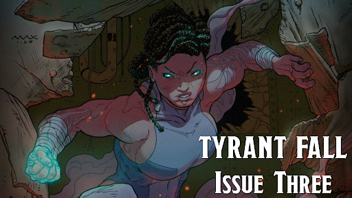
Tyrant Fall is the epic fantasy battle comic about a warrior unintentionally reigniting an ancient war in her quest for vengeance.
It answers the question, "What if DragonBall was published in Heavy Metal Magazine?" And is perfect for fans of both, as well as other battle comics and manga.
Today’s the last day to get Tyrant Fall’s third issue across the finish line!
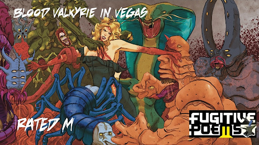
Clive Barker's Hellraiser meets Quentin Tarantino's From Dusk Till Dawn with a Norse mythology twist, Blood Valkyrie in Vegas is a non-stop slaughterhouse that will keep you gripped in its blood-drenched hands until the very end.
Christian is a fantastic writer and I’m always down for another Fugitive Poems project!
"The Invisible Illness" - BrandComix Lupus Awareness Comic Book Project
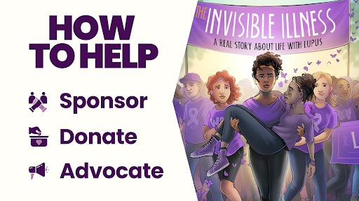
Support this comic book project bringing awareness to an oft-unspoken illness!