Ridgewood's sidewalks are getting trippy
This week’s update is a collection of colorful press-to-seal plastic bags found around Ridgewood, NY. Bags which used to contain cannabis products, all collected in about 20 minutes during some afternoon toward the end of April. New York has an abundance of weed trash. When you start looking for it, you start seeing it everywhere.

The packaging for cannabis products used to be discreet. In a market defined by secrecy and the decades of harsh legislation, there would’ve been no need for “branding.” The sellers themselves wanted to remain as anonymous possible, and packaging likewise reflected that. Wads of aluminum, plastic sandwich bags, film cannisters. The less brand identity the better.
Not so now. It was in the mid-late 2010s that the market began to undergo rapid shifts as a result of the legal attention. Most of the market was made up of unregistered sellers, but the culture was loose enough for competition between them to emerge. This was when it finally happened, that dealers became confident enough to develop their own brand identity. And cannabis packaging at large changed from discreet to branding with a capital B, and it often came with the most unsubtle of neon shades.
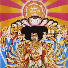
The hippies historically provided us with a similar bright, trippy, vibey aesthetic. Not through their bud packaging, (sandwich bag/cling wrap era) but in their album covers, band posters, etc.
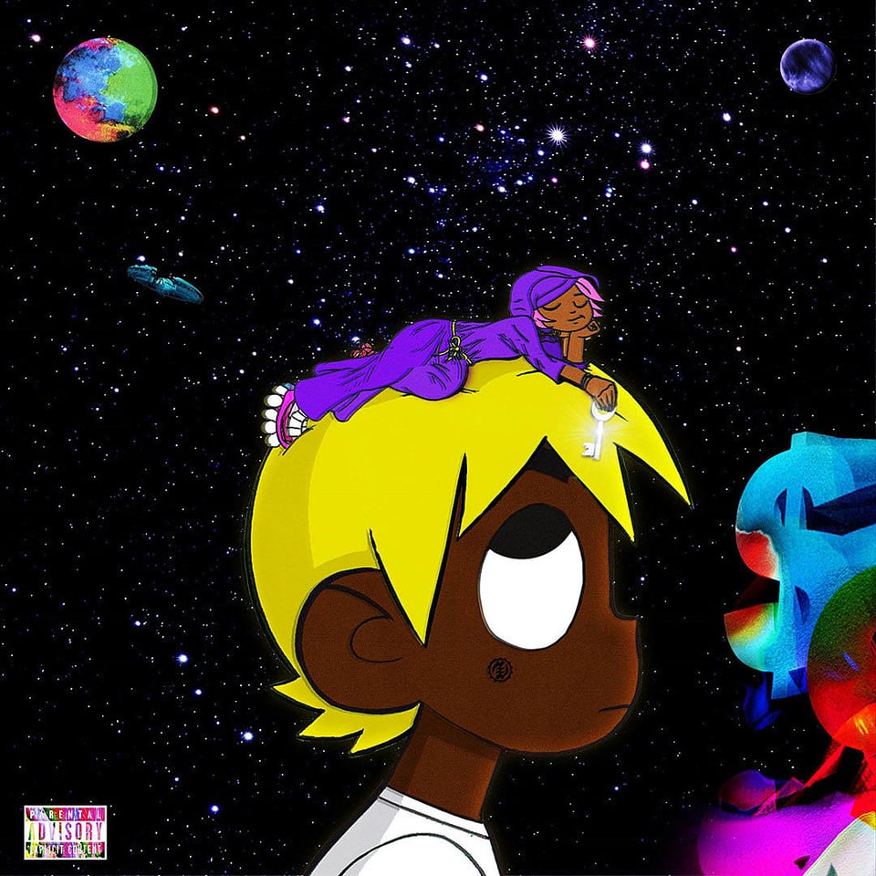
And in the 90s, it was the ravers’ turn with the trippy aesthetic. Them and their neon colorful and. holographic outfits and fuzzy backpacks. Cannabis was part of this scene only tangentially though. It belonged more to hiphop, and later became associated with trap culture in particular. The trap aesthetic was at first neutral, gritty, black and white grainy images. Mid-2010s there was the aesthetic shift which became the trap aesthetic we know today, found on YouTube thumbnails and mixtape covers, on Instagram and Soundcloud. the un-subtle neon colors, the nostalgia-emulating certoon characters, paired with less innocent references. It was a representation of the trap ethos, an irony of nostalgic childhood fun/pain and reality.
This was the inspiration for a lot of the key DIY cannabis distributors of New York and LA. Picture Bart Simpson smoking a blunt, his red bloodshot eyes, against a swirly rainbow background. That one appears on a lot of backwoods products.
*Not an indie brand, but prevalent in the culture and a good example to illustrate the aesthetic.
The advertising was often done on socials, Instagram in particular, where a strong visual culture was necessary. Toward the end of the decade, there was also a stronger emphasis on independent sellers to automate their process, so the thicker plastic mylar bags rose in popularity, as they could be printed with brightly colored designs at home. The shift was also in part due to the changes brought on by COVID — less social gatherings, smaller sizes became standard. And the New York legalization for recreational marijuana in 2021 (medical use was 2016) not only increased the availability of legal cannabis products, but it made unregistered sellers more prominent and confident existing within the market as well.
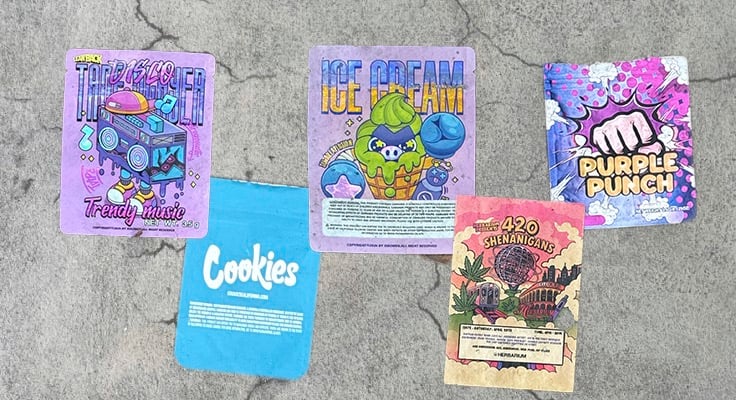
The mylar bags with the neon colors are characteristic of unregistered sellers. Every state has certain regulations for child safety. New York requires certain levels of difficulty in packaging closures — regulations that the plastic mylar bags almost always do not adhere to. Certainly not the tear-open press-to-seal bags of the Ridgewood sidewalk. The designs on the packaging themselves are, as of the mid 2010s, not supposed to be overly loud and colorful or emulate the packaging of sweets in any way, to turn off minors from the products. The neon ban. Not to mention that certain products include images of cartoon characters — callback to Bart Simpson smoking a blunt — or even intentionally spoof/emulate popular sweets.

These flat mylar bags with press-to-seal closures, printed with trippy neon designs and nostalgic cartoonish figures, are almost assuredly always not up to code.
The design reflects a long history of cannabis in New York, often tied to language of resistance, counterculture, and music subcultures — trap in particular. Now we’re left with a New York’s child safety neon ban, and the post-legalization culture where partaking in weed is becoming more of a normalized activity for all types of people. We’re seeing a trend of “upscale” cannabis brands using muted, dark, sophisticated branding. A “luxury” vibe which might appeal to the masses. Those who’ve never bought and smoked something called “cheetah piss” or “purple monkey balls.” (Real strain names.)
And yet, the sidewalks of New York suggest that we’re sticking to what we know: the stylings of cannabis products such as “purple punch,” and “420 shenanigans,” and that one bag just labeled “ice cream,” as pictured above. New York State may take issue with that one in particular. (Not to worry, potheads. The Scrolls is no snitch.)
Reading List
📚 June Armstrong’s collection of old mylar bags of bud
📚 The Acid Aesthetic: A Brief History of Psychedelic Design — print magazine, Steven Heller
📚 "Psychedelic: Optical and Visionary Art Since the 1960s" by David Rubin
📚 "Trap Music: The Subterranean Circuitry of America's Drug War" by Langston Wilkins