LBP - Issue № 6 - Researching at the IPM
Exploring the International Printing Museum and its Linotype treasures; seeking old issues of “The Linotype Bulletin.”

Linotype Book Project - Issue № 6
Researching at the IPM
Back in August, I was in LA with my family and was lucky enough to schedule a special appointment with Mark Barbour, the director of the museum, for exclusive access to the museum and its library. Today I’ll be sharing some of the highlights.
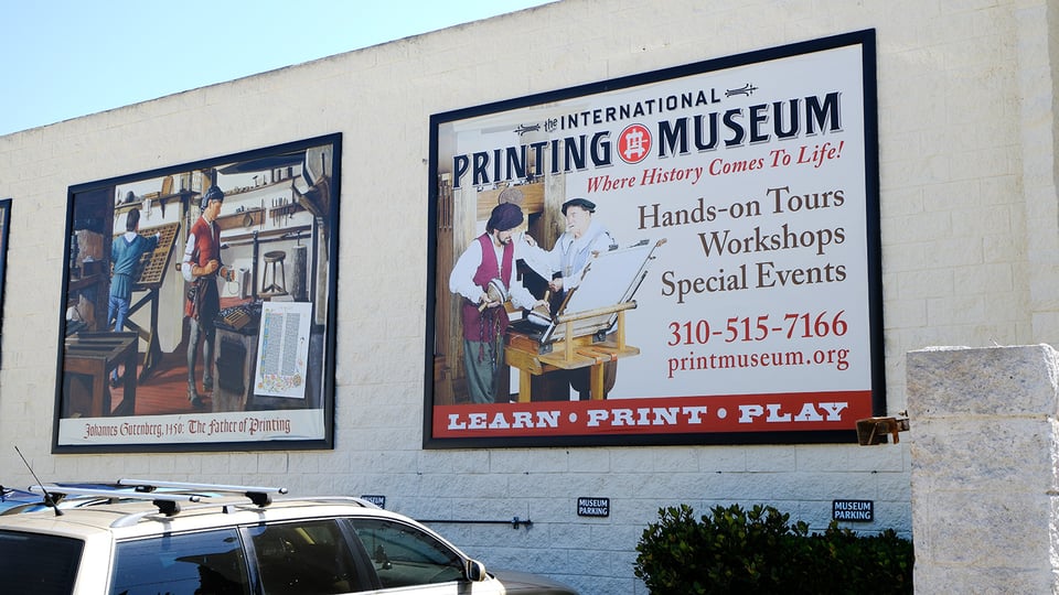
Just Off an Interstate Interchange
The International Printing Museum is located in a nondescript area of Los Angeles; near the intersection of the “One Ten” and the “Four oh Five” interstates. If you aren’t specifically looking for it, you’ll likely miss one of the best printing museums in the United States (if not the world) and end up in a “Floor & Decor” parking lot across the street.
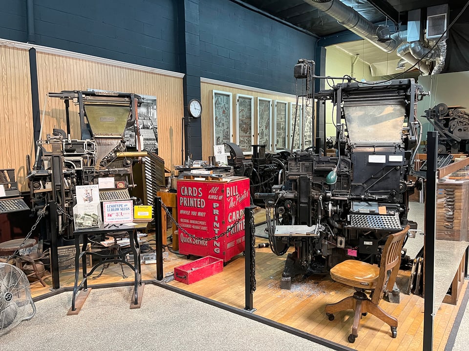
Walking inside, you’re immediately hit by the universal smell of every print shop I’ve ever visited: a combination of oil, ink, dust, and paper that instantly brings a smile to my face. The IPM is a treasure trove of machines, books, and type that will get anyone even slightly interested in printing excited.
Cataloging “The Linotype Bulletin”
I was most interested to see an almost-complete run of the Mergenthaler Linotype Company publication The Linotype Bulletin. This magazine, “Devoted to the Linotype and Its Users,” was printed from 1904 to 1926 and totaled over 160 issues. The magazines give a wonderful insight into how the company educated its customers and promoted its machines & products.
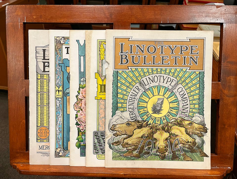
With the help of a museum volunteer, I photographed every cover in the bound volumes to add to my ongoing spreadsheet documenting every specimen book and publication that Linotype printed over the years. Doing this just for the American company (not to mention the Canadian, German, UK, or Italian companies) is a large undertaking that will take months — if not years — to complete.
SPECIAL REQUEST: If anyone has old issues of The Linotype Bulletin that you would be willing to let go of, please contact me by replying to this email; as I would give them a good home as part of my personal collection.
Those Special Covers From 1914
Back in 2012, I got to screen our film at the IPM for the Los Angeles premiere. It was a fun night with many fans in attendance. I remember their Linotype was hot and most attendees stayed after the screening to get their name cast in a Linotype slug — the best party trick of all.
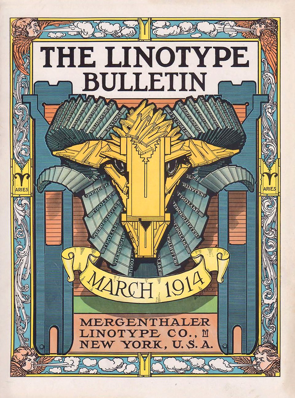
That evening I was shown the above cover from March 1914 based on Aries and it absolutely blew my mind. The ram head made of Linotype matrices! The horns constructed of Linotype slugs! The giant spacebands framing the ram! The cherubs in the corners blowing the early spring winds! If you can’t tell, it was love at first sight.
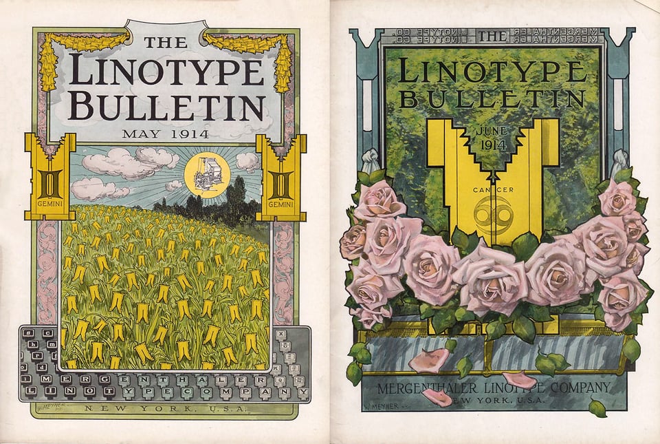
Later on, I learned this was one of six covers illustrated/painted by Walter Meyner for the magazine. Of all of the covers that I photographed at the IPM, these are by far the most illustrative, striking, and evocative.
Because I just can’t help myself, if you really want to nerd out about these covers, you can read my full blog post just published on my personal site.
Rogers Typograph & Linotype Junior
Two of the most rare typecasting machines at the IPM are the Rogers Typograph from 1895 and the Linotype Junior from 1908. I’ve only seen one other Typograph machine (at a museum in Germany) and I had never seen a Linotype Jr. in person.
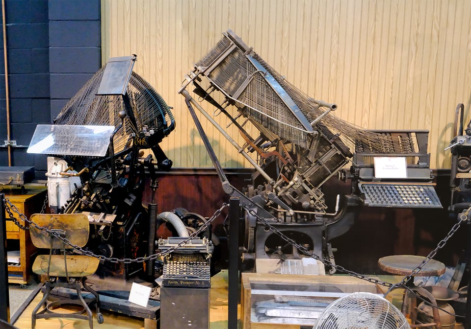
The Typograph was designed by John Rogers and was a direct competitor (and a cheaper option for smaller printers) to the Linotype in the early years when it wasn’t a foregone conclusion the Linotype would dominate the market. There is a whole fascinating history of Rogers and how Linotype eventually bought out his company and put him in charge of engineering, but that story will have to wait for the book. ;-)
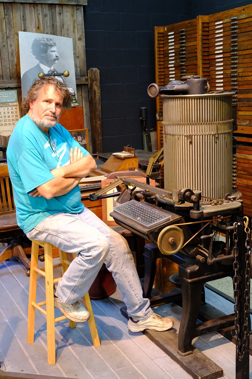
If you want to learn more about both of these machines, make sure to read the Rogers Typograph page along with the Linotype Junior page and watch the videos Mark created — they are great information you can’t find anywhere else.
Slow and Steady Progress
As mentioned above, I am busy building a full list of the publications from Linotype over the years. Part of this is my OCD obsession for completion, but it also makes sure that I leave no stone unturned in writing the most comprehensive story of the Linotype that I can possibly write.
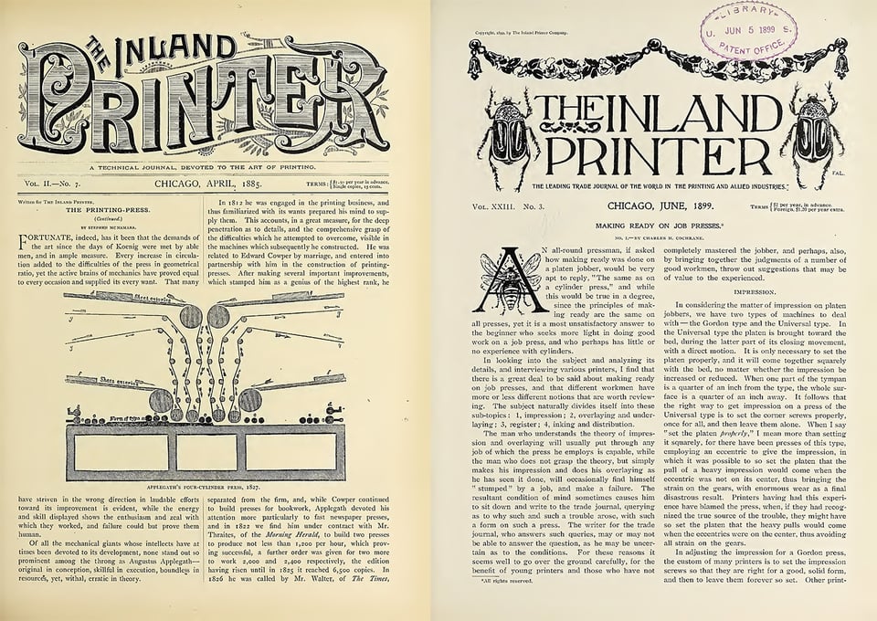
Another long and arduous process I recently completed was digging through the first 65 issues of “The Inland Printer” from 1883 to 1900. I did this because I needed to see how the printing and typesetting industry talked about the Linotype in the early years of its introduction. What did the public think about the Linotype before it became the obvious winner of the typecasting machine race? That’s another story that will be covered in the book.
Always a ‘Thank You’
This will be the last email from me this year. I have some exciting new opportunities ahead of me both personally and professionally that I can’t share just yet, but I’m looking forward to continuing my book research and writing next year.
Thank you for reading. It really means the world to me that there is a small, dedicated group of people that are interested in the history of printing, journalism, and typography like myself.
I wish all of you peace and health in the future,

Doug Wilson
