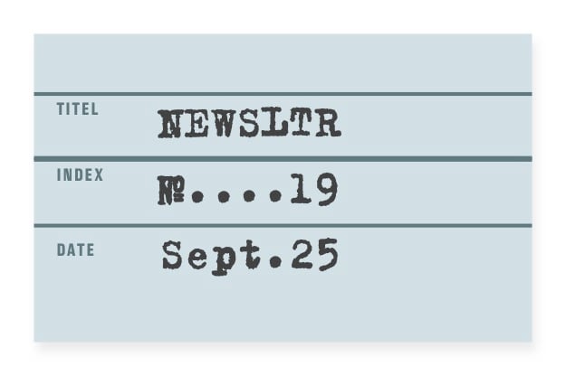
NEWS LTR №19: Of Forgeries and Fonts
Diving into the intriguing mystery of forged KGB documents and the Trixie typeface.
Some time ago a researcher (link at bottom, but read first) asked me if I could take a look at some documents. These were very official looking typewritten pages, with as many rubber stamps, signatures and numbers you can think of. The researcher said there were only scans available, the originals could not be found in any archive that could reasonably have had a copy. The documents were allegedly correspondence between two departments of the KGB, between 1982 and 1990. The typewriter’s typeface was Trixie.
Regular readers of this NEWSLTR will know that I take pride in being an expert in recognising Trixie, due to having designed the typeface back in 1991.
You see the problem. Even if the KGB, for reasons unknown, would have chosen to write their letters in a digital font so that it would it appear to be typewritten, (in an office with stacked with real typewriters, I imagine) it would have taken place in the decade preceding the creation of the font. Their spy-craft may be good, but they do not have time machines.
The researcher was thorough and did not just rely on my observations. He wrote to the curator of the KGB archives in Kyiv, and collected statements from a forensic graphologist and an actual typewriter academic. It came down to the repeating specks of dust, dear reader. I am sure both Agatha C. and John LeC. would have loved this.
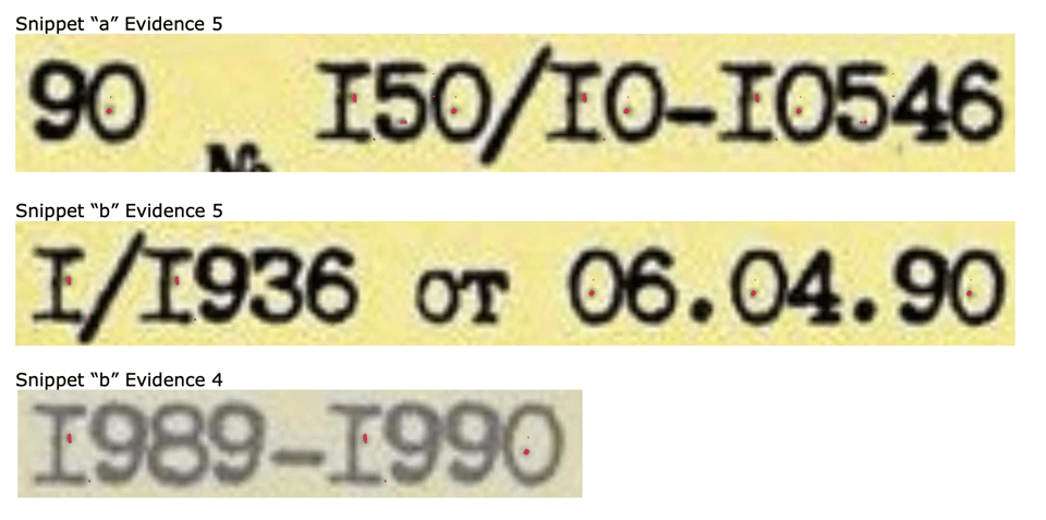
The actual provenance of these documents still needs to be determined. Personally, I would be surprised if it were the KGB because why would they. I am not a detective or even a researcher, but I am impressed with the care and attention that goes into an autopsy like this. I also appreciate the time and effort that goes into investigative journalism in general, because there is so much misinformation. I just draw type and I know what I drew in what year. But I can state that these documents were printed in Trixie, conclusions can be drawn by others.
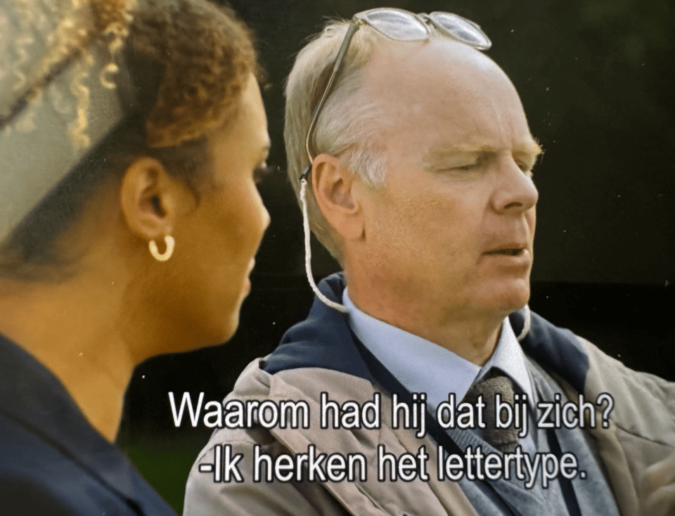
This font though, amazingly it continues to attract subterfuge and mischief. We fondly remember agents Mulder and Scully, goofing around in the basement of another three-letter-agency. Since then there have been plenty of movies in which the prop & production designers took my typewriter and created convincing assets. Do I stop the movie and zoom in? You bet.
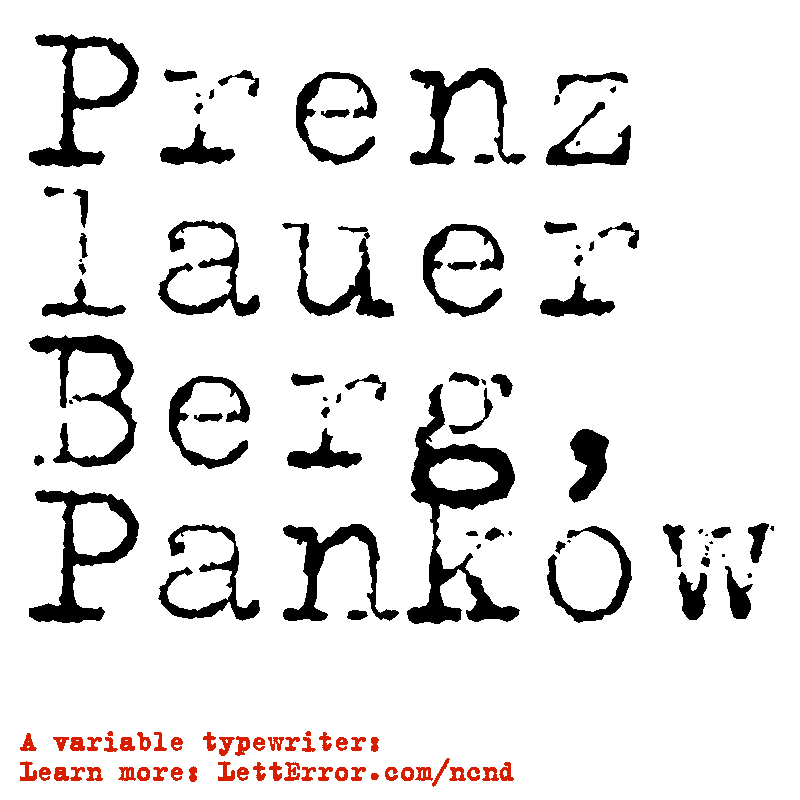
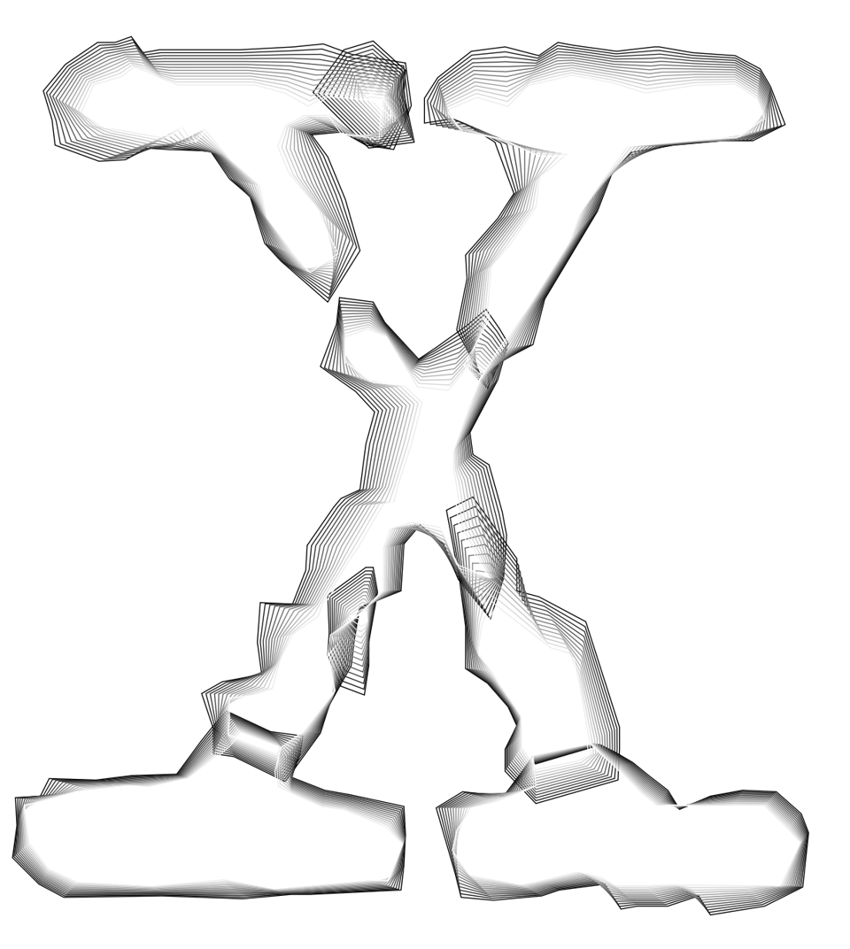
For reasons best summarised as “🙄Monotype”, the current edition of this font is named LTR NCND (Neither Confirm Nor Deny). Aspiring forgers will be pleased to hear this edition has fewer specks of incriminating dust! It also has a variable weight axis that allows randomisation of the impressions for each glyph, so that the shapes will not repeat with digital precision (applied with a convenient script!). For fictional forgers of fictional documents that need to convince equally fictional detective inspectors, this is should be great news!
However, if you’re planning to forge actual documents that need to withstand actual forensic scrutiny and stand up in a real court, you need to take more steps. I have given this some thought, hear me out. First I’d start by collecting boxes of location and period appropriate paper, and store this in a dark and possibly climatised room, minimising contact with outside air. Maybe rent some space in one of those Customs Bonded facilities. You know, at an airport, easy to get to with the jet. And then I would add a floor full of typewriters, all kinds of models, versions, typefaces and keyboards from all over the world. I’d research ways in which to obtain or recreate the appropriate ink ribbons, for each of these typewriters, with the right chemical compounds for each year I would want to make documents for. So maybe add a small chemical laboratory, opposite the reference library and coffee pantry. I’d find out which types of pollen that reasonably could be expected for the location, season and year, and maybe just also collect samples of the pollen, to be safe, hire a scientist just for that. I would learn everything about nicotine particles, and any other contaminants in the dank office atmosphere that would have gotten hammered into the fibers of the paper. I would prepare tables of the carbon dioxide ppm levels for all the years, to be safe. I would hire a staff of scientists, researchers and editors, to draft the right kind of content for such letters. See, I think I would be a very thorough forger, but maybe not a very practical one, I would never get anything done in that warehouse. Or maybe I just watch too much silly British crime drama.
LTR NCND, your go-to typeface for all props and in-movie hero documents, on LettError.com. Code TRX on checkout for 10% off on Classic and Variable orders. LTR NCND is also available on Adobe Fonts, if that is your cup of tea.
This is the research, now you can click: Report on KGB documents about David Pugliese by Giuseppe Bianchin [Academia.edu]
Thank you reader for subscribing to the NEWSLTR, and your commitment to finding out about the work and lives of independent type designers. All of these words were written and edited by people for people who read. That is all for now, be good.