NEWS LTR №7: More Weights, Less Baggage

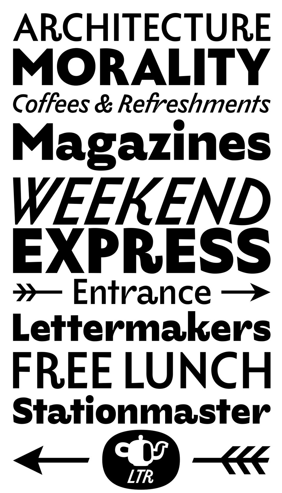
The increasingly misnamed LTR Limited Grotesque received more weights. Now available in Regular, Book, Medium, Bold and Extra Bold, in two variable fonts (upright and italic). As expected, while drawing these new weights, changes to the regular and italic became necessary. There were many improvements. Kerning and metrics were extensively reviewed and the stylistic sets were shuffled.

The bolds follow the direction of the italic and regular, in a celebration of the letterforms of the semi-formal communications of the British isles. You know these fonts started as an exploration of the work of Eric Ravilious in 1930. That would be only a couple of years after Eric G. and Edward J. proposed their sanses, and it would have been an exciting and new style (avoiding the word “modern” as it means too many things). In the Dunbar Hay Ltd. engraving Ravilious drew only a couple of letters. Speculation of course, but think he might have been reflecting on the new letter shapes he saw in the city.
Read more about the OpenType features

Shortcuts to long arrows
Included in the required ligatures and in the Fancy Arrows with Fletching stylistic set. Create arrows with fitted text just by typing!
Service Announcement
To celebrate the extension of the line and the opening of the new stations I asked Lars van Blokland to make this video.