NEWS LTR №5: More LTR Limited Grotesque

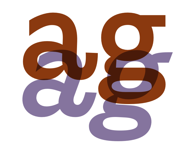
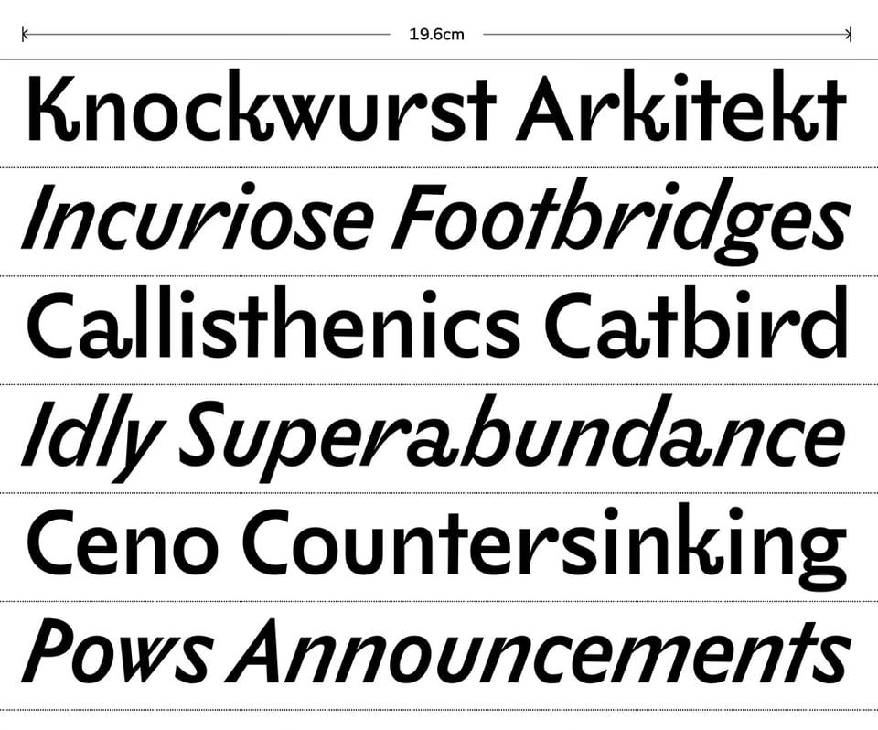
Dear reader! You may remember NewsLTR number 4, earlier this year, in which LettError Type announced the release of LTR Limited Grotesque. At that time exclusively as a very steep italic. “Of course we need a roman”, you said. “Of course”, we muttered (quietly), as we had given the matter considerable thought already. Now the conventional ways of doing things in typedesign, the very ways enshrined in books and teaching materials the world over, those ways dictate that the romans are drawn before the italics. And you understand that this will not do! LTR Limited was drawn in the wrong order! There was not to be a matching italic, but a pressing need for a matching roman. For this the LettError Type drawing department had to coin some new professional terminologies. And then we had to redraw all of it, because the italic has a touch of the oblique, but it actually wasn't. So the usual mathematical transformations were not useful in this process. Neither a faux-talic nor a faux-reauman.

That Limited Grotesque exists in a dense forest of historic references is clear. Let’s go around the table and fully acknowledge all present. The wonderful a, the joyful r and spurless u, the steep angle, inspired by a piece of lettering by Eric Ravilious. Then there was the insight by Edward Johnston that the contrast in the strokes of the broad nib could be reduced, and the serifs removed, and that this would create an interesting and viable alternative to the experimental grotesks created from slab serifs. And then we have to consider how Eric G. took Johnston’s ideas, polished them a bit and sold them as his own? Maybe there was more to that, who knows.
Dear reader, these influences are acknowledged with all due reverence and respect and in the understanding that these endeavours before you are a tribute. (And a folly for sure!)

While other foundries created drawers and vaults as a venue for the tentative and almost-finished, the drawing department of LettError Type realises our undertakings will always be, to some extent, tentative. Thus we release our typeface more like software, with occasional updates.
If you are considering LTR Limited Grotesque, or LTR Principia, or indeed any member of the LettError Type collection for a branding or identity project, do get in touch! We can tailor the fonts to your needs, add custom menu names, add a logo, etc.
Fish

For typographic convenience, we added directionality to the 2 icons: a right facing fish and teapot in the italic. The roman has a left facing fish and teapot. This way major directions of pescatarianism are represented, and tea can be poured for all.

Justifiable


Visit LettError soon. Look at fonts. Buy fonts. Easy.