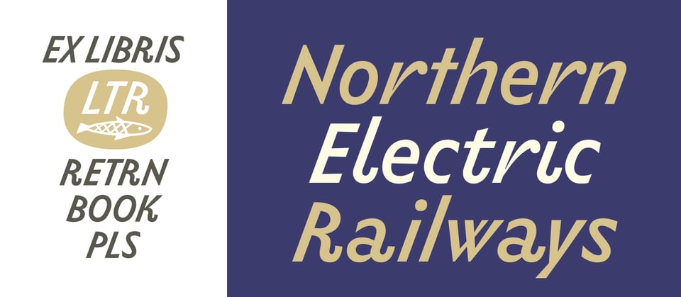
NEWS LTR №4: LTR Limited Grotesque


Dear friends of typography, I need to tell you about a new title in our collection: LTR Limited Grotesque. This is a low contrast, sans serif typeface with a rather steep angle and a joyful mix of shapes. Unlike any other humanist sans out there! And there's a nice story of how this one came to be, read all here.

LTR Limited Grotesque has you covered* (to the extent that a single style can cover all the needs of a branding project.)
This single-weight wonder is chock full of stylistic sets that provide rounder and straighter options, as well as many alternate characters. Over 530 glyphs!

The default Limited Grotesque features: the long upstroke on the r, the long tail on the a, the t and u with neither serif nor terminal, and the straight j and y.

The images above and below illustrate the different textures. Only the o is the same.

And I haven't even mentioned the automatic ligatures. But perhaps it is just better to have a look yourself. There is a font tester (with clickable features) and a Buy button should you feel the urge. LTR Limited Grotesque may be exactly what your next design project needs.


