NEWS LTR №21: Keep on Drawing
LTR Limited Grotesque® on FontStand
This family of variable weight, low contrast, illustrative and profoundly humanist sanses are now available from versatile font provider FontStand.
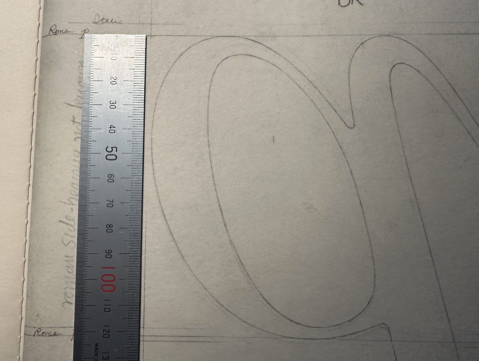
Dwiggins’ B Formula
W.A. Dwiggins wrote to Rudolph Ruzicka some time before 1940 and described how he would place his type drawings on the floor and then hold his 10 × reduction glass at his belt (B) in order to observe the drawing at “roughly 12 point”. It would be fun to do a Dwiggins Looking at Type Re-enactment if we knew the length of Dwiggins’ legs and could determine the exact optical qualities of the lens. Maybe this “diminishing glass” became part of the Boston collection?
Do we know enough to do a Dwiggins Looking at Type Re-enactment? Perhaps just even just a performance with the W.A.D. marionette. Imagine this diminutive typographic Pinocchio looking through a reduced reduction glass at an agate! The world does not need to know these things, but it would love the distraction, I’m sure. Maybe we can add the B formula to Dwig’s list.
Fast letters
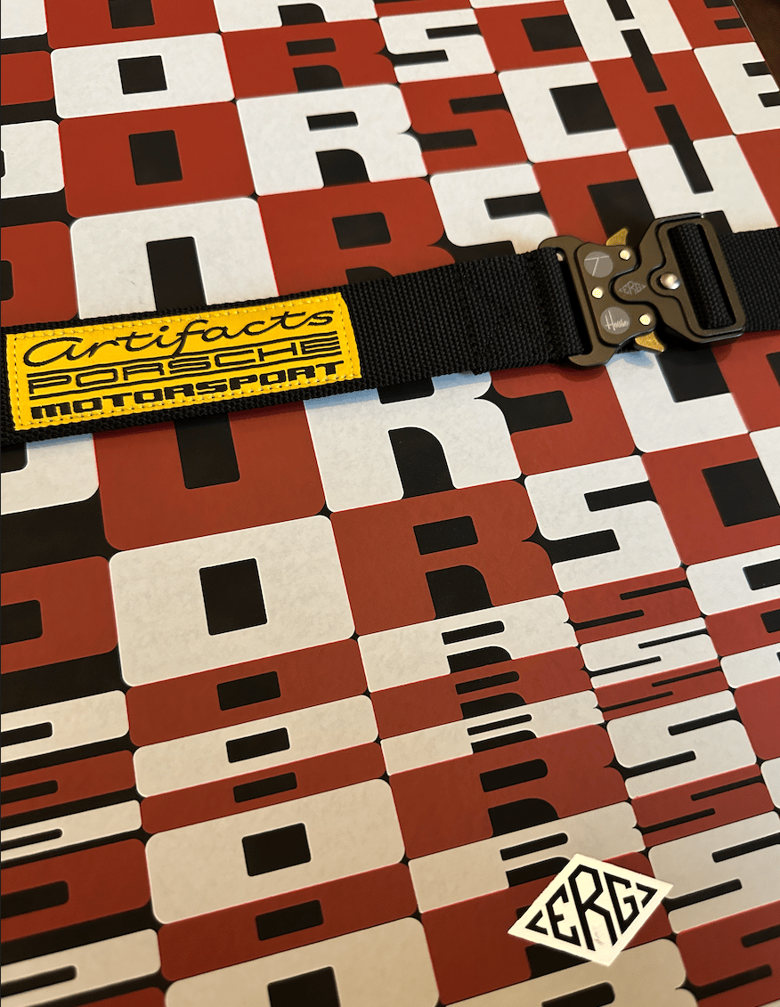
House Industries’ Andy Cruz worked with publisher Type7 to produce a stunning book showcasing a massive trove of material from the Porsche Archive. Photos, machine parts, cars, signs, documents. A tome of tremendous dimension, it ships in several boxes and even has its own safety belt. Ken Barber drew that connected italic, and I signed up for a super flexible rounded sans based on their classic and weirdly trippy patterns. Some funky Python was required to precisely engineer and animate them. Fans of internally combustible automotive typography should check out the book at the publisher.
Concrete
During a quick visit to London last November we inspected the Barbican Center. I have to say it is a lot better when you do not accidentally walk into it, and also when the sun is out. There is a lot to like about the architecture, and I think I understand where it is coming from, but it was disappointing that the café was not called “Brewtalism”. I resisted buying the domain… you’re welcome.
Letter Exchange!
The reason we were in London: a talk to the Letter Exchange people in the beautiful Art Workers Hall about the design process of the UvA library letters. I handed out some 3d mini printed letters and a RISO print. Thanks to all who came!
Dancing
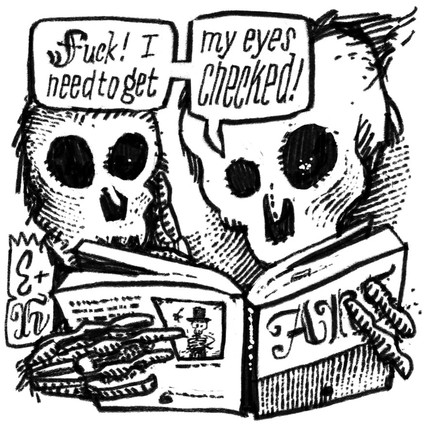
Some time ago I bought the modest Penguin book “The Dance of Death” with the engravings of Hans Holbein. Learn how small the original engravings were! Such detail! Death (a skeleton dressed in bits of cloth and undefined body bits) politely escorts noblemen, kings, queens, popes and paupers to their very neat, freshly dug graves. The scenes appear a bit grim at first, and then… they become funny. I had to think of the drawings by James Ensor where the skullies play the same part: reminding the rich (top hats, fancy suits) of their own mortality while taking care of all sorts of housekeeping. Had there not been over four centuries between these artists, they might have gotten along. Ensor & Holbein, each dressed in nowt but their own bones, posted on all high quality social media (cough). Drawing will continue until morale improves.
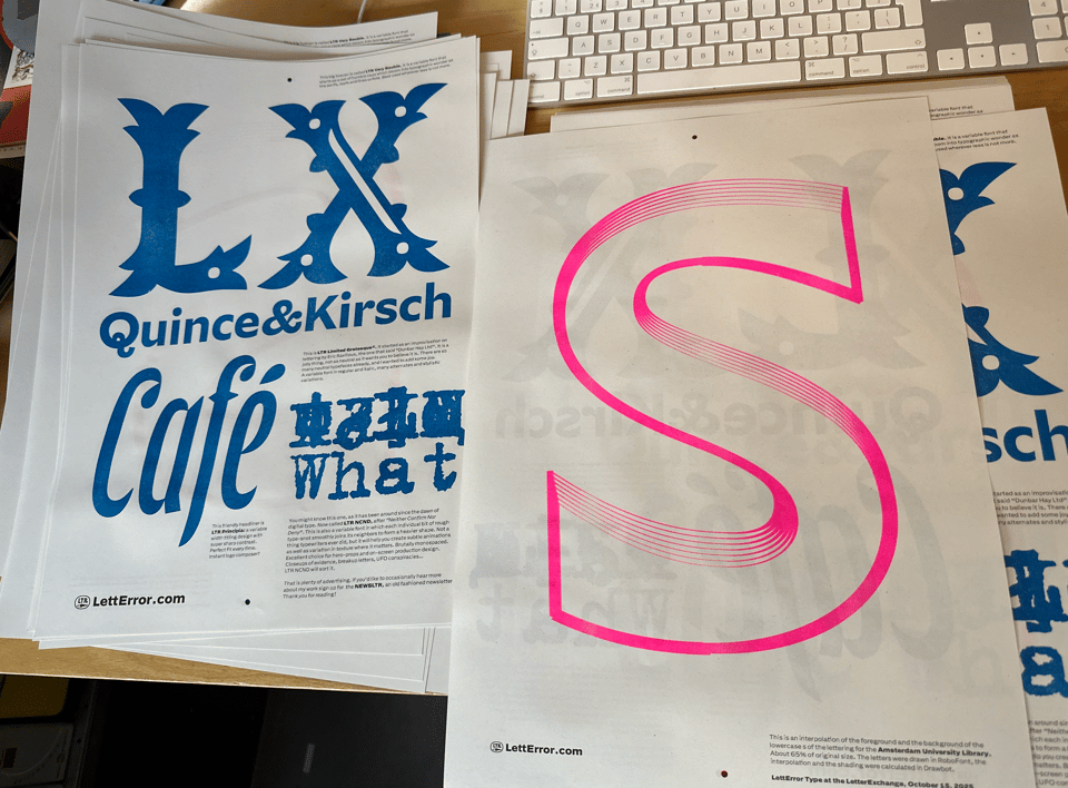
LTR Principia
The friends at FontsInUse added photos of a nice book designed by Dale Tomlinson. Using Jeremy Tankard’s Ravenscar for the insides and LTR’s favorite and very own Principia on the cover.
https://fontsinuse.com/uses/74328/a-passionfruit-as-big-as-the-ritz-by-bill-pow
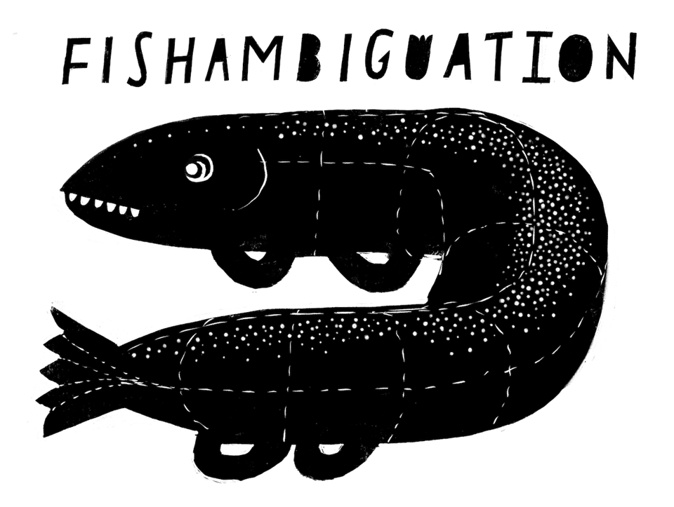
Fish
Proofing
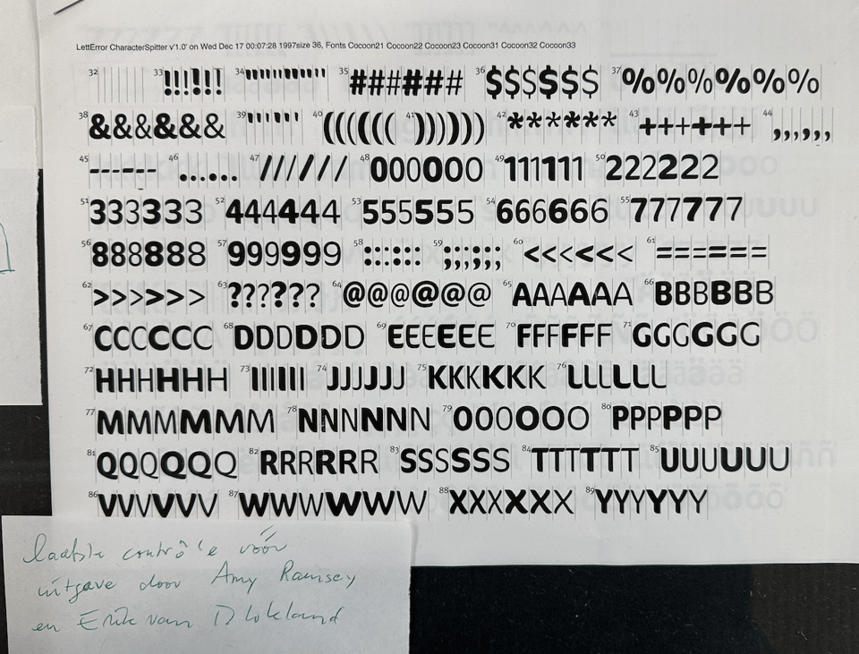
A document captioned “LettError Character Spitter” in the Evert Bloemsma exhibition curated by Jaap van Triest and Sébastien Morlighem. Generated on December 17, seven minutes past midnight, 1997. This was early days for scripting, it must have been Python 1.3 or 1.4, and generated some sort of markup that selected the new fonts and the thin intermediate lines. This was one of the proofs that Amy Ramsey and I would make for new FontFont releases to have a full overview of the characters and metrics. Must have been before FF started producing OpenTypes. Oh, to think that Evert kept this print!
—What is FontFont you ask? A publisher of new fonts, “for designers, by designers” until it wasn’t.
Foundries
Check out these other foundries making nice work:
Tal Leming: TypeSypply
Petr van Blokland: TyPetr.com
Tim Donaldson: Shapes For Cash
Nick Sherman: Hex Fonts