NEWS LTR №20: London, Old Things
London!
Next week, Wednesday October 15, I will talk about the Amsterdam University Library lettering. This will be at the ✨Letter Exchange, at the ✨Art Workers’ Guild in London✨ I will go into the design process and the amazing team. And some pretty awesome, sparkling new slides. There are still tickets surely. Of course there are still tickets.
I know I will regret this, but I will bring one of the library letters to London. I used this talk as leverage to get one from the manufacturer and now I need to deliver on my promise. (I also intend to take it back!)
Old school
While digging around in my computer for an old file (which I did not find), I found this neat Superpolator icon, circa 2012. Maybe you remember it, I certainly do. Making the aqua-shine effect was not easy, I found a how-to and followed all the steps to make it look professional. If I recall, the gray plus was a default master, the blue an on-axis master, the red one is a selected instance and the double yellow is an anisotropic instance with 2 separate locations. Good times.
Publishing an application, even a relatively focused one as Superpolator, is so. much. work. Fixing issues, working on new features, responding to OS updates (and repairing things that broke because of them), it never ended. And then at some point you discover that the application needs changes that require the whole thing to be rewritten, and that becomes a parallel track to all the other work, like running a design practice, that also just continues. It was a tough call to stop developing it.
The type-tools world is very small. If you make fonts, you may already know this: the applications you use are made by a very small group of people. Even if it has a shiny icon, it is probably just two people and their cat and a friend who keep it running. Join their discords and let them know you like their work. And if you’re friendly they will probably answer your questions and help you.

Speaking of anisotropic interpolation, such mathematical adventures are now within reach in the new release of my RoboFont extension Longboard (Github and Mechanic). If you do not have font-licensing on your mind, dear reader, perhaps you are a RoboFont-minded typedesigner, so this may be interesting. Subtle anisotropic variations can be used to see nice changes in contrast. But you can also go full-reverse, upside down.
Adventure
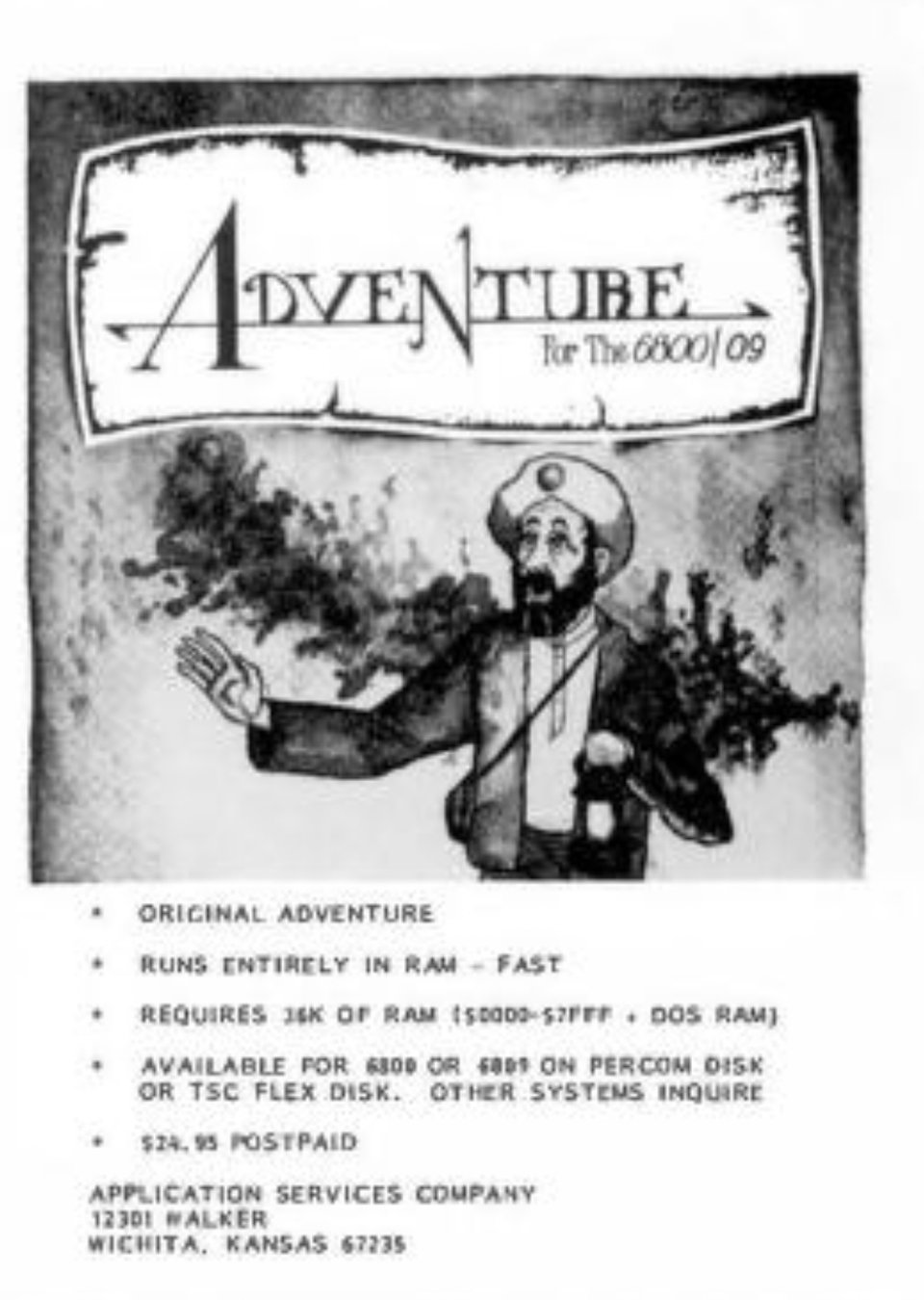
As a much younger and smaller person in 1981, I built a kit computer with a 6809 microprocessor. It used an obscure operating system (FLEX) and had one (1) single game called Adventure. Just text, no graphics. No game studio, not even a credited developer, no logo, nothing. I played this game for solid months, drew maps, fought dwarves and pirates and got lost in the maze. But it always kind of bugged me that I did not know much about its origins. The cool kids had brand recognition with Sinclair or NES. My kit machine, cool as I thought it was, less so.
Of course the old internet has the answers!
After a nostalgic dive on Wikipedia and text-heavy web, I finally found it! The game I played was a version of the 1976 Crowther-Woods text adventure, sometimes called ”Colossal Cave”. The original game ran on massive computers, and I never had access to one so I knew it wasn’t that. I read about a programmer named Jack Doremus who had faithfully ported Colossal to 6800 and 6809 assembly. Maybe that explained why I thought it was fast on my ½Mhz machine, but perhaps also because I had no reference. The idea that someone could just republish a game feels strange, even in today’s world. But that is how Jack rolled back in the day.
There’s a documentary about these early text adventures named Get Lamp. You can find it on Youtube, but this is its wikipedia entry. Uh, a lot of grey-bearded men talking in this documentary, there is no other way around it.
Oh! one wonderful thing I learned from Get Lamp: the original programmer, William Crowther, was an enthusiastic spelunker and parts of the map of the game are based on real caves somewhere in the US. No I will not visit.
And another wonderful thing. The Internet Archive has massive collections of magazines and periodicals. And in an issue of 68 Micro Journal (Volume 03 Number 01), I found an actual ad for the Jack Doremus 6800/09 Adventure. I know you probably can’t care much. It has nothing to do with type. But that’s where my digital life began.
While in Amsterdam:
EnterEnter, “a space for books”, currently hosts an exhibition by Sebastièn Morlighem and Jaap van Triest about the life and work of Evert Bloemsma. Impeccably researched, with many interviews, original work, drawings, sketches, publication materials, books and photographs of and by Evert. A very special designer, with a unique and original voice. The exhibition will be open until Sunday November 2, 2025. Check times here.
While still in Amsterdam:
Check out the programme at letterspace.amsterdam: “a montly series of lectures about experimentation, innovation and research in type.” The lectures I’ve attended have always been interesting and great. LetterSpace also has a newsletter!
Fonts
Still working on some new things. Very Bauble season is coming! Thank you for reading this! In the mean time, if you just signed up, have a look the fonts available at LettError.