NEWS LTR №18: Big Type
NEWS LTR №18: Big Type
Typographic Recontextualisation
Letters in the public space are exciting! Anything from the smallest painted sign, to the biggest neon: letters add meaning, sell things, and tell us where to go. Perhaps the main purpose of architecture is to provide surfaces for typography.
Some time in the 1980’s the city of The Hague asked the Office for Metropolitan Architecture to think about a space for the Nederlands Dans Theater. I will spare you the complete history, but art and philosophy magazine De Witte Raaf has a nice writeup of the entire history. If you don't mind some big architectural language, that is. All links at the bottom, maybe you will read more. A group of buildings, two theaters, a hotel, a parking structure. It also involved feuding architects, years of talk, and city politics. But in the end something was built.
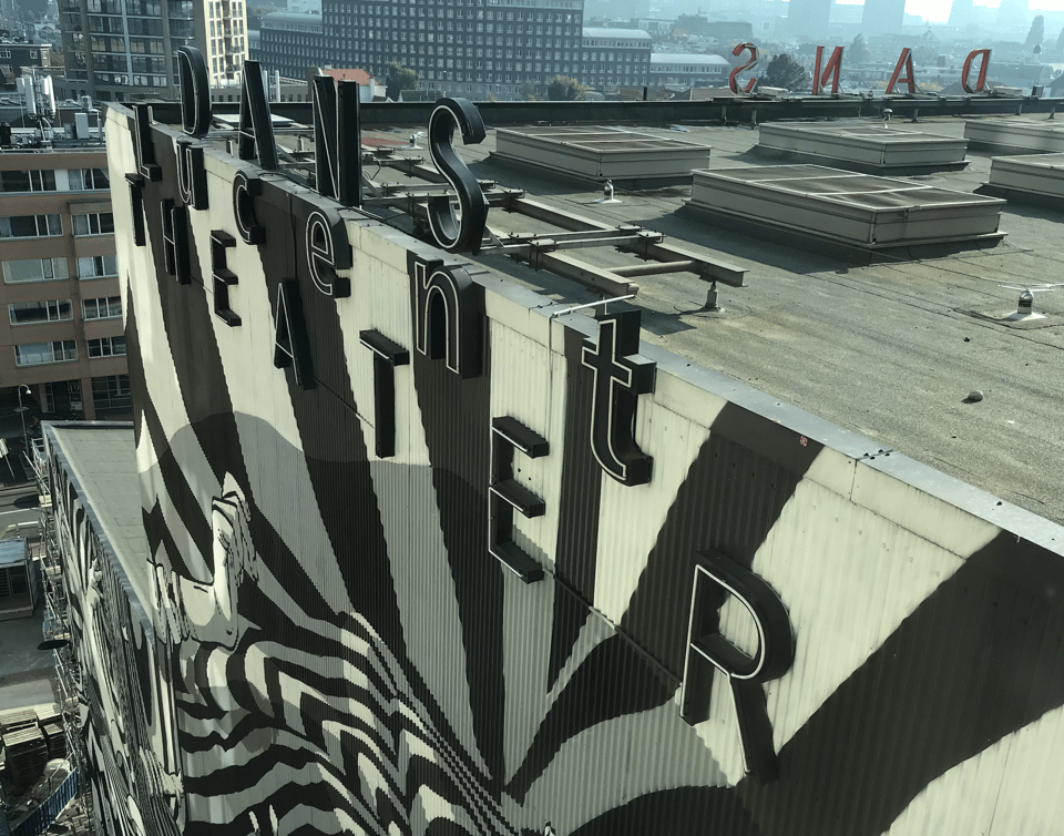
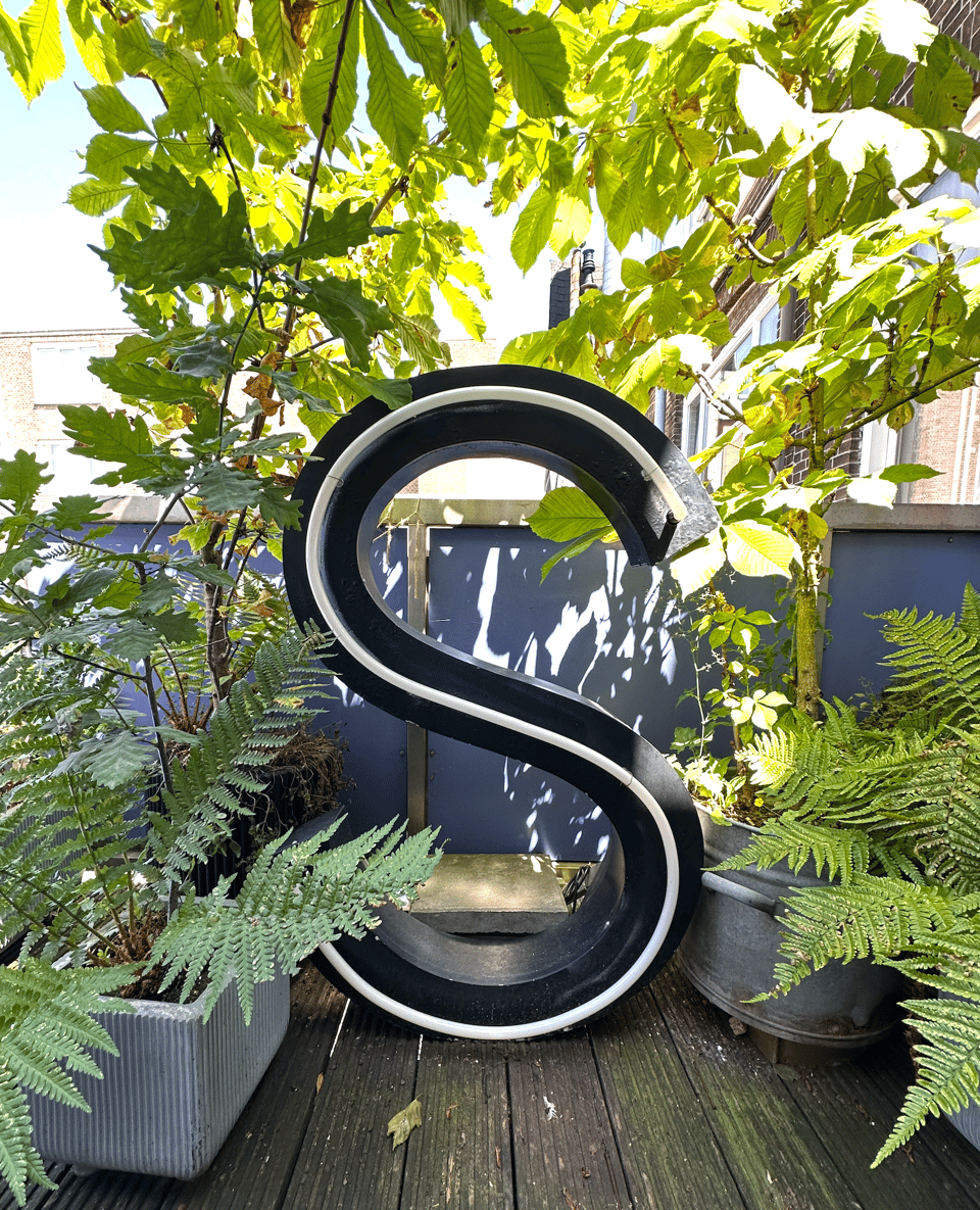
Shortly after construction finished in 1987 it was deemed necessary to remind the world that the Dans Theater was indeed part of this ‘context of walls and roofs'. Karel Martens was asked to design something, and the result was the word DANS (“dance”) mounted above the roof on three sides with the word THEATER attached to the walls below. A non-Helvetica, skinny gothic, perhaps of the News Gothic genus, in channeled boxes with a single strand of neon. A modest typographic intervention, perhaps, when seen from the ground, but effective. AT&T became a patron of the theater and the acronym was cleverly included into the sign by lighting up just some of the letters. Later, a corporate rebrand required the word “Lucent” (with the catchy we make the things that make communications work) to be added. It is not clear whether Martens was involved as a typographer for this addition. The name was materialised in a different typeface, and the neon followed the outlines rather than center stroke. But the sponsor gets to write their name which ever way it wants, I suppose.
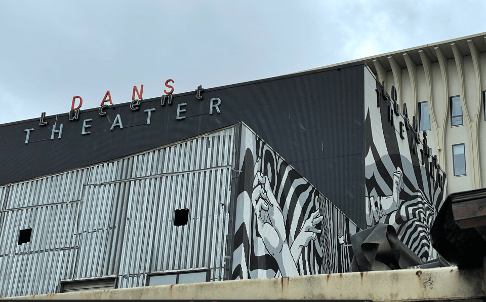
The letters on the northeast face of the building were painted black when Koen Harmsma and Jelmer Noordeman of the Rotterdam artists collective Bier en Brood created their iconic and optical zebra / dance mural. A hypnotic, dynamic visual pattern referencing dance and music that would remain on the theatre until the end.
When construction started for the Amare building (designed by architecture firms NOAHH | Network Oriented Architecture and Jo Coenen Architects & Urbanists), most of the Muziektheater had already been torn down. A section was saved as rehearsal space for the NDT dancers so the letters continued to shine over the city for several more years. In 2021 the proverbial curtain was lowered and the last scraps of the THEATER were to be demolished. Mural and all.
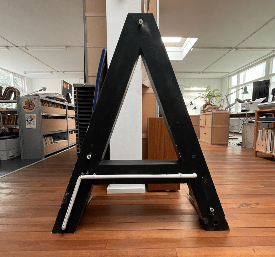
The LettError Office for Public Lettering (puffs up cheeks) made efforts to preserve some of the letters. Even in demolishing there is bureaucracy and it took some effort to convince all the different stakeholders, but results were achieved. Not everything: the THEATER signs, on the sides, were quite literally out of reach and could not be salvaged at reasonable cost. But the three DANS words on top of the building were accessible by crane and could safely be brought down to earth. Under strict supervision of course, all work was done by properly trained and instructed demolition workers.
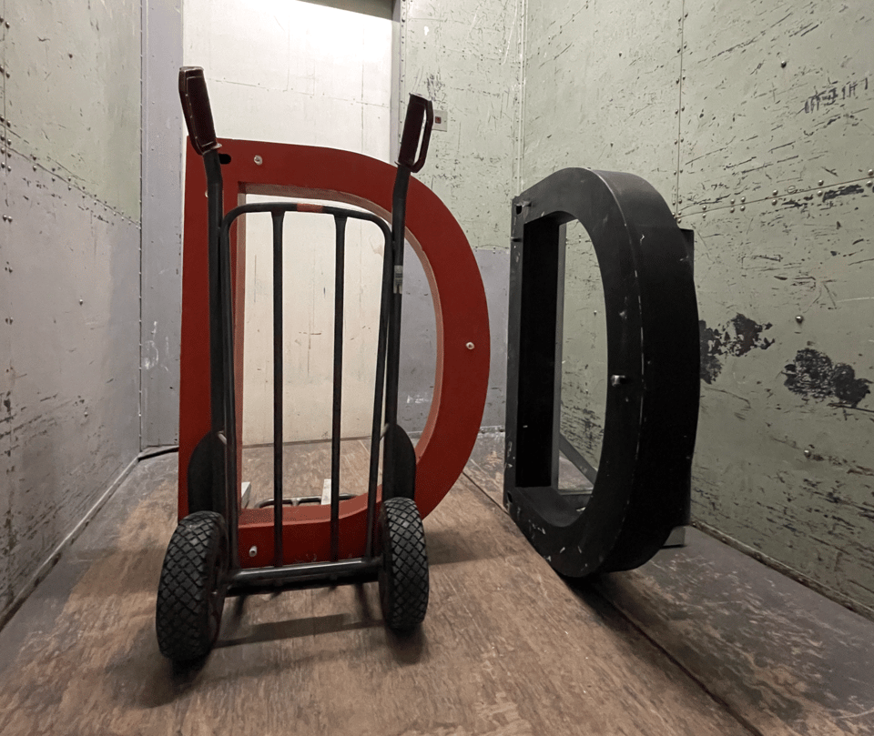
By removing the letters from their original context, they became cultural artefacts in their own right. Initially the letters marked the location of the theater, now they are sculptural reminders that the place once existed. Some were eagerly adopted by retired NDT dancers, others by fans and supporters of the NDT. Some had new neons fitted. Star NDT choreographer Jiří Kylián is rumoured to have one at his house. And one S lives under our collection of chestnut saplings.
Currently on show in the Karel Martens exhibition, “unbound” at the Stedelijk Museum in Amsterdam, is the set of red DANS letters that went to the NDT. Thomas Castro, curator and conservator for Graphic Design at the Stedelijk, included the lettering together with the original design drawings by Karel Martens. Obviously you should go see this amazing exhibition for all the things, but this newsletter permits itself some focus.
Takeaways
This story has a pleasing arc. Saved from the rubble at the last moment, now on display in a museum! But more often than not, efforts to preserve public lettering are less successful. Even when all parties agree letters should be preserved, they often end up in a skip after all. Too much hassle, no time, etc. So, dear friends of public typography: keep making the effort, send emails, chat with hiviz workers because they always know what is going on. It also helps to know a local van rental company. And maybe purchase a hacksaw and crowbar and some working gloves. You need to be able to say “I will pick these up this afternoon!” and mean it.
One last thought. Now that the NDT has been absorbed into the Amare complex, I’m sure there will come a time that someone would like to advertise with some big lettering on the roof. I will do some preemptive sketches and keep you posted.
More reading
Karel Martens: unbound. Stedelijk Museum Amsterdam. July 11 - October 26 2025. Unmissable.
https://www.stedelijk.nl/nl/tentoonstellingen/karel-martensDe Witte Raaf: Vaarwel papier! Het Nederlands Danstheater van OMA/Rem Koolhaas (1980-2016). Christophe Van Gerrewey, Editie 187, mei-juni 2017.
https://www.dewitteraaf.be/artikel/vaarwel-papier-het-nederlands-danstheater-van-oma-rem-koolhaas-1980-2016/99% Invisible. Lessons from Sin City: The Architecture of “Ducks” Versus “Decorated Sheds” by Kurt Kohlstedt. Witte Raaf references Venturi’s observation and it is an interesting read, if tangential.
https://99percentinvisible.org/article/lessons-sin-city-architecture-ducks-versus-decorated-sheds/More on the NDT Mural by Bierenbrood
https://bierenbrood.nl/project/nederlands-dans-theater/OMA on the design of the Nederlands Dans Theater, with some interesting aerial photography. https://www.oma.com/projects/netherlands-dance-theater
A contemporary record of public lettering in and around The Hague: Haagse Letters on Mastodon: https://typo.social/@haagseletters
Oh please:
LettError does not condone or promote vandalism or theft of lettering or signs from the public space or private property. By reading this, and nodding, you agree. Do not put yourself or others in situations that can be harmful. Make clear agreements with all parties involved: owners, builders, forepeople, demolition and construction workers, the lot, before taking any steps. Do not enter construction sites without permission.
Free Saw & Crow logo font: I was curious how this would vectorise and now I know. You read this far, well done and thank you. Here is a silly but free Font + pdf download.
LettError Makes Type
Check these really useful fonts, fit for all sorts of messages and occasions.
LettError sells fonts, not subscriptions, no unexpected price hikes by creepy private equity account managers trying to hold your brand to ransom. Does that happen, you ask? Oh man, does it ever. (link to Reddit thread)
Questions about licensing? Customisation? Characterset? Get in touch!