NEWS LTR №16: Fonts & Music
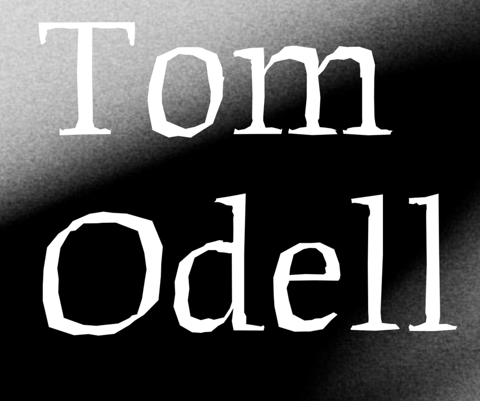
English singer songwriter Tom Odell recently announced his “Don’t let me go” tour, and it features LTR Beowolf! Odell’s graphic design is by Fraser Muggeridge Studio (who have done more fun things with Beowolf before). Ooh, maybe there will be some Odell/Beowolf merch! Looking at the Tom Odell website closeup I see the OpenType features are alive and kicking. Randomised, live, on the web! (Someone will point out that this is only a pseudo-randomisation at best, or just a cleverly managed set of fixed alternates, and you would be right, but don’t be that person.)
Check the Tom Odell tour dates
More about LTR Beowolf and the other randomfonts
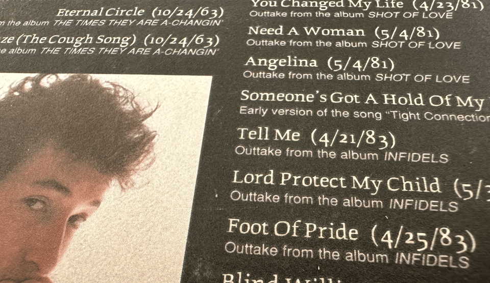
That got me thinking about other musicians who have used LTR Beowolf. There was a boxed set of the “Bootleg Series volumes 1-3” of Bob Dylan way back in 1990. Only the smaller print stuff on the back is Beowolf, but Just and I were over the moon! Did I buy a Bob Dylan box set because of the type? Absolutely.
And then of course there was the Neil Young & Crazy Horse live album “Weld” with LTR Beowolf center stage so to speak. Described as “grunge-foreshadowing sludge”. I don’t feel the sludge necessarily, but Beowolf did its share of foreshadowing.
Neil Young & Crazy Horse Album art on Fonts In use
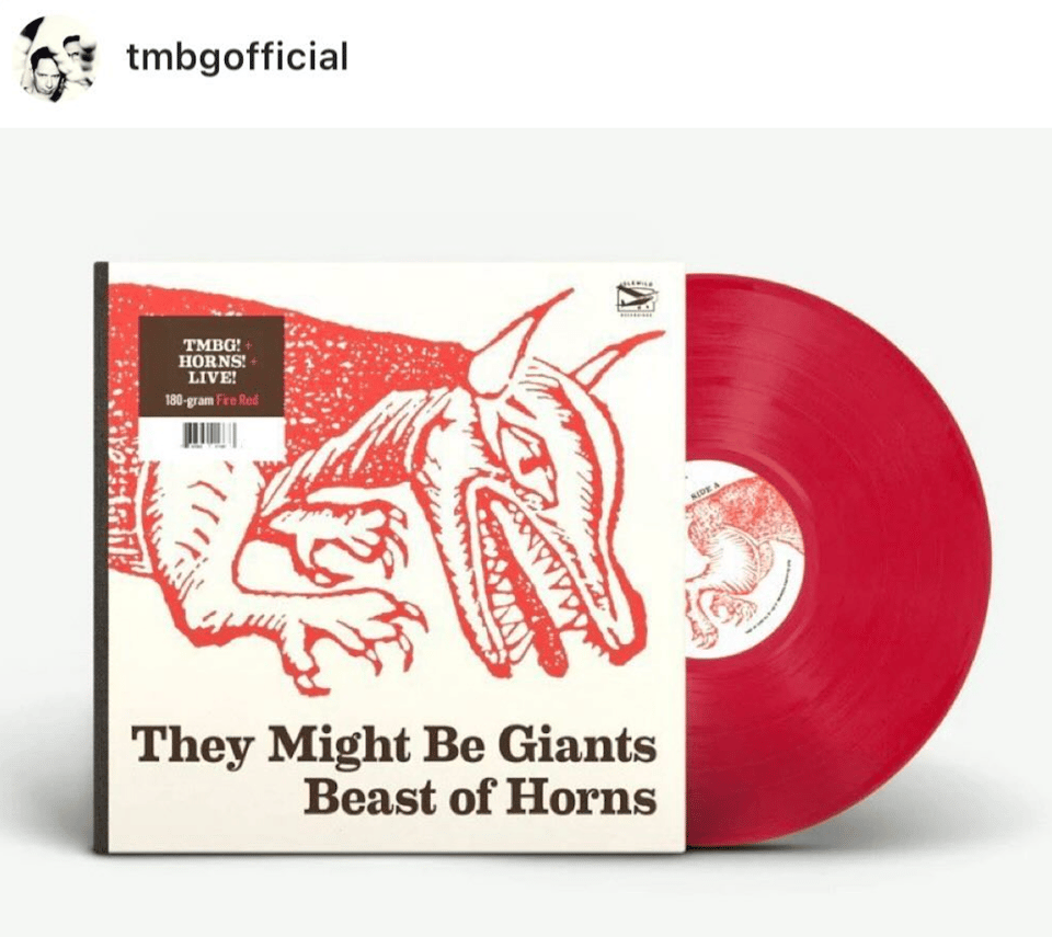
On the subject of records, here’s one more. They Might be Giants, longtime LettError favourite, recently released a couple of things with House Industries Eames Century Modern. Including a really nice use of Eames Stencil Black on the album art for “stelluB”, a free download from TMBG.com. See Eames at House Industries, here.
I don’t know if there are any lessons to extract from this eclectic typographic playlist. Some righteous anger? Something edgy? At least they all have impeccable taste in type!
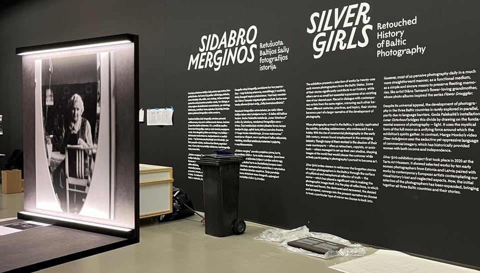
Sidabro Merginos
Aleksandra Samuļenkova desgined the exibition for Silver Girls: Retouched History of Baltic Photography at the National Gallery of Art in Vilnius, Lithuania. Aleksandra picked LTR Limited Grotesque for the typography, and she made it look amazing! The serious quirkiness seems to fit the exibition really well! To be seen until 15 June 2025 at the National Gallery of Art, Vilnius.
Update for LTR NCND Classic HD Pro
LTR NCND HD Pro version 7.505: The most detailed and certainly the largest font files of the entire LettError type catalog received a small update. The Light weighs in at a counter-intuitive 10.3Mb. The Heavy, true to its name, a whopping 13Mb. Why so big? Well, every glyph in HD Pro has seven alternates, each with a super detailed rendering of ribbon and ink, and all those points add up even when efficiently compressed.
If you want the refresh and you already have a valid license, let me know. If you want a new set of HD Pro fonts, they can be licensed, but they’re too bulky for the web shop. Let me know what you need we can sort things out. Check out all the update news here.
As always: if you have a license for any Letterror font and you need an update: just send me an email.
Free drawing!