NEWS LTR №15: Baubly Updates
An update for LTR Very Bauble!
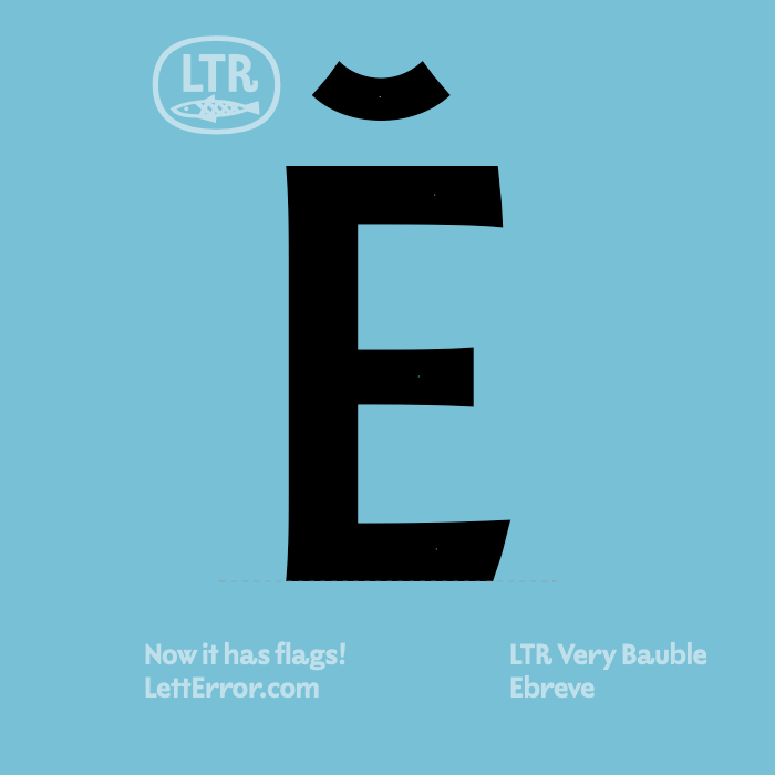
The first release of LTR Very Bauble had a rather sparse characterset: I really wanted to see if I could make the idea work, because there were some interesting challenges. Now, in the cold harsh light of March, I sketched and experimented and I have found a nice way to draw the diacritics, I hope you like them too!
I had to lift the ceiling a bit to literally make some room by changing the em-square. This means new the version will appear a bit smaller at the same point size. The font has the same outlines of course, but they’re scaled a bit tighter to hang the bunting so to say. You will manage I’m sure. I also had to make some room in the fonts and I had to scrap the solid, thornless version of each glyph. You will say “I was not aware the font had a solid, thornless alternative” and I rest my case.
Free updates if you licensed already, I will send them by email soon. Holler if you need them sooner.
This is the PDF for LTR Very Bauble 1.4
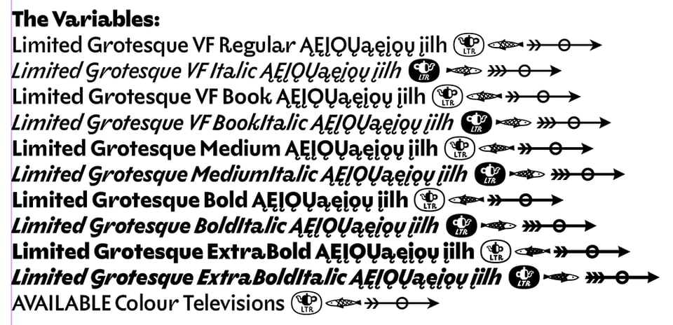
Limited Grotesque v1.806, Feb 28.
This edition improves ogonek service in all styles. As well as a fix for the overlaps in the OpenType singles. Again, free updates if you licensed already, will send them by email soon. Holler if you need them sooner.
Automatic Type Design 3 Conference, ANRT
The Atelier National de Recherche Typographique outdid themselves with the outstanding Automatic Type Design 3 conference in Nancy this year. All talks, including mine, are online here.
FontStand 2025
I am looking forward to the FontStand conference, organised by eponymous FontStand and Typotheque companies, right here in The Hague. Look for a LettError RISO print in the goodies! A gaudy colourful thing, with gaudy letters, but still, a thing, printed with warm heart. I will also bring some more Process and Practice prints because I will keep printing them as long as you like them.
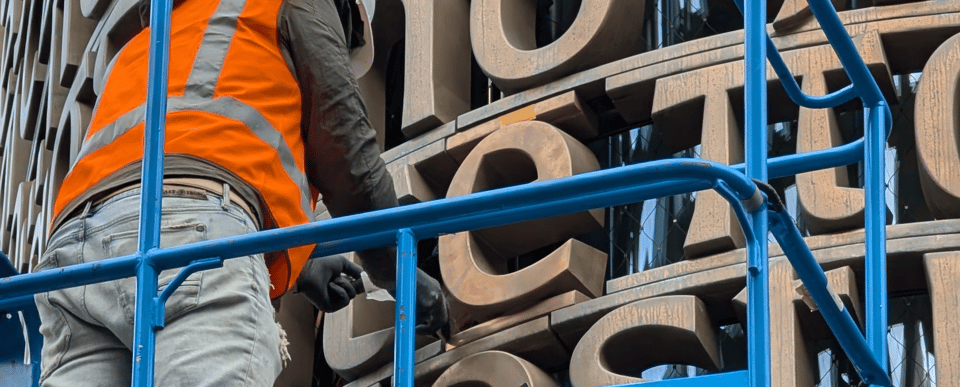
Close call at the Library
Correspondent M. L. in A. photographed one of the last letters going into the letter wall of the new UvA Library couple of weeks ago. And can’t describe how shocked I was to see a lowercase e getting added to a classic Greek line, I hopped on the first train to Amsterdam with urgent text corrections on my mind. On site, thankfully, I saw the letterworkers had found out and swapped the e for the alpha before I got there. That would have been a unique conversation. Phew!
Thanks for signing up to this newsletter and reading all the way to the end. You know, you should also sign up for the Shapes for Cash newsletter: the foundry site by infinitely talented pen-worker and brush-man Tim Donaldson.