NEWS LTR №14: Accountability
An update on drawings, zines and fonts.
I Can Confirm
If you need to refresh the old distressed typewriter you once licensed from F°n†Sh0p™, look no further, LTR NCND, Neither Confirm Nor Deny, is your title. All the original versions, with support for Latin, Greek and Cyrillic are here. Let me know if you’re not sure which one you have, I can help identify.
Update for LTR Limited Grotesque
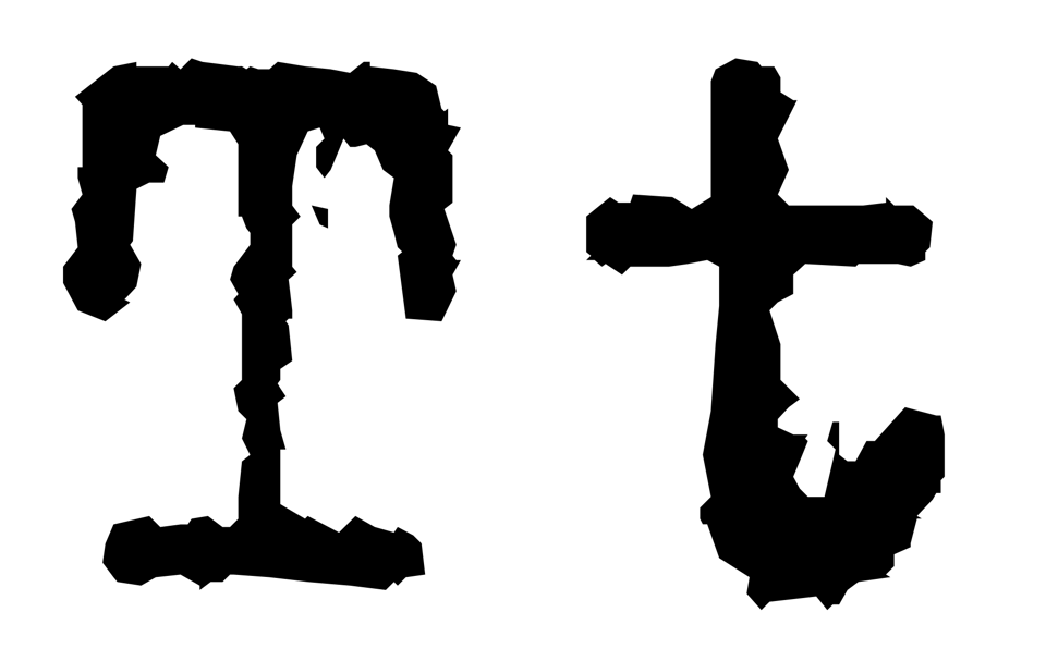
LTR Limited Grotesque got a small update with some fixes: an issue with the dot size in iogonek, an alignment issue in the lowercase h stem, the right margins of some accented variants of Z. If these sound useful to you, let me know and I will send you the new fonts. All LettError Type updates will always be available to registered users at all times. Just send me a mail. More release reports.
All LettError’s fonts
If you’re making an identity for a museum, or titles for your friends’ new short movie, posters for your local theatre, if you’re building an app, if you’re designing a book, if you’re sketching proposals for a logo, if you’re updating an existing webpage. If you work at an agency and they have that has one of those monster subscriptions to yesterday’s fonts but none of them speak to you: have a look at all those clever and charming LettError typefaces, right here.
LettError Type is not a massive, private equity owned portfolio with heavily mortgaged IP. All these fonts are mine (plus one I share). If you write me an email, I will personally write the response. If you ask for a quote, I will do the math and make a proposal. Best of all: if you need something new, I can draw it for you.
Zine
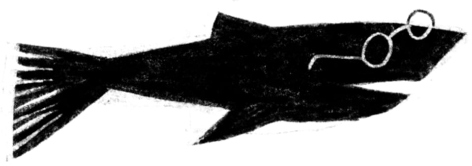
I might be working on a new one. The themes are well established: lettering, maps, bookshops, fish, interplanetary commerce, islands, trains. Will report more on this later.
Process and Practice, printed
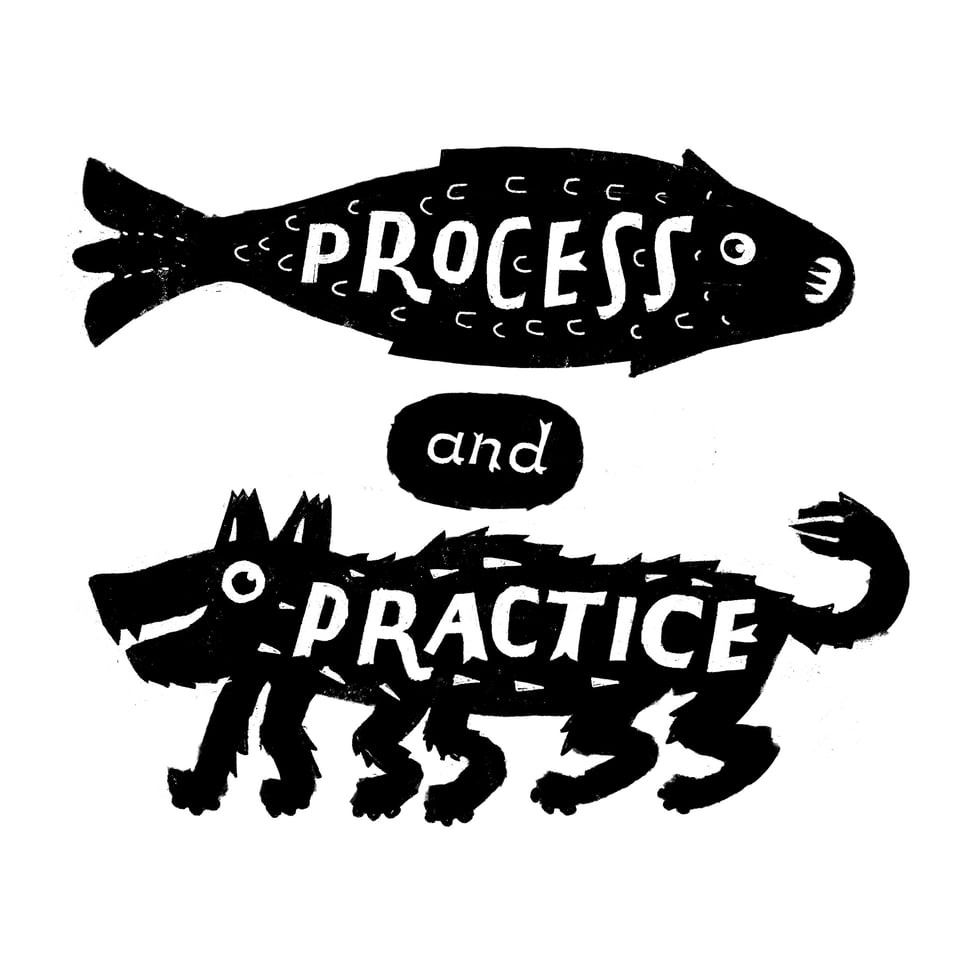
I made some RISO prints of the Process & Practice friends. A3, portrait, sturdy EOS off-white paper. Cash only, in the studio. I don’t have a cost-effective way to mail these. Tubes, large envelopes, the shipping is prohibitive. But they’re here if you’re here and want one. €20.
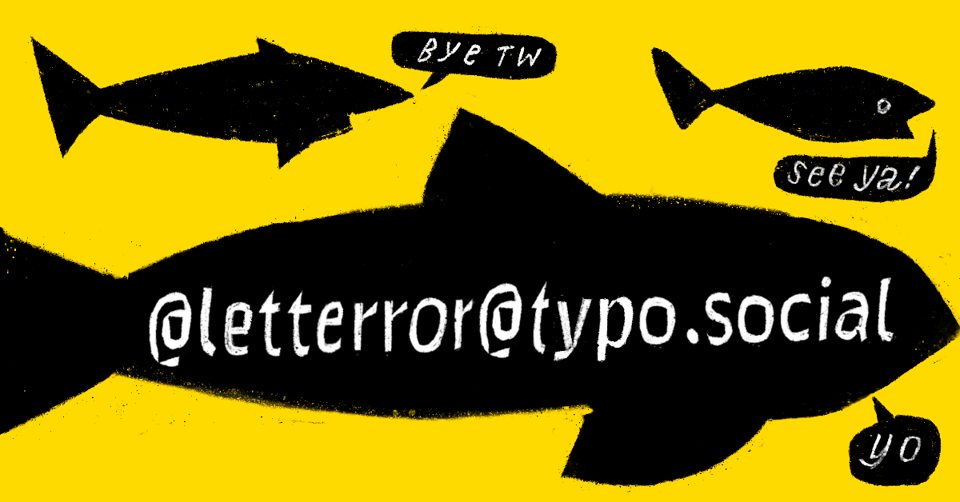
LettError’s Socials
Many people are moving away from bully-billionaire social media, for good reasons. Funny: I closed my Twitter donkeys years ago and it was gone for a while. But now the account page is revived and says I got suspended because I broke their rules? A mystery how that works! I guess the LettError account on Instagram may meet a similar fate: apparently my lettering can be dangerous. I joined Typo.social, a quiet type / typography / lettering oriented community in the Fediverse.
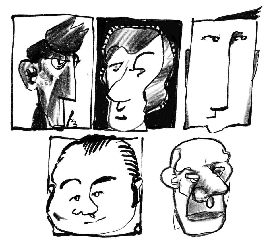
I have seen things.
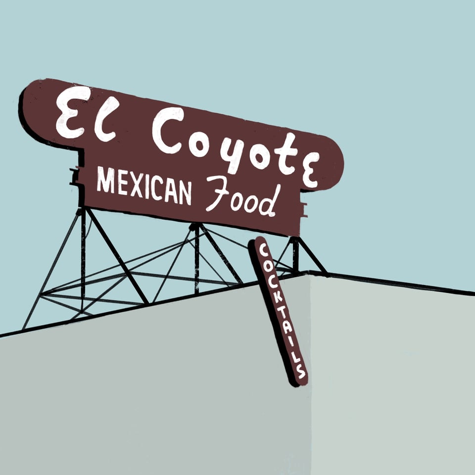
Thank you, dear subscriber, for reading the whole thing. Just for you, a drawing from a sign from Los Angeles from February 2020. I vaguely remember traveling. Now buy some fonts!