NEWS LTR №12: Big Letters
Exciting news: the lettering for the new building of the UvA University Library is finally getting up. If you’re in Amsterdam in the coming days, have a look at the ongoing construction in the Nieuwe Doelenstraat.
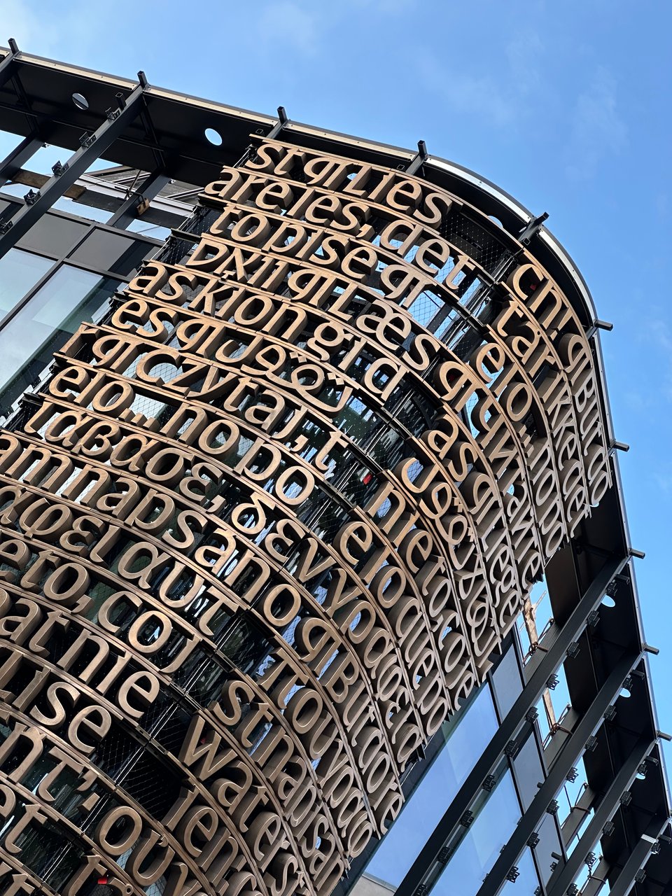
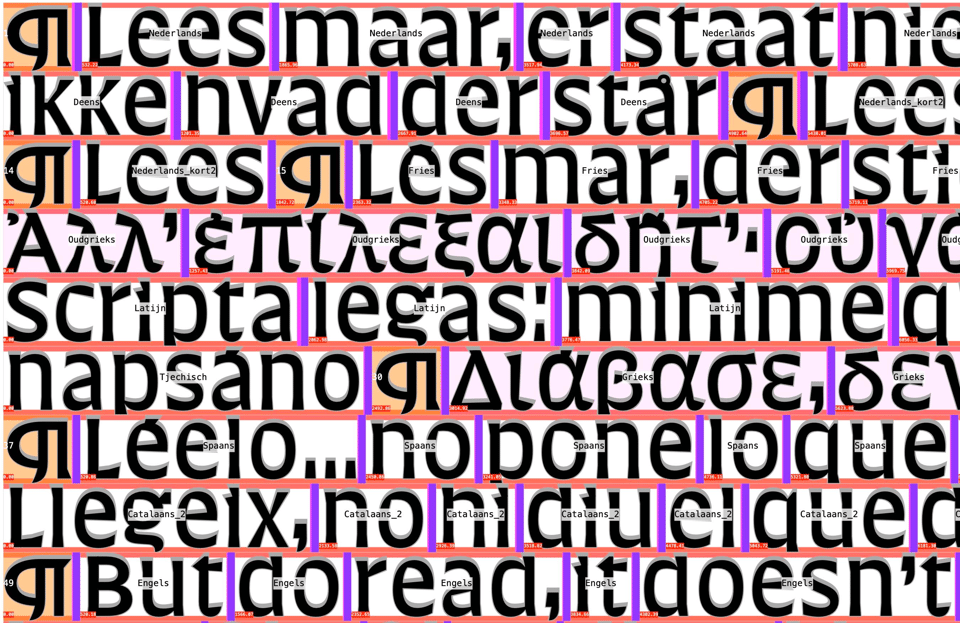
Eventually the whole street facing side of the building will be covered in this lettering. The text is a line from a poem by the Dutch writer Martinus Nijhoff: “Lees maar, er staat niet wat er staat” - “Do read, it doesn’t say what it says”. A cheeky invitation to read and to be critical. A lovely choice for a library. The language faculties of the university then translated this line in all their languages. The design for this was finalised in 2021.
The typeface, and the layout of the lines were designed by Erik van Blokland. Based on the Latin Aleksandra Samuļenkova drew the Modern and Classic Greeks. Anya Danilova drew the Cyrillic. Bahman Eslami drew the Arabic. The Hebrew and Yiddish were drawn by Daniel Grumer. The Cuneiform for the Hittite was drawn by Erik, with J.J.M. Hazenbos. Read about the whole team, architects, builders and type designers here: article on the design and development.
LTR Very Bauble
Have a look at this new pretty thing. Nothing to do with the Amsterdam project, but I suppose could write “while we’re talking about big letters, how about..” Bifurcating the terminals puts a pleasing tension on the stem. Thorns, more incisions and a sprinkling of pips add grit and texture. LTR Very Bauble can present as a peaky, beaky sans, a sharp serif, and all varying degrees of baublicity in between. All this on a single, smooth, easy to animate, variable font axis named Serif.