Every Click Has a Cost
Like every rose has it's thorn, design debt saps cognition
Design / User-Experience (UX) Debt
The Tools Tax
A field guide to the quiet friction of bad design, when our digital tools trip us up instead of helping us think.
TL;DR (for Busy Humans)
Every pixel, pop-up, and extra click is a tax on attention.
When the user experience is cluttered or inconsistent, teams lose flow, confidence, and energy. ND folks feel it especially.
Flip it: treat design as an accessibility issue, not an afterthought.
Simplify the interface, clarify the journey, and measure how easy it is for people to stay in flow.
Good design saves cognition. Bad design spends it.
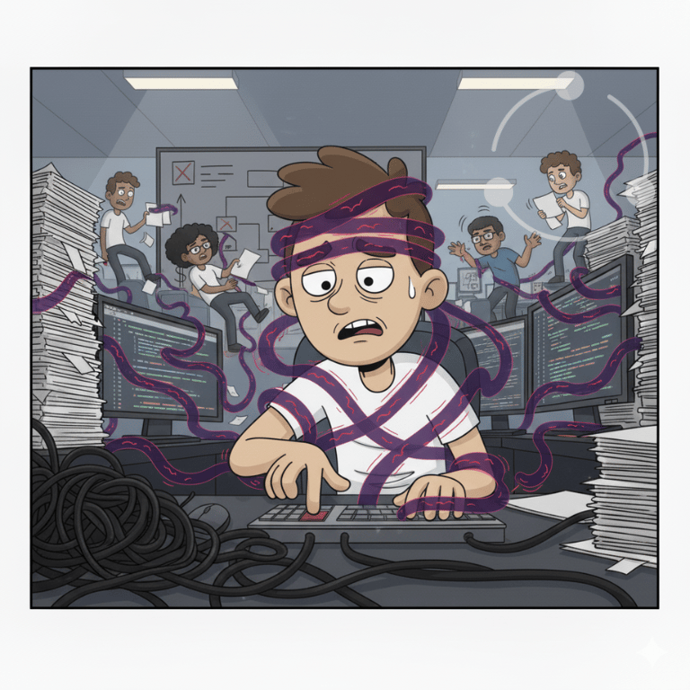
What is Design / UX Debt?
It’s what happens when the small usability gaps, the extra clicks, unclear layouts, inaccessible colours, or inconsistent terminology accumulate faster than anyone fixes them.
Over time, they turn the simplest task into mental parkour.
Every “just one more step” compounds until people build workarounds instead of workflows.
That’s Design / UX Debt: the hidden drag between intention and action.
In the Wild (you’ve seen these)
The Click Maze — completing a simple action takes six screens and three confirmations.
The Vanishing Button — core actions buried behind tooltips or hidden icons living inside an unintuitive drop-down.
The Popup Parade — alerts everywhere, none of them helpful.
The Colour Clash — low-contrast text and red-green status cues that exclude a bulk of your users.
The Manual Workaround — “Oh, you just have to know to double-click here first.”
Each of these is a micro-tax on cognition and they don’t just slow work, they erode trust and good-will in the system.
Why this hits ND folks first
Working-memory load: remembering multiple steps, buried paths and unintuitive workflows eats energy.
Sensory overload: flicker, colour, motion, or cluttered layout.
Executive function drain: inconsistent patterns increase decision effort.
Accessibility gap: designs built for “average” users exclude those who process differently.
As always:
Same job, higher energy cost. That’s design debt, not a character flaw.
What it Costs
Lost time through micro-friction and repeated steps.
Higher cognitive load = lower clarity.
Avoidance of core tools (“I’ll just do it manually”).
Support tickets that fix the symptom, not the design.

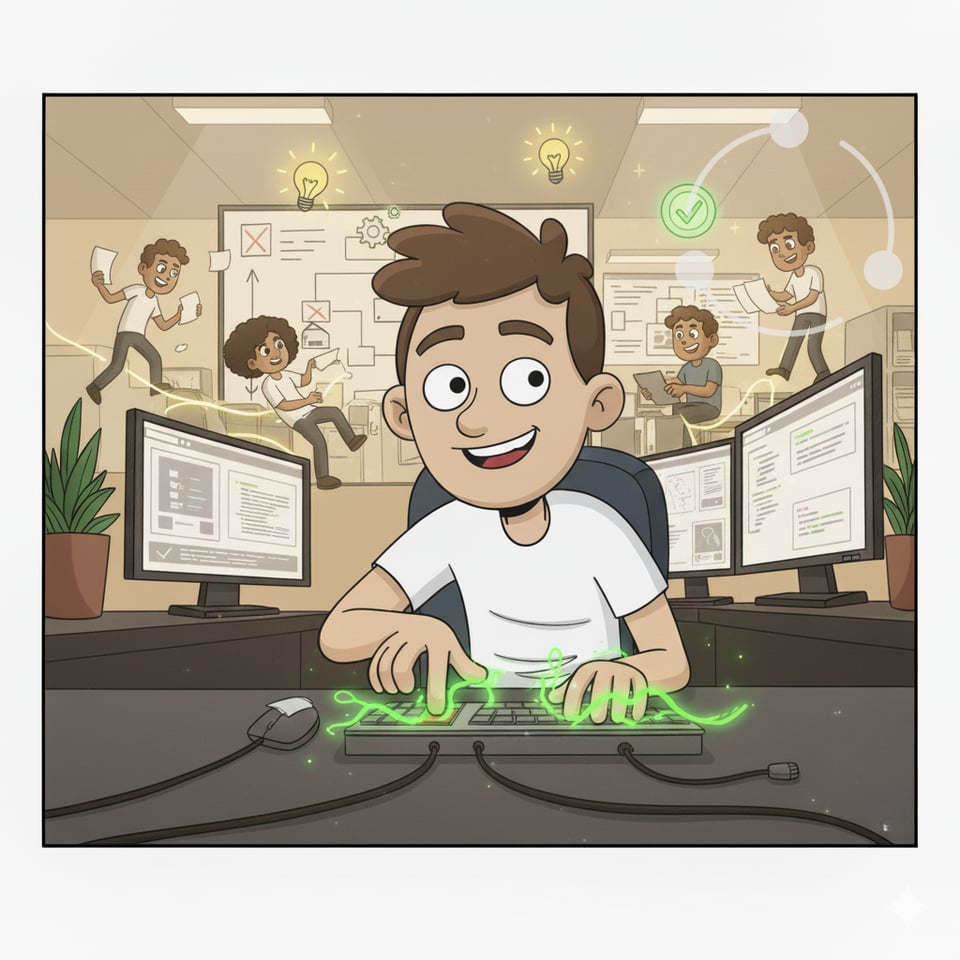
Five Fixes for Design / UX Debt
1. Map the journey, not just the interface.
Watch how people actually complete tasks. Note friction points and dead ends. Get them to explain the path they take.
2. Design for clarity first.
Contrast, readable fonts, colour-blind friendly, plain labels, no visual noise.
If someone needs a tooltip to use it, it’s too clever.
3. Reduce interaction steps.
Every extra click, modal, or confirmation eats focus.
Three steps should do what six used to.
4. Test with diverse brains.
Include ND testers early. Watch where they pause or overload.
If design debt shows up there, it’s already costing everyone.
5. Close the feedback loop.
UX debt compounds when no one owns it.
Track fixes like bugs, celebrate clarity like new features.
Two-Week Rollout Playbook
a) Pick one high-use tool or workflow. Observe real use.
b) List the friction points. Count clicks, steps, and confusion.
c) Fix one usability issue per day. Small clarity wins add up.
d) Run ND-aware tests. Ask: “Is this clear under stress?” or perhaps ask yourself “Could I do this easily while exhausted, with itchy socks and a dog barking in my ear non-stop?”
e) Review after two weeks. Measure completion speed and error rate.
Be sure the users understand you’re measuring the tools, not them. Trust is key, users will rightly fear being measured without understanding the real goals.
Remember: we’re reviewing the system, not the users.
Metrics that Prove It’s Working
Steps per core task ↓
Time to complete ↓
Reported frustration ↓
“Where do I click?” tickets ↓
User satisfaction ↑
Pocket Responses to Pushback
“It’s just design polish.” → No, it’s cognitive capacity. Every pixel is a choice that shapes energy.
“We’ll fix it after launch.” → That’s how debt accrues interest. Things that don’t halt production usually don’t get fixed.
“We don’t have ND users.” → You do; they’re just masking.
“People will learn the quirks.” → They shouldn’t have to. Learning quirks is paying the tax.
Copy-Ready Templates
UX Debt Log
Issue | Impact | Frequency | Owner | Fix Status
Accessibility Quick-Check
Colour contrast AA+?
Keyboard navigable?
Motion optional?
Plain-language labels?
Design Review Prompt
“What’s the cognitive cost of this interaction?”
Starter Blurb (Internal)
We’re paying down Design / UX Debt.
For two weeks, we’ll observe real workflows, fix small usability gaps, and test with diverse brains.
The goal: fewer clicks, calmer screens, and tools that help rather than hinder.
We’ll measure clarity and completion speed, not just aesthetics.
Closing Note
Every rough edge in a product, every extra step in a process, spends cognitive energy.
Over time, those small spends become fatigue, frustration, and exclusion.
Design debt isn’t a cosmetic flaw, it’s a system tax on attention.
Fixing it lifts everyone’s capacity, especially ND colleagues who’ve been carrying that tax quietly for years.
Good design gives energy back.
That’s the dividend on clarity.
Thanks for reading.
This is the last in our 5-part series on Design Debt, our next newsletter will focus on reframing other pressing issues Neurodivergent folks experience in both organisations and society. As always we will feature fixes, tips and guidance on easing the burdens for everyone.
— Brian McCallion, Founder, Kind Mechanics
About Kind Mechanics
Kind Mechanics helps organisations pay down design debt in how they work: fewer scrambles, clearer calls, kinder defaults. I write about practical fixes that lead the way for everyone; especially neurodivergent folks.
Clarity as the Standard. Kindness as the System. Usefulness as the Goal.
Human-readable by default.