Inspired By #71

🙀 Oposta
A bold, reverse contrast, display typeface used in this issue’s header image. Pedro Leal created a set of over 2000 interlocking characters, specifically designed to reduce excessive white space and create tight word blocks.
https://www.behance.net/gallery/43421461/Oposta🤯 River Runner
Click anywhere on the map of the US and this tool will show you the path of a rain droplet and then animate along that flowline’s downstream path.
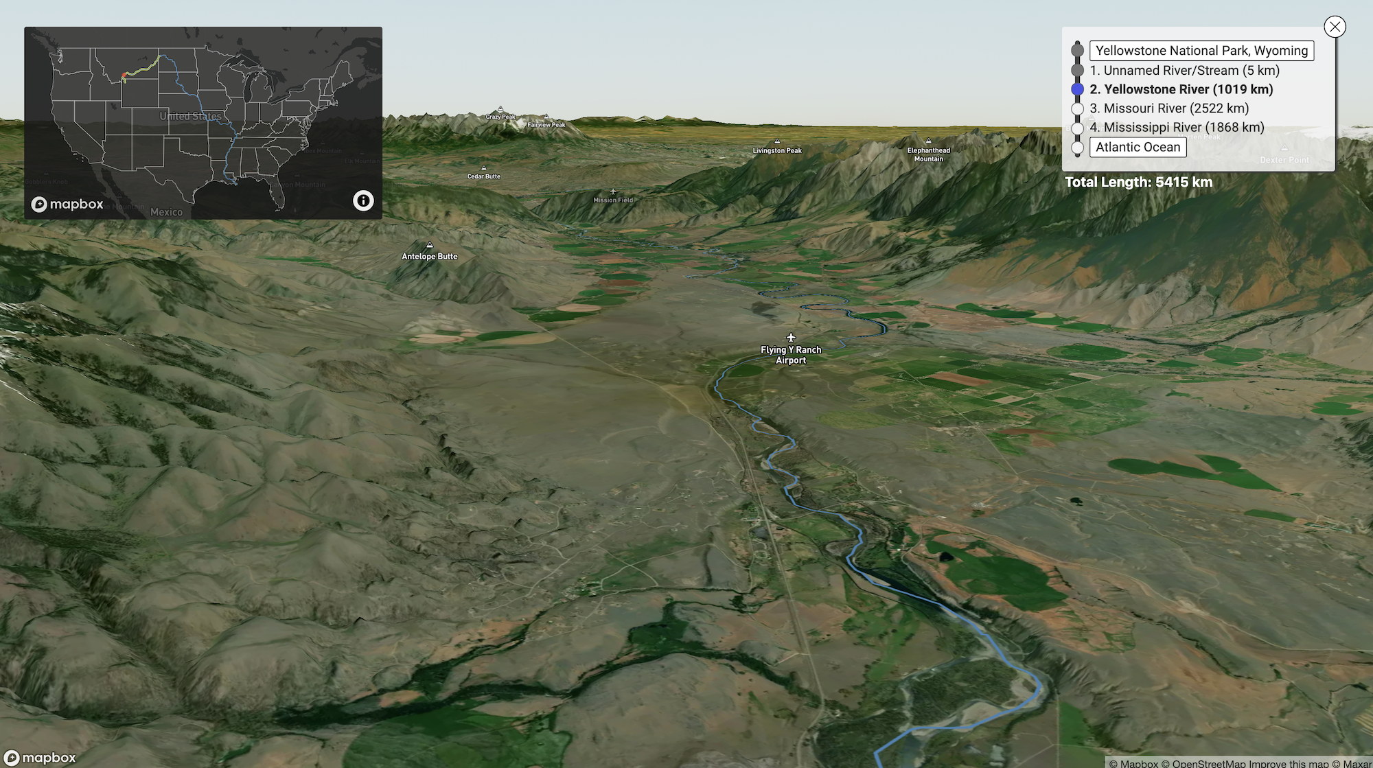
River Runner
Watch the path of a raindrop from anywhere in the contiguous United States
(Via Dense Discovery)
💥 The Internet of Grift
Ed Zitron wrote a piece about NFT's and I agree: "I can’t hate [that] people want to belong, they want to feel important, they want to meet people with shared interests, that’s fine - but the rest of it is a loathsome combination of greed and desperation masquerading as art sales.".

The Internet of Grift - Ed Zitron's Where's Your Ed At
NFTs are an even more insidious form of grift than regular crypto products.
(Also via Dense Discovery)
🧩 Le Puz
Le Puzz is a new jigsaw puzzle company inspired by vintage puzzles from decades past. This website! From the copywriting to the branding and UI, every detail is weird, I love it! 🥰
(via Ronny)

🎨 Little Troop
That puzzle company website was designed by Little Troop, the design studio of Noemie Le Coz and Jeremy Elliot. And their website and projects are amazing! Take a look:

📚 Stripe Press
The people at Stripe (that online payment processing platform) sure now how to make websites. This is their book/film publishing company website, built with nice 3D animated books (on desktop), smooth transitions and nice type and colours.
And it even works pretty good on mobile too. 🔥
(via everyone on Twitter)
Stripe Press — Ideas for progress
Stripe Press produces works about technological, economic, and scientific advancement.
❤️🔥 Ultra by Grilly Type
"Noël Leu’s GT Ultra dances between the worlds of sans and serifs, fusing calligraphy and construction. Achieving a balance between flair and function across a versatile typographic system, the design combines the centuries-old context of serif type with the dynamism of modern sans; challenging its own definition and questioning contemporary typographic expectation."
Uh, wut? That's an interesting way to describe a nice font.
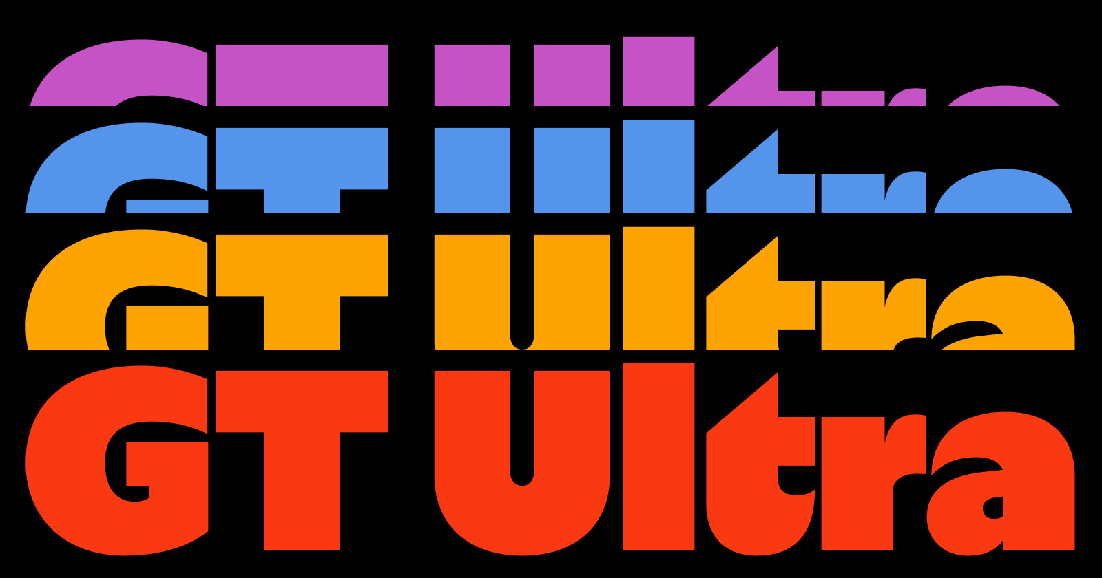
GT Ultra typeface family exclusively at Grilli Type â Download Free Trial Fonts
Noël Leuâs GT Ultra dances between the worlds of sans and serifs, fusing calligraphy and construction. Achieving a balance between flair and function across a versatile typographic system, the design combines the centuries-old context of serif type with the dynamism of modern sans; challenging its own definition and questioning contemporary typographic expectation.
🚲 VanMoof V
VanMoof’s new high-speed bike looks pretty nice (although a little cartoony but maybe that's just the render?). It features two-wheel drive, a full suspension frame, advanced acceleration, and next-gen integrated tech with a top speed of 50 km/h. Coming end 2021 for €3498
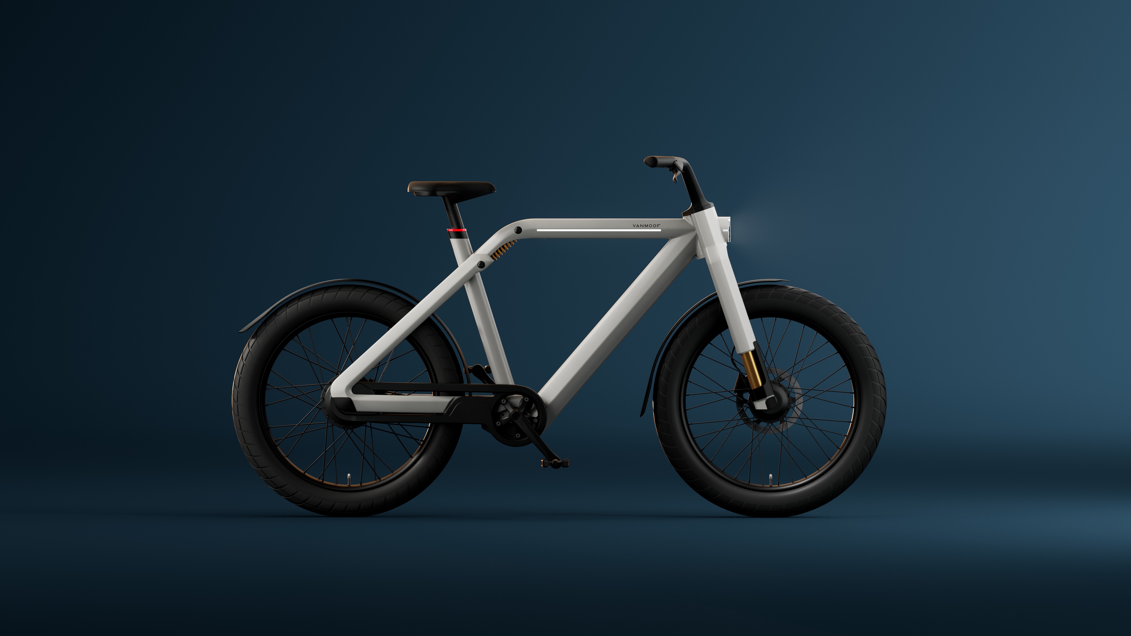
VanMoof V | VanMoof
We redefined the bike lane. Now we're coming for the roads.
[**Inspired By**](https://spacemonkey.nl/) is a weekly bi-weekly monthly? newsletter with design, typography, tv, film, music, products and other random stuff I found on the internet.
Thanks for reading and until next time!