Inspired By #7

Hi!
Welcome to the 7th issue of Inspired By. I saw a lot of nice thing this week. Let’s get to it...
— JP
💀 How Stranger Things got its retro title sequence
You've probably seen the Netflix-series Stranger Things by now, but do know why the logo looks the way it does? Check out this short video to learn why:
🙃 The Upside Down
And talking about Stranger Things, check out this cool LEGO set! It has all the popular characters (except Barb) and authentic details that you will recognize from the retro 1980s universe.
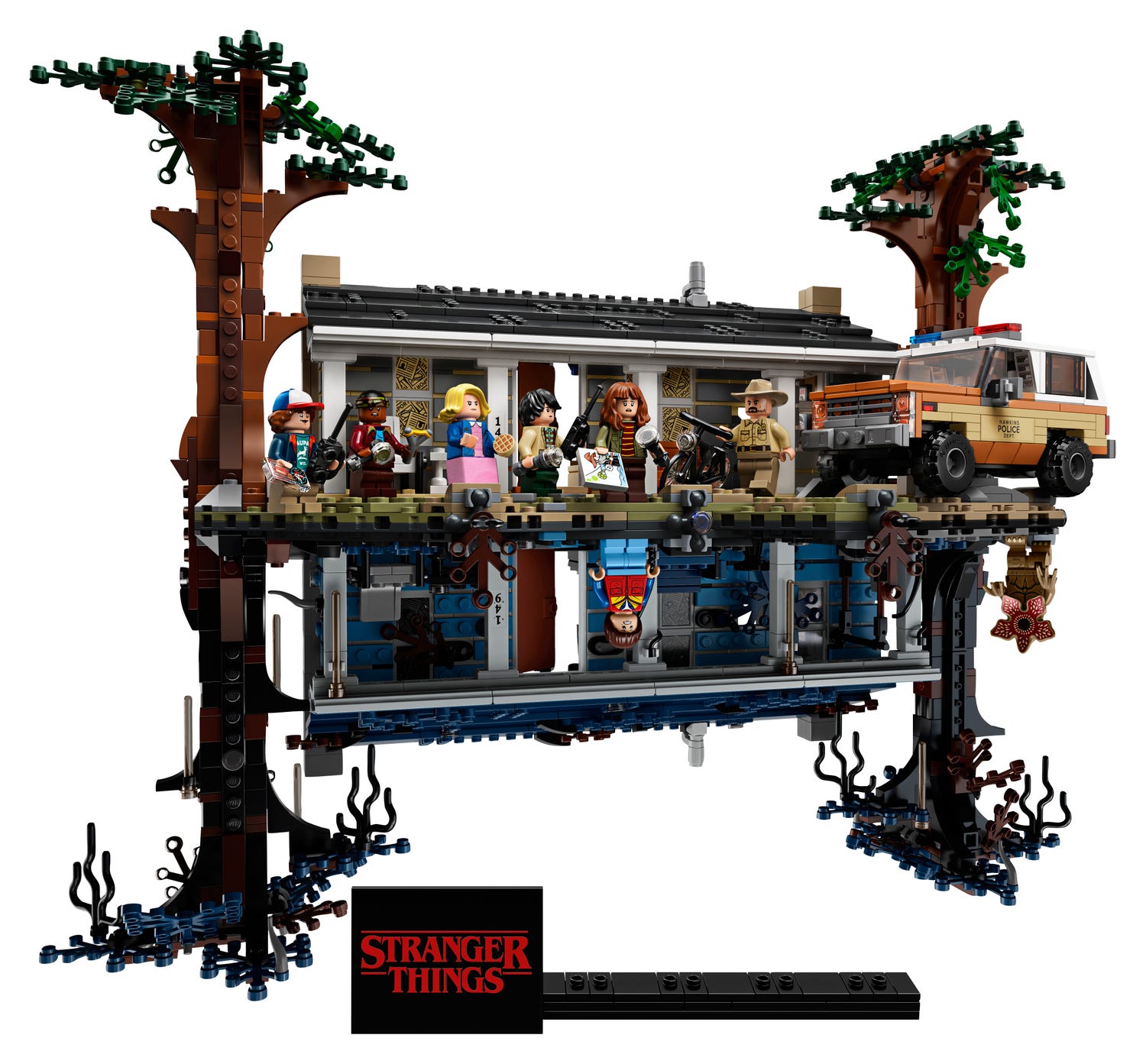
The Upside Down 75810 | Stranger Things | Buy online at the Official LEGO® Shop NL
The ultimate LEGO® Stranger Things model to build and collect!
📕 Walking the Americas
This was a joy to read. Levison Wood walked about 2.896 km along the spine of the Americas, through eight countries, from Mexico to Colombia, experiencing some of the world's most diverse, beautiful and unpredictable places. What an adventure, highly recommended for fans of travel stories.

Walking the Americas by Levison Wood | Goodreads
Walking the Americas chronicles Levison Wood's 1,800 mi…
🕵️♂️ Brand Recognition
You're exposed to around 4.000 to 10.000 ads every day. With such fierce competition for your attention, how much do you actually process and remember? Let's see if you can correctly recognize 15 of the world's top brands when we zoom right into them. (This was harder than I thought, I knew 5/15 😬)

🥰 House Industries
House Industries is a design studio that makes fonts, creates products, takes commissions and welcomes collaborations. I've been following this studio for years and they keep on producing quality work. I own some of their work, from wooden blocks, to prints and t-shirts, I just love it. Two years ago they released an incredible book showcasing their work and their process.

💗 Eames Century Modern
House Industries also collaborated with the The Eames Office (famous for their mid-century furniture) to produce a typeface. Ray and Charles Eames did not design a typeface. But they did leave a lot of clues about what they liked in type and typography. Victorian lettering, wood types and circus posters keep coming back in their works. Such temptation was hard to resist.
Together with The Eames Office, House Industries set out on a typographic quest: if they had done a typeface, what would it have looked like? Designed by Dutch typeface designer Erik van Blokland.

🌶 Sriracha Hot Chili Sauce
This is one of the most popular hot sauces in the world (with about 8 typefaces on its label) and I saw a short video about the founder, a refugee from Vietnam, who now owns a multi million-dollar family business. I couldn't find the original at my local shop, so I settled with the Go-Tan version and I now put it on everything.
🌌 Star Wars: The Rise of Skywalker
Only 50 days left...🚀
That’s all for the 7th issue of Inspired By. Hope you liked it and see you next time! ✌️