Inspired By #111
Hi! My name is Jan-Paul and this is where I share all the things that inspire me.
Stranger Things Title Sequence
Eric Demeusy animated the original Stranger Things title sequence back in 2015. In this video, he shares his behind-the-scenes perspective: how it all started, what inspired that vintage ’80s look, and everything in between.
He also breaks down his entire workflow. Here’s his in depth After Effects tutorial.
Tex Jernigan
Tex Jernigan is a creator and digital strategist based in Brooklyn, NY. He runs ARKO and a few other projects I really enjoyed exploring, including a portable bullet-time rig, VHS label & cover generators, and Flagthousand — a visual project mapping over 900 flags from around the world (and counting).
(via Decaf Links from Wimp Decaf Coffee Co.)

texs.org
Hi, I’m Tex! I’m working on a few projects: Multi-camera GIF maker VHS Label & Cover Generators Flagthousand New Buy! JCard / Cassette Stickers CD’s (Vinyl Soon) Also, I run which gives teams access to my skills. Here’s a mostly accurate about page. You can reach me through: EmailInstagramLinkedInTwitter Latest Thoughts: Old stuff coming eventually
It’s hard to justify Tahoe icons
A deep dive into the (mis)use of icons in Apple’s latest version of macOS.
It’s hard to justify Tahoe icons @ tonsky.me
Looking at the first principles of icon design—and how Apple failed to apply all of them in macOS Tahoe
Pin Keeper: Jean Jacket
A felt pennant with a jean jacket print — a lovely way to display your enamel pin collection. (Via Chris Glass)

Pin Keeper: Jean Jacket – Pretty Useful Co.
Do you hoard enamel pins like Beanie Babies in the '90s? Are you running out of places to stick them on your jackets and hats? Are you a little concerned that if you fell in a lake their weight would drag you into the depths and sentence you to a watery grave? Fear not, with the Pin Keeper you can continue collecting
Designing Gotham
A very detailed long-read about the origins and influences of Gotham, one of the most popular fonts of the early 2000s. Doug Wilson interviews designer Tobias Frere-Jones, who shares more than a few insights into typography.

Frere-Jones Type
The story behind the Gotham type family
The Pitt
This award-winning medical drama is incredible. Each episode covers one hour of a single workday, and it is intense!
The show tackles (so many!) medical ethics through the eyes of a group of healthcare workers. It gets graphic and emotional — and I couldn’t stop watching.
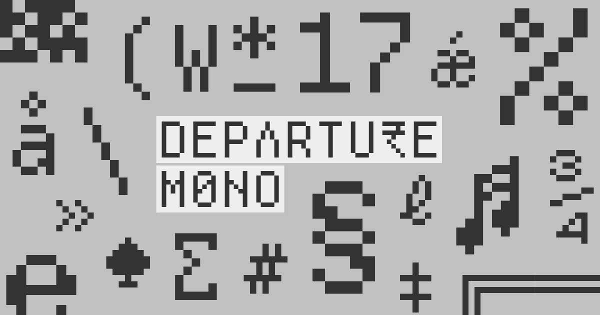
Departure Mono
Departure Mono is a monospaced pixel font inspired by early command-line and graphical user interfaces, tiny pixel fonts from the late ’90s / early ’00s, and sci-fi concepts from film and television.
The mini-site shows off those influences beautifully and even includes a little Breakout-style game. Designed by Helena Zhang, website built by Tobias Fried.
Departure Mono
A monospaced pixel font with a lo-fi, techy vibe.
Phosphor Icons
Also by Helena Zhang & Tobias Fried: Phosphor Icons — a flexible (and free) icon family with 9,072 icons for interfaces, diagrams, presentations… whatever, really.
They range from thin to bold and fill, and there’s a Figma plugin too, which is very handy.

Phosphor Icons
A flexible icon family for interfaces, diagrams, presentations — whatever, really.
Death by Lightning
A mini-series about the stranger-than-fiction story of 20th U.S. President James Garfield and his admirer Charles Guiteau, who ultimately assassinated him.
With incredible performances from Michael Shannon, Matthew Macfadyen, Shea Whigham, and Nick Offerman, you really can’t go wrong.
That’s it for this edition of Inspired By.
Thanks for reading
—
Jan-Paul