Inspired By #106
Back from vacation and designing a movie scene location app, exploring immersive AI, and correcting global maps!
Welcome to Inspired By #106. I’m back from vacation, recharged and ready to go! I’m JPKoudstaal, and this is where I share all the things that inspire me.
🎬 Side Project: Designing a Movie Scene Location App
Just before my vacation I started a little side project that blends two of my favourite things: travel and movies.

The idea is simple: help people discover and explore real-world filming locations. Yes, there are a few websites doing this already… but let’s be honest, they’re not exactly a joy to use.
So I figured, why not design one that actually feels good to use?

Inspired by the thoughtful design of apps like Sequel and Letterboxd, I’m experimenting with:
- Map-based exploration
- User-generated content
- And (soon) cinematic transitions and smooth animations

Big thanks to IMDb, CineMapper, movie-locations.com, and Wikipedia for laying the groundwork with their content.
🥪 Salt Hank’s
Salt Hank’s is (apparently) a famous youtube/tiktok chef (4.6M followers!) that makes French Dip sandwiches (sandwiches that come with a cup of jus to dip it in for extra flavour) and he recently opened a shop in the West Village (right next to John’s of Bleecker)
I don’t like to stand in line for food hypes, but the video does make me curious! I haven’t had one yet (anyone know a spot in The Netherlands that has this?) but looking forward to trying it (if there’s not a line)!
🧠 DanMaLLMind
As a Dan Mall Shares member, I now have access to DanMaLLMind, an AI trained on 20+ years of Dan Mall’s thinking (built with Delphi).
I had it help me rewrite my “About” page, and it came back sharper, cleaner, and still felt like me, just with a dash of Dan’s brainpower baked in.
Tried the “read aloud” feature too. Spot-on Dan’s voice… just a little flat and uncanny. Like Dan after a long day of client calls.
It’s still an experiment, so it’s not perfect. But already, it’s weirdly useful. The kind of tool that makes you rethink what mentorship could look like.
If you’re curious how Dan designs his businesses and his life, sign up for Dan Mall Shares:
⚒️ Usable Google Fonts
Smith & Diction shares a Figma file with all of the google fonts that are actually good categorized by ✨vibe✨.
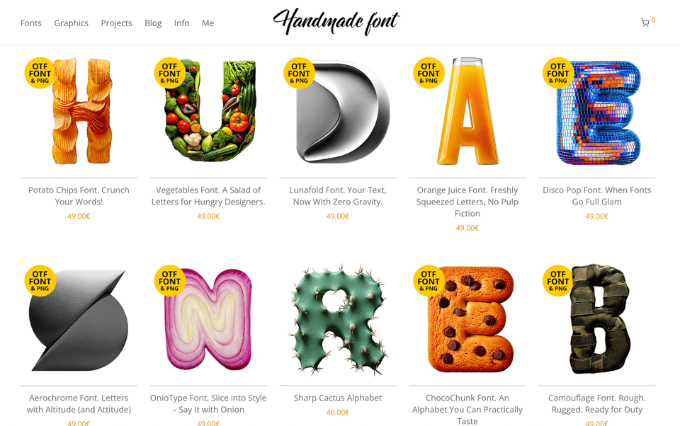
🤨 Hand Made Font(s)
A big collection of fonts made from real natural materials, products and goods. They look fun and interesting, but also very AI-generated. (Via Secret Type Club)
🥞 You've Never Seen Pancake Art Like This Before
SuprOrdinary is a series by Devin Mathews about taking the everyday ordinary and through the magic of creativity turning it into something SuprOrdinary.
In episode 4, Mathew sets out to master one of the most unruly artistic mediums known to man… pancake batter.
If you haven’t seen it yet, checkout the Hair Episode too (Yes, it’s kinda gross…)
🔥 HYPERYOUTH
Joey Valence & Brae kinda sound like a Beastie Boys cover band, and I’m here for it.
Their first single from 2021 “Crank It Up” has the legendary lyric:
“I always wipe twice for good measure. One for business and one for pleasure”

HYPERYOUTH by Joey Valence & Brae
Listen now on your favorite streaming service. Powered by Songlink/Odesli, an on-demand, customizable smart link service to help you share songs, albums, podcasts and more.
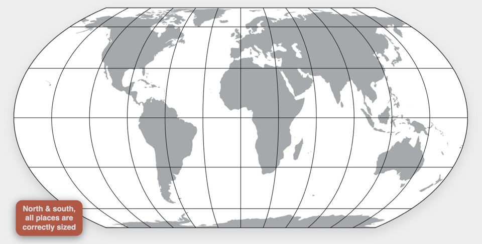
🗺️ Correct the Map
Did you know the world map you grew up with is wrong? Chances are you've seen the Mercator projection, the world map we see most often.
But it’s super misleading, making Africa look about the same size as Greenland. In reality, Africa is a 14 times bigger! You could fit the U.S., China, India, Japan, Mexico, and much of Europe inside it and still have room to spare.
Thankfully, there's a better map out there: the Equal Earth projection. It gets the sizes right, accurately showing just how big Africa is and presenting continents in shapes that are closer to how they look on a globe.
The Correct the Map campaign challenges the distortion of Africa’s true size on world maps, aiming to empower global understanding and respect for the continent’s significance.
(Via the NOS in Dutch)
🗺️ The True Size
Speaking of maps, you can use this tool to drag and drop countries around the map to compare their relative size. Try it with Greenland and see how it shrinks 🤯

The True Size Of ...
Drag and drop countries around the map to compare their relative size. Is Greenland really as big as all of Africa? You may be surprised at what you find! A great tool for educators.
🗼 TOKYOBUILD
Handcrafted scale models of buildings from Tokyo made by a Swedish furniture designer, love this! (I would definitely be interested in a Brooklyn brownstone or bodega version of this…)
(via Tina Roth Eisenberg)
Congratulations! You’ve reached the end
Liked (or loved) this issue? Let me hear your thoughts! Reply here or on Threads.
See you next time! 👋🏻