Craft & Practice #9
2026-02-12
Hello internet friends,
It's been 43 days since our last correspondence. Funnily enough, #8 started the same way...with 43 days in-between!
Feels like there's some sort of underlying rhythm there.
This newsletter has four parts:
a few paragraphs (filled with links of what I’m reading) on the macro-level of this year’s beginning. Spoiler: super fashy; this is the content warning.
high-level takeaways from the Throughline Conference at the end of January.
an introduction to the newsletter’s new branding and context around the design decisions.
a quick bit on what to expect of my newsletter this year.
2026
On a macro level, the first month-ish of this new year has been shit, to say the least.
The United States' federal government is pursuing a more direct path towards a royally authoritarian'n'fascist regime while also colluding with capitalist oligarchs, covering for pedophiles by redacting names of the misogynistic, sexual abusers, and instead released full names and photos of 47 victims, inclusive of minors—children.
Don't forget the ethnic cleansing, murders of Renee Good and Alex Pretti in Minneapolis, shootings of two people at a traffic stop in Portland; concentration camps with cases of tuberculosis, COVID-19, and measles; and the hundreds of deaths of people being held in those concentration camps. Amnesty International released a report on "Alligator Alcatraz" in Florida.
Children are being disappeared on their way home from school, taken to these concentration camps in record numbers. ProPublica received letters in January from children at Dilley Immigration Processing Center in Texas—the only concentration camp holding families)—and published them this week...if you're looking for some more heavy reading.
We're in the middle of a polycrisis.
A word that describes multiple, interconnected global crises, amplifying each other's effect—collective damage being far worse than the sum of its individual parts.
This is why "may you live in interesting times" is a curse, not a blessing.
"More hope and a hell of a lot less hype"
How the hell are you supposed to have a career in tech in 2026? was an appropriate early-January read by Anil Dash.
At the end of January, I attended Throughline Conference—hosted by Active Voice with slew of superb speakers. Two days seeking respite, gathering and discussing a lot of what these times mean from our multi-disciplinary industry of technology and design.
It was explicitly not filled with doom & gloom, but focused on real, practical, thoughtful ways to look at career, craft, industry, and future. It was about Power, identifying where we can impact Change, and using one's Voice.
Two weeks after the conference, I do have a few immediate takeaways:
self-promotion is a necessity, a mindset that needs to out-message consumption & convenience;
everything is storytelling, use it intentionally to communicate value;
there's a price of staying silent and a price to say the thing—say the thing even when it feels risky;
design and glue work are leadership skills, framing that communicates strategy;
outsourcing thinking to tools (like generative AI) is an abdication of leadership;
process is a product that needs intentionality, with its own time and space;
change the aperture of where you're showing up, where your work is focused.
I'm still cultivating my own thoughts on how I'm acting & coming out of the conference. It's been impacting how I'm framing my own Crafts & Practices—as well as this newsletter!
Craft & Practice’s Future
I'm going to continue this newsletter, but it's going to change.
Branding
First, I’ve worked on the actual branding & aesthetics of the newsletter.
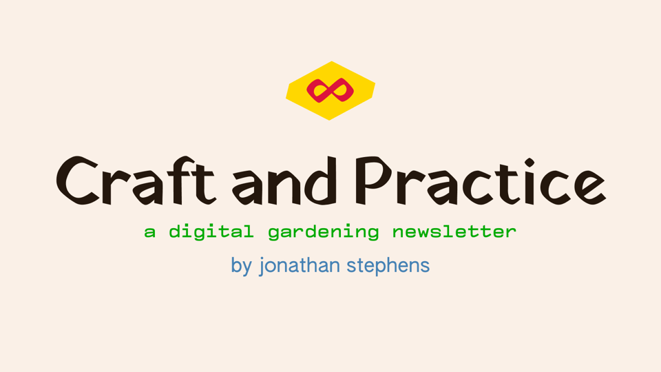
Logomark: crimson infinity mark encapsulated by a typographic lozenge, set in Yatra One font.
Wordmark: also in Yatra One, is the newsletter’s title: Craft and Practice.
Subtitle—a digital gardening newsletter—is set in Compagnon Medium.
Byline—by jonathan stephens—is set in Authentic Sans.
I’ve been intentional about these decisions:
Yatra One is a font designed by Catherine Leigh Schmidt. Ever since reading The Manual’s print editions, I’ve wanted to use this sort of font: brush-like, sign-like.
Compagnon has five distinct styles and combines different periods of the history of typewriter typefaces—open sourced and available at Velvetyne Foundry; designed by Juliette Duhé, Léa Pradine, Valentin Papon, Chloé Lozano, and Sébastien Riollier. Typewriter patina ftw :D
Authentic Sans is a typeface that “aims to subvert the Eurocentric standards of typographic quality and refinement,” reflecting on expanding and redefining the visual and cultural boundaries of default systems. Designed by Christina Janus and Desmond Wong—its specimen sheet (and its Pro counterpart’s) are well worth a read.
The brand colors are from characteristic and taken from W.E.B. Du Bois-style guide, coming from digital recreations of Du Bois’ data portaits project (available on Github).
One of my University professors contributed to the book W.E.B. Du Bois’s Data Portraits: Visualizing Black America, (how I was first introduced to his data portraits and W.E.B. Du Bois). I have loads more to learn about him—I know far, far too little. A quick nutgraf from biography.com:
Scholar and activist W.E.B. Du Bois became the first African American to earn a Ph.D. from Harvard University in 1895. He wrote extensively and was the best-known spokesperson for African American rights during the first half of the 20th century. Du Bois co-founded the National Association for the Advancement of Colored People (NAACP) in 1909.
That said, these data visualizations resonated, deeply, as I went through the Data Portraits book. I frequently come back to it, reading, and studying the graphics themselves.
There’s power in data visualization and storytelling.
He, and his students, created these Data Portraits for the 1900 Paris Exposition to make data visible on African American culture and the lingering impact of slavery. They created two sets, the first focused on statistics related to the Black population of Georgia and the second illustrating the condition of former slaves residing in the United States.
Here’s a beautifully long read that I’m working my way through to learn more than what’s in the Visualizing Black America book:
For me, using his color-set is about recognizing and remembering the impact that Craft and Practice can have when applied in a thoughtful way—an aspiration for my own work’s impact.
I’ve got a long way to go.
Each time I look or use this branding, I’ll be reminded of that.
Forward-facing
It's going to be focused on the actual development and deepening of my crafts and practices. It'll be about:
reading with intentionality and learning in public, more dedicated writing on what I'm adding to my soil
a reaping of my digital garden, similar to what I’ve had in the past but more focused (don’t know what yet); and
monthly posting and writing, acting as month-notes. The time’s booked in my calendar for creating this space, cultivating a sustainable, predictable pace.
I’ll be syndicating this newsletter out a bit more as well, getting the actual https://craftandpractice.com site up to consume Buttondown’s sends and all…but one day at a time.
Finally!
The end. It’s been a while, had a lot to get out.
Be safe; take care—and, lastly: FUCK ICE.
Jonathan
Don't miss what's next. Subscribe to Craft & Practice: