Baseline #17 – Typography Variables in Figma Are Here
…and everything else that’s new from Figma’s Framework event
Hello again! 👋 It’s a chilly spring morning here in Ohio, and it feels great to write and share this post with everyone reading. I appreciate you being here! Before getting into the topic of this post, you may have noticed a little change in formatting, as this is my very first post from Buttondown in place of Substack. I’m excited to try this platform, and if you notice anything that feels off, please let me know!
Framework by Figma, the company's new virtual design systems event, happened this week and included several exciting announcements that I’d love to recap in this newsletter edition. I was almost sure we wouldn’t see any of these until at least Config, which is just around the corner, but hey, I’m not complaining! Okay, with that, let’s get into everything new.
Update 1: Variables in Gradients
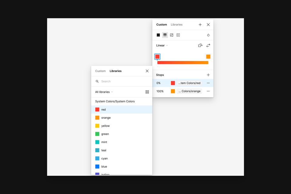
Just a few months ago, Figma announced updates to the gradient tool, which included the ability to flip and rotate gradients. At Framework, the updates continued, as color variables can now be bound to gradient stops, and we can now directly and precisely edit the position of the stops. No more guessing where 50% is!
Here's a little backstory to explain why this entire update may be more exciting than it may initially seem. At the 2023 Config conference, the Figma team announced that variables were coming to the design tool, a highly anticipated feature for designers and developers who rely on the tool to effectively design, build, and communicate with one another.
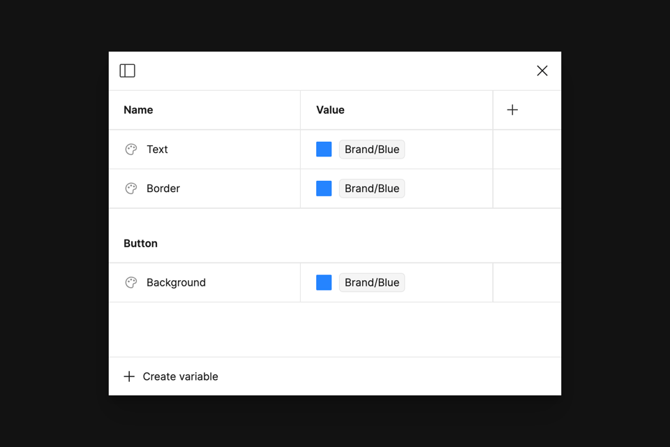
If you haven’t tried them yet, variables are a feature that allows us to create, store, and reuse values such as numbers or colors throughout Figma. Unlike styles, one of the first tools in Figma that let us do this, the superpower of variables is that they allow us to create links between the definitions and applications of those values. This ability means we can define a variable such as brand/blue and use that exact value of blue within other variables, such as those supporting button backgrounds, borders, or text strings. If our color value within the brand/blue variable ever changes, each referenced variable would receive the update—no more updating tens or hundreds of styles with the new color value.
However, throughout the year that variables have been available, they couldn’t be used everywhere throughout Figma, which included both text (more on that soon!) and within gradients. The lack of support meant that either styles or one-off values were still necessary, often leading to disconnects and mismatches between the design system and the design.
That’s all a thing of the past, as we can now use color variables within gradients! For teams responsible for multi-branded design systems, or for those brands whose design language makes use of gradients, this update is sure to be impactful. Manual adjustment was often necessary because designers were only previously able to update colors when switching variable modes and not gradients. Color values are challenging enough to keep track of, but gradients? Whew, that’s just another level of complexity.
Wait, what about styles?
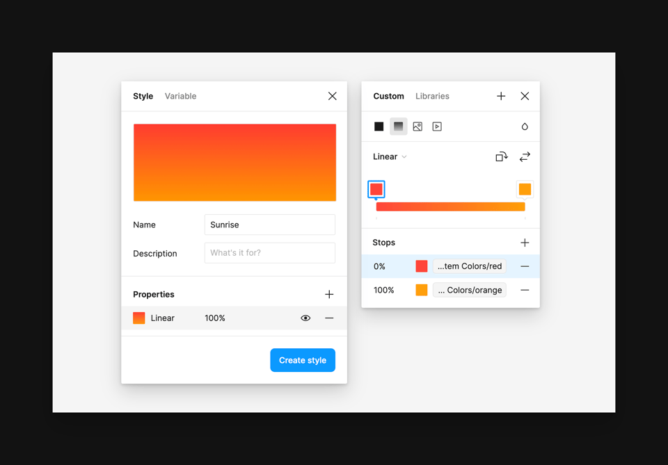
Ah, yes, styles. Unlike converting a color style to a color variable, we’re unable to convert a gradient style to a gradient variable, as variables can only store one value, not multiple. Just as Figma mentioned within the Framework conference, I’m beginning to also see and use styles as the composite token. They’re the tool that allows us to bundle multiple values or variables together.
Wait, but styles don’t allow for modes, right? Wouldn’t the use of styles prevent us from switching themes or brands? Actually, this is what I’m most excited about with this update, and it’s the further positioning of how styles can be useful in combination with variables. Because all styles (yes, typography now, too!) can use variables, adjusting one variable mode within a style will adjust all variables to reflect that new mode change. For example, a gradient style can now use two entirely separate variables that support differing colors based on their mode, such as one value for Company One and another for Company Two. When the gradient is selected, and the mode is adjusted, each variable adjusts accordingly.
Generally, there are two cases I’ve found for continuing to use styles within component libraries:
Continuing to store gradient values
Storing multiple stacked effects, such as fills or shadows, as one repeatable value
Update 2: Variables Support Typography
I’m so happy to finally be typing these words: variable support for typography has finally arrived, and after nearly a year, the variables feature is officially out of beta.
Variables within Figma have made it much easier for teams to store and reference repeated values, such as those needed for colors and spacing. However, when managing typography within components, many designers, including myself, still relied on a combination of styles and component variants to help shift the typography properties based on a particular theme or brand. From the teams I've had the chance to work with this past year, I noticed that the split between being able to use variables for some things within Figma and not others only slowed adoption of the feature. Variables made the dream of creating components and systems that supported multiple brands feel sooo close, but it was never quite there until now.
Perhaps, like yourself, I was always wondering how Figma would choose to implement variable support for typography. Would there be an entirely new variable type to compliment numbers, strings, booleans, and colors? And if so, with all of the possible type properties and options needed, would that even be a variable, which is supposedly only responsible for holding just one value?
Strings or numbers can represent nearly all the type settings we commonly use in design. The font family? Well, that’s just a string, such as “Aeonik”. What about the font size or the line height? Both of those are numbers. What about the paragraph or letter spacing? Hey, numbers again! Variables already supports numbers and strings, and with this update, Figma has made it possible for us to create variables that are purposed for type settings and can be applied when styling a text layer.
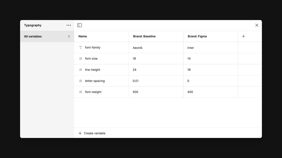
As an example of how this all works, let’s imagine I’m working on a component library within Figma that supports two different brands: my little company, Baseline, and Figma. Within the variables modal, I created a new collection called Typography, and inside this collection, I have five variables: font-family, font-size, line-height, letter-spacing, and font-weight. To support the different brands, I’ve also created two modes: one for Baseline and one for Figma. The font-family variable is a string variable, as this will help us store the name of the font we’d like to use for each mode, while the rest of the variables are numbers with their values defined.
Note: at the time of writing, variables don’t yet support percentages for properties such as line height, but it very much sounds like that’s on its way! Additionally, if you’re using an automatic value, variable strings aren’t supported within either the letter spacing or line height inputs.
One thing I’d love to see added, maybe with the power of AI, is for Figma to detect when a variable’s purpose is to define the font family and to provide access to the font menu when typing in its corresponding value. Within the last day, I've learned just how challenging it can be to spell font names correctly!
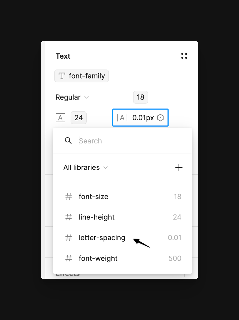
With those variables created, we can connect them to our text by heading to the text section within the properties panel. When hovering over an input or within a dropdown menu, such as the one present when selecting text size, we now see a brand new variables icon. Woohoo! Figma will show the relevant variables based on the input we’ve chosen based on their property type. Now, just as we’ve done with previous inputs, such as those for width or height, we can bind those values to their respective variable.
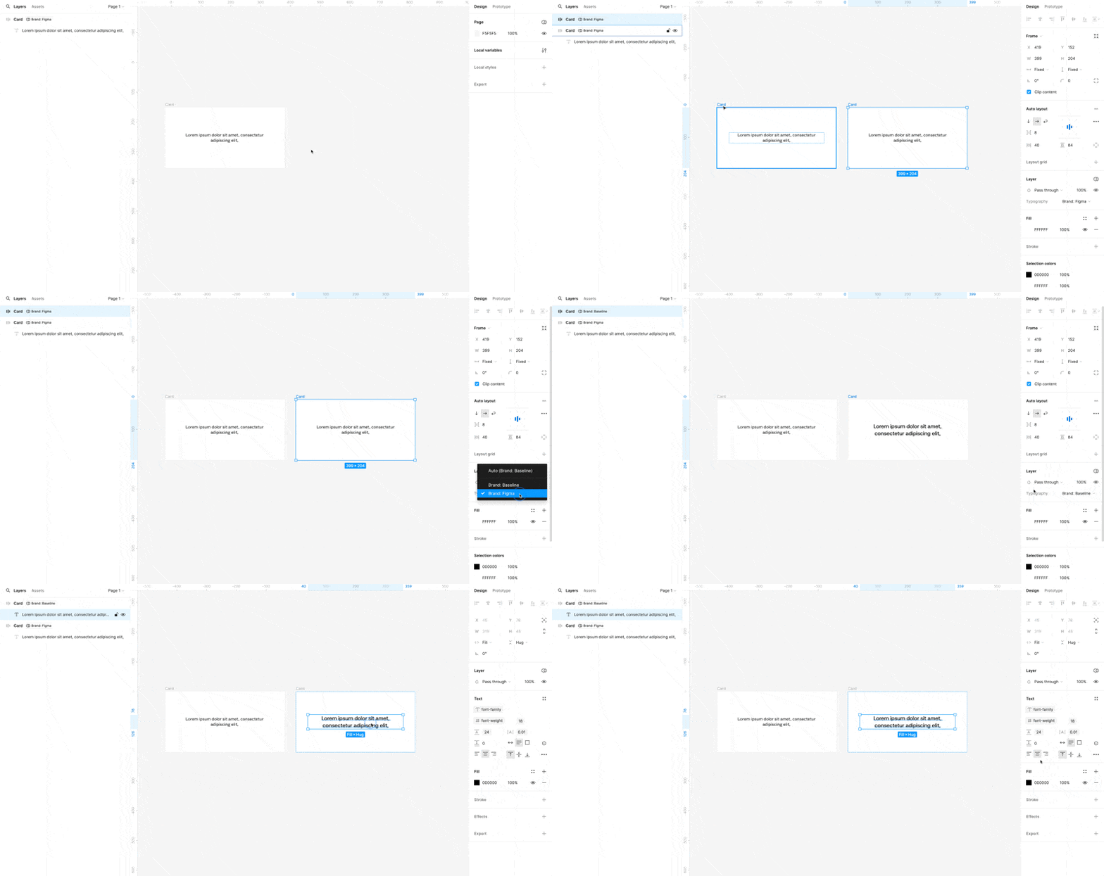
Now, when we adjust a design or component’s mode, which in this case would adjust the respective brand, typography will adjust and creating a multi-branded design system just became that much easier.
Wait (again!), what about styles?
Even with the introduction of typography variables, text styles are just as important and helpful as ever. Creating styles for text is one of the best ways to visually see the newly defined purpose of Figma styles, which is to be a tool that allows us to create a composite of variables. With text settings now consisting of various variables, such as those that define font families or font sizes, styles allow us to bundle all selected variables into one repeatable style.
Using styles in combination with variables means that we can now create text styles that contain groups of text variables, which can adjust between screen sizes using modes—this feels big. I’m still playing around with various ways to set these up, but in the example below, I created several groups with relevant variables inside, such as those for font size or font weight. This collection has four modes: two for Baseline’s desktop size and two for (a made-up) Figma’s mobile size.
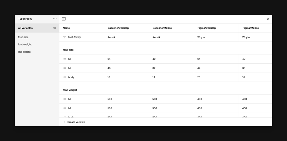
With these variables created, we can apply them to their relevant fields and then choose to save the combination as a singular style, such as H1 or H2. In this example, I put the brand first with the style following, where Baseline’s H1 style reads Baseline/H1 and Figma’s H1 would read Figma/H1. Using modes, designers could then adjust between the desktop or mobile size and style options.
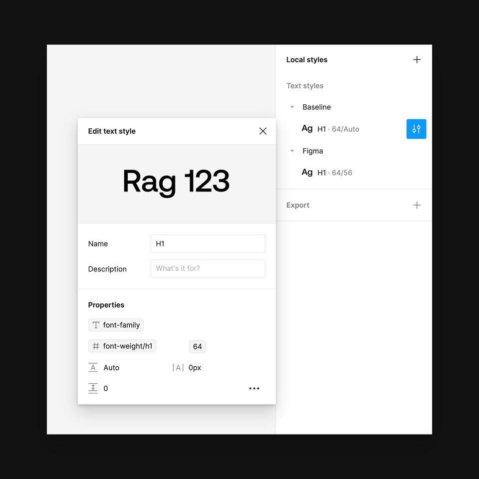
Thinking through this setup is interesting, and there are so many ways to approach the table, as it may be one of the first variable collections that requires establishing three or more dimensions. In this case, it's the brand, style, and size. If you're working with a different method that's useful for you and your team, I’d love to know!
Update 3: Tools for Increased Design System Adoption
It’s no secret that design systems adoption can be challenging (that said, I don’t know if removing the “Component updates available” banner will help us much, buuuut that’s a topic for another post.) Figma continues to release updates and features that help bridge the gap between design and engineering, such as Dev Mode or component properties, but for as much progress as the team and tool has made, the fact hasn’t changed that a component in Figma is just that—a component in Figma. Engineers have forever had to figure out what to do after viewing component designs within a design tool. Does the component exist today? Do the properties used within the Figma component align with those available in code? If not, what happens? From Figma’s perspective and my experience, these questions and dozens more further hinder design system adoption and often lead to a worse product experience for users.
To help with all of this, Figma announced a new feature called Code Connect, and it’s an exciting one that carries a lot of promise. Code Connect is a tool that allows developers to view actual design system code right in Figma itself rather than only being able to view generic, often unhelpful, code snippets.
I haven’t yet had the chance to talk with engineering partners yet about their thoughts (or concerns), but I think there’s an exciting future here and I don’t think it’ll be long before we wonder how we ever performed a design handoff without its existence.
From Figma’s blog post:
“Our vision is to create an even deeper connection between design and code, beyond just design systems or components. Imagine a future where we have that connection for variables, iconography, typography—all the things involved in a design. Code Connect is laying that foundation…”
I’m sure there will be much more to talk about here soon with this feature, but for now, it’s available in beta for teams on either the Organization or Enterprise Figma and supports SwiftUI and React, along with Storybook.
In case you missed it...
For those designers wanting to become more comfortable with any of Figma’s newest features, such as multi-edit, typography variables, auto layout, or the world of design systems and how to structure them within the tool, I’d love to help you or your team in 2024!
Recent bookmarks
Wow this one took me back to my Gateway Computer childhood. Here’s a repository of every Windows 98 icon, available for nostalgia and download.
Design Engineer ⚬ io, a new and beautifully designed job board from Moe Amaya that’s completely dedicated to open design engineering roles.
Rauno Freiberg writing about why some interactions just feel great.
If you’re a designer and you haven’t tried posts.cv from the read.cv team yet, it’s been a fun social network to be a part of. Come say hi!
I recently started to use Eagle, a tool for macOS to help me organize my digital life, and just saved every iOS wallpaper officially released by Apple, along with all of my other collected wallpapers.
I recently revisited a great post from Jordan Hughes of Untitled UI which detailed the best practices for creating tables in Figma. It’s worth the read!
