Festival Lineup Posters: A Typology
This article has now been un-paywalled, enjoy!
Three years ago I was booked to play at a party alongside Trusme, a DJ whose name begins with the letter T and mine begins with the letter J. When the promoters made the flyer for the party (which was not announced in public, by the way, it was a pretty illegal private party) they put the artist names in alphabetical order: my name was in the middle and Trusme’s name was at the bottom of the list. I heard, through the grapevine, that he wasn’t happy about being at the bottom of the list, leading the promoters to rejig the flyer with the headliners — me and him — at the top. Apparently, he STILL wasn’t happy about being in second place below me, so they redid the flyer a further time with his name at the top. Finally he was content.
I tell this anecdote because I’ve had one thing on my mind all week, one vital topic that lies at the root of the dance music industry’s much announced collapse, one thing so important that if we could just solve it the world would be a much better place: festival poster lineup design. More precisely, how do you successfully announce your blockbuster festival lineup in a way that translates through a six inch screen? In a way that sells the tickets you so desperately need to shift in order to remain solvent for another year? But also in a way that communicates what your festival is about? And meets your contractual obligations regarding the artists’ billing? etc etc etc??
I guess it’s been on my mind because we are balls deep into festival lineup announcement season and they simply aren’t letting up. With every new announcement on IG there’s a chance to examine the contortions festivals and their designers go through when putting together their posters. So I’ve collected a few and am sharing my THOUGHTS.
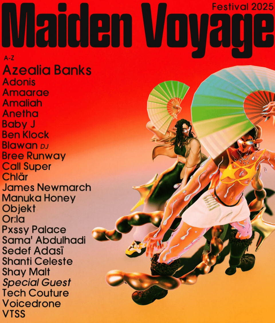
Let’s start with a poster that takes absolutely no chances: A-Z billing, all caps, consistent font size, even the b2bs are split up so each individual artist gets their day in the alphabetised sun. At the top it tells you it’s A-Z in case you were unable to deduce that from the fact it’s in alphabetical order.
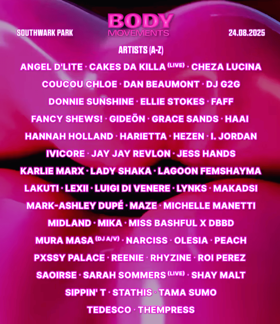
I give this poster further bonus points for placing the one “DJ”-DJ (God knows how there’s only one, given the proliferation of these in recent years) under “D” for “DJ”, a choice that shouldn’t be controversial yet, as we will find out below, apparently is…
The A-Z is surely the only really legitimate arrangement when you have fewer than 50 artists (check Equation in Vietnam, for another straightforward example) and want to take a horizontal approach, or at least appear to take one, given that the hierarchy of fees behind most A-Z lineups is surely far from horizontal. But leaving the money to one side for a moment and thinking purely visually, once you start moving to a bigger scale — say, 100-200 artists — it can all start to get a bit overwhelming.
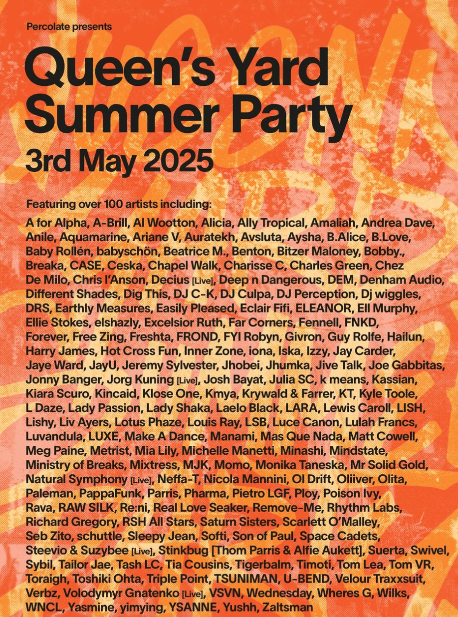
If anyone can actually read this lineup they’ve got better eyes than me. I haven’t been to Queen’s Yard Summer Party but, from what I have heard, the visual matches the experience of being there: everyone crammed into the smallest spaces to see whoever happens to be on at that moment. Props here must go to A For Alpha for absolutely smashing the A-Z lineup game. Outfoxed only by…
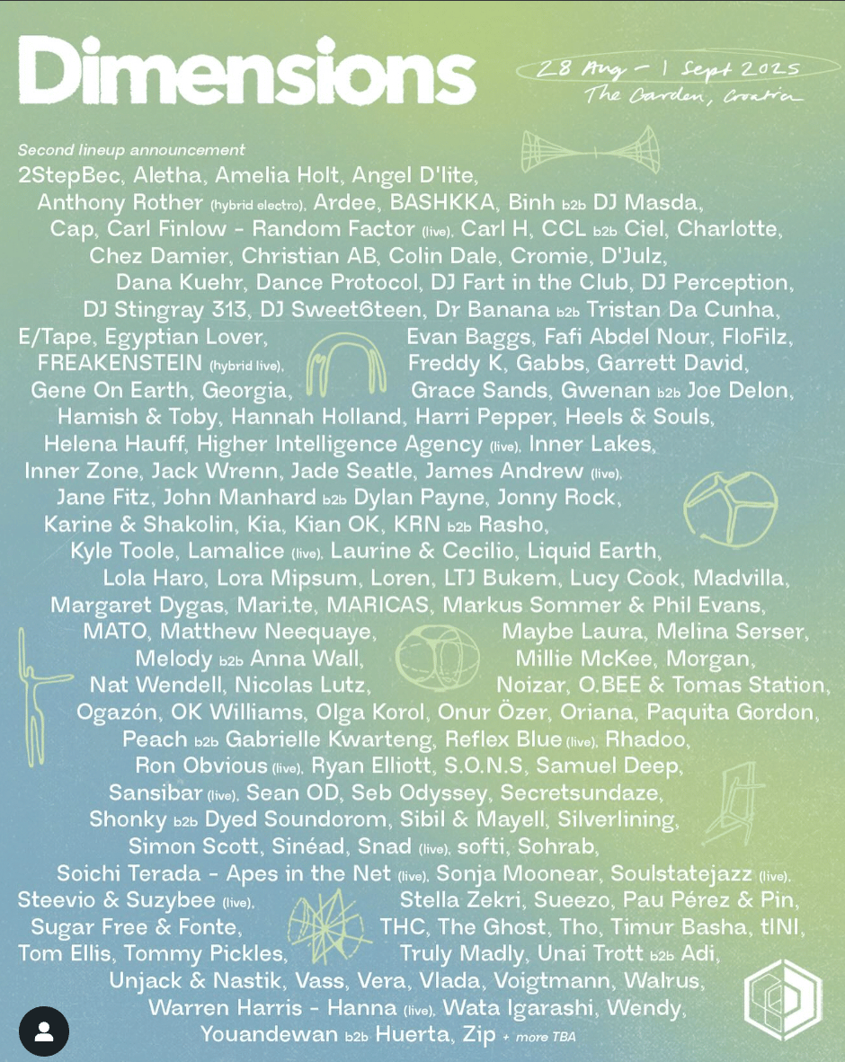
2StepBec! Does anyone’s DJ name begin with a “!”? I have to give it to the Dimensions designers for incorporating at least a few areas of free space amidst the torrent of monikers. Waking Life also chose the pictogram approach for their initial 2025 lineup release, with cute results. But the prize for most elegant lineup visual of the year surely goes to Butik, with a meticulous spiral-into-sphere motif showing that everyone is on an even footing in not just two but three dimensions, as well as being properly alphabetised (though 93kb must be feeling sore they got relegated to last place).
How to avoid visual overload? The big big festivals — like the Glastonburys and Coachellas of this world — usually split their lineups by stage and/or day, as well as discarding any pretence of parity among tiers of artists: they put the big names in lights, the next biggest names in slightly smaller lights, and so on. But what about more underground festivals (if that word even applies) that still have artists coming out of their ears, yet want to try to keep things democratic? Dekmantel, for example:
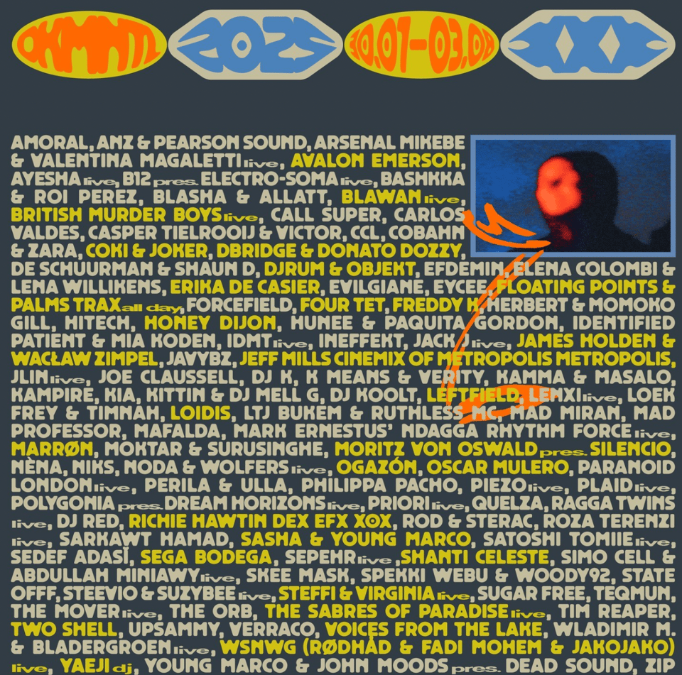
At first this might look like they’ve just alternated the text colour for some visual variety (like this reassuringly old-school poster from Rewire), but actually it’s more strategic than that — the ‘headliners’ are in yellow and everyone else is in beige. Of course this instantly raises the question of who qualifies for the yellow treatment. For dance music legends like Leftfield and Moritz Von Oswald there’s little quarrel. But then shouldn’t The Orb and Plaid be up there too? At the very least over flavours of the month like Marrøn or Two Shell? But the latter names have about 50 million more followers on Instagram and will resonate with the under-30 demographic far more than the former, so they get the highlight.
Soundit have fewer names to deal with, and are also more circumspect with their headliner highlights, doling out a stingy 15 and employing a rather subtle halo effect around the names in question. In fact it’s so subtle you wonder if they should have bothered in the first place — why not let the lineup as a whole stand for itself?
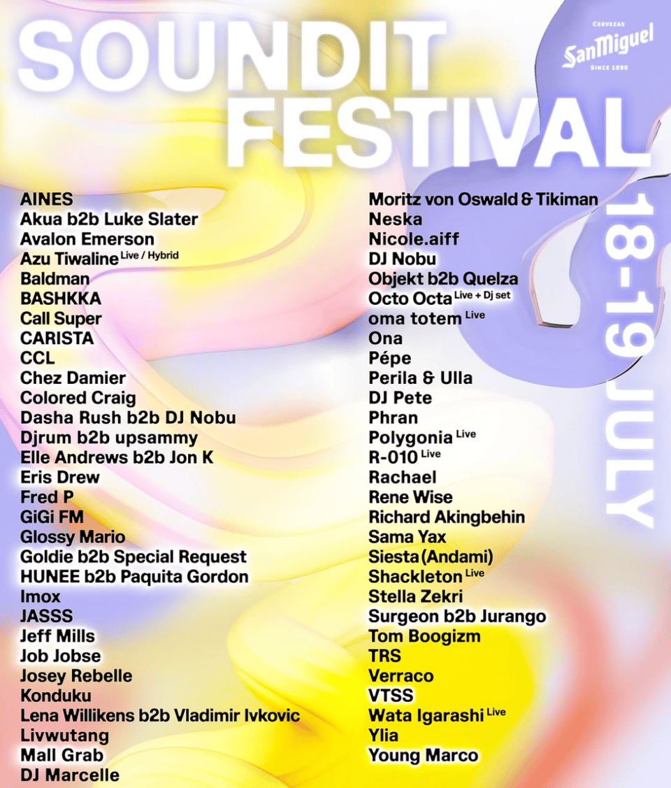
Sidenote: I have to take points off both Dekmantel and Soundit for categorising “DJ”-DJs not under “D” for “DJ” but under their other names. You’re creating extra work for your designers and extra stress for Marcelle and Nobu fans who thought their favourite artists were playing but can’t find them in the lineup. (Another point gets taken off Soundit for choosing sentence case and then capitalising the ‘l’ in ‘livwutang’.)
Regarding the highlighting again, you start to ask yourself whether these aren’t just examples of tiered billing under the guise of A-Z billing (they are). Presumably this is driven by a desire on the part of the festival to sell tickets: they want their headline names to do their job and sell the festival out. After all, those are the artists that are getting paid the most so their names are worth something special. I imagine there is some concomitant pressure from the artist and agency side too: A-Z billing may be admirable in principle, but in practice you want your name to stand out and will include that demand in the deal negotiations. A recent DJ contract I read stated: “The Promoter agrees that the Artist will receive 100% alphabetical or headline billing in all promotional materials related to this event.” So basically either their name is at the top, or everything has to be alphabetical. It’s not quite Trusme levels of entitlement but it’s getting there. Surely there comes a moment, though, in negotiations for certain events, where the agent has to admit that, OK, my artist isn’t actually on a level with Moritz Von Fucking Oswald, so we’ll suck it up and take the second tier billing.
Personally I’d prefer it if these mid festivals dropped the alphabetical pretence of being underground and just owned their big-bucks selves. Others are far less prissy about how they are perceived and just go full in on the classic multi-tiered format. But even within that there’s some wiggle room for creativity. Some go A-Z per tier, for example, and/or split the tiers across multiple announcements. That’s what Paradise City in Belgium seem to have done:
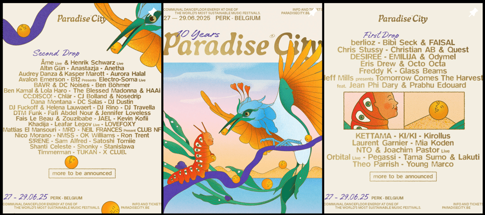
Lead with the big hitters, but also save a handful for the follow-up. Sometimes you look at a festival lineup and feel like they just threw everything at the wall to see what would stick. If there’s a musical vision to this curation (or for the sister event in Austria) I struggle to see it. I guess the model is that the acts with 100ks of IG followers are your cash cows keeping you afloat, and that then gives you the latitude to book the rest? A few months ago I saw an even extreme version of this approach in this lineup in France. But what on earth is the crowd at these events going to be like? Or will the hard techno drones have an epiphany to Theo? One can hope. HOWEVER! I’m not actually here to judge the lineups themselves, just how they are presented. And both of these have the “DJ”-DJs in the right place, so I guess they get a pass.
Other festivals don’t even go to the trouble of A-Zing the tiers and to be frank I’m all for it. When you find an example of the classic tier billing with seemingly zero logic to the order, it can be almost disconcerting, but also highly refreshing. Take Shapes Festival:
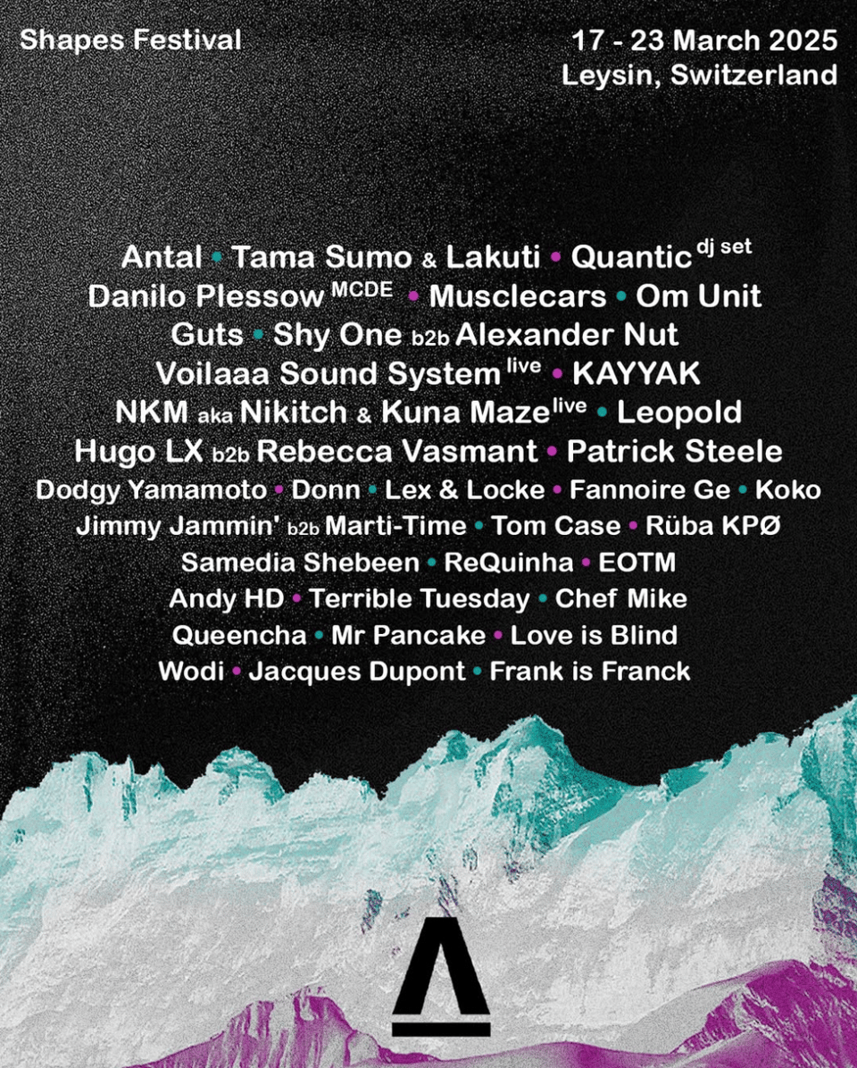
They fake you out with Antal — “oh it’s alphabetical” — but then, oh no! They hit you with what looks like a truly random order of names. The difference in font size between the top tier and the next is also subtle enough to make you question just how many tiers there are. Does it even matter? I guess that’s the point: fairness in chaos.
At first I thought We Out Here’s poster was also a free-for-all until I started to pay a bit closer attention:
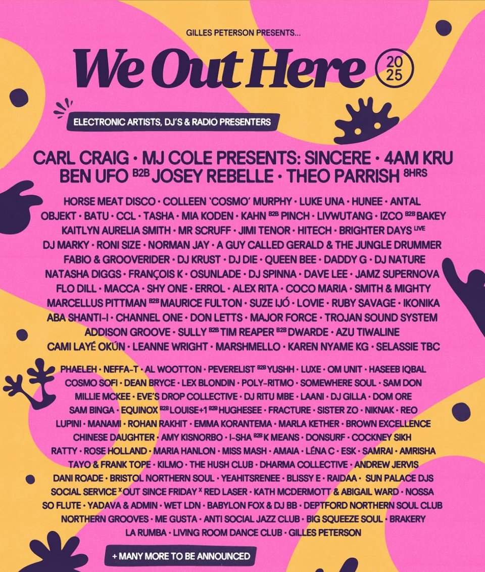
There is clear grouping among the middle tier, like a heat map: disco dinosaurs on the first row, 30-something bass bin botherers on the second (sorry liv for mis-ageing you), dnb dinos on rows 4 and 5 etc. It’s a subtle piece of design work and I applaud it, except for the grave injustice done to poor Pev, who has been rudely demoted to tier three.
Then again, I probably shouldn’t complain about tier cut-offs too much since I’ve had the benefit of them on the Kala lineup:
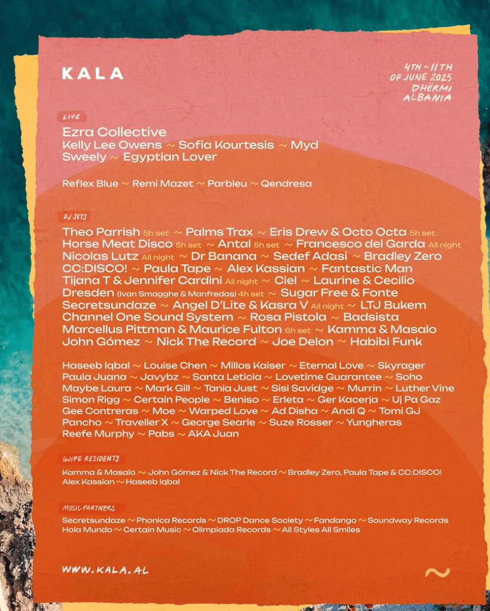
Somehow I snuck into tier two above Haseeb Iqbal, Louise Chen and Millos Kaiser. Is it because my name was a letter or two shorter than theirs and fit better on that final line of tier two? We’ll never know.
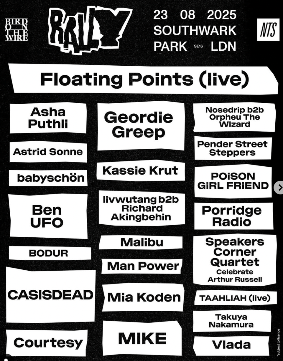
To finish, a category of lineups that I didn’t even know existed until the past few weeks when I started paying attention to these things. It’s difficult to know what else to call it other than the Church of Floating Points category:
I guess it’s Floating Points’ festival and we’re all just living in it? Far be it from him to submit to the ignominy of alphabetisation. It’s the same for Gala, though here he magnanimously shares the non-A-Z real estate with his mate Caribou:
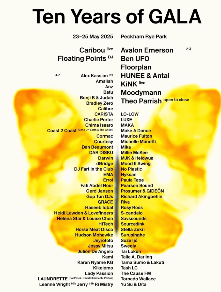
The same design studio did both of these posters so maybe there’s some back room dealing going on? The Gala poster also exquisitely shows off a dilemma associated with acts like Coast To Coast and Laundrette: you may book our novelty 3manyDJs act, but your poster designers will have to deal with the consequences.
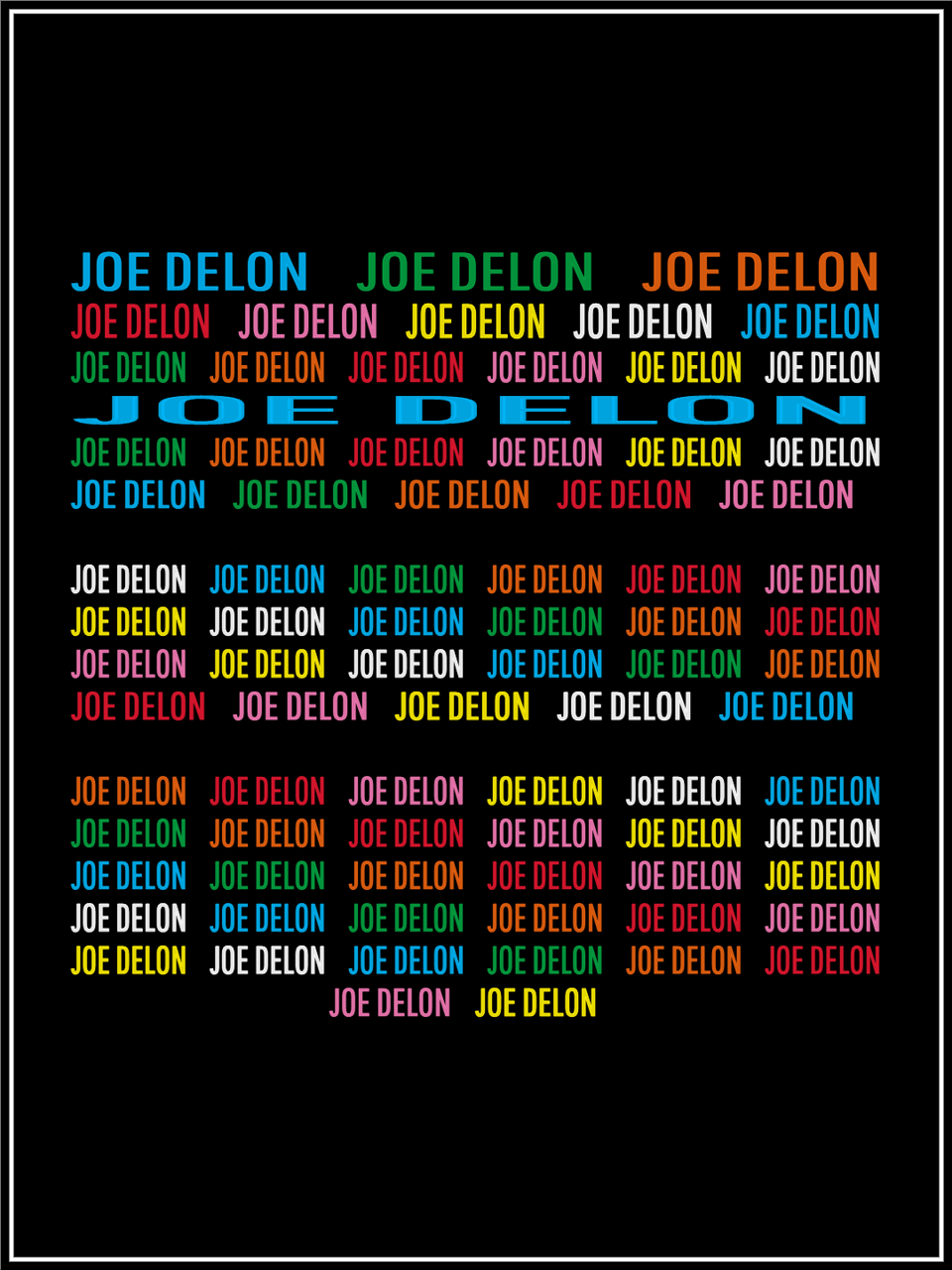
I’m definitely not on board with the Church of Floating Points approach. In fact, in the case of Rally I find it positively embarrassing that they would reify someone, even the venerable Points, in such a way over Asha Fucking Puthli. That being said, I did see one lineup recently where this level of idolisation was fully merited. Rising high above such worldly concerns as alphabets, indeed raising a middle finger to the hesitant (and entirely incorrect) “A-Z” written directly above her name, as if this redundant indication of alphabetical order were in fact merely a restatement of the first two letters of her name, announcing her arrival, celestial in her own font size, the queen herself! And she, as always, gets the final (or should that be first) word:
(Postscript: Trusme’s set at that party was one of the worst I’ve ever heard, which just goes to show that headline billing does not always translate into a good time.)
Add a comment: