Fixing a background pattern with round()
Hello everyone,
First, I'd like to thank all of you. In the last email, I asked you to reply if you got my email, and I got about 50 replies with lots of kind words and support. That means a lot!
Let's get into the email.
State of CSS 2026 is still open!
This is your chance to take the state of CSS 2026. In this year's version, the questions are shorter, and you don't have to answer every one of them; you can skip.
If you don't have the time at all, just write a short list of what CSS features you want to be added/fixed/etc. If you like my work, I'd appreciate it if you could mention my name in the resources section, it will mean a lot!
Take the State of CSS 2026 Survey
Fixing a background pattern with CSS round() function
Recently, I was working on my wife's portfolio website. She is a digital illustrator, so the design is not quite typical.
In one of the sections, the designer used the brand pattern as a background. When I built it first, the pattern was cut off at the end due to the dynamic height of the section.
Here is a figure that shows the pattern and the section.
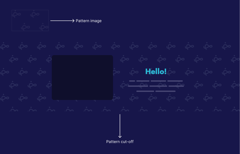
In CSS, we can solve that by using background-repeat: round, but this will cause the pattern itself to scale a bit to substitute for the cut-off.
section {
  background-image: url("pattern.svg");
  background-size: 243px 170px;
  background-repeat: round;
}
While this works, I asked myself: Is there a solution that can grow the height of the section based on the pattern size?
I thought about using the round() function in CSS. Even though I wrote about it in the last month, this use case is not covered (yet).
The idea here is to use calc-size() to get the auto height value, then round that to the nearest 175px, which is the pattern's image height plus some spacing.
section {
   height: calc-size(auto, round(up, size, 175px));
}
Check out this Codepen demo that showcases the two solutions.
Prop for that
A great tool by Adam Argyle that gives us props for things CSS can't do. For example, getting the X and Y of the mouse position.
Here is an example from the docs that changes the font size based on the viewport width.
<div data-props-for="size">…</div>
.box h2 {
  font-size: calc(var(--live-w) * 0.055px);
}
I know we can do this with clamp(), but sometimes we want more control over things.
Using Scroll-Driven Animations for Opposing Scroll Directions by Silvestar Bistrović
I like this effect! The solution uses scroll-driven animations.
I'd use CSS masking for the masking effect instead of adding a pseudo-element with a background the same as the body, as this will fail if the background color is changed.
Finally, can you please answer the question below? It will help me decide.
On a related note, you might like The Layout Maestro, my interactive CSS layout course, which I built to help you understand layouts and know when to use which layout method in CSS.
Check out the Layout Maestro and enroll for just $199. Student discount and purchasing power parity are available, too.
Thanks a lot! If you have ever found something interesting in CSS or design recently, please feel free to share it in a reply. I'm happy to hear from you!
Ahmad
Add a comment: