Inclusive Android Apps #3: The Problem of Color As The Only Indicator
Third issue of Inclusive Android Apps discusses the pitfalls of using color as the only indicator in app design and how to make it more inclusive.
In the summer, I was out, kayaking. The sun was shining, and everything was beautiful. I wanted to check the weather for the upcoming days, opened the app, and realized I couldn’t tell whether the weather warnings for the next few days were mild or severe because they used shades of yellow and orange to indicate them. The sun’s brightness made it impossible to see the difference.
The Problem of Color As The Only Indicator
That moment reminded me of the fact that color alone isn’t enough. Unfortunately, it’s still surprisingly common to use color as the only indicator for a piece of data in apps. Here are some examples of where apps rely only on color:
Error messages are shown only in red text, with no icon or label
Form fields with a red or green border to show an invalid/valid state
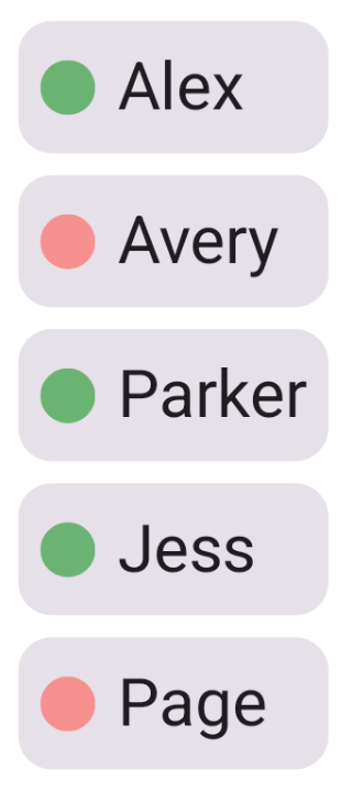
Status dots (green = online, red = offline) with no text
Charts where different data series are distinguished only by color
Links shown only by blue text color, with no underline
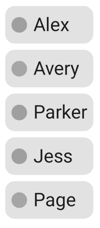
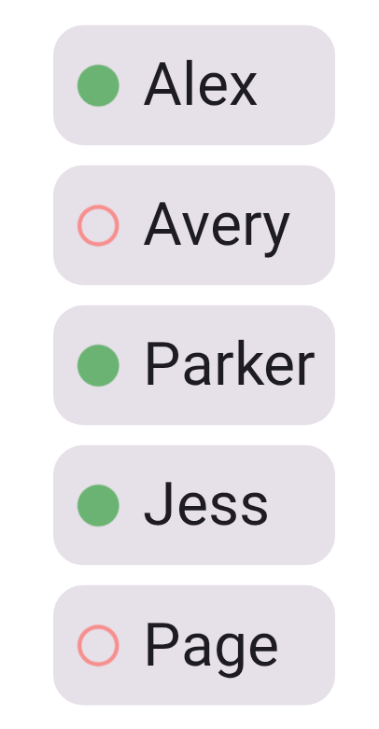
Let’s say we have a chat, which lists who’s online and who’s offline:
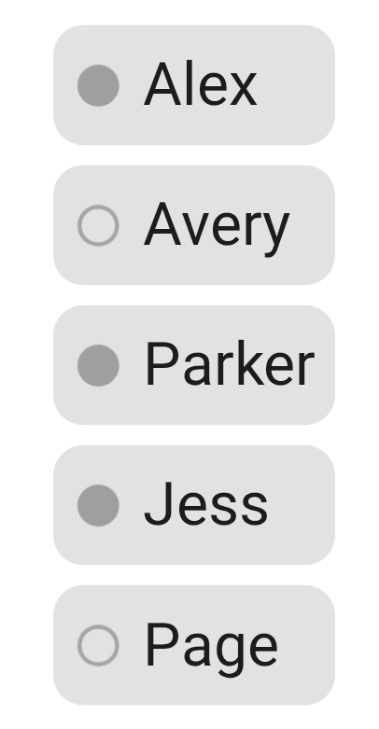
Here’s what happens when we remove color from these indicators:
Color is often used to convey information. It can be a wonderful tool for communicating different things, like the status of something, or for grouping things visually.
Then there’s the fact that not everyone sees color the same way - color blind people can’t reliably distinguish between certain color combinations, depending on the type of colorblindness they have. If you’re interested in learning more about the different types, Colour Blind Awareness has a dedicated page about colorblindness: Types of Colour Blindness.
Meanings of colors aren’t intuitive or universal. People learn these associations, which vary by culture (for instance, red can mean either danger or celebration), and not everyone automatically understands them. One good example is people who process information more literally or benefit from explicit labels.
And there are situational factors: bright sunlight (as I experienced), grayscale mode for digital wellbeing, or simply using a screen with poor color calibration.
All of this leads to the problem in this issue of Inclusive Android Apps: Using color as the only way of conveying information is not enough.
Who This Hurts
Color blind users
Low vision users
Anyone using the app in bright sunlight
Someone coming from a different cultural background, where the color has different meanings
Users who process information differently and don’t understand what that color means
Users with older or lower-quality displays where colors appear washed out or inaccurate
Why Developers (or Designers) Do This
Color is one of the easiest and fastest visual differentiators. That’s why it’s become the default for showing states and status. We’ve built conventions around it - red for errors, green for success - and these patterns are everywhere in design systems and UI kits.
While colorblindness is surprisingly common (about 8% of men and 0.5% of women have some form of it), most designers and developers aren’t colorblind. If you’ve never struggled to see or interpret color, it’s easy to forget that others do. You test on your own device with full color vision, everything looks clear, and you ship it.
The Solution
There are several options to do instead of using just color.
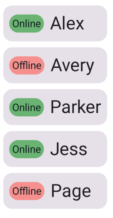
Use Text
The first and most straightforward solution would be to use text alongside color. This way, it’s clear what each color means for users who can see color, and there is also accessible text for assistive technologies.
One version could look like this:
And in greyscale:
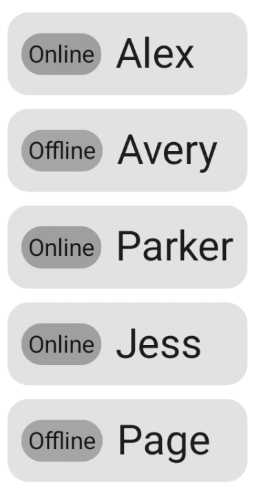
The user's status is still distinguishable, even if color is out of the picture.
In code, it could look like this (I’ve removed the parts that are redundant for this topic):
Card(...) {
    Row(...) {
      // Status indicator
      Box(
        modifier = Modifier
          .clip(statusIndicatorShape)
          .background(status.backgroundColor)
          ...
      ) {
        Text(
          text = status.name,
          color = textColor
        )
      }
      // User's name
      Text(
        text = name,
        ...
      )
  }
}
It’s a simple solution - adding a Text-composable next to the user’s name. The Box , in this case, handles the shape and color of the status indicator.
Use Different Icons with Each Color
Another option would be to use different icons in addition to colors. What this could look like is this:
And in greyscale:
In code, this would look like:
Card(...) {
    Row(...) {
      // Status indicator
      Box(
        modifier = Modifier.size(20.dp)
      ) {
        Icon(
          painter = painterResource(status.iconResId),
          contentDescription = status.name,
          tint = status.backgroundColor
        )
      }
      // User's name
      Text(
        text = name,
        ...
      )
  }
}
Compared to the previous suggestion, there’s one downside: There is no visible text to describe the status. For assistive technologies, contentDescription would handle the accessible name, but anyone not using them would not see it.
Use Patterns
The final suggestion is to use different kinds of patterns. This pattern is actually what Trello uses for its colorblind-friendly mode.
The idea is the following: Instead of just color, there is also a pattern accompanying it. In our example, it could look like this:
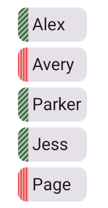
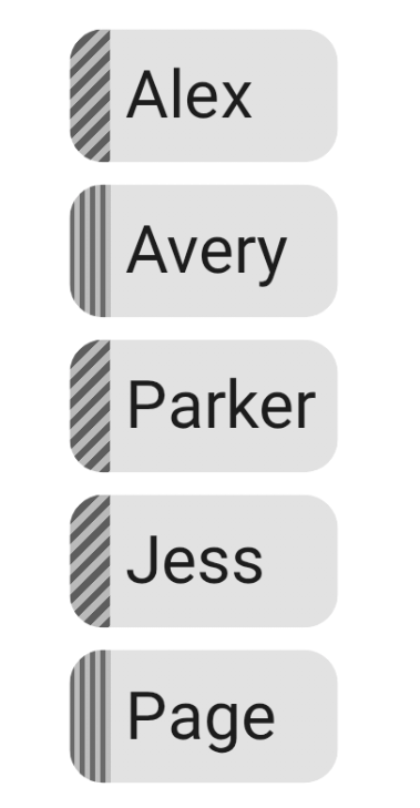
And in greyscale:
The code for the solution in the pictures is the following:
val gradient = status.patternGradient.invoke()

Card(
  modifier = modifier
    .clip(CardDefaults.shape)
    .drawWithContent {
      drawContent()
      drawRect(
        brush = gradient,
        size = Size(
          width = size.width * 0.15f,
          height = size.height
        ),
        topLeft = Offset(0f, 0f)
      )
    }
) {
    Row(...) {
      // User's name
      Text(
        text = name,
        ...
      )
  }
}
The gradient itself looks like this:
val Status.patternGradient
  @Composable
  get() = {
    val color = when (this) {
      Status.Online -> Color(0xff376C3D)
      Status.Offline -> Color(0xffF04542)
    }

    val startOffset = Offset(0f, 0f)

    val endOffset = when (this) {
      Status.Online -> Offset(10f, 10f)
      Status.Offline -> Offset(10f, 0f)
    }

    Brush.linearGradient(
      0f to color,
      0.5f to color,
      0.5f to color.copy(0.3f),
      1f to color.copy(0.3f),
      start = startOffset,
      end = endOffset,
      tileMode = TileMode.Repeated
    )
  }
The solution uses Compose’s drawWithContent modifier to draw a striped pattern on the left edge of each card. It uses a linearGradient with TileMode.Repeated to make the stripes.
This approach has its problems, too. If there is no label accompanying the pattern (as in Trello’s example), there is no accessible text available for assistive technology or as visible text.
So, the final decision of how to improve the color-only UI always depends on the context. Sometimes additional text is needed to make components more accessible, and sometimes visual changes are enough.
Which approach should you use?
Text labels: Best for most cases - status indicators, form validation, anything that needs to be immediately apparent. Works for everyone.
Icons: Good when space is limited, but you can use distinct, recognizable shapes (checkmark vs X, play vs pause)
Patterns: Useful for large areas (like Trello cards) where text might feel redundant, but still consider adding text for clarity
When in doubt, use text - it’s the most universally accessible option.
Testing
Enable grayscale mode on your device (Settings → Accessibility → Color correction/Color and motion)
Use color blindness simulation: Settings → Developer options → Simulate color space (spelled ‘colour’ in Android settings)
Test in bright sunlight or very bright conditions
Ask colorblind users for feedback
Read More
We are Colorblind
An excellent resource about colorblindness, with information, interviews, examples of good and bad solutions, and learning resources.
Improving The Color Accessibility For Color-Blind Users
Author: Adam Silver
While this article is old, its content remains a good resource for the considerations to keep in mind when designing with color. While the title is about colorblindness, these same solutions help anyone listed in the "Who this hurts" section.
That’s a wrap for Issue #3 of Inclusive Android Apps. What color-only patterns have you seen in apps? Or what topics should I cover next? Hit reply and let me know!
Next month: What to consider with time-based actions.
Thanks for reading!
-Eevis
eevis.codes