Inclusive Android Apps #1: The Problem of Rows Breaking with Large Text
Troubleshooting Android's Row for better app accessibility with larger texts
I was fixing an Android app and found buttons in a row getting cut off when I increased the font size. After diving into the code, the problem became clear: it was using Row when FlowRow was needed.
The Problem of Rows Breaking with Large Text
Let’s say we have this code:
Row(
  modifier = Modifier.fillMaxWidth(),
  verticalAlignment = Alignment.CenterVertically,
  horizontalArrangement = Arrangement.spacedBy(
    space = 16.dp,
    alignment = Alignment.CenterHorizontally
  )
) {
  Button(onClick = {}) {
    Icon(
      painter = painterResource(R.drawable.ic_arrow_back),
      contentDescription = null
    )
    Text("Previous year")
  }
  Button(onClick = {}) {
    Text("Next year")
    Icon(
      painter = painterResource(R.drawable.ic_arrow),
      contentDescription = null
    )
  }
}
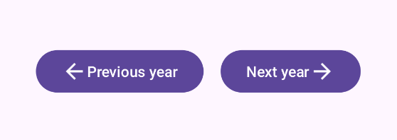
Which, in turn, looks like this with the default font size:
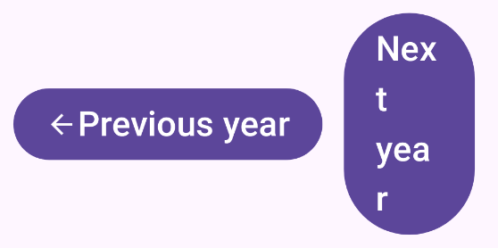
However, when we turn the font size up to 200%, things start breaking:
Who This Hurts
- People with low vision who need larger text to read comfortably
- Elderly users (a huge and growing demographic)
- Anyone using large system font sizes—whether for accessibility or personal preference
- Users on smaller screens, where even default text can cause issues
Why Developers Do This
Developers often test on their own devices with default settings, and everything looks fine. They don't realize that Row treats its children as a non-wrapping container, so if the content doesn't fit, it just overflows or gets cut off. There's no automatic wrapping behavior. It's not a bug in Row. It's just not designed to handle dynamic content that might change size.
The Solution
The most straightforward solution would be to use FlowRow:
FlowRow( // Changed from Row
  modifier = Modifier.fillMaxWidth(),
  itemVerticalAlignment = Alignment.CenterVertically, // Changed from verticalAlignment
  verticalArrangement = Arrangement.spacedBy(8.dp), // NEW: spacing between wrapped rows
  horizontalArrangement = Arrangement.spacedBy(
    space = 16.dp,
    alignment = Alignment.CenterHorizontally
  )
) {
  Button(onClick = {}) {
    Icon(
      painter = painterResource(R.drawable.ic_arrow_back),
      contentDescription = null
    )
    Text("Previous year")
  }
  Button(onClick = {}) {
    Text("Next year")
    Icon(
      painter = painterResource(R.drawable.ic_arrow),
      contentDescription = null
    )
  }
}
Which fixes the issues:

FlowRow allows content to wrap on multiple rows if it doesn’t fit the horizontal space. Just remember not to set a fixed or maximum height for the FlowRow component!
When you use FlowRow, there are a couple of things to keep in mind:
- Use
itemVerticalAlignmentinstead ofverticalAlignment(different API) - Don't set
maxHeightor a fixed height, because if you do so, you'll defeat the wrapping - If you need certain buttons to stay together, you can nest them in their own Row within the FlowRow
FlowRow handles wrapping, but there’s one thing you’ll need to remember: each button still needs enough space to be readable. Test with large text and small screens to ensure everything works as expected for every user.
Note: FlowRow was added in Compose 1.4.0. If you're on an older version, consider updating or using a custom wrapping layout.
Read More
Flow layouts in Compose
Android Developers documentation has a whole page dedicated to flow layouts and how to use them. The page explains the features of flow layouts (FlowRow and FlowColumn), as well as how items can be arranged on the main and cross axes, aligned, and more. I recommend checking it out to learn more about flow layouts and how to use them.
Accessibility Scanner
Accessibility Scanner is a great tool for testing the accessibility of your app. It tests for four categories: content labeling, implementation, touch target size, and low contrast. While it does not reveal all possible accessibility problems, it can help with catching many low-hanging fruit.
Google has also provided a video about using the Accessibility scanner: Accessibility scanner - Accessibility on Android by Android Developers.
This was the first issue of the Inclusive Android Apps newsletter. What topics should I cover in the next issues? Hit reply and let me know!
Next month: Building more inclusive gender selection forms and why binary options exclude users and how to fix it.
Thanks for reading!
-Eevis
eevis.codes