📕 The Right Box To Think Inside Of
Friends!
Aza Raskin once said that great design isn’t about thinking outside the box, but finding the right box to think inside of instead. And that’s precisely what I’m trying to find with all the prototypes that I’ve been making lately; what’s the right trim size and how do I want this book to feel? Once the container is set in stone I can make a lot of other decisions much more easily, from the design of the cover, to the writing of each chapter. But now, thankfully, I think I’ve got it.
I’ve found the format for this little book of mine.
A few weeks ago I sent off designs for two prototypes to Lulu and on Friday I got the physical copies back in the mail. One hardcover and one soft, both of them in the new format of 5.83 x 8.27 inches and, well, they’re just perfect. Here’s how they stack up against the other prototypes in order from first to last:
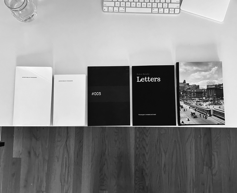
These new prototypes are a bit bigger than paperback size but they both feel pleasantly more squarish in the hand. I have to admit though, I wasn’t prepared for these prototypes to feel good. Close readers of this here newsletter might notice that I never wrote about prototype #3. It was so bad that it was difficult to write about; the printing was all messed up and I kinda half-assed things since I was rushing. It was in fact so bad that the prototype didn’t feel like a book at all. That really threw me off and shot my confidence a bit.
These though—prototypes #4 and #5—both feel like real books, books you might find in a store, even if they look a bit rushed still. But who cares about that? All that’s important today is that I can imagine what these books will be once they’re all polished and designed and complete. I’m so glad that I abandoned the much smaller size for this one as well, since I can also imagine how I’m going to illustrate the insides now that I have much more space to experiment with.
Here you can see how I’ve thrown big gray blocks into the book where I think some kind of visual description is required:
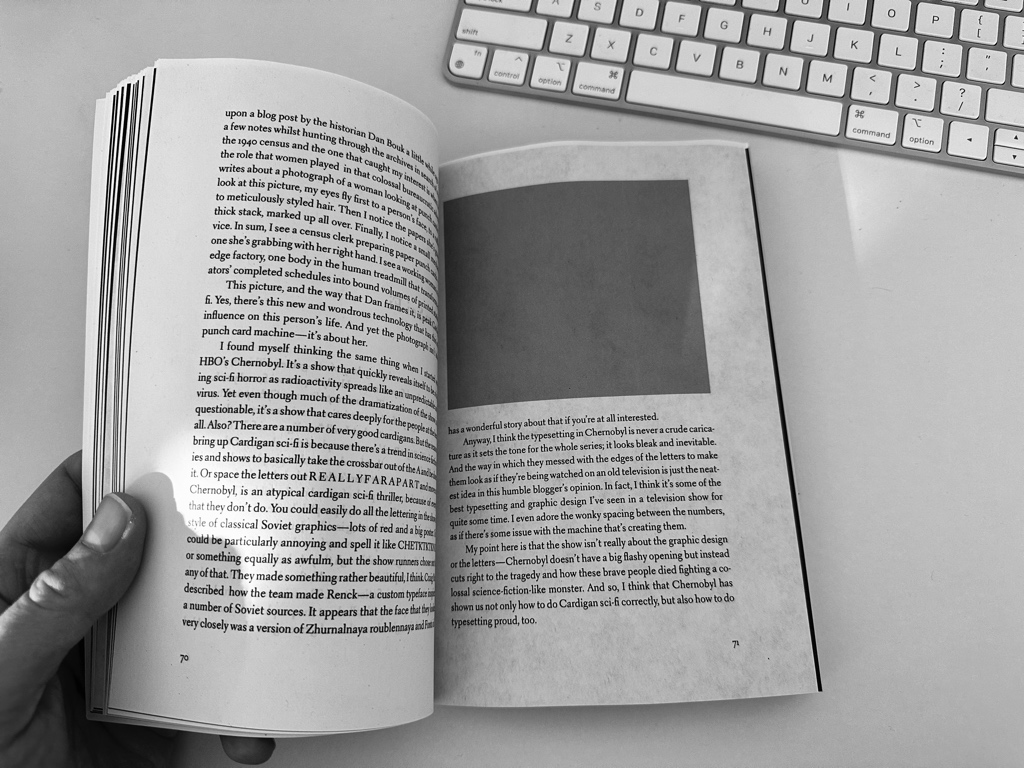
For a while I assumed this book would be entirely text-based—nothing but a book of stories—but these prototypes have shown me just how much visual explanation is demanded for this subject. In fact, that reminds me; Marcin Wichary has a very, very good website about what his book, Shift Happens, means to him. He has Three Important Things, like a sort of mini-manifesto:
- FORGET ABOUT NEITHER PEOPLE NOR TECHNOLOGY
- VISUAL STORYTELLING IS IMPORTANT
- STRANGE IS BETTER THAN BORING
Each of these are important for Letters but I think that second point is the one I need to hone in on for the next step in my book. Every time I write about a letterform or a typographic style or a technique or what have you doesn’t just need an illustration, it demands it.
Anyways, I’m sure in a few weeks I’ll look back on these two prototypes and blush with shame. How embarrassing it is that I forgot about this one detail! Oof! But, for now, they make me happy. Progress is visible here; things are getting better and better, slowly.
So what’s next then? I want to return with two things for you next week: a draft chapter of the book and a list of everything I need to get done. I expect this list will expand over time but I want to turn up the heat on this project ever so slightly.
Until then,
✌️ Robin