📕 Format, format, format
Books about typography are giant, table-sized behemoths. They take up all the space in the room—the attention is on them—so that you can see the letters close-up and zoom in to the smallest details. Big illustrations and graphics are then required and so these books are mostly dense tomes rich with information.
Jaroslav Benda: Typographic Designs and Letterforms is one such magical thing. It consumes your whole field of view with details about this man’s work.


This book isn't alone though, many books about typography are hefty and through their heftiness have an excuse to show us complex layouts. Just take a look at Radek Sidun’s ever-so-excellent Manual of Diacritics which is just as lovely...


But it’s noticeably a few inches smaller in both directions than the book about Benda’s work:

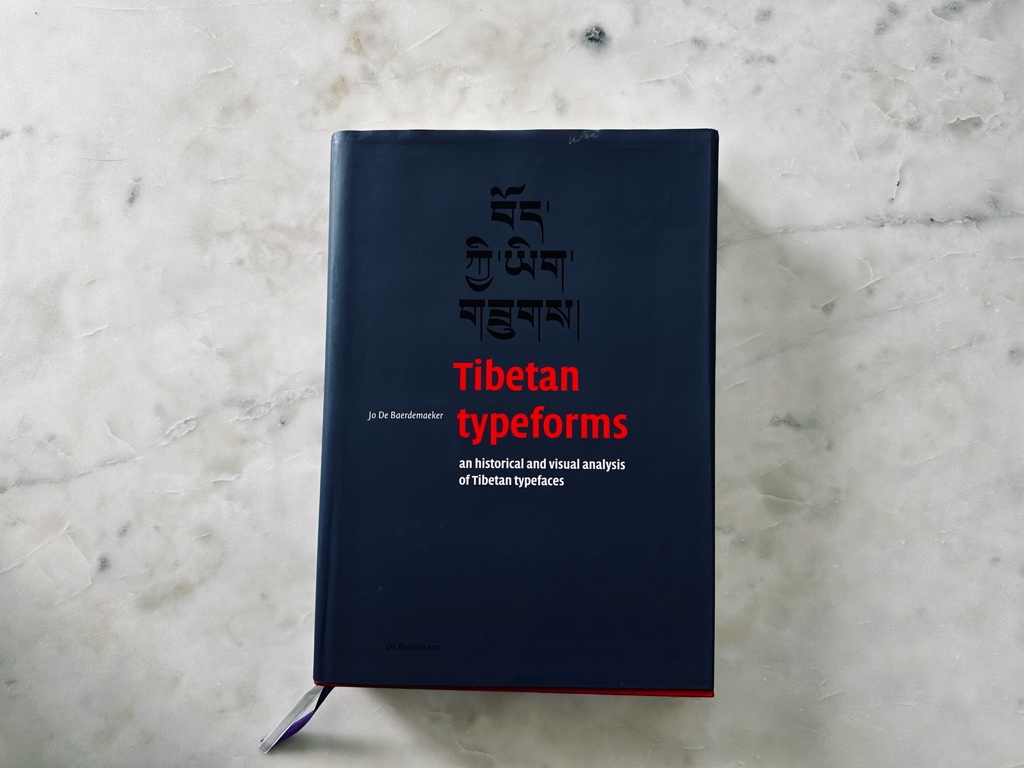
“So what?” you might say. But to a book designer this space make all the difference. You can feel the more squarish-ness of Radek’s book as you turn the page. And then Jo De Baerdemaeker’s Tibetan typeforms is in a whole other league...


The format is about the same as the others but the hardcover and the single column of text makes it feel like a regular novel on steroids. There’s room for illustrations in the margins and the paper stock is thick so those diagrams and full color photographs don’t bleed through to the other side of the paper.
I can’t fathom how expensive this thing was to print but damn I’m glad they made it like this.
Richard Rutter’s also excellent book, this time all about setting type on the web, is the smallest of the bunch yet there’s still enough room for big illustrations to make his point...


Yet, however, but! I feel terrible for saying this but if I was honest with myself then I’d quietly admit that I don’t read these kinds of books carefully—I skim read them or use them as reference when I need to because I can’t sit in bed comfortably with them in my lap or bring ‘em on the train on my way to work. Many of these tomes are lovely but also entirely, completely, un-backpackable. Which is fine! These books are not designed for my backpack and that is ok. I wouldn’t have them any other way.
But I’m less connected to books in these larger formats than I am the little novels that I can slip into my pocket.
With a big ol’ book about typography, it’s always at arm’s length, there’s always some distance between you and the subject. The hardcover will jab into your belly and the laws of physics will prevent you taking them on vacation.
With a smaller book there’s less demand from the reader, and less risk of it being placed on a shelf to be bragged about to friends. I also love how the spine can bend in soft cover books, I love how it can be folded away and treated with less care.
Cyrus Highsmith’s book Inside Paragraphs is one of a few books like this that comes to mind...


It’s so tiny! Both the format and the style are closer to a comic book or a graphic novel than one of these typographic tomes above. That allows you to get much closer to the subject and doesn’t feel like you need a magnifying glass to read things.
So as I’m flipping through these books, I’m wondering what format mine should take. What size should my book be?
I look at Cyrus’s book and I can’t stop thinking “ah yes, I want more of this.” I want the reader to be snuggled under a blanket or reading my book in a park because there’s this proximity—a special bond you form with a writer—when you feel close to them. And from my experience small books have that feeling locked down.
When it comes to the book I’m working on here, I’m drawn towards a novel-shaped thing. I adore cheap paperback books and how you don’t fear hurting them. There’s no inclination to frame them, worship them, but never not read them.
Take this edition of Invisible Cities for example. The lightness of it! The paper and typography inside feels all wrong to me—rushed at every level—but the format and size is wonderful, a format whittled down to perfection over the last 500 years.


These small books encourage a different kind of reading. If Tibetan typeforms was damaged or if I poured coffee on a page I would be devastated and would likely go to my grave having never forgiven myself. But this type of small book? Eh...I feel like it adds to the format somehow. I like the damage because it proves it was a thing well-loved.
The same goes for Emperor of the Eight Islands by Lian Hearn: I’ve used the absolute living bejesus out of this book and I am perfectly ok with how worn-down the book now is:


Looking closely at the format of these books, I want to bottle up this feeling in my own. I don’t want anyone to be afraid of damaging it or losing their copy, I want someone to proud of the scratches and damage. But this is going to be difficult considering I’ll need to showcase a lot of beautiful things in this tiny format still.
So I’m not entirely sure how I’m going to pull this off just yet. But here goes nothin’.
✌️ Robin