Watercolors in the Age of Digital Reproduction
One of the most surprising things I found in researching How Comics Were Made is how many daily newspaper cartoonists work with traditional media—paints, watercolor, and rich inks—that would have been impossible to reproduce before the newspaper industry made its digital transition.
The surprise wasn’t how many pick a pen or brush instead of a digital pencil or stylus. All older cartoonists started with media on paper, and many continue to use it; some younger ones prefer it, even if they started their careers drawing digitally.
Rather, the issue is that cartoonists use media that was unreproducible in comics until around the 1980s. Shouldn’t conventional media have been preferred in the analog era?
Yes, but only a very specific kind: India ink and other dark, solid blacks. Anything that varied in tone, revealing grays, and all color were foribdden as they were incompatible with newspaper (and general printing) production. The rub is this: until the 1980s, newspapers and nearly all printing required a solid black to make a mark.
Letterpress printing (1450s to the end of the commercial period in the 1980s) and offset lithographic printing (1900s, picking up steam by the 1960s) can’t reproduce anything but solid colors. That’s black for text and a lot of daily routine work. If you see color, it’s either process, a separation of full color into cyan, magenta, yellow, and black, or spot, the use of solid colors mixed to a certain value. To make a lighter version of any solid color printing relies on patterns that fool the eye into seeing tones. (There’s a kind of printing called rotogravure, a form of incised or intaglio printing that newspapers adopted for a time over 100 years ago, that I’ll be writing about separately—it was expensive and specialized.)
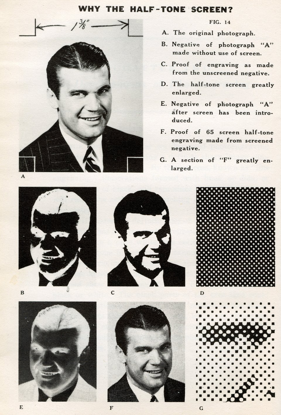
It might be easier to visualize when you think of a photograph. A black-and-white picture, as below, has white and black areas, but many tones in between. If printing can’t reproduce those grays, what then? For photos, printers interpose a finely etched screen (shown in D, below) that uses diffraction to convert grays into dots that are black-only. The dots are just fine enough to make us “see” tones.
As a consequence, cartoonists always had to work with a black ink or paint. Anything less than a solid black would pass through the photographic step, whether in the 1920s or the 1970s, as mottled or purely invisible. (Why not use a photographic screen? Because it wasn’t possible to retain the fine black lines as black while also pulling out patterns from tones. Screened comics look fuzzy and reproduce poorly.)
As I noted in previous newsletters, cartoonists had to either rely on cross hatching, stippling, and other pen techniques; pass the task on to Ben Day artists to apply tints using painted screens (through the 1950s, at least); or apply or have production people apply adhesive dot patterns. (See “Everybody Loves the Ben Day Artist.”)
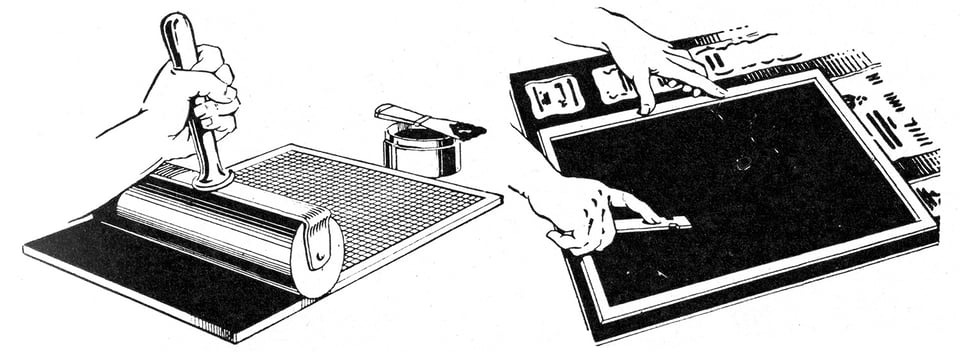
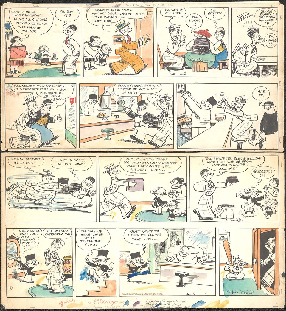
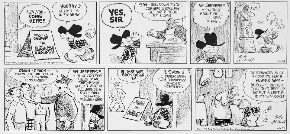
There were exceptions. I found some WWII-era “Barney Google and Snuffy Smith” installments in which Billy DeBeck tried using charcoal for the texture. It produced an interesting effect without halftoning, though it he used it only for a short period and I expect the syndicate or its engravers’ didn’t like it, as I have rarely seen the use of anything similar.
The transition from analog to what is often imprecisely called “digital color” in the comics world didn’t change the nature of printing. Rather, it allowed cartoonists to work directly with a wider range of color without requiring the intermediation of a chart or engraver. An artist then sent a file to the syndicate that could then be broken out in into the four process components, with any necessary tints built by software.
Newspaper reproduction is fairly low fidelity, though. Because of the coarseness of newsprint and the speed of presses, dots can’t be too small or too big to represent light or dark tones. Small dots get sucked up in the pores of the paper, disappearing; large dots fill in with ink through the bleed of surrounding ink in the fiber and appear as 100% of the color.
Mix too many of the CMYK colors, and instead of a hue, you get a muddy smear because of how inks absorb and mix on newsprint. Newspapers also limit the total ink coverage. This is measured as total percentage of ink across the four process colors, maxing out typically at 240%. That is, if you have a color that’s 30% black plus 75% each of cyan, yellow, and magenta, you’ve gone over with 255%. Photoshop and other software can help keep cartoonists within those ink limits and preview newsprint gamuts, or reproducible color ranges. (On higher-quality paper and presses, you can get to 280% to 300% or even higher.)
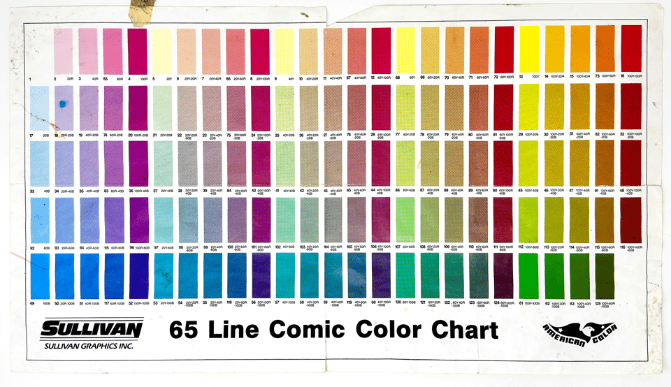
Further, newspaper rely on low frequency screens. The frequency refers to the size of the cell in which a dot is made (see illustration earlier), measured in lines per inch (lpi). This terms refers to the old days of screens that had actual etched lines, identically spaced horizontally and vertically. (A lot of digital aspects of printing reenact previous physical processes.) In the color chart above, the “65 Line” refers to 65 lpi, which is very coarse; modern newspapers use 85 to 110 dpi; fine printing is 175 to 200 lpi.

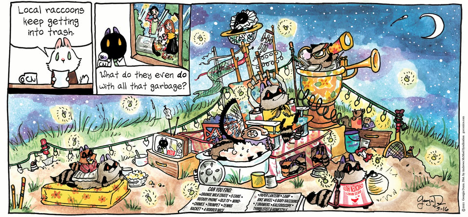
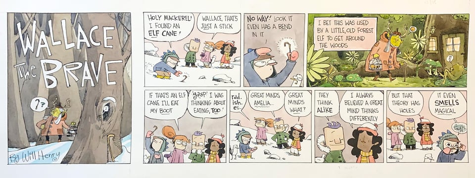
Despite all these provisos about fine detail, losing light and dark areas, and the potential for mud, digital color still allowed cartoonists to blow open their palette and choose any working method. Will Henry, who creates “Wallace the Brave,” colors his Sundays directly in watercolor, scans the results, and sends his work on its way to the syndicate. Ditto, Georgia Dunn of “Breaking Cat News,” whose comic appears earlier in the newsletter and in detail just above.
In my book, How Comics Were Made, I’ll have a section in the chronologically later portion that looks at the huge variety of conventional and digital ways artists draw their work today. This is separate from whether digital or analog drawing is “better.” Nick Galifianakis, a long-time illustrator and cartoonist at The Washington Post, said that he tells young artists, “Don't learn how to draw on a digital device. Don't do it. You won't grow as quickly.” He says that working with a pen and ink or similar media leaves you without a net—if something goes wrong, there’s no Command-Z. But he doesn’t advocate a position after artists gain experience: “The more confident you are, the more authentic your voice is. The more you have a vision, the more you have control of your skills, the greater chance that then the digital tool that you use will be just a tool, as opposed to it being your art, being about that thing.”
Some daily strip artists have retained the working methods of the 1920s or 1950s, because it fits them. They draw in black only (with ink or markers), then prepare a color guide or have an assistant prepare one, using a numbering system like that shown above—though today, they can select from a much larger set of numbers. The syndicate takes their scanned black drawing and a scan of the color guide, and a colorist uses Photoshop or other image-editing software to fill in areas with the specified color.
Jim Keefe, who worked as a colorist for King Features decades ago, and now is the artist on “Sally Forth,” told me that he still marks up a numbered color guide for his Sunday strips for King, since his contract allows that—it saves him work and he gets the results he expects from a long working relationship. But, he said, “There are some Sundays I do the color steps myself because they are so involved. It would take more to do a color guide to explain what I want than just to do it," such as this Sunday comic from last October.
Book and Crowdfunding Update
The Kickstarter campaign for How Comics Work continues to go gangbusters, as it approaches 50% funded six days in! I still need the support of hundreds more people to make the book a reality, but with over three weeks to go, it feels quite possible! If you know a cartoon lover, please do forward them the campaign link.
I have interviewed dozens of cartoonists and other folks in the comics world (so far) for my book, and continuing that trend, I’m interviewing several on livestreams during the campaign! Here’s what is yet to come. Click through and you can have YouTube send you a reminder to tune in; these will all be available to watch later, too, at the same URLs:
March 5 at 10 am PST: Georgia Dunn (“Breaking Cat News”). I talk to Georgia about her entry into syndication a few years ago, her use of watercolors, and how she approaches storytelling.
March 12 at 10 am PST: John “Derf” Backderf (“The City”, My Friend Dahmer, Kent State) and I chat about Derf’s work and career, and his early years at newspapers, coloring comics and illustrating and editorializing the news.
March 19 at 10 am PST: Barbara Brandon-Croft (“Where I’m Coming From”) explains how she started in cartooning, what her pioneering strip was about, and where she’s going to.
You can watch previously recorded livestreams from last week, too:
Kickstarter launch with Glenn! I showed printing artifacts, discuss the book, and answered questions about how cartoonists worked and the process from pen to printed paper. (You can ask more questions in the comments!)
Benjamin Clark (curator, Charles M. Schulz Museum) in discussion with Glenn on February 28 about curating a collection of one person’s life’s work and how to tell stories about cartoonists through their drawings and materials. Glenn shared printing items, newspapers, and originals that he saw in the museum’s archives and in its exhibitions. Benjamin is also the co-author of Charles M. Schulz: The Art and Life of the Peanuts Creator in 100 Objects.
Add a comment: