Toning Up
Welcome back to the latest installment. I start with book news and then move on to the tricky issue of halftone-screened comics in magazines—and why I brushed over the subject in my book!
The Latest Book News
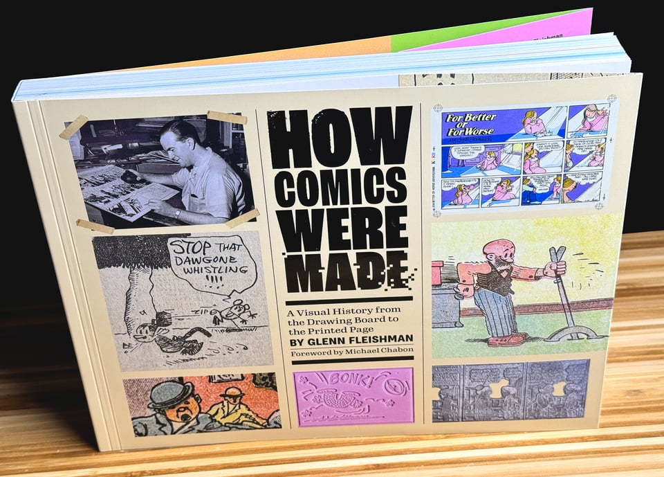
The last copies of How Comics Were Made are now on a significant sale: 40% off—now $39 plus shipping (to the U.S. or Canada). No coupon is required. The reasons are complicated and I discuss below (skip to the next heading if you don’t care!), but you can still snag one of the final Kickstarter edition copies before the bookstore edition appears in June 2025.
How Comics Were Made is a great celebration of cross-border commerce between the United States and Canada. I wrote and directed the production of the book in the U.S., where my designer, editor, proofreader, indexer, and spot illustrator also live. Most of the material also comes from U.S. sources, the one exception being some original artwork provided via Archives Canada with permission of Lynn Johnston (For Better or For Worse).
After reviewing bids and services, I opted to take the book to Hemlock Printers in the Vancouver, B.C., Canada, metro area. I’ve had books printed in the United States before and considered bids from across oceans, but Hemlock had the right mix of closeness for doing a press check, cost, and fulfillment. The printers’ sibling firm Hemlock Connect is a short drive from the printing facility and shipped out thousands of copies, both in an initial batch and as website one-off orders.
This was all possible because the United States doesn’t impose tariffs on books brought into the United States. Hemlock Connect is fully set up with the U.S. Postal Service and, a few times a week, drives a truck through customs across the border to Blaine, Washington, where they drop off ungodly numbers of packages at the P.O. there. I opted for the affordable USPS Media Mail rate, allowing low shipping costs.
(Canada imposes GST on books sold within Canada as well as delivered from the United States and other countries. For books imported into Canada by an end buyer, the importing shippers collect. This is unlike American sales tax, which is the responsibility of the shipping party to collect and remit if necessary.)
So: I have a modest number of copies left in Canada, and it’s possible that 25% tariffs will be imposed in early March. Early March is also when I agreed to “sunset” the Kickstarter edition in preparation for the bookstore printing that ships June 3, 2025, from Andrews McMeel Publishing (as How Comics Are Made). Hence the sale.
My ebook edition remains available until early March as well. Andrews McMeel will offer an ebook version along with the print edition.
You can still grab a last Kickstarter copy directly from me, shipped via Canada to the U.S. or Canada. If you want to wait for the bookstore edition or are in another country, you can pre-order the bookstore edition. Outside of the U.S. and Canada, the bookstore cost will be dramatically lower for you, between cover price and shipping.
Gray Areas
Throughout How Comics Were Made, I repeatedly explained how newspaper cartoons were primarily built around solid black lines and that any gray tones required on weekdays or colors on Sundays required elaborate processes until the rise of fully digital production and output methods.
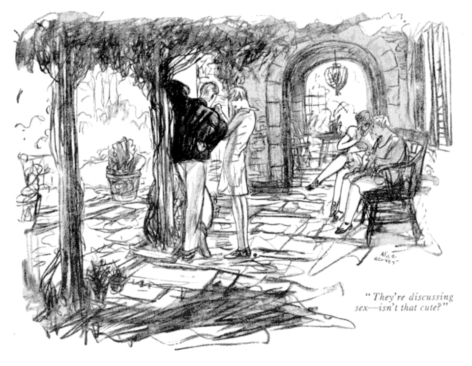
That remains accurate. But there’s a whole area of cartooning I didn’t cover: those that appeared in magazines, often, but not always, as single panels. In an era gone by, panel cartoonists and gag writers made the rounds on Tuesdays and Wednesdays in Manhattan, meeting with editors and dropping off or going over sketches for future comics. Then they got together to drink—heavily.
Once you had an in, you might be able to send packets by courier or mail. In modern times, The New Yorker is the only widely surviving U.S. example of glossy paper that publishes lots of comics in each issue, although “lots” is still not many compared to their old days or any magazine in its heyday.
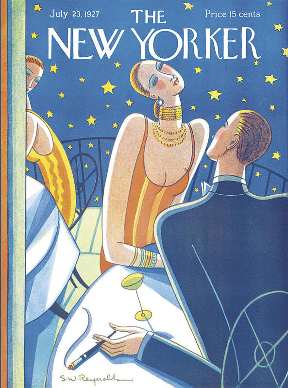
Because magazines relied on better production methods, cartoons that appeared in them often had halftone reproduction. That is, a cartoonist painted or drew in grays, and the cartoon was converted to black-only tints the same way a photograph was.
This was made possible for several interlocking reasons.
First, magazine cartoonists were paid both very well and very poorly at the same time for a good chunk of the 20th century, at least until the 1980s and well through the metal era. Most weren’t guaranteed sales, and fashions changed. But when they worked, they could get fees that today would be the equivalent of hundreds to thousands of dollars each. That depended on the magazine, its reach, and the cartoonist’s popularity.
For instance, Barbara Shermund, an early New Yorker contributor was paid $75 in 1931 as a regular rate, which is $1,500 in 2025 dollars. (See Caitlin McGurk’s Tell Me a Story Where the Bad Girl Wins: The Life and Art of Barbara Shermund, reviewed in the last issue.) And remember that housing and medical costs have risen far faster than inflation for a long time, meaning that those older dollars went a lot farther than the adjusted equivalent today. That is, if you could rent an apartment for $75 a month in 1930, the $1,500 equivalent today would fall far short.
(Cartoonists today are typically paid several hundred dollars for major magazines that still run comics, and only a few have recurring gigs or appear nearly weekly in the New Yorker. Even selling several cartoons a month doesn’t pay the rent in most major cities.)
A daily cartoonist, or even one producing Sunday-only extravaganzas, might have made as much or more money a week as a magazine cartoonist selling a few comics, but the work was more grueling and unrelenting. The top newspaper cartoonists raked in $2,000 a week or more across the late 1920s to 1950s (very roughly $20,000 to $35,000 today), but most saw paychecks more in line with a solid magazine performer. The more popular cartoonists also often paid for a staff to manage production and other projects; magazine cartoonists were typically solo.
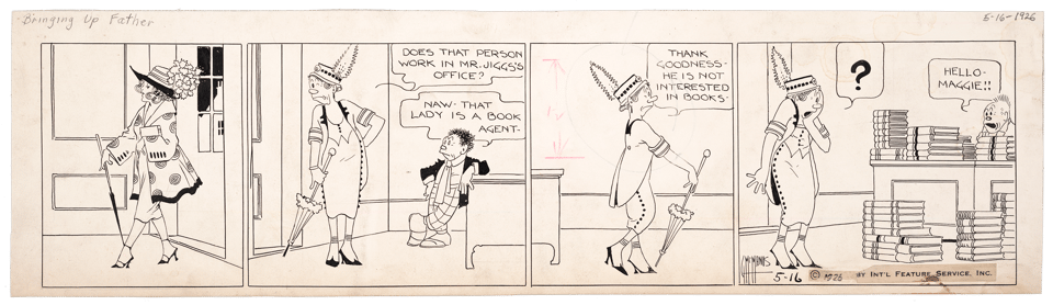
A magazine cartoonist typically produced a single panel, even if it was large and contained a lot of detail; the cartoon might have no caption, or they might write it, hire a gag person, or be assigned one by the magazine. A newspaper cartoonist generally produced multi-panel strips each day, and many had storylines. Some cartoons in the paper were, of course, single panels with one-off gags or multiple panels with recurring characters but no plot from day to day.
This extra time relative to money and workload may have contributed to magazine artists turning to watercolor, gouache, artist’s crayons, pastels, and other drawing methods that offered gradations of tone instead of solid black. You can see what artists employed at the New Yorker in this now-public-domain collection of comics the magazine published in 1928.
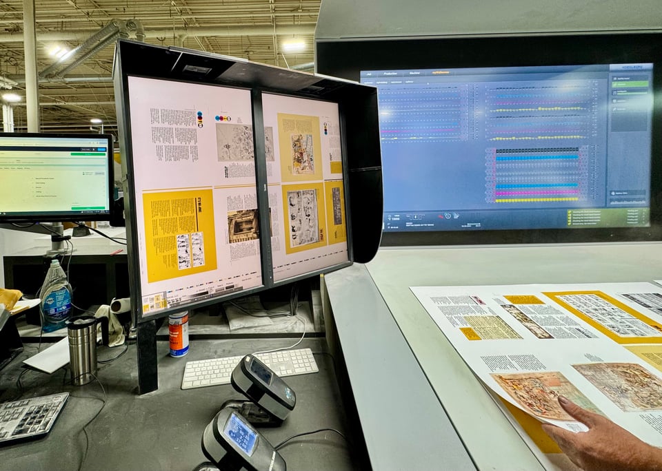
Second, let’s compare the metal-era production process for newspaper comics and magazines. A syndicated cartoon is drawn, shot on negative film, and made into a zinc or magnesium plate. A mold is made from that plate and shipped to a newspaper, which in casts a lead plate for layout. The laid-out page has a full-page mold made, which is then cast as a semi-cylindrical plate, which goes on press and is printed on newsprint, a low-quality paper. You can watch my video showing this lengthy process on YouTube.
If the comic was created as in-house feature for the newspaper, it goes straight from drawing to negative to plate to layout instead of requiring the extra mold/casting part syndicated needed for distribution. But it still winds up on porous, rough newsprint.
A magazine cartoon follows the same abbreviated model, with the final stage resulting in printing on a glossy (or coated) paper, which “holds out” the ink better: being less absorbent, the pattern of dots and any lines or solid areas remain on a smooth surface, provide a much better printed result. Four-color work of all kinds is typically printed on a coated, often glossy paper. (There are many exceptions.)
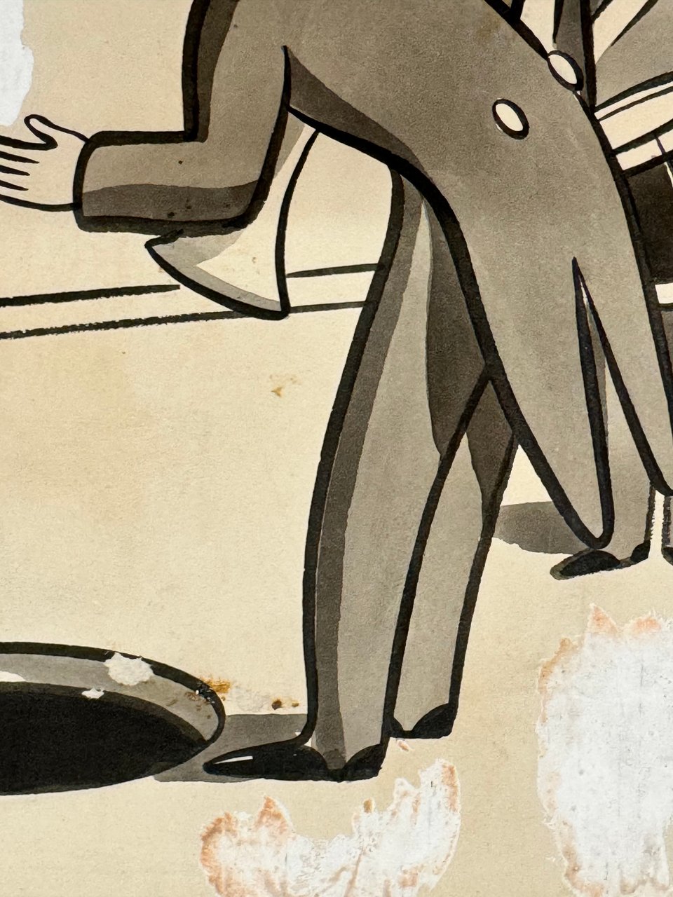
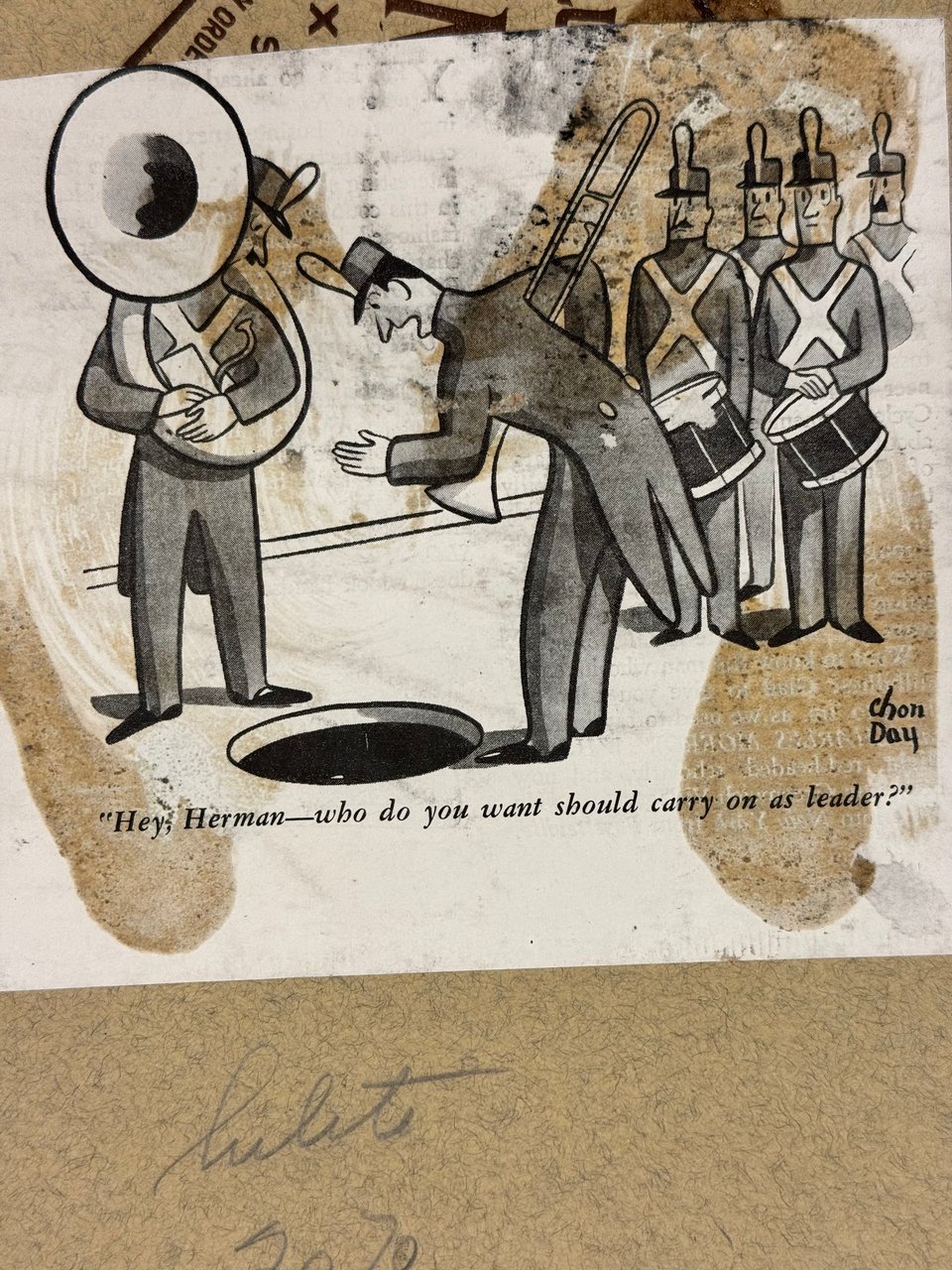
Newspapers and syndicates didn’t allow the use of gray tints in cartoons that would require halftoning for the above reasons of reproduction. But it also would have required a separate process for just some cartoons, which would have had to be photographed through an interposed etched glass halftone screen to produce the black-only dot tints required instead of shot as solid line art and then optionally having Ben Day dots applied for tints. The one exception on “grays” was when cartoonists added halftones through Zip-a-tone and similar methods on their original artwork, as these dot patterns were solid colors and photographed the same as line art.
Third, solid black often reproduces poorly through the old mechanical halftone process of a screen over a plate, followed by etching. Without exceptional care, the black looks mottled. Because hand-lettered dialog and clear, black character outlines were characteristic of newspaper comics, a comic passing through halftoning to capture grays in the original would be less legible and look wrong compared to other comics on the same page.
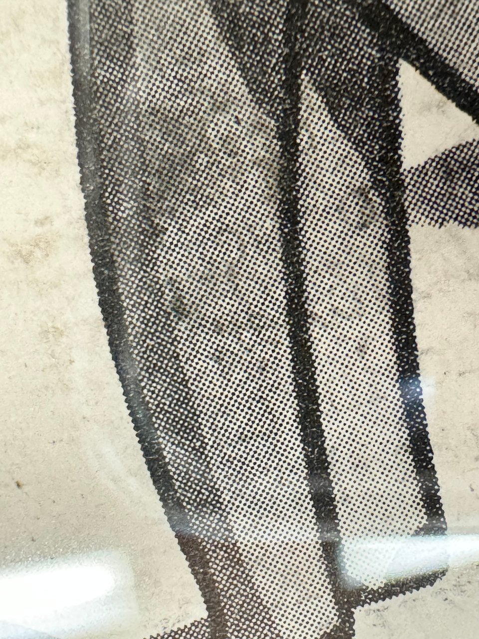
This is coupled with the extremely low screen frequency or density of the dot pattern used to make tints. This measure, in lines per inch (lpi), indicates an invisible matrix (like graph paper) with cells in which tint dots appear. A coarser screen has a lower number, meaning dots are bigger and more visible to the unaided eye, making the eye-fooling tint effect worse. A finer screen has a higher frequency and can disappear visually.
Newspapers’ coarse paper required a low screen frequency, often 55 or 65 dpi. Otherwise, tiny dots that show highlight detail would be sucked into the paper’s fibers and become invisible, blowing out the tones, while larger ones for darker, shadow detail could saturate the fibers and fill in areas that should be less than 100% black. Magazines using glossy paper could opt for a higher frequency, such as 110 lpi, as the tiny dots could be held better in printing.
A coarser frequency blurs details as fewer dots are available to show those details. This is equivalent to pixelization, where you can see the pixels in a low-resolution image on a screen while they disappear for a high-res one. The identity to the original drawing or photo feels lower with a low screen frequency because of the loss of detail.
You can sometimes see this halftoning in collections of comics made in the digital era before production techniques fully caught up to the process. I don’t want to call out particular creators, but I have thumbed through entire books of comics that were halftoned instead of scanned as black-only line art. The result looks fuzzy—it doesn’t look like the original at all.
The variables for newspapers have changed since the introduction of digital color and preproduction because cartoonists could create tints and gradations that passed through the film- or platesetter that produced the image used on press. (Filmsetters produced exposed negative film that would be contact exposed to plate material. Starting 25 years ago, platesetters, which directly output the final plate put on press, quickly replaced the film stage.)
Cartoonists typically create a separate black layer in their digital file that contains dialog and outlines, and preserve that as they add color. This lets them ensure they have a solid black with no dots while having all the benefit of picking any in the range of reproducible colors or color transitions.
The digital file, sent to each newspaper as a separate item or in pages composed by syndicate-sibling companies—Andrews McMeel Syndicate and King Features Syndicate each have one—allows the newspaper to output the screen frequency used in their setup. That’s typically no lower than 85 lpi and often 110 lpi. Magazines have largely increased their frequencies, too, offering even more luxurious, eye-fooling reproductions.
Add a comment: