That Explains the Tints
In this issue:
An update on the status of How Comics Were Made!
Color isn’t real—in newspaper comic strips
Images in this issue nearly all from the Billy Ireland Cartoon Library; see below.
How Comics Were Made Will Be Made
Here’s the latest on the book’s progress. (Please tell your cartoon-loving friends to subscribe to the announcement list or this newsletter. Word of mouth will make this book happen.)
Interviews: I’ve conducted over 30 interviews, some lasting two hours, with a host of people—mostly cartoonists, but also academics, historians, and production folks. You’ll recognize some of the names in the list so far: Bryant Alexander, Derf Backderf, Tom Batiuk, BJ Bolender, Tauhid Bondia, Matt Bors, Paige Braddock, Barbara Brandon-Croft, Luke Coleman, Meg Cullen, Rich Dana, Georgia Dunn, Lex Fajardo, Nick Galifianakis, Guy Gilchrist, Bill Griffith, Steven Heller, Lynn Johnston, Mark Kaufman, Jim Keefe, Dave Kellett, Rick Kirkman, Susan Kirtley, Sean Kleefeld, Keith Knight, Wiley Miller, Eric Reynolds, Joey Sayers, Garry Trudeau (email), Brian Walker, and Shena Wolf.
Do I have more to come? You bet! At least another dozen—maybe many more as word of the project continues to spread. And some people were way too busy in the fall to talk, but I’ll be speaking to them in January or February. My white whale remains Bill Watterson, of course.
Research trips to Billy Ireland: I had an excellent third trip three weeks ago to the Billy Ireland Cartoon Library & Museum at the Ohio State University in Columbus. This time, I was plumbing the depths of artists’ collections for their 1970s to 2000s production materials: acetate separations, original drawings—even Mike Peters faxes, yes faxes, of his editorial cartoons to his syndicate. (Cartoonists would fax way above size and on “fine” resolution—about 200 dpi—when working on deadline and not close enough to messenger material or enough time to FedEx. I guess it worked!)
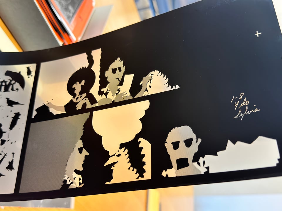
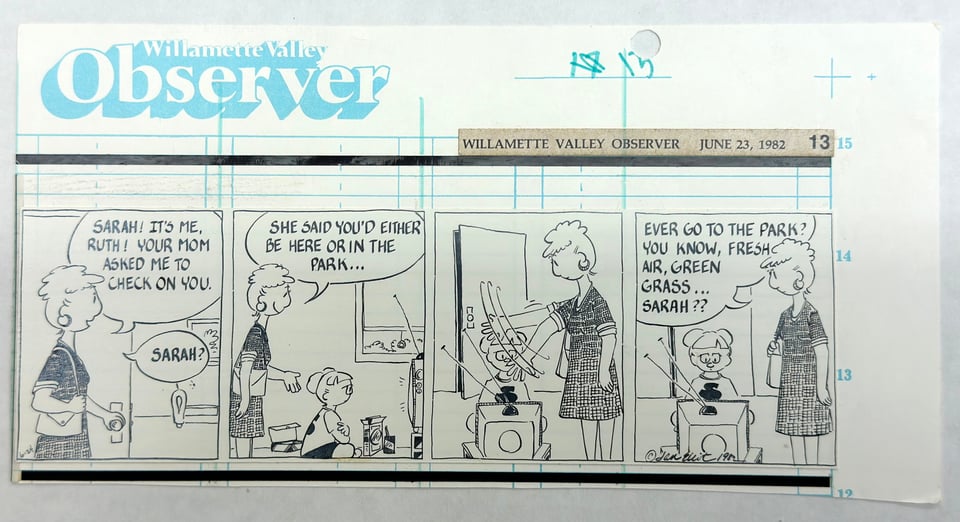
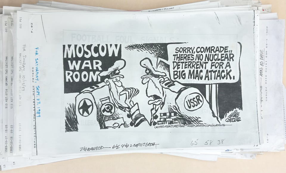
I also delved into the Tim Rosenthal collection, a set of materials donated by his family after his death in 2000. Tim was an executive at Great Buffalo Press/American Color, which handled coloring Sunday comics and printing them for many newspapers; he was instrumental in helping newspaper cartoonists transition to digital color.
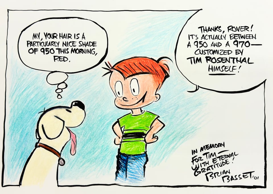
As Wiley Miller (“Non Sequitor”) told me in a Zoom interview recently, “[Tim] was the only one who was open to this.” Wiley also wrote via email, “Tim met resistance at American Color, with his boss saying it can’t be done. We just bulled ahead and did it anyway. The result was an explosion on the comics page as the art stood out among all the others in spot color.” People loved Tim. His archives are full of signed originals, holiday cards, and in memoriam pieces. I plan to feature him in my book as part of my larger discussion of American Color. He deserves to be remembered.
Upcoming library visits: In January, I have a session booked at the Charles M. Schulz Museum and Research Center in Santa Rosa, Calif., to look through “Peanuts” materials and talk to curator and creative folks. In March, pending the Kickstarter, I am planning to visit Harvard (which has some historic cartoon material), the Beinecke Rare Book & Manuscript Library at Yale in New Haven, Conn. (Garry Trudeau’s Doonesbury papers and originals), and Columbia University Libraries in New York (various historical materials). I’ll also be stopping along the way to meet with at least one cartoonist to view and scan from their personal archives.
Design: I’ve been working with the designer, Mark Kaufman, on a sample chapter that we’ll show off in the Kickstarter campaign. We’re moving towards a final preview cover as well that will be similar to but more refined than the one I’ve posted on the website.
Copyright stuff: Permissions work has sped apace, too. One of the critical aspects of making my book work will be obtaining reproduction permission. I’ve had conversations with dozens of cartoonists, two major syndicates, and some large rightsholders. Everybody is willing, which is fantastic, and some are offering rights at no cost. In other cases, I’ll have to provide a final list and negotiate on fees, which, again, everyone is very positive about. It’s all going very smoothly, including obtaining scanning-only permissions that I pass on to the folks at Billy Ireland, which they need to scan in-copyright material and will help in blocking out the book.
On target for launch: We’re still headed for a February 2024 Kickstarter launch! More details in January 2024!
Color Me Surprised about Colors in Comics
A comic-strip artist never knew the color they would get on their Sunday strips. They could indicate the desired hues and tones, but never be assured of the result. Newspaper comic strips may be unique in the history of art designed for reproduction in that the artist and the publisher both lacked any substantive control over how the danged things were printed!
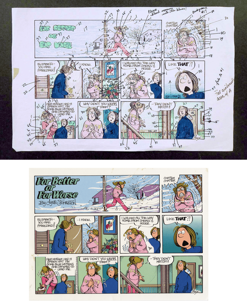
Fine-art prints created from etched, engraved, or lithographic originals were made through direct contact. The artist might not have gotten their hands inky or oily—depending on the era, an artist might have used pencil or ink for the drawing and then a craftsperson transferred it or transformed it into a plate or printable surface. But it was a relationship: artists drew or painted, craftspeople and tradespeople produced, and a publisher got what they wanted, whether the artist or otherwise.
Consider, instead, the control any comic-strip artist had from the dawn of the art becoming common in the 1890s through the creation of webcomics. An artist drew a black line. Potentially, they might stipple, crosshatch, or use other techniques to impose tone or texture. But after that moment, it was out of their hands. They could mark up—or, when comics money flowed like water for several decades, have one or more assistants mark up—a copy of their original to show where they wanted grayscale tints for daily strips and a coloring guide for Sunday funnies.
Then, their work went through an incredible series of transformations, as I’ll document at length in my book. (You can see a preview of this at my website.) It was shot on film, exposed on metal, painted with dots and patterns, etched (repeatedly), compressed into a paper mold (flong), shipped out to newspapers, where it was cast into a plate, laid out on a page, compressed (again!) into a page-sized mold, then cast into a full page for the press.
Imagine how anything could get through that process and resemble the original in the least? I count about seven generations of reproduction, all removed from the artist’s hand. And then hundreds or thousands of newspapers, with their own inks, presses, and presspeople, would turn that final transformed hunk of metal into the comics page. It’s amazing anyone could read the things at all. But the process was refined and remarkably high-quality for all that transformation.
This goes back again to the artist’s hand: a cartoonist had to draw a black line that could survive the journey from the end of their fingers to a reader’s hands, also inky from reading. (Until newspapers improved inks and drying, making Silly Putty offsets a thing of the past.)
Because of the production process used in the metal/relief era of printing—lasting into the 1970s, and even 1980s at some newspapers—tints and colors had to be marked up on copies of the original. Tints of black were sometimes sketched in or marked with a blue pencil. (There’s a special color of light blue called “nonrepro” or nonreproducing blue that was invisible to the high-contrast black-only film used for capturing line art.)
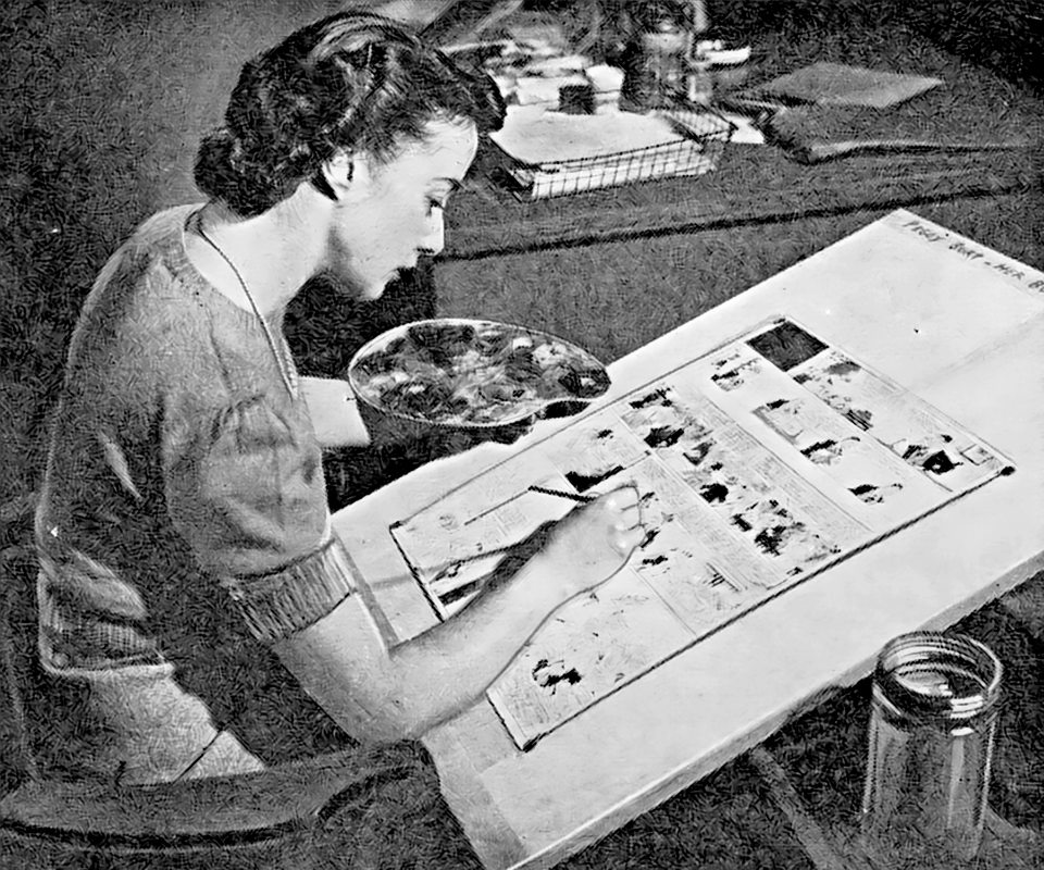
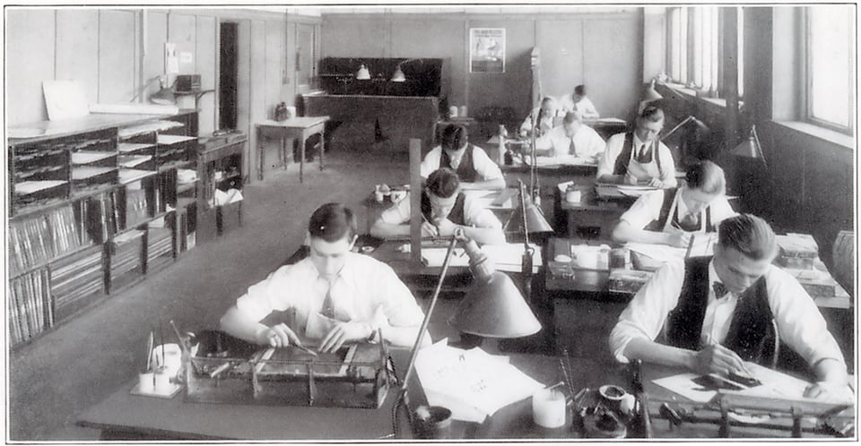
Color was marked in a more complicated fashion. A cartoonist or their colorist (employed by the artist or the syndicate) would use some method of indicating what colors to use on a copy of the orginal. Artists might use colored pencils, watercolor paints, or markers, depending on the artist and era. In the early days of newspaper comics, artists or colorists seemed to draw the first instance in a strip of an item, like a person’s face or vest or a car or horse. They would leave that item uncolored for the rest of the cartoon, leaving the engraving to reference the first instance. Later, and I’m still looking as to when “later” started, though definitely by the 1950s, color would typically be roughed in completely, and then each instance would have a number written on it, too, using color guides distributed by the firms that handled engraving. Newspapers relied largely on specialized businesses to handle the color engraving and often print the Sunday comic sections.
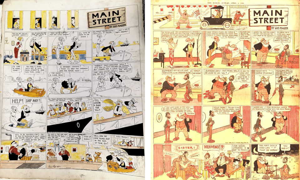
I spoke with Eric Reynolds, the vice president and associate publisher at Fantagraphics Books, who is likely the person—living or dead—who has had his hands on the most reprintings of comics strip. We talked about this issue of what the “real” color in comics was:
…if you go way back into the 20th Century, when someone like Frank King would hand color their Sundays, is that the real thing? Personally, I would always sort of love to see the artist’s actual hand. But then again, we’ve done things like the Peanuts Every Sunday books…, where we’ve completely recolored them.
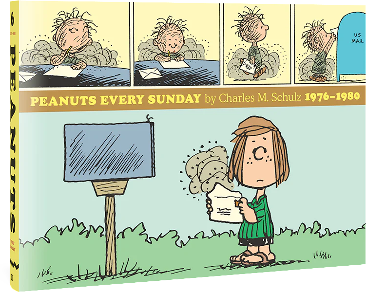
Eric said the choices about how to pick the right color for comics depend on the preference of the artist, estate, or editor, depending on who is shepherding a cartoonist’s work and whether it’s in the public domain. A collection might rely on colored originals, if they exist; reproductions in newsprint that are cleaned up; or colored versions created for earlier, inexpensive collections.
He noted that the Peanuts Every Sunday books essentially recreated the color from scratch, coming after other Peanuts collections. As he recalled:
I’m guessing we proposed the idea to them of completely stripping out the color from the Sundays, using photostats or whatever line art scans we had for the Sundays, and then rebuilding them and printing them in a way that they’d just never been seen—in a way that just really made the work sing a little bit. And I think it totally works in that regard, especially in the context of the Sundays also appearing in The Complete Peanuts in black [ink].
With a collection of Walt Kelly’s “Pogo,” the process was quite different:
…working on “Pogo” with Carolyn Kelly, Walt’s daughter…she made the aesthetic choice of wanting to go the route of just scanning Sunday tearsheets [newspaper reproductions] and doing a little bit of touch-up on them…not embracing the obvious flaws, like stuff that’s wildly out of register [colors not aligning]…But trying to kind of make a facsimile of what a kind of optimal Sunday reproduction was.
They cleaned up the newsprint scans to keep the flaws from becoming too distracting. He explained: “It really just depends on the project. There’s definitely no right or wrong answer. It’s just a choice—an aesthetic choice.”
I’ll be writing a lot more about color in future newsletters and in the book. And noting that it all changes with the introduction of “digital color,” the general term in the comics world for the period starting in the 1990s of being able to create an image file on a computer with the colors all in place that was then digitally separated and printed.
Then it all changes again with webcomics, introducing digital-only, digital-first, or multi-modal comics production, in which strips are read entirely or largely online, or created in a workflow for webpages, PDFs, print-on-demand or offset books, and newsprint.

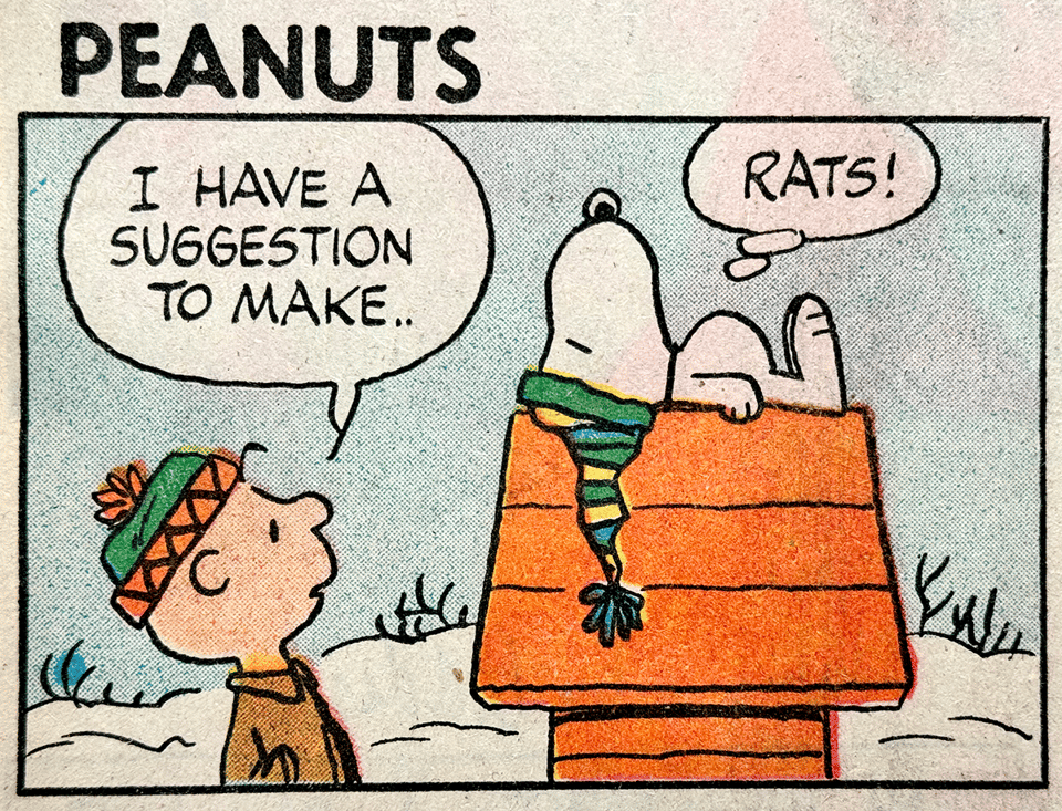
You can still see these factors at work in the present day. In the above “Beetle Bailey,” from 21 November 2023, I saw that there was both a dot-based tint pattern applied to certain elements (the characters’ T-shirts, Beetle’s cap, etc.), but there were also solid colors used for the bed frame, window frame, and Julius’s shorts. I suggested on Instagram:
this Beetle Bailey strip is drawn for both black-only newspaper and color online/newspaper reproduction. In b/w version, the tint-pattern on shirts and the blue shorts (not halftones! those are for photographs) was used to have a gray tone appear in the printed version, which can only reproduce blacks, not tones; all the color you see is white outlines in b/w. Somewhere along the line, the tint wasn’t replaced with gray for the color version (or it’s a texture, and who cares—conveys the message)
I tagged in Greg Walker, one of creator Mort Walker’s sons, who draws the strip, and he said, “You got it!”
When I posted about this on Mastodon, a clever replier noted that given Beetle’s statement to Julius, I should have made the joke, “That explains the tints.” So good! I remedied that with this newsletter issue.
—Glenn
Add a comment: