Everybody Loves the Ben Day Artist
In this issue:
The latest on How Comics Were Made: full interview list, and the book heads to crowdfunding shortly!
Ben Day screens: the complicated story of how tints were applied to comics for several decades.
The Interviewees and Moving Towards Kickstarter
How Comics Were Made is right on schedule, heading to crowdfunding in late February. I’ll post another newsletter before it launches. If you want to receive email as soon as you can back the book, sign up for the announcement list.
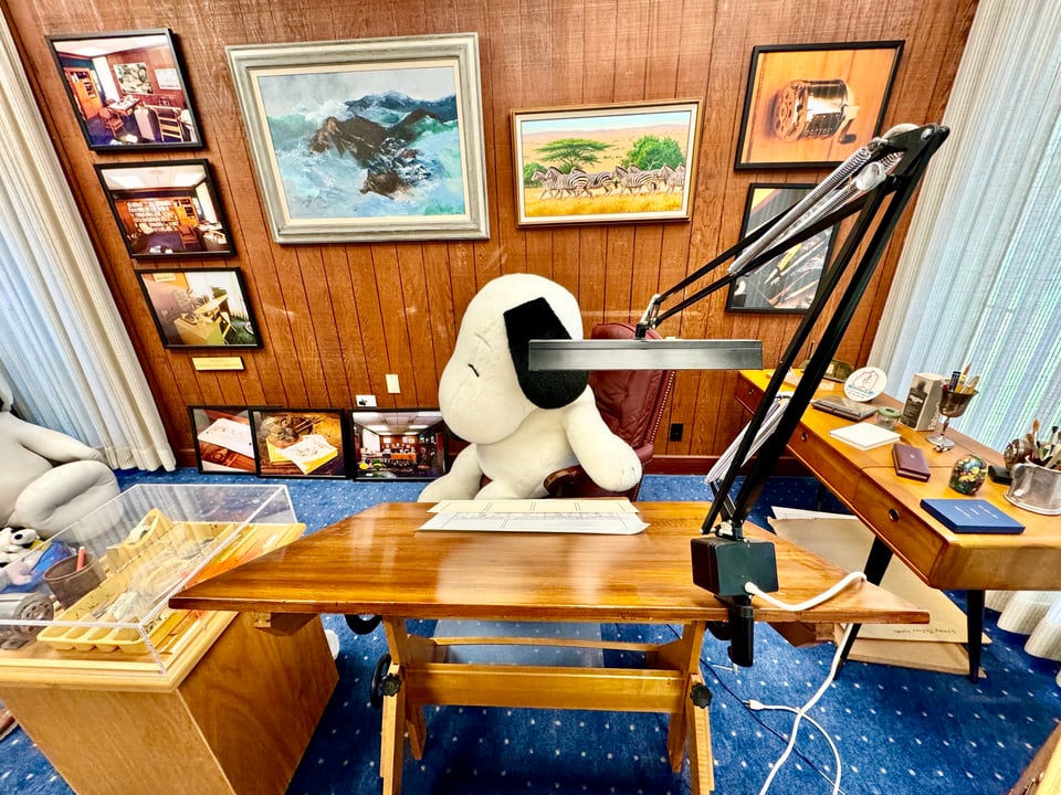
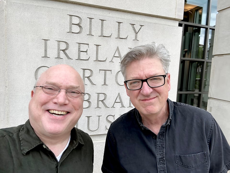
I’ve conducted nearly 100 hours of interviews so far, which have been supplemented by three research trips to the Billy Ireland Cartoon Library and Museum, a trip two weeks ago for research and conversation at the Charles M. Schulz Museum and Research Center and Charles M. Schulz Creative Associates, and remote research and conversation with archivists and librarians at five other institutions, including Yale’s Beinecke Library and Archives Canada!
Are you curious who I interviewed for the book? My list so far is (name plus their cartoon(s), book(s), or other credits):
…Barbara Brandon-Croft (“Where I’m Coming From”), Bill Griffith (“Zippy the Pinhead”, Invisible Ink, Three Rocks), Brian Walker (comic historian, museum exhibit curator, creative team for “Beetle Bailey” and “Hi & Lois”), Bryant Alexander (professor and dean at Loyola Marymount University, author “A Tribute to Franklin: A Comic Appreciation”), Dave Kellett (“Sheldon” and “Drive,” plus the co-creator of the movie Stripped), Derf Backderf (“The City,” My Friend Dahmer, Kent State), Eric Reynolds (vice president and associate publisher, Fantagraphics), Garry Trudeau via email (Doonesbury, Rap Master Ronnie), George Corsillo (colorist of Doonesbury and collaborator with Trudeau on books, special projects, and ephemera)
…Georgia Dunn (“Breaking Cat News”), Guy Gilchrist (“The Muppets” [1981–1986], “Nancy” [1995–2008], among several others), Jim Keefe (long-time colorist, former “Flash Gordon” artist, current “Sally Forth” artist), Joey Sayers (“Thingpart,” writer of “Alley Oop”), Keith Knight (“K Chronicles,” I Was Teenage Michael Jackson Impersonator), Alexis Fajardo (editorial director, Charles M. Schulz Studio; cartoonist of “Kid Beowulf”), Luke Coleman (animator and cartoonist), Lynn Johnston (“For Better or For Worse”), Matt Bors (editorial cartoonist [retired], Justice Warriors, publisher of The Nib), Meg Cullen (letterer and colorist for “Prince Valiant” [1991–2004])
…Nick Galifianakis (cartoonist, Washington Post), Paige Braddock (chief creator officer, Charles M. Schulz Creative Associates; cartoonist “Jane’s World”), Peter Maresca (publisher, Sunday Press Books), Rich Dana (CHEAP COPIES!: The Obsolete Press Guide to DIY Hectography, Mimeography and Spirit Duplication), Rick Kirkman (cartoonist and co-creator, “Baby Blues”), Robb Armstrong (“JumpStart”), Sean Kleefeld (Webcomics in the Bloomsbury Comics Studies series), Shena Wolf (formerly, Andrews-McMeel Universal; currently, cartoonist agent), Steven Heller (designer and art director of many publications; Growing Up Underground), Susan Kirtley (professor, Portland State University; Typical Girls), Tauhid Bondia (“Crabgrass”), Tom Batiuk (“Funky Winkerbean”), Wiley Miller (“Non Sequitor”), and Will Henry (“Wallace the Brave”).
I hope to be speaking to Nicole Hollander (“Sylvia”) soon and I have continued to work to track down other artists who span eras as well as more modern ones who started in webcomics or made a full transition to them after working at newspapers. While that’s nearly 40 people listed above, I expect to have a lot more conversations before this book is locked and ready for the press. I have a March trip across New England and New York/New Jersey for research and interviews that will happen if (when!) the book is funded.
Only Trust a Licensed Ben Day Artist
When I looked at old cartoons before all the research I’ve done over the last few years, something that always struck me with my “printing hat” on was this: how did they make the tints?
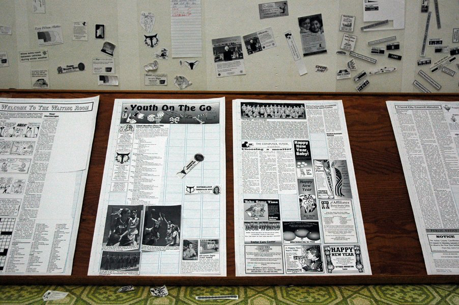
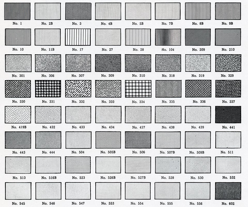
I knew how tints were applied starting in the offset lithographic and photographic production era: you could use sheets of Zipatone or similar products from Letraset (Letratone), Chartpak, and others. These sheets had printed patterns on a transparent, thin plastic sheet backed with adhesive. The patterns could be a tint (a regular matrix of identically sized dots), a gradation (from light to dark with dots in a regular pattern, but increasing in size), or novelty or other patterns, like stippling or lines.
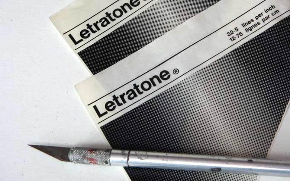
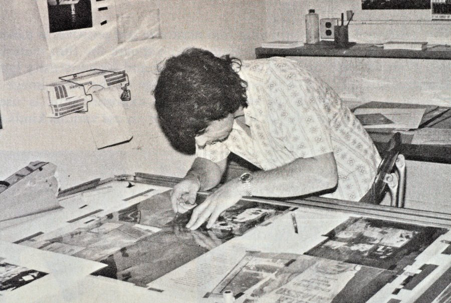
To use Zipatone, you cut it out with an X-Acto knife, carefully pulled it off its backing with the tip of the knife to release the adhesive, and placed it on your drawing board or photostat, laying it down gently in a rolling motion to avoid air bubbles. You would often use a burnisher to stick it hard when correctly placed. In some cases, you could remove the adhesive and lay it down gently, then cut out the shape you needed and pull up the remainder. The stuff was expensive! You used it carefully to avoid the ire of your boss or whomever managed supplies.
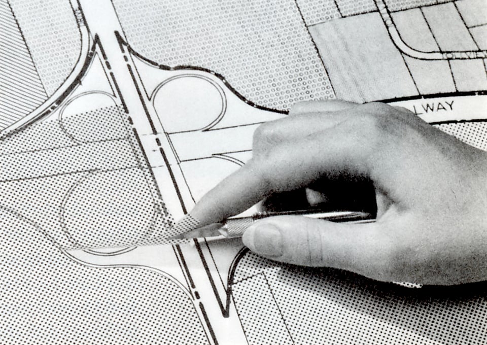
These tones or patterns were always combined with art—advertising, illustration, page layout, or comics. Then they were photographed on a stat camera to make a single seamless positive print for layout. (A stat camera was typically an overhead camera that shot a flat, evenly illuminated board.)
Or, the tint film was applied directly to items on a layout board and the entire board was shot as one or pages onto negative film in a special prep room. The film was “stripped”—cut out and assembled—and used to make the flat offset printing plates. (This photographic paper and negative film was high contrast: essentially, developed to black only with no gray tones, required for the black-only reproduction medium of printing.)
This I had lived through. It made sense. And I knew photographic negatives and positives were used decades before the full adoption of offset printing to etch metal plates for relief printing. But before that—seemingly from the 1890s through the 1950s—some other method was used. What was it?
Back in April 2023, on my second visit to the Billy Ireland Cartoon Library & Museum, I had a long chat with the curators about this. They had originals, color guides (marked-up color by cartoonists or assistants for engravers), etc., and none of us had the answer. I set out to get it. Oddly, right around that time, I got a call from an author looking for the same information for something they were writing. (I’ve now been an “old printing methods” consultant for three authors, providing free advice by Zoom.)
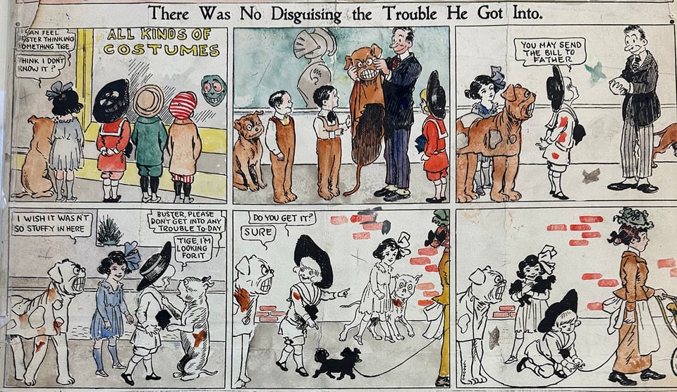
The reason none of us knew? It’s ridiculous. Largely forgotten, it took months of on-and-off again research for me to piece together the story. Once you understand what was involved, you will be amazed and admire the ingenuity. It blew my mind, and let me blow yours.
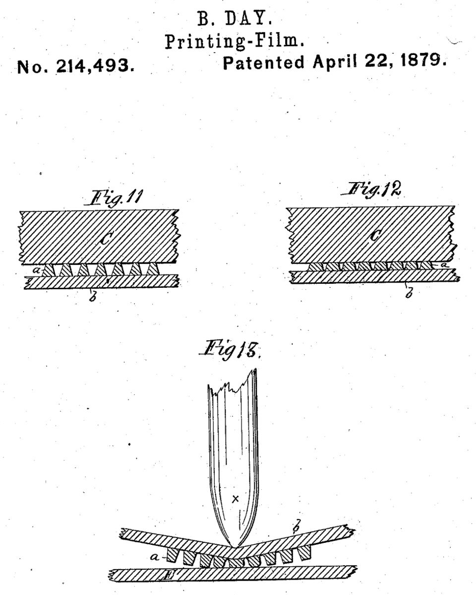
From the 1880s onward, for several decades, the way to apply patterns and tints to plates used to print works on paper for mass production—whether illustrations, ad inserts, or newspapers—was the Ben Day method. Patented in 1879 by Benjamin Henry Day, Jr. (1838–1916), the son of Benjamin Henry Day (1810–1889). The father created the first penny paper in 1833, when most papers were five or six cents, relying on ads instead of subscriptions—he’s responsible for the popular press, for good or ill.
Ben Day Jr. was an illustrator and inventor who developed his eponymous Ben Day process as a way of mechanically adding patterns to drawings. Guy Lawley, in his absolutely exhaustive and magisterial multi-part overview of the history of Ben Day patterns, believes that the invention was initially primarily marketed as a tool for chromolithography. Lithography was newly invented right around 1800 by Alois Senefelder nearly by accident. It’s a planographic or “flat” printing method that relies on selective drawing and etching to make some areas attract ink and others water. Prints are made by inking and wetting the stone, then running paper through a press. Unlike letterpress, which relies on a carefully calibrated relief surface, lithography is all about pressure.
Chromolithography, as you can guess from the name, was a way of producing multi-colored lithographic prints. These could be made quite cheaply by the 1880s compared to other fine-art reproduction methods that featured color and were used to make greeting cards, collectible prints, and other popular items.
The invention of photographic halftones, developed in the 1870s and perfected by around 1880, opened up a new way of looking at the world. Photographs were largely continuous tone images, with a range of gray from white to black created by the particular chemicals used in the negative and printing medium. Printing photos, however, was extremely difficult, as printing is a black or white medium: there’s either a raised surface holding ink or not in the letterpress or relief printing days. Lithographic printing of the 1900s could produce tone but not print in large numbers, such as for a newspaper. (Offset lithography, used for the majority of printed pieces since the 1970s, has the same limitation as relief: no tonal range.)
(I’m eliding a vast amount of detail about 19th-century photographic reproduction you can read in Richard Benson’s remarkable The Printed Picture; you can also watch his videos, which parallel segments of the book.)
Halftones, by contrast, can be printed in solid black or colored ink. The conversion of tones to solid inks comes by interposing a scribed screen—an etched piece of glass with regularly spaced parallel lines, for instance. By exposing a continuous tone photo through the glass onto a photosensitized medium, like a negative or zinc plate for etching, it was possible to convert grays into concentrations of dots. When printed, those dots appear to the eye as tints.
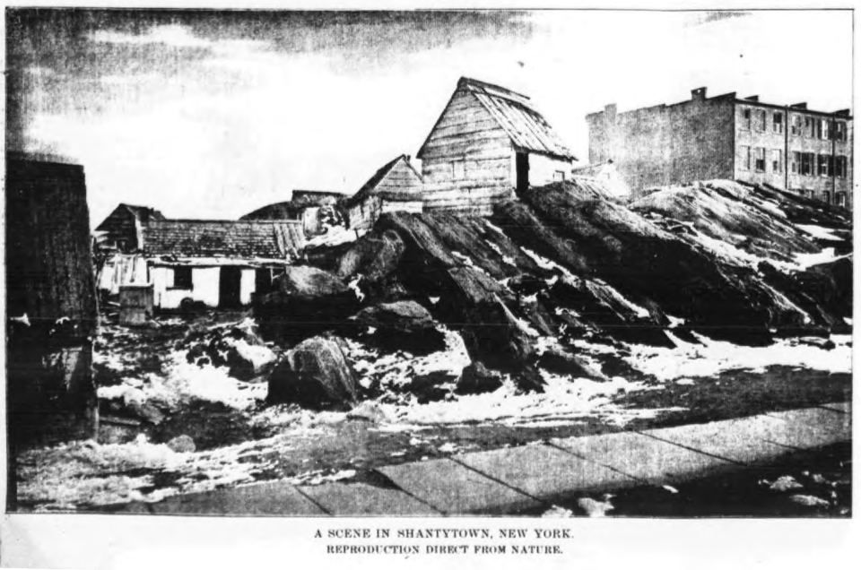
That was all well and good for photographs, but what about comics? Cartoons rely on a black line, and halftoning typically makes a solid black into a slightly screened set of large dots, thus pockmarking the black and making it poor for reproduction. You’ve probably seen this even in modern collections of cartoons or other printing: a drawing seems to be gray or mottled where it should be solid black.
Instead of screening a drawing made with tints, Ben Day created a way to apply regular patterns, whether dot screens, random stipples, lines, or other recurring elements. He created a set of what are typically generically called Ben Day screens, which were sheets of celluloid covered with tiny raised hardened gelatin dots and stretched onto a frame. The screen is locked into a Ben Day apparatus with a hinge, and placed above the artwork.
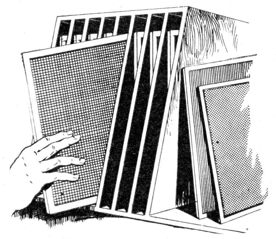
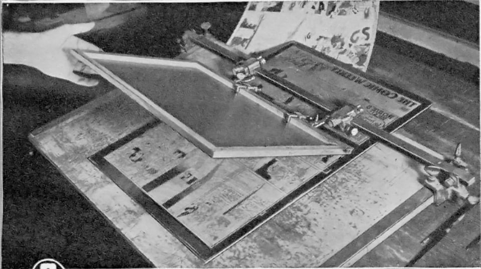
For putting tints directly onto a zinc plate for etching, the most common way that tones were added to cartoons—for daily black-and-white and Sunday color strips—the Ben Day artist would consult a color guide or other instructions provided by the cartoonist or an assistant, like a colorist, to identify the tones needed, as each tone required a separate pass through a different Ben Day screen.
Before applying the Ben Day dots or patterns, the worker paints, around all the areas that require the pattern with gamboge, a yellow, water-soluble resin, essentially masking those areas. Then, the screen is inked, and the frame tilted down on top of the plate. The artist carefully burnishes (or rubs down with a roller or other tools) the ink onto the plate. A Ben Day person knew techniques to apply the pattern perfectly evenly, to create the appearance of a gradation, or even to use the frame apparatus to shift the screen slightly in two directions to double the pattern.
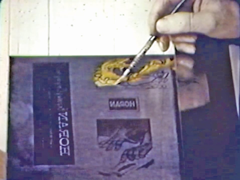
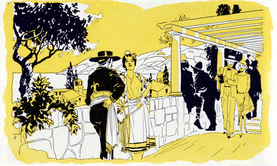
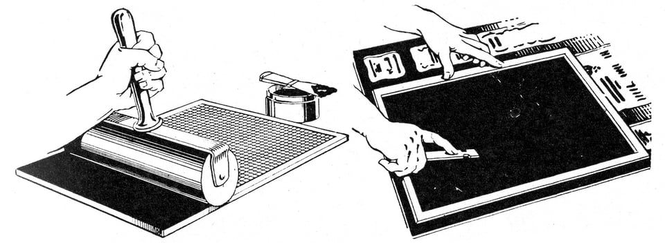
After each tint was applied to all gamboged areas, the resin would be washed off, which left the water-resistant ink undisturbed, and additional Ben Day screens could be applied. When complete, the ink would be treated to make it acid resistant before it went through a series of etching “bites” in a tank to gradually eat away the areas that were not to be raised to receive ink on a press.
If you think that’s complicated, think about color: for color comics, each color marked by a cartoonist or staff could require up to four separate tints in cyan or blue, magenta or red, yellow, or black. A Ben Day worker had to consult a color chart—or they had it memorized) to lay down a specific dot tint on each plate! A long-time DC Comics production manager, Jack Adler (1917–2011), worked earlier in his career in an engraving plant. He said in an interview with Brian Stroud in 2018, “[A] guy doing the Ben Day, putting the dots on, spent one week on one page. On ‘Little Orphan Annie’ and stuff like that.”
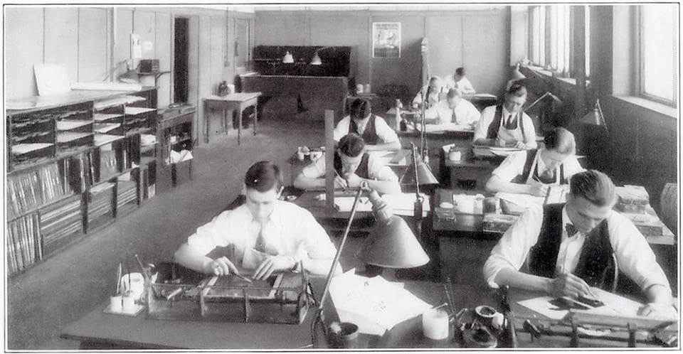
It should be noted that it appears all Ben Day artists were men. I have not found any reports of Ben Day women, only men, even though there were limited numbers of female cartoonists, Linotype operators, colorists, and other production people from the 1890s onward.
This was due to sexism and likely enforced by licensing: because the process remained under patent until at least the 1920s, the patentholder could control who was allowed to use the Ben Day process. Graphic Arts for Printers and Users of Printers (1914) wrote, “It will be well for the advertising man, unfamiliar with this process, to seek out an engraver licensed to use the Ben Day screens and patterns (this is a patented process) and study its possibilities.” Other sources suggest the machines were leased, not sold, making that the element controlled under the patent; the screen patterns were also patented at various times.
I have enormously more to say about the above, along with a huge number of illustrations and materials captured from all over that will appear in the book. If you found the above a little difficult to follow in text with a few pictures, you’ll find the book’s presentation of the Ben Day process, particularly for color, truly illuminating. Yes, I am sorry for that joke.
Add a comment: