The Lettering List 009 - Adapting for the Same Artist
Welcome to The Lettering List. I'm Hass, a professional comics letterer, and in each edition of this newsletter, I throw up some lettering samples and then talk a little bit about the craft of lettering comic books.
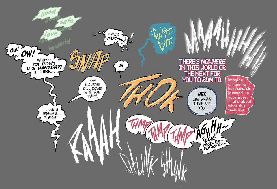
Without much more fanfare, here's some balloons that have been across the desk over the past couple of weeks:
There's a couple of balloons in there (that don't spoil anything) from The Infernals, which is a new Image series with art by John Pearson (written by Noah Gardner and Ryan Parrott). Working on the second issue of that recently, it got me thinking about John Pearson's art, and this being the third thing I've lettered that he has drawn, and how different the approaches have ended up being across the board. And this is, I think, an interesting facet of comic, where developing a style for one artist doesn't necessarily mean that's the only style you might ever use on their art, which is an insight, I suppose, into the role that the design of lettering plays in genre and tone of comics, too, rather than just specifically it being about working with the art style.
I think the first thing I worked with John on was the original pitch pages for Mindset, which was published by Vault and written by Zack Kaplan. That was a story about mind control and a kind of tech-thriller kinda deal, but the first thing I was looking at with that series was definitely John's art.
I decided to keep the hand-made quality of what John did with the panel boarders and things like that, overlaying strips of paper. So I hand drew every balloon (but not every caption) in that series, and every tail. The brush was a custom brush that had irregularities built into it and my own hand was designed to be a little wobbly, in my head I think I wanted to have this idea of it being like scraps of paper, but a little more substantial with the outlines. So there is a paper texture sat under every balloon, and then a transparent colour overlay to give it a bit of a hue shift. The colours would change depending on the scene (though the caption colours were constant for characters to distinguish voice).
John's style has such personality while also being (especially in Mindset) loose in approach. One panel might just be outlines, another might look like a pencil sketch, another a fully painted and rendered image - and everything in-between. And so I wanted the letters to be able to have some of that same looseness, too, to be able to mould and shift and change to what they might need to be in any given scene or panel.
Before we really got into Mindset, but after the style was figured out already, I lettered a short story John wrote and drew called The Ride, for the Razorblades anthology that Steve Foxe and James Tynion did over the pandemic.
This has the same hallmarks you'd anticipate with John's work, but the whole tone of the piece is so different. It reads as a much more direct address from the narrator. Where Mindset also used a narrator, it was used more as a way to bridge scenes, whereas in The Ride it was the main driving point of the story. We were hearing the words or thoughts of the narrator directly, and the images work more directly alongside that to bring the narrative to fruition. So I wanted to change the style and make this feel different to Mindset.
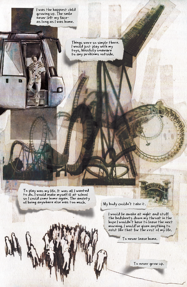
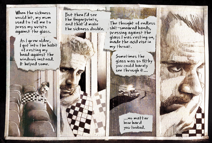
I also wanted to replicate the collage and layer effect that John has in his art, which felt especially connected to this story as it felt like a fundamental part of the storytelling. So I got these paper scraps and found a found that was a little scrawlier and less clean but still felt a little hand written. The ideal would probably have been to hand letter this on scraps of paper, print out the pages and layer them over and then take a photo of the finished page but sometimes you have other work to do and the page rate doesn't stretch that far, but I'd still love to try doing that with John's work at some point.
But I show this as an example for how the tone of the piece and the genre and the whole goal of the work can lead you to somewhere completely different in terms of the styles.
And then we started working on The Infernals, and I had to come up with a different approach for the lettering again. It's probably too late to preface all of this, but even if you aren't that familiar with John's work, it's probably obvious looking at the examples I've shown here that his stuff is also changing, too, so it's not like it's just the same style perfectly replicated and I'm changing the lettering. So there's also his work that is informing style choices in the lettering, but that's also being filtered through that same idea of genre and tone, too, (I suppose! We'd have to ask him).
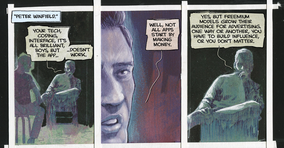
So for The Infernals I wanted to find something that was slightly cleaner, but still with some identity. There's the hard-edged balloons, no stroke, and balloon tails, and a pretty kind of straight-forward lettering font. But the difference here as compared to Mindset and The Ride is that I knew we'd have a lot of different voices and tones and factions (I guess is the right term), and so the style itself would be changing in different ways. I figured having something that sits nicely as the "baseline" style allows some of the weirder or more angelic and demonic voices work better in juxtaposition to a kind of standard speaking voice.
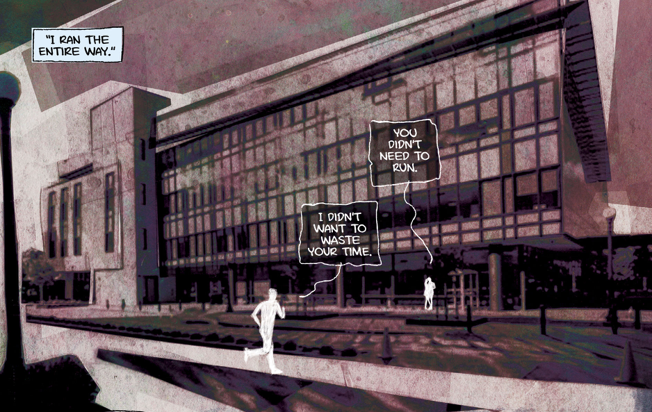
The line tails were there because there's something about scratchy lines that clicks to me with John's work, and I think lines are just extremely fun in terms of expression. Here's a small aside, but a line is really the simplest thing you can draw that still contains some form of expression (I think, anyway).
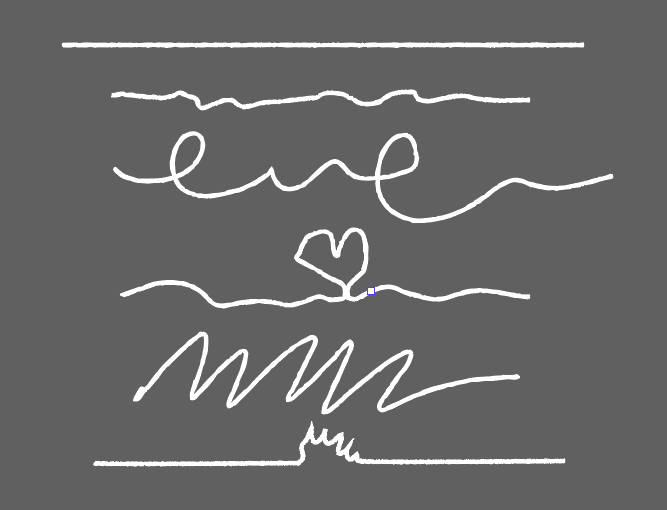
I don't know what those lines mean, but they mean something, right? There's something added to them, and you can do the same thing with tails, too, but this is just the completely reduced form of that. So there's something to be said for the elasticity of balloon line tails that is nice. And specifically John has the kind of art where they usually don't get lost, so you can get away with this style a lot easier than in some other types of artwork.
But getting back to the style, briefly, as this is already running a bit long, the style for The Infernals contains a lot of the same kind of thoughts and processes as what I did on other styles for John, but you can see some of the modifications and adaptations based on the tone and genre of the story, and what will be expected from the lettering as the comic continues.
I have no idea how to end this one, but just to say I think it's interesting to consider how genre plays a part in the lettering design even outside of the art style that you're working with. There are a bunch of considerations to be made when lettering (will you ever have to veer into a different style? is it always just humans speaking? do you need to change the volume and tone a lot?) that factor in outside of the decisions you make when matching style to the art.
Hass
Comics featured in the Lettering List this edition: Assassin's Apprentice, [Unannounced], [Unannounced], [Unannounced], [Unannounced], Midlife, The Infernals, Harley Quinn.
Sneaky plug for my graphic novel, THE UNLIKELY STORY OF FELIX & MACABBER - created with Juni Ba. It's available to buy right now: https://www.amazon.co.uk/Unlikely-Story-Felix-Macabber/dp/1506738222