The Lettering List 007 - ...
Hello!
Welcome to another edition of The Lettering List, a newsletter (by me, Hass, a comics letterer on things like Poison Ivy, The Flash, The Deviant, What's the Furthest Place From Here? and more!) about balloons and sound effects and, this time, punctuation.
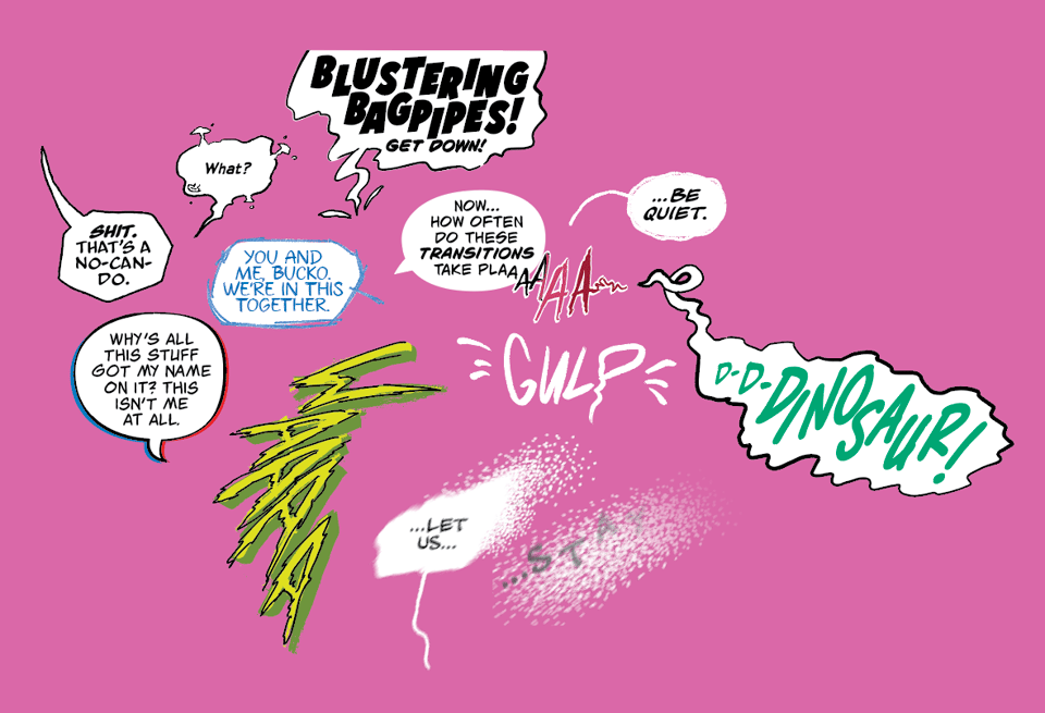
As usual, here's a smattering of balloons and shouts and gulps that have been across the desk in the past month.
The more work you do, the more you find that you have thoughts and opinions on very specific things in the world you work in. This is true of lettering as well, obviously. On average, I'm looking at around 400 pages of comics a month, which is quite a lot, and usually many multiple times that of my own word balloons. It's quite a lot.
Something that's been sticking lately is line breaks and punctuation and they can (and should?) work in tandem. Most editions of this newsletter have some variety of "comics are a weird medium", and this is no different, because the use of dialogue in comics is a really specific use of text, if you want it to be. It's not just prose, but there's a highly visual element to it, and the way you break balloons can be a useful tool in the presentation of it.
Before we get any further, I'm more than happy to accept that this whole concept is a product of lettering a lot of comics and only has a small impact (if any, you could argue), but what else is this for if not the trivial minutiae of lettering comics?
What I specifically want to hone in on is punctuation intended to create some kind of 'beat' in the language, in comics this is typically one of two things: double-dashes and ellipses.
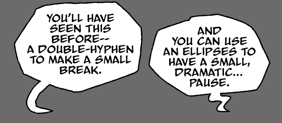
In comics we don't really have a lot of control on the way the reader reads, but we have a bit of control of the language to create an intended effect. A double-dash or an ellipses can be used at the end of a balloon to further heighten the effect, so you could take the above two examples there and reformat the, as this:
That's sort of a visual representation of what the punctuation is achieving in its "prose" form. In comics, I do like the this format, because it is visual, and to some extent we're creating the acting and visualising the effect of speaking by using the balloons in the first place. But! It takes up more space, and you could make the opposite argument, too, that the punctuation is already making that break, so why do we need the balloons to do that, too? And I would probably agree in a lot of cases, it's a good argument! (But it's less fun, so...)
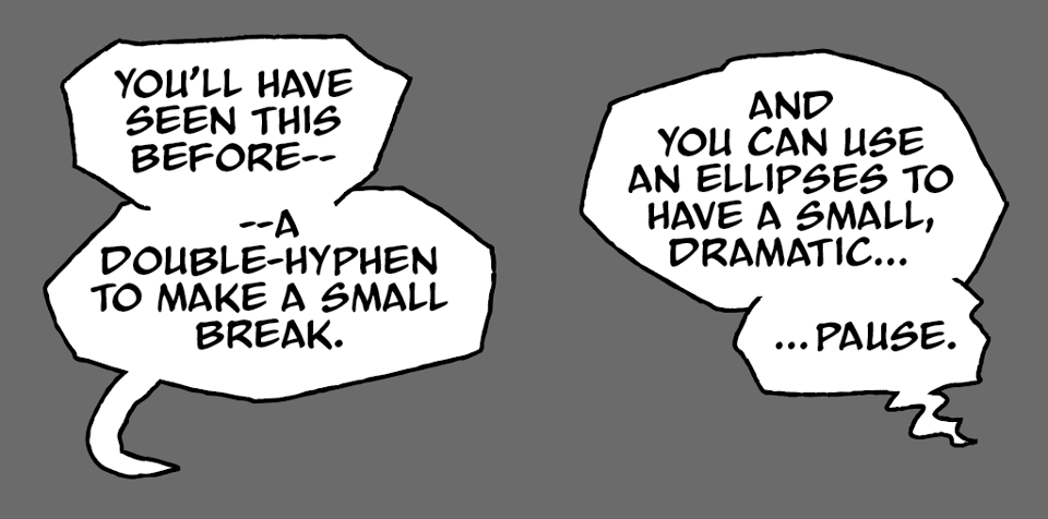
If we follow that logic though, there are things that letterers can do to help the visualisation of these ideas. My favourite (a rule I try and stick to, but sometimes edits and revisions make it a lot harder to work, but we're talking perfect worlds here) approach is to try and consider the line breaks to help punctuate (sorry) the punctuation. For example, you could stack those balloons like this:
Notice the A after the double-dash on the left side, and the PAUSE arriving immediately after the ellipses. The left side example is a pretty intense one, admittedly, but when I see this I try to make the change for a line-break, because I feel like I'm not hitting the beat properly. The small break that the double-dash creates is being broken by the immediate letter or word.
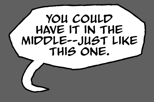
Again, it feels (to me) like we're crushing that gap without the line break. We're running straight through from middle to just like this one. And, yeah, that's just how sentences work--like this one here, you carry on and the world keeps spinning. But I think, again, there is a distinction to be drawn between the world of prosaic text and the visual theatrical dialogue of comics.
The same applies to the ellipses there, too.
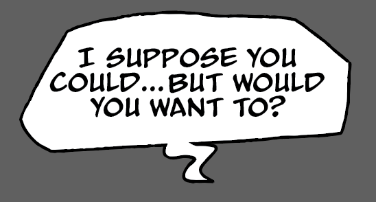
There's a little lingering pause there, a small buffer of space before the sentence continues on. But breaking that into a new line:
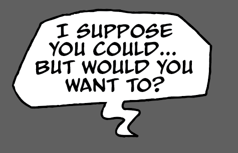
It just creates that space in a visual nature, which I think helps the flow of the balloon in a a nice way. It almost creates the effect of two bits of speech being placed in the same container, rather than it being one sentence running on.
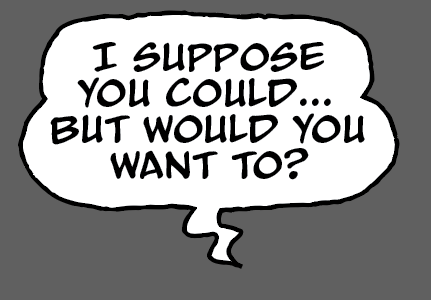
Here's yet another visualisation of that idea, which (to me) looks like two balloons that have been joined together into the same shape. But it's two bits of speaking, two breaths of speech, or whatever you want a balloon to represent in actuality.
This is all a long-winded way of coming back to that central idea of comic book dialogue being this hybrid of prose, design, and to some extent, cartooning. Everyone has their own approaches, rules, guides, everything else. I think what's especially fun about this is what works and makes sense to me might be completely different than another letterer or cartoonist doing their own lettering. One of the benefits of comics having quite flexible "rules" means anything can be anything. What a weird medium!
Hass
Comics featured in the Lettering List this edition: [Unannounced], Hawkgirl, Harley Quinn, [Unannounced], The Flash, Monster Fun, [Unannounced], [Unannounced]!
Sneaky plug for my graphic novel, THE UNLIKELY STORY OF FELIX & MACABBER - created with Juni Ba. It's available to buy right now: https://www.amazon.co.uk/Unlikely-Story-Felix-Macabber/dp/1506738222