The Lettering List 006 - City of Madness
Hello!
Welcome to The Lettering List. I'm Hass, a professional comics letterer. I've worked on things like What's the Furthest Place From Here?, Poison Ivy, NO/ONE, The Witcher and a few other things, too. One of those other things will be the subject of this one, after what you really came here for, a smattering of lettering images.
So the theme this time is about the lettering in Batman: City of Madness, which just came out this week. It's written and drawn by Christian Ward, who I've worked with before on Blood Stained Teeth and Machine Gun Wizards, but this was the first longer form thing I've done that Ward has also drawn. And it was clear early on that Arkham Asylum was a big inspiration for the approach, which means getting to dig back into some Gaspar Saladino lettering as reference points.
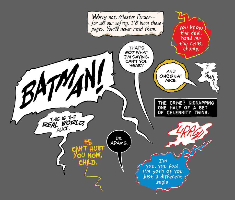
I like to throw in little references when I can (and it works for the work) in the lettering. When I lettered World of Krypton, I tried to bring some of the Workman-flair to the Next Issue caps, just as a small throwback to the series that had come before it. City of Madness was no different. There's lot of references within the story itself, and so I wanted to try and bring the same 'energy', I guess, to the lettering. Looking back at Arkham Asylum, there's lots of fun little things that immediately stand out. There's Joker's speech, which isn't in balloons, and is instead carved out against the art. There's Batman speaking in black-fill/white-outline balloons, there's the fun hand-written narration. There's just a tonne of hand-drawn elements that I wanted to try and incorporate in interesting ways.
This is a difficult thing to manage without it just feeling like you're replicating the style, but in some ways is made easier by Saladino hand-lettering it and me not doing that. It's never going to have all the personality of his letters, not by any means, but I wanted to use some of that established approach to kick-start what I would do. So I took some of those basic elements, like the black-fill/white-outline Batman balloons, and the wavy approach for some of the voices, and the big visual indicator of Joker's voice and tried to figure out how I could bring them into a style that also matched Ward's artwork. I think that black-fill/white-balloons for Batman are such a fun touch, because he does really speak different when he's in the costume compared to when he's out of it. For the right art style and right tone, I love it. (I used it on Batman Begins, too, in a sequence where Batman gets kind of lost in this magical dream maze thing.)
Using the Joker approach was fun (And leads to many, many issues, when having lettering that lives outside a balloon, but that's less interesting!), and made thematic sense in that it's used for the Batman Below, who is this sort of Lovecraftian version of Batman from Gotham Below. So the fact that his speech is different from everyone else's makes sense within the context of the world, as well as just a nice homage to that style with Joker. It's a strange, grungy font, but I think it gives a horrible and slightly gross edge to the dialogue, and completely removes Batman Below from feeling like he fits in the 'proper' Gotham.
I went with clean spherical balloons, in part because, again, it's not a million miles away from the style of Arkham Asylum, but also because I think it works nicely against the art in CoM, where there is a pretty clean approach to a lot of it. It also creates (I think) a kind of visual standard that the rest of the various balloons can play off of. So there's something grounded against the wilder or weirder balloon approaches.
The other major choices are Batman's narration, the Court of Owls and the Harvey Dent voices. The Harvey Dent voices are pretty solidly inspired by what Ward did in the art, and less from Arkham Asylum, but I guess keeping that concept in mind. They're hand drawn, irregular and with offset strokes, which is pretty much how Ward draws the interpretations of Dent in the series (it's really cool). The Batman narration was inspired by some of the design backmatter from Arkham Asylum, rather than anything specifically in the story. I thought it was a pretty specific approach to selling the flat, grittiness of the Batman voice in a really detached way (it's the least emotive looking thing in the whole book, I hope). The monospaced font helps, I think, and it just gives the whole thing a vibe of distant cold-ness, which is mostly what I imagine Batman to be like. The Court of Owls voices are essentially just distressed regular balloons that only come into play when the Owl masks have been put on, as though wearing the mask brings something unearthly or uneven out in the voices of those that wear it. (It could also just be they like to put on silly gravelly voices when in their masks, too, I suppose.)
It's interesting to see what handletter letterers used to do, and especially those like Saladino who were heavy on pushing the direction, and making the lettering be an intrinsic part of the experience. As is ever a recurring theme in this newsletter, the concept and approach and value, I guess, of lettering is very subjective. But for my money, Saladino's lettering on that book brings such an interesting flavour to everything that matches the visual approach, too, in a way that only comics can do. I think that's always part of the goal, and it's great to have something like that to look back on and see how the greats pulled it off.
Anyway, that's a little about the behind-the-scenes that went into Batman: City of Madness.
Hass