The Lettering List 002 - Really Nice and Clean Readable Traditional Comics Lettering
Hello!
Welcome back to The Lettering List for issue #2. As will always be the case, below is a handful of various balloons and sound effects from the past week or so (that “or so” is doing a bit of heavy lifting in some cases) from things I’ve been working on. And for this edition, I wanted to write a little bit about the process of “styles” for lettering, using a couple of examples from a book I’ve been working on recently (that is currently unannounced). But more on that after the List, which is what you’re really here for, right?
Never too much

No thanks?
 Looks like it hurt
 I'm losing you
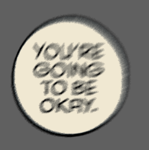
Because it's a superhero comic!
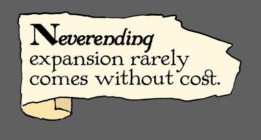
 Heavy, dude.
 That's good, get that down on paper.
Styles v1
 Styles v2
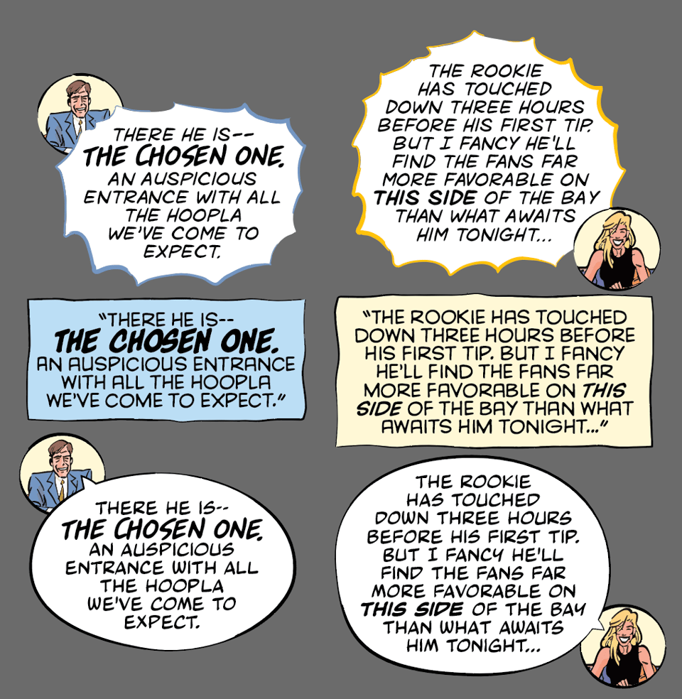
So the last few images there are what I wanted to dive a little bit more into. This is from an upcoming sports comic with Jack Mulqueen, Abylay Kussainov, and Jason Wordie (& me). The starting point for most lettering process is coming up with some different ideas that will work with the comic, and seeing what works best. But let’s roll it back a little bit. With digital lettering, one of the things that’s fun about it is the ability to be slightly more chameleonic, because you truly have so many tools and styles available to you. Ignoring balloon and tail styles, just the sheer number of different dialogue fonts that you could be using on a project means you can tailor what you’re doing to each new artist and genre and style. That sounds obvious, but (to me) as a letterer who is working across a bunch of genres and with a bunch of different artists, having that flexibility is a huge part of your identity as a letterer. Which, reading that back, is a funny concept, obviously. Your ability to blend and change and be different is your identity.
Now, there are some styles that I think will always just work. There’s just some clean, nice looking lettering approaches that, when paired with 99% of comics art in the Direct Market and YA/MG world, will be fine. It’ll be readable, it’ll not be distracting, it’ll do the job. But hey, look, we want to do something more than that I think. There are better paid places to just do the job, so the next part of that for me is figuring out what can bring some character and integration with the work.
So that’s what we get with these styles. For the main dialogue looks, they all share a lot of characteristics, because I knew there were certain elements that would work for the book and the art style. Obviously it would have a stroke, it would be a classic black border/white bg (because the pages mostly worked with black panel edges and a white background, it felt like it fit), and the fonts are fairly similar. I think these three stretch a scale of Readable Traditional Comics Lettering, going from slightly Bouncier Readable Traditional Comics Lettering (the example that uses Blambot’s Plot Holes font) to Really Nice and Clean Readable Traditional Comics Lettering (the example with Comicraft’s YadaYada), to Slightly More Pen-y, Fun But in a Different Way to the Others Readable Comics Lettering (the example with Comicraft’s Wascally Wabbit). They’re all in a similar space, but different amounts of bounce.
Plot Holes was the way we went in the end, I think because there’s a roughness and slightly bouncier feel to it (look at the leg of the L, the way the baseline seems to slightly shift, the lines feel like they all bend and curve in noticeable ways) that might the art.
The other main difference is the tails. Two are pretty similar, one with the tail connected and one with an overlap, and then there’s the line tails, too. I really like line tails because of how much expression you can give them. Not that regular tails don’t have that, but with a line I feel like there’s more room for it to do its thing. That’s an entirely personal depiction of the line, of course, but there’s a malleability to a line that I think is easier to accept within the context of the work. Or, at least, that’s how I can best explain it within this newsletter right now. Come back next time and I’ll have a different opinion on it, I’m sure.
And it was the line tails that won out, in part as a preference for the rest of the team, but I think there’s something in there about the flexibility of them that adds character to a comic art style that already leans into that style of things.
The brush strokes had similar qualities. All three have a sort of thick-n-thin thing going on, which is a default for me really, to emulate a real pen being used. The connected-tail version is the cleanest version of that, while the middle one has a smaller variation but a bit of a crunchier touch. The one that we went for is the leakier edition, where the pen starts and stops. I made this brush for this book specifically, based on a brush I’d made for Sword of Azrael (based on a brush I’d made for some sound effects in Bloodshot…), because it matched how the artist would leave ink lines open in various places on figure outlines and things like that. I really wanted to capture that same quality in the balloon stroke, too. So I took the old Sword of Azrael brush, and I added a layer or two on top of it and changed some of the breaks so that it closer matched Abylay’s lines
The other style choice was figuring out how to do the overlaid narration. It’s a comic that has a few different types of overlaid narration, between an authorial voice narrator and then a handful of pundits who run some of the story through news and TV “talking head” style snippets. The traditional way was through captions, but there’s something about having duelling caption types that I didn’t want to do too much, and the TV pundits were so instrumental to the process (and so recognisable for sports fans, too) that I felt like they needed a little something extra. And I’m a big fan of the little manga (and elsewhere) trick of having a little head pop-in to deliver some dialogue, so one of the options I offered up was the characters speaking next to a balloon.
Which was ultimately what we went with, alongside some more traditional dialogue captions for when regular scene dialogue floated over some over imagery.
I wanted to shine a little light on just some of the decisions being made when you see some finished lettering in a book, and I’ll write more about examples of specific balloons that have occurred into a book next time, rather than the styles before you actually get going in earnest, but thought this might be a fun training ground before getting into that next time.
If you made it this far through the words, thanks for reading, and let me know if there's anything else you'd like to see in the Lettering List.
Hass
Comics featured in the Lettering List this edition: [Unannounced project], The Witcher, Time Before Time, [Unannounced Project], Hawkgirl, [Unannounced project], and, yep, you guessed it, [Unannounced project].
Sneaky plug for my upcoming graphic novel, THE UNLIKELY STORY OF FELIX & MACABBER - created with Juni Ba. It's available to pre-order now here: https://www.amazon.co.uk/Unlikely-Story-Felix-Macabber/dp/1506738222