Abe's Art+Code Journey // Coming art fair // May 2024
Hello, dear friends and Patreon supporters!
In 4 days, my train trip to the Adela Festival of Generative Arts will begin. I will participate in the Parameter Generative Arts Fair. It will be my first time in Ljubljana and my first time participating in an art fair. I wish I had time to explore the city, but the Portishead singer performs on Sunday, and to make it on time, I'll take the train back at 5 AM. That's 21 hours on trains and 4 hours at the art fair. Fortunately, I like trains, and they are usually quite comfortable.
I started writing this newsletter one week ago, knowing I had to send it before the tsunami of tasks found me. But I failed. Every morning, I opened this text and had it wait the whole day while I cut papers, changed pens in the pen plotter, and plotted new designs. At the end of the day, I felt too tired to construct coherent sentences. But this time, I'll manage :-)
Plotting, plotting, plotting
In recent weeks, most of my focus has been on plotting artworks. I use a pen plotter, a computer-controlled output device, to draw on paper with a brush or a pen.
I started preparing for the fair by buying paper in 3 sizes, A3, A4, and A5, in two different colors: black and sepia. Fortunately, a Boesner store near the studio has three floors full of art supplies.
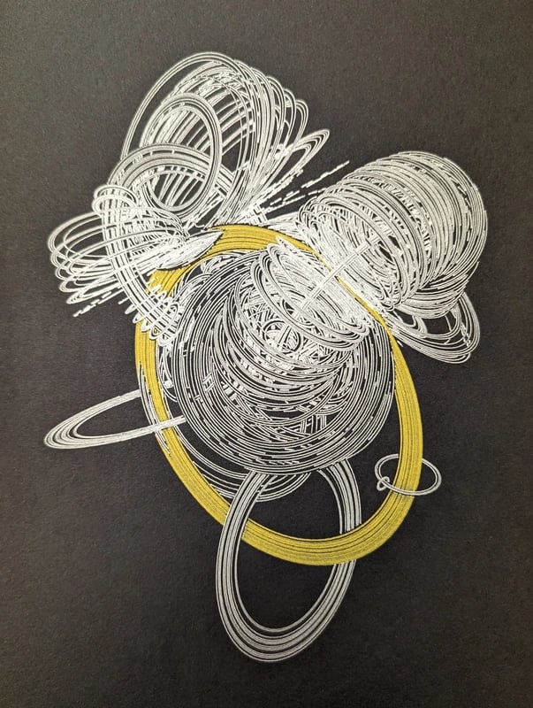
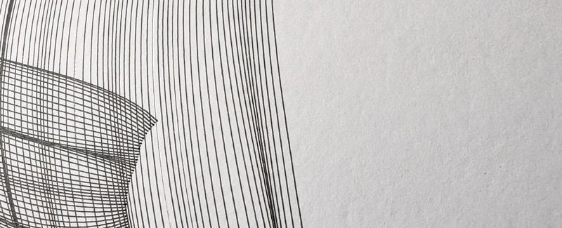
Black A4 paper, silver and gold ink.
I didn't research the ideal kind of paper online and just followed my instinct. The 250g/cm² Clairefontaine felt good enough to me.
I made two mistakes when choosing the paper. I bought blocks with all the sheets glued to one edge. I have learned how to quickly separate them with a scalpel. After separating the sheet, I must remove the glue on the edge by cutting away half a millimeter. Next time, I should buy loose sheets of paper to avoid these unnecessary steps. Less things that can go wrong.
The second issue is that the sepia paper feels too dark, which reduces the resulting contrast, especially when drawing thin lines with a 0.4mm pen.
The sepia paper works better with a brush because the thicker strokes produce a higher contrast.
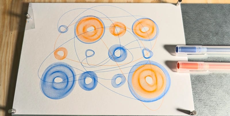
All the designs you see in this newsletter were generated by code. I work by writing computer programs that output files that I send to pen plotters. Sometimes, my programs have a simple user interface to move points or adjust properties. In most cases, there is no user interface, and I change the code repeatedly until I'm happy with the image it produces.
There are several things I like about using a pen-plotter. One is that something living only inside the computer suddenly exists outside it. Another is the non-digital aspect. You see, on the computer, things are "perfect". Every pixel has a precise color, and you can find out which color it is by reading its red, green, and blue levels. Curves have vertices with exact coordinates. Designs can be reproduced endlessly without any loss in detail. On the other hand, every plotted design becomes slightly (or very) different, depending on the pen or the brush used.
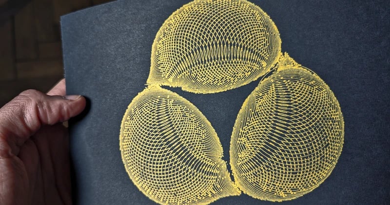
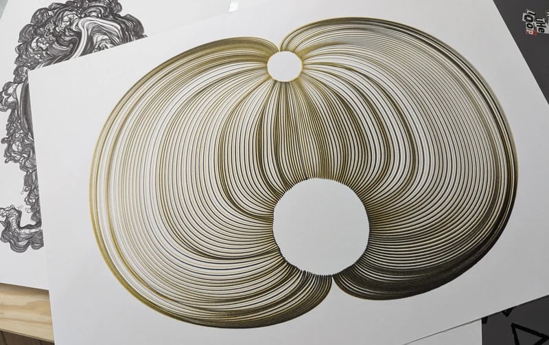
Let me give you two examples. I plotted four copies of the image on the left, and they all look different. I used a special pen my friend Grit gave me for my birthday (thank you!). From a certain angle, all copies look green. But when I tilt the paper, each plot shows different red areas. Magic :-)
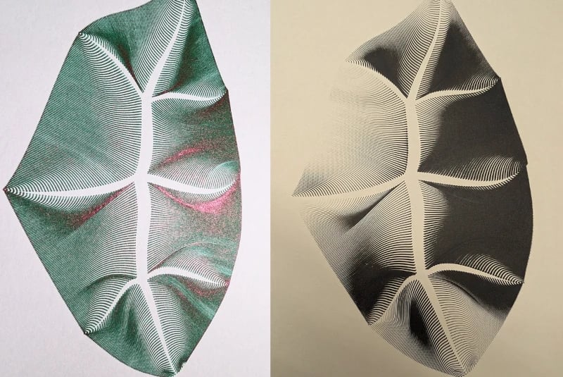
Another fascinating example is the image on the right (black on sepia). The thickness of the lines varies greatly. What happens is this: the plotter starts to add wet paint to the paper. I configured the height of the brush to barely touch the paper, producing very thin lines. But when the paper starts to get wet, it rises. Raised paper is closer to the brush, producing thicker lines. The paper behaves as a very slow wave in the sea, moving up and down depending on the humidity. It made me so happy to see this happen :-)
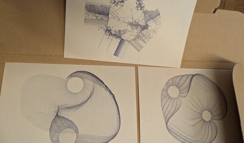
Since I was unconvinced about the sepia paper, I returned to the shop and bought a block of white A3 paper. I decided to skip the smaller paper sizes because I can easily cut A3 sheets in two or four, letting me decide on the final size afterward. I prefer this flexibility.
During these weeks, I made numerous mistakes and learned from them. I like how feelings slowly transform from insecurity to confidence while unknowns become understandable. When plotting an image, one can configure many settings: the horizontal and vertical speed of the pen, its high and low vertical position, the order in which lines are drawn, and more. Each setting can impact the result.
Things I learned
Note: what follows is be rather technical. Feel free to jump to the images and skip the rest :-)
Before plotting, align the pen with the top-left corner of the paper. Once, I forgot to do that, and the design was off-center. One could even break a pen by drawing out of the paper and then hitting the edge of the metal plate (if you use one).
Another way to forget to align the pen is to press the pause button and restart the plot without moving the pen home. One more way is to align the pen to the corner of the metal plate instead of the corner of the paper. They should be been in the same location, but once, they were not.
Solution: crop the paper.
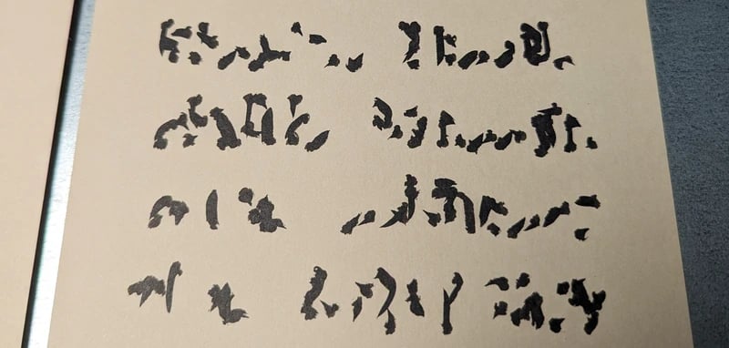
If I draw many times over the same area before the gel ink is dry, the pen starts to remove old ink and make a small mess. Initially, I thought this was terrible. Now I'm starting to like it. Very organic :-)
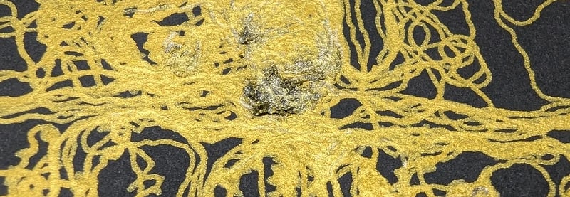
It became silver-rusty looking.
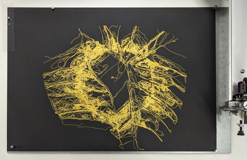
I can think of two solutions for this. One is to draw over an area only if it's empty or already dry. Sorting the lines in a way that lets them dry first is difficult, so I tried a different approach: process my design by removing overlapping segments. Here is what it looked like:
overlap other line segments.
Sometimes, a plot is almost perfect, but one or two lines are missing. What I do in this case is to plot the defective lines again. It's essential to keep the plotter motors running. Otherwise, the lines will not end exactly at the expected location.
A classic issue: run out of ink in the middle of the plot. The easy solution is to throw the unfinished plot away and start again. But I've been collecting my mistakes with the idea of painting a second layer over them. I think the mistakes can serve as an interesting background. The working title for this collection is "It's not a bug; it's a feature."
This is a funny one: you're in the middle of plotting when you accidentally close the laptop lid, and the plotting stops with the pen on the paper. It happened to me as well. Luckily, I wasn't using a pen with liquid ink (otherwise, it would produce a big dot on the paper). After panicking for a few seconds, I opened the laptop lid, and it continued as if nothing had happened! Incredible!
This one cost me three A3 plots, and I think it's a bug in the Axidraw software: There is a setting called "Randomize starts of closed paths." That sounds like it should affect closed paths like the letter "o," right? Well, I had this setting enabled somehow, and I plotted many open curves with a brush. The plotter would change the drawing direction in the middle of the plotting. Changing the drawing direction with a brush is terrible. It makes one line look different from the previous line. First, I thought it was a mistake in my design. I checked, but it wasn't. Then, somehow, I turned off that setting, and suddenly, everything looked great. Surprise surprise!
One final thing I have learned (or re-discovered) is that mixing pen types doesn't work, at least for me. The first time I tried, I was very shocked. I painted with one pen and then added a layer with another pen. When I looked at the drawing the next day, it had almost disappeared! The two inks somehow interacted with each other.
More reminders for my future self:
Use the Axidraw command-line tool instead of the Inkscape tool for plotting. With it I can save the plotter configuration per design. Super useful. Or write my own plotting software integrated into my design tools, so I don't need to open Inkscape at all.
Keep a spreadsheet of plotted images since day 1. It's easier than creating the spreadsheet after two weeks.
Write notes into the spreadsheet after every plot. What went well, what didn't, and what would I like to try next time? I did this, and I found it very useful.
The end
My typing rate is becoming slower and slower as people slide into their beds and dreams. It is time for me to end this month's newsletter.
But not before one final pen-plotter story: my partner visited the MUJI shop in Berlin. She asked me if I wanted some of their pens. I didn't expect wonders because they're not an art shop. But I was curious, so I asked her to bring me the ten-color 0.38mm gel-ink set. And they did surprise me. The pens come with a tiny seal on their tip to avoid drying. And they write so well, thin, bright, and crisp!
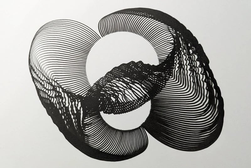
I plotted one image with their black pen, which has been my favorite so far. I think it has too many lines, creating some embossing or 3D relief effects. You can see it in Ljubljana if you are there next Saturday :-)