New in v1.4 & Reflecting on 1 Year 🥳
What’s new in Font Proofer version 1.4, what’s coming soon, and reflecting on how to define success for a creative project.
A few months ago Font Proofer had its first birthday! To celebrate, I launched version 1.4 with a couple frequently requested features.
And because I’m a bit late in sending this newsletter 😅, I’m already close to having a beta of the next major version, with a new Glyph Grid layout! The biggest update yet. If you’re interested in testing the beta, reply and let me know!
What’s New in Version 1.4
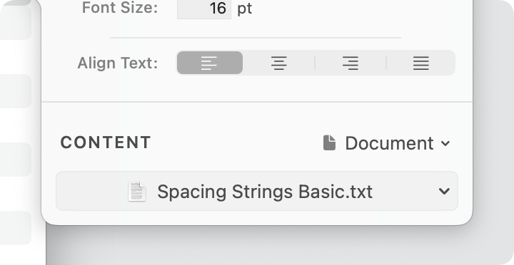
- 📄 Use a text document as the content for a proof section. This new option links your proof to a text file, allowing you to define your favorite proofing text in a central place.
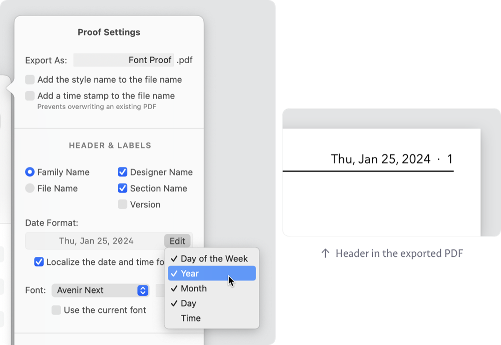
- 📅 Choose which parts of the date and time to include in the proof header. For example, some designers prefer to hide the time and day of the week if their proof is for a client.
- A bunch of 🐛 bug fixes and 🎛️ UX improvements.
Check out everything new in the 🗓 Version History →
One Year Old, Defining Success
A good friend and mentor told me that his favorite definition/metric of success for a project was who it allowed you to spend time with. Who are your collaborators, customers, and audience? Does the project bring you into contact with people who you admire and enjoy spending time with?
I love this. It feels like wisdom. It disarms the conventional notion of success, which is so rooted in capitalism and external validation that it’s always out of reach.
The best thing about making Font Proofer have been the conversations and connections with type designers from around the world. Every week I’m talking with someone new. Our conversations are informative, inspiring, and energizing. They reassure me that this project is important and has potential. They feel like success.
Seeing the tool help creatives make better type and enjoy the process more is another success metric. Check out the Made with Font Proofer section below and in the last issue.
Of course, we can’t fully ignore money, even if it isn’t the motivation. Font Proofer is still far from being financially sustainable. I don’t care about it being very profitable and I doubt it ever will be. Sustainability is the goal. It’s the goal because our community needs and deserves a tool like this, and we need to be able to rely on it over time. I still believe this is possible, and your support is noticed and impactful.
I truly feel like this is just the beginning of a long, exciting journey and I’m deeply grateful to share it with you.
What I’m working on:
I’m making steady progress on the roadmap! Here are some of the features I’ll be releasing in the coming months:
- 🔠 Glyph Grid layout: I’ve rewritten Glyph Grid from the ground up, adding tons of requested features—like slanted side bearings, vertical flow direction, and much better layout of narrow or zero-width glyphs.
- 💤 Compare every glyph in multiple font styles with the Glyph Grid layout. I’ve received so many requests for this, and I can’t wait to unveil my solution. It’s the next killer feature. Check out the mockups and description on the Roadmap.
Do you want to test these features before they launch? Simply reply to this email and let me know!
Made with Font Proofer
I’m in awe of what Font Proofer users are creating. If you’ve made something with Font Proofer, let me know—I’d love to celebrate your hard work!
Here are some recent releases:
Tré, by Vocal TypeTré Seals 
|
Name Sans 1.0, by ArrowTypeStephen Nixon 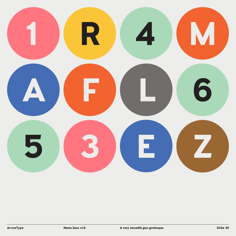
|
Viroqua, by Mark SimonsonMark Simonson 
|
Ojuju, by Ụdị FoundryChisaokwu Joboson 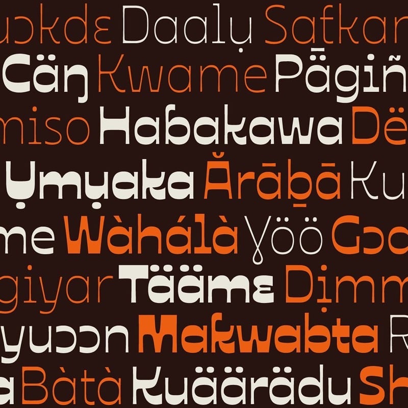
|
Forager, by Dingbat Co.Jacob Cummings 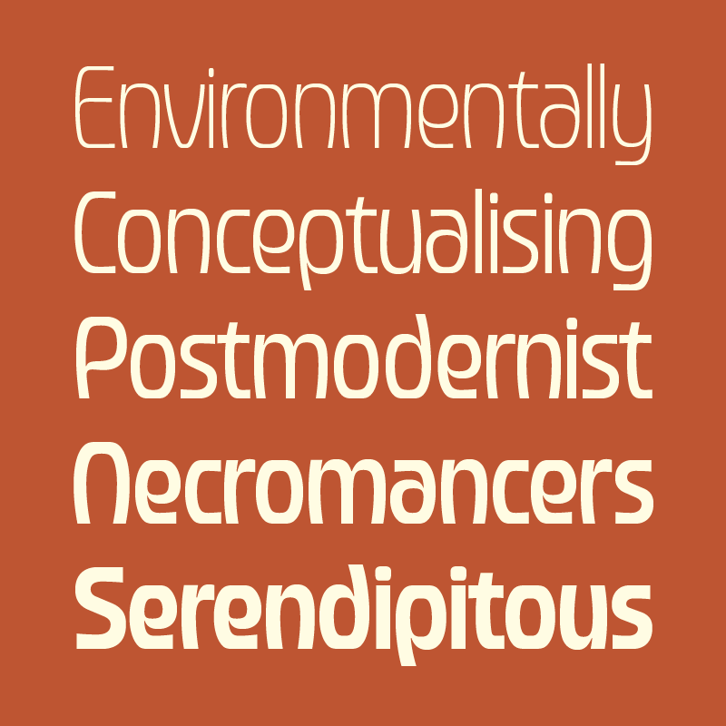
|
Oculi, by JTD TypeJames Hultquist-Todd 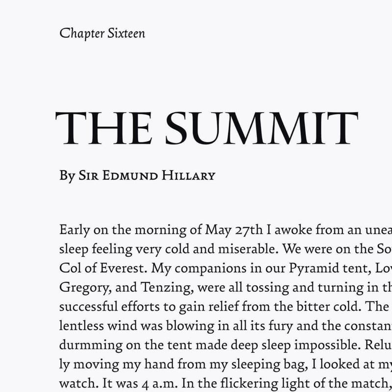
|
Antic, by Manic TypeJamie Chang 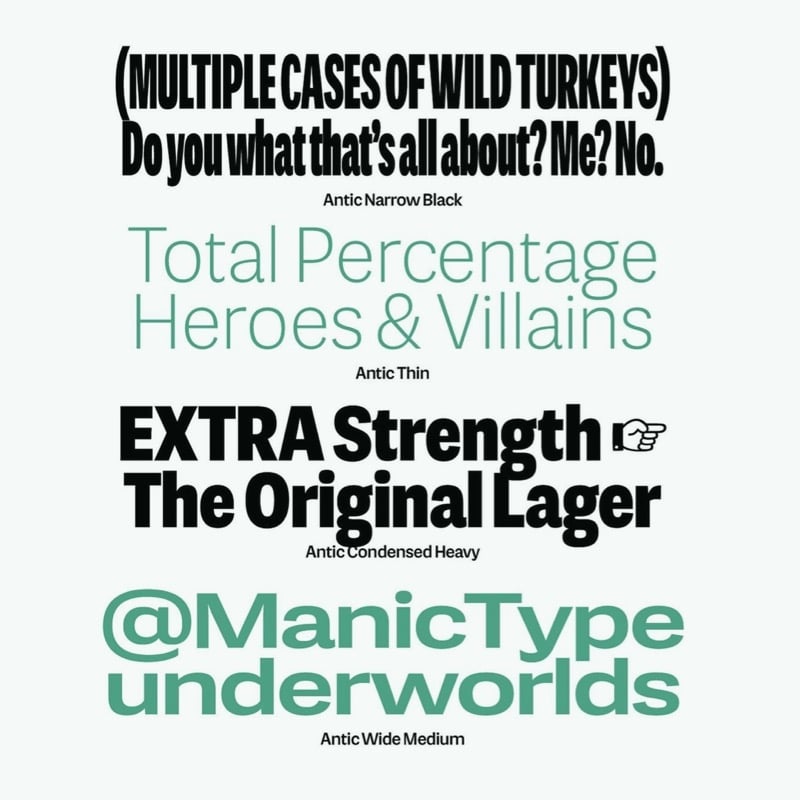
|
Blackbird, by Fort FoundryMattox Shuler & Brian Brubaker 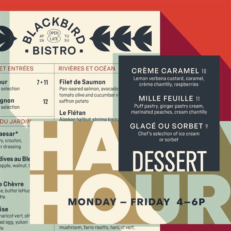
|
Thank you for being part of the Font Proofer family. You inspire me every day!
Peter
Peter Nowell
Creator, Font Proofer