The font robots still need to work some bugs out.
Hey, font freaks. Just a heads up that this newsletter contains affiliate links. So basically, I get a percentage of every font or book you purchase, at no cost to you. You get a nice thing and I don't feel as guilty as I would setting out a traditional tip jar.
When family visited a few weeks ago, I did the unthinkable: I went outside. I even touched some grass. That Saturday, we went to Universal Studios Hollywood, and I took some pictures of nice fonts to scan later. Uploading these images to popular font matchers (I used WhatTheFont and Font Identifier) made the OCR robots lose their damn minds! So if you're worried about a robot uprising, maybe stop. They can't even figure out what typefaces are yet.
While font matchers still have a long way to go, they can still be a helpful tool to discover what you like! Even though the guesses were way off, I found some interesting results from uploading pictures. Try it out with the next font you see out in the wild! No exact matches this time, or even affiliate links, but enjoy some anecdotes from Universal. And as always, a nice freebie at the end.
Universal Plaza sign

Taylor's notes: I did warn my brother about this beforehand, but he was still perplexed when I came to a full stop on the sidewalk. To be fair, the Universal Plaza sign and building are very pretty, especially on a rare overcast day. Et tu, brutalism?
Easily the most straightforward font upload. The other two did not, uh, fare well on WhatTheFont.
Most interesting WhatTheFont result: Europa Grotesk SH
Simpsons Duff logo
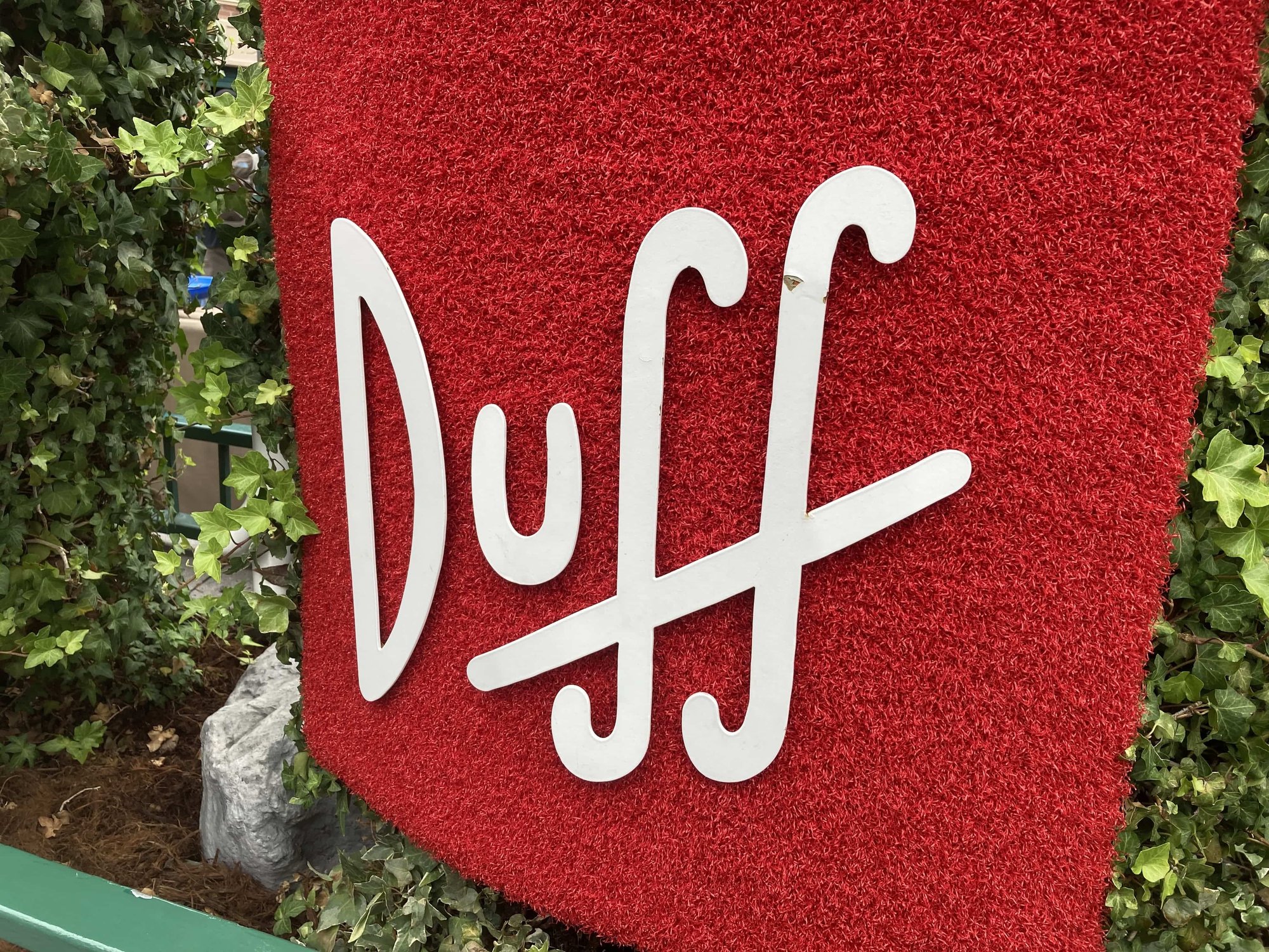
Taylor's notes: I haven't ever watched the Simpsons at length, but both this logo sighting and the Krusty ride were pleasant surprises! It felt very House Industries to me. On some level, I knew the Simpsons was self-referential and metatextual. The combo of the font and the ride really underscored how true that was and how long the shambling corpse of the series has lasted.
Uploading this to WhatTheFont sent it into what I can only describe as a total shutdown. Blank results page, no error message. My working theory is that the double-f ligature killed it. Anyway, I swapped over to Font Identifier for the rest.
Most interesting Font Identifier result: Chinchilla Regular
Minion Café lighting

Taylor's notes: This was the most tastefully laid out indoor space in the park, and there's no way I can make you believe that. The minions, irreverent little shits that they are, know their way around a basic shape. The food was pretty good too.
This also sent WhatTheFont into full meltdown despite having pretty legible examples, so back to FontSquirrel it was.
Most interesting Font Identifier result: Dylan Condensed
Boo! It's A Free Font!
Lift Type, a French font foundry that is, to be honest, very much out of my price range, is giving away a Halloween-themed family. It's cute! Get on it!

Bouuuuuh, by Lift Type
Other Things I Did
My new gig at Press SPACE to Jump is still in between "holding pattern" and "full swing," but I wrote about Marvel Snap(the new free-to-play card game) in the meantime. I'm just as surprised as you are. Expect more JRPG-adjacent coverage from me soon!
That's all for now!
-Taylor