
When the economy seems good in numbers but feels bad in reality
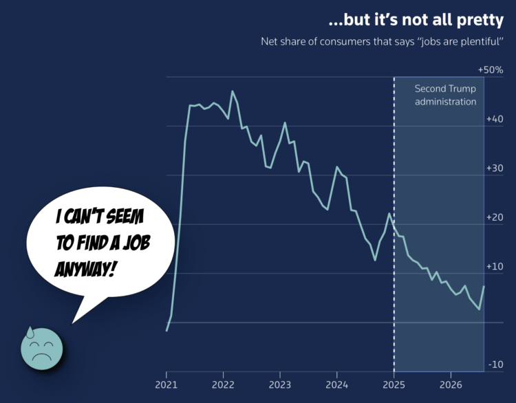
When you think about how the economy is doing these days, it can seem bad when you know people out of work and wages are not keeping up with inflation. The economy can seem good though when the unemployment rate is relatively low and spending is up. For Reuters, Prinz Magtulis and Ann Saphir use a set of line charts to show two perspectives of the economy.
The icons for happy and sad feel like corporate PowerPoint, but hey, if it works it works.
Tags: economy, perspective, Reuters
FlowingData is 100% made possible by supporting members. Become a member today and get access to courses, guides, and more resources from this real person (me, Nathan).
Don't miss what's next. Subscribe to FlowingData Daily: