The ABCs of NYC
Read about my collection of New York typography and the history of gay life and AIDS activism that it reveals.
When you are an anxious person, a common piece of advice is to connect with the tangible reality around you by listing things: five things you can see, four things you can hear, and so on. Moving to New York in 2022, I methodically counted and listed things: how many steps it took to make my way up to our apartment, counting down until the light turned green when I was cycling, timings that I would do certain things during the day.
One of the ways I soothed the loneliness of moving here was to obsessively photograph and categorize the typography I saw while I was walking or cycling around: subway signage, laundromats, moving vans, delis, packaging, delivery trucks, diners. Absorbing myself in what I could see around me not only kept me present but connected me to other New Yorks: older ones, ones more vibrant and colorful, less afraid, truly twenty-four-hour cities.
I also started this newsletter. Every month, I would count up to three in art, design, films, books, food, typography. At times of upheaval, the smallest of everyday pleasures can form a rhythm to your life that takes the place of the familiar. This is that newsletter, although I have decided going forward to forego the counting.
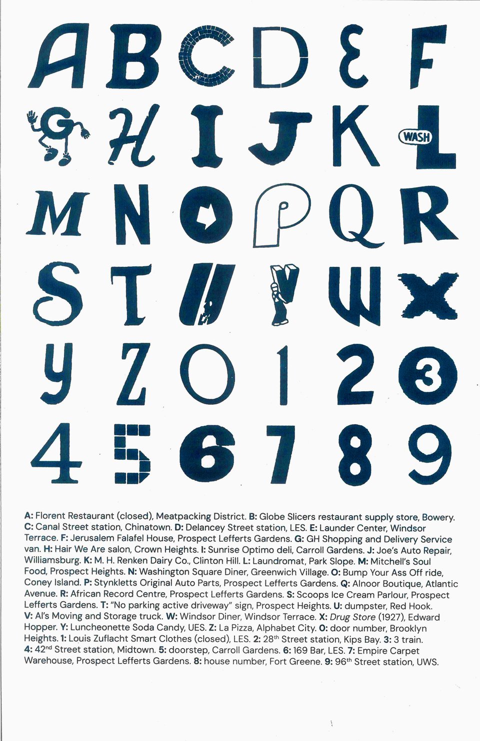
This week, it is about a recent project, the culmination of the New York found type project: a poster that I screen printed showing the ABCs of New York, made up of glyphs I have ‘found’ all over the city (mostly Brooklyn and Manhattan, being the boroughs I spend the most time in). It is a type specimen of a real but fictional font, of a local vernacular visual language, a sampler of a speculative typeface.
The threads of inspiration for this project came not just from the signage that surrounds me, but also from the very first lists we make as children: our ABCs and 123s, as I saw all over again when I was a school professional for a kindergarten class in 2023, and as I see now as my nephew grows up and learns how to read and write, and thus how to make sense of the world.

Out of over 700 photos that I had collected, I chose the characters that I would screen print based on a few factors: which ones would give me greatest variety in style, location, type of signage, and the community that it reflected. These 700 (now over 800) photos were not gathered from any particular mission or pilgrimage made to any specific signs. They are simply what caught my eye on my walks. The funny thing is though that often these signs reveal a rich history that I had by chance captured.
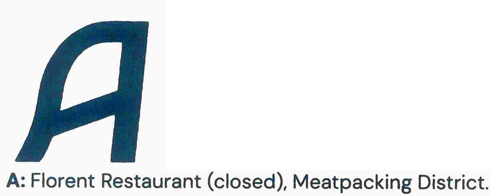
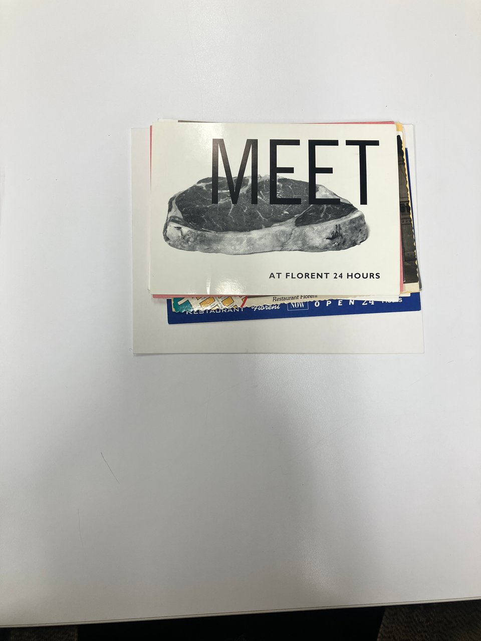
The A of the NYC ABCs poster is taken from Florent Restaurant (69 Gansevoort Street), a sign which you can still see in the Meatpacking district despite the (closed) designation on the poster. With its signage preserved from the former R&L restaurant at the same location, the 24-hour diner opened in 1985 and quickly became a hub of gay life. Its owner and namesake, Florent Morellet, wrote his T-cell count on the wall menu after his AIDS diagnosis in 87. And one of its graphic designers, Tibor Kalman, would go on to publish in 94 a special issue of Colors, the United Colors of Benetton magazine, about AIDS: how it was spread, how it was not spread, with testimonials about going to get tested. It also featured an excerpt of text from Derek Jarman’s Blue (1993, released four months before Jarman’s death from AIDS-related illness), as I discovered this week when I was lucky enough to get to see Tibor Kalman’s archive at the Herb Lubalin Study Center of Design and Typography.
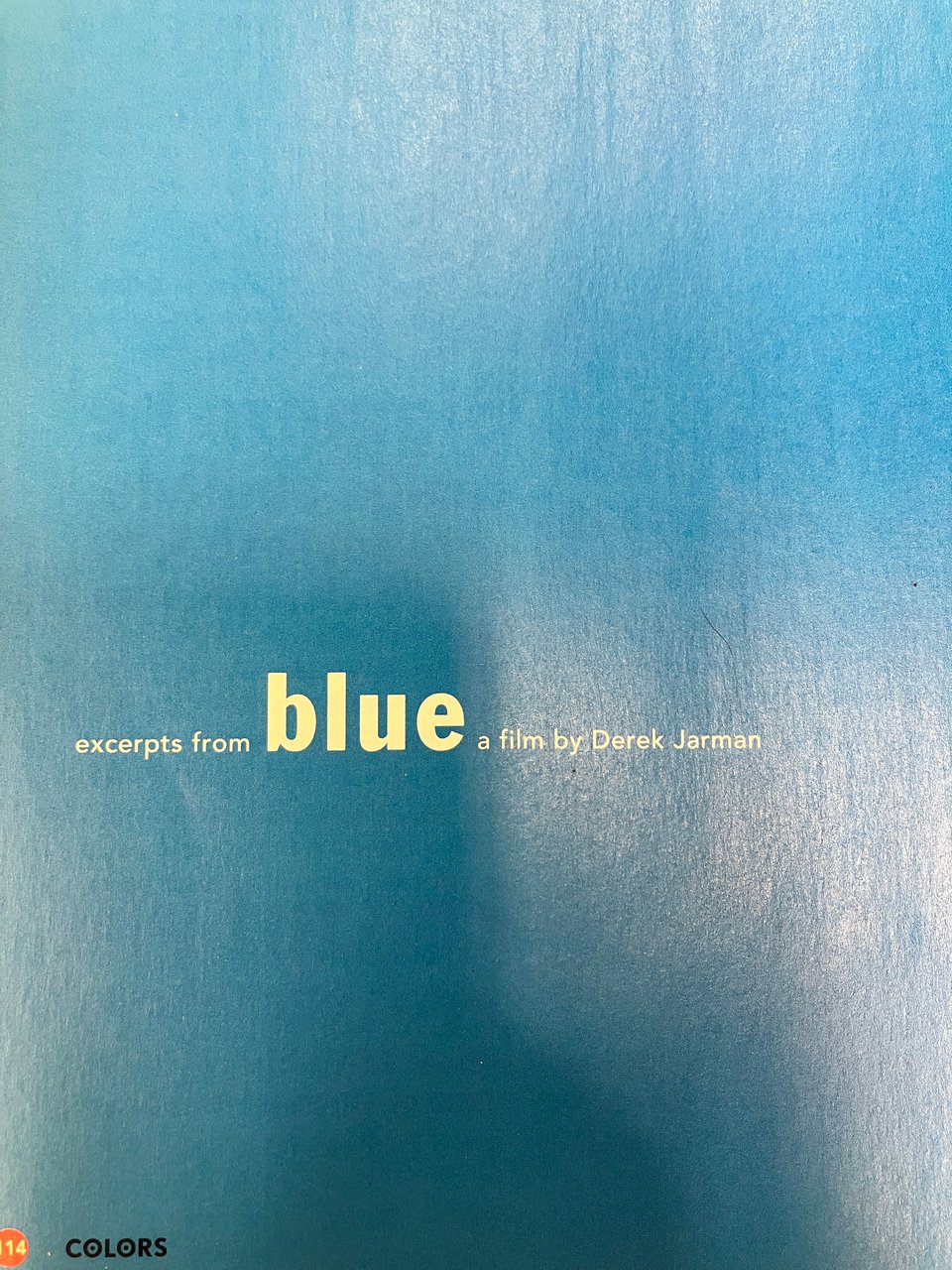
I have often wondered where the ‘archive’, if such a thing exists, of closed queer spaces can be found. I went to the archive hoping that I would find out more about the typography that I had featured on my poster. I never dreamed I would find menus, postcards, newspapers, promotional materials for a reception for a candidate for the US senate to discuss AIDS, and so much more from Florent restaurant.
I’m particularly in love with this as someone who was constantly told as a graphic design student to never have more than 2, maximum 3, different fonts on one page. I think this has 6.
I also love this visual pun, and the way it evokes a place where you are likely to run into a friend:
The history of typography in New York is a history of the meeting places of its marginalized communities, but it is also a history of gentrification and landlord extractivism. Florent closed in 2008 after a massive increase in rent (I read, $6,000 a month to $30,000). It’s a little difficult when doing projects like these to not become sad at the thought of not having a place to go like Florent as a gay person new to the city, a diner in the middle of gay nightlife that never closed. In the meantime, discovering the architectural archive of past versions of New York as a queer person, graphic designer, artist and good-time haver has given me that longed-for sense of rootedness and connection.
NYC ABCs, dark blue screen print on 135 gsm pale grey card stock. 11×17 inches. Edition of 20. $30. Available from my online shop.