I hope 2024 is going well for you so far. I was lucky enough to dedicate a good chunk of that first week back to making plans for the year ahead, and it felt great. I even wrote a load of plans on different sheets of paper, stuck them to the wall, and drew lines between each one, like a crazed detective in a film, trying to figure out what the hell is going on. Very apt.
Then the second week hit and my optimism waned somewhat. Whether it was the reality of getting back to all the things, the daunting task of navigating (too many) side projects, or the general state of, you know, the world, I found myself in a bit of a slump. But then my 2024 wall planner arrived in the post, I broke the back of a project plan via an over-the-top sprint plan in Notion, a semi-random “please can you do me an intro to...” email immediately bore fruit, and everything started to feel a little bit more doable again. So, onwards!
And we’re also now just under two months away from the publication of my book: 12th March in the US and 14th March in the UK. It’s available to pre-order from your favourite local bookstore and, if you do choose to pre-order it (thank you thank you thank you), would you mind helping me and my publisher out by pre-ordering it from somewhere that’s not Amazon, please? Bookshop (US | UK) is a great place to start.
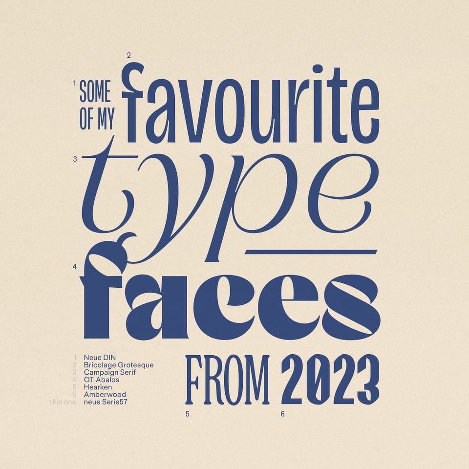
At the very beginning of January, I made a graphic, just for fun (I suppose this is my version of a social media strategy) that collected some of my favourite typefaces released in 2023. You can find the post on Instagram, Threads, Mastodon, and LinkedIn, and although I made sure I credited all of the type designers and foundries, I neglected to link everyone up, so here you go. Folks, I believe this is what you call a “subscriber exclusive”:
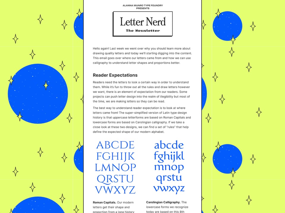
Amberwood, from the list above, was designed by Alanna Munro, and I’ve recently subscribed to her Letter Nerd newsletter. I can’t find somewhere to link you to directly, but scroll to the footer of her site for the signup form. It’s well worth your time.
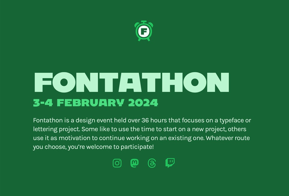
The Fontathon is happening again this year — and soon! “Mark your calendars for 3–4 February 2024 for a fun weekend of non-stop type and lettering design. What is Fontathon? It's a sprint-like design event held over 36 hours that focuses on a typeface or lettering project. Some like to use the time to start on a new project, others use it as motivation to continue working on an existing one. Whatever route you choose, you’re welcome to participate!” And oh, look, coincidence fans: I see Alanna Munroe is going to be one of the streamers, too.
Last week, Alphabettes published their round-up of typefaces created by female type designers in the second half of 2023 (see also: first half). Some absolutely stunning typefaces compiled here — some of which you may have seen in past issues of this very newsletter.
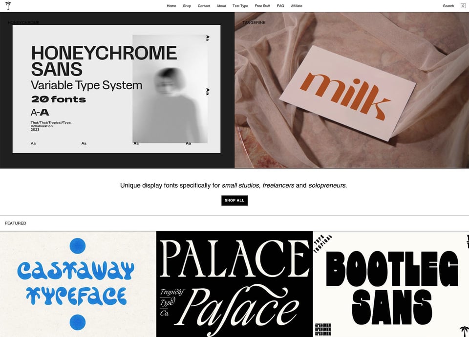
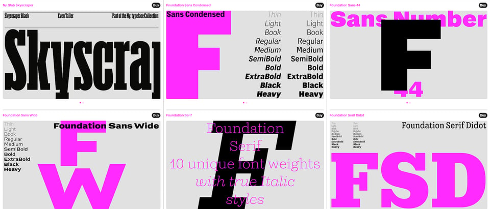
One of my absolute favourite things to do in Typographic & Sporadic is to share new foundry discoveries with you. These might be legitimately “new”, as in recently launched, or simply ones that have never come across my radar until now. But as I’m often asked to recommend foundries not everyone’s heard of, it seems like a good excuse to share these discoveries, whether they’re technically new or not. Anyway, this edition’s first one is Tropical Type — “unique display fonts specifically for small studios, freelancers and solopreneurs.”
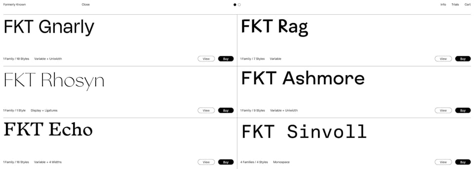
The second one is new! Sort of. The foundry formerly known as Hype Type have relaunched as... Formerly Known. I see what you did there, lads.
Another new (to me) foundry discovery: London-based A2 type. Oh, and it looks like A2’s Henrik Kubel is speaking at the...
... TypeParis Now24 conference! This is happening on 1st June and looks set to be a great event. I haven’t sorted my travel plans yet, but I’m really hoping I can get over to Paris for this. The organisers have very kindly offered an exclusive discount to you, my dear newsletter subscribers: use the promo code SUPERNOW24 to get an additional discount of €20 off the (already discounted) early bird ticket price of €120. And please don’t share that code! The ticket price goes up to €170 after 14th February.
Space Type Generator is a seriously impressive tool for creating some potentially pretty crazy images with type, directly in the browser. Found via Guy’s newsletter, which I also thoroughly recommend.
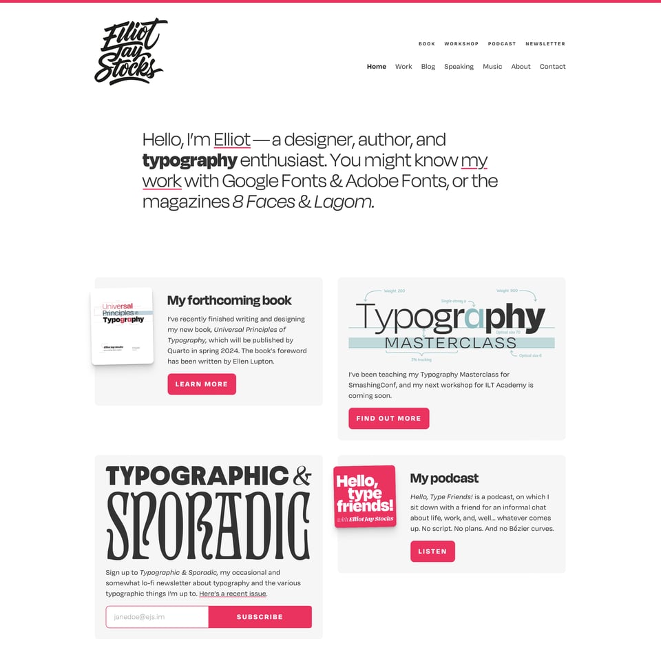
If you follow me on the socials, you might know that I recently redesigned my personal site. I would’ve been proud of myself for getting this out there so early on in the new year, but the truth of it is that I did 99% of this months ago, then spent the last few months just sitting on it and fretting over the final 1%. Originally the plan was to do a lot more work to it and launch in the spring, but I figured it was just time to get it out there, and having it out there in the world adds a nice little bit of pressure on me to get those others bits done soon-ish. Hope you like it.
And, is it just me, or is there something in the air about blogging again? Or, if not actual blogging, then at least the idea of having your own website? I’m hearing more and more folks talking about the so-called IndieWeb — which makes a lot of sense, given the general sentiment towards social media — and, honestly, I’m totally here for it. And, for a couple of months now, I’ve been really enjoying Own Your Web, the newsletter run by Matthias Ott “about designing, building, creating, and publishing for and on the web”. I know this isn’t specifically typography-related, but I’m sure it’ll resonate with a bunch of you. And, if you’re someone who’s thinking, “hey, it’d be nice to have my own website that isn’t totally reliant on a third-party platform or service, but I’m just not sure how to start,” then I thoroughly recommend you subscribe.
Related (and somewhat more mainstream) reading: Anil Dash’s The Internet Is About to Get Weird Again for Rolling Stone.
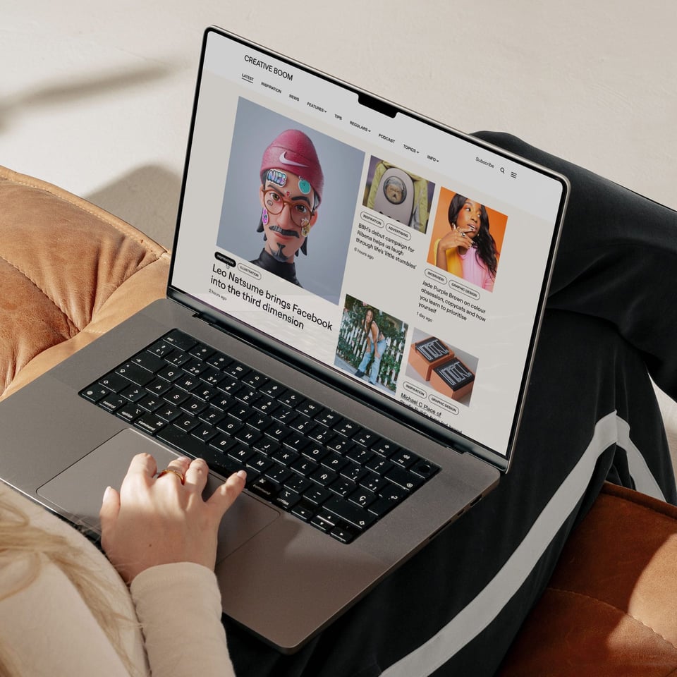
Did you see that Creative Boom got redesigned? See, all the cool kids are doing it. The balance here between spacious, readable content and meaningful CTAs to explore the site is, in my humble opinion, one of the finest examples on a contemporary online magazine. Congrats, Katy and co.!
Heads up: episode 4 of my podcast, Hello, type friends!, is dropping (urgh, did I just say “dropping”?) next week. So now’s probably a good time to catch up with the first three if you haven’t already:
- Jessica Hische (Apple | Spotify | hellotypefriends.com)
- Dan Cederholm (Apple | Spotify | hellotypefriends.com)
- Erik Spiekermann (Apple | Spotify | hellotypefriends.com)
Any guesses on who’ll be my next guest?
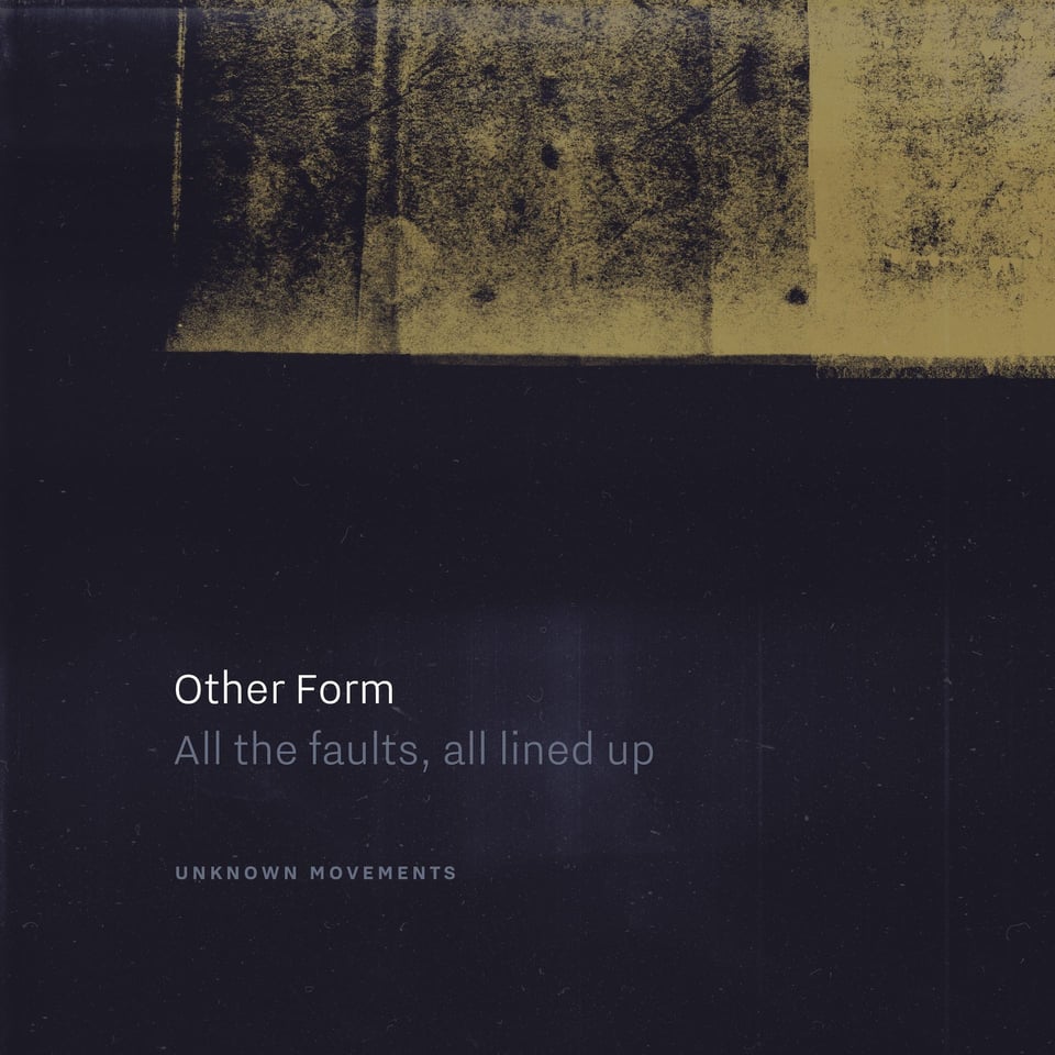
Now, I know this newsletter is about typography, and that’s probably why you’re here, but I feel like it’d be weird if I didn’t occasionally mention my music-making alter ego Other Form, and, well, I don’t think I’ve ever done it yet, have I? Well, right before Christmas, I put out a new EP called All the faults, all lined up and, in a couple of months, I’ve got an EP coming out on one of my favourite German labels. More on that soon! But meanwhile, perhaps some of you might enjoy this recent one.
Okay, I’m off to pack for a brief trip to Cologne tomorrow — I’m MC-ing the premiere of the film This Is What I Want To Do. I believe there are some tickets left if you’re prepared to brave the sub-zero temperatures.
You just read issue #24 of Typographic & Sporadic. You can also browse the full archives of this newsletter.
