Hello! If you detect a hint of excitement in this issue of the newsletter, it might be because it was mainly composed while on a plane heading back from Brooklyn, where I spent two wonderful days attending Kinference. This was an event that’s not really a conference, but more an intimate gathering of like-minded folks noodling away on creative conundrums, like the looming clouds of the global economic crisis, the threat of AI in the design community, and most of us just, well, being 40-ish and wondering why everything looks a little different these days. A bit of group therapy, really. And the chance to hug a lot of friends I’d not seen in a long time. Craig Mod said much the same earlier today.
My sustained state of semi-euphoria has actually been bubbling away nicely since I finished running my Universal Principles of Typography masterclass for SmashingConf near the middle of March, and also from when spoke at Letter Luvvers #5 shortly after that. Both sessions were filled with such lovely people, it’s been hard not to feel optimistic about… I don’t know… human connection? I guess that’s the thing — because, hey, let’s face it, it’s not easy to feel optimistic about earning money at the moment. (Wait, is this weird euphoria a stress reaction?) Anyway, on with the show! It’s been a while.
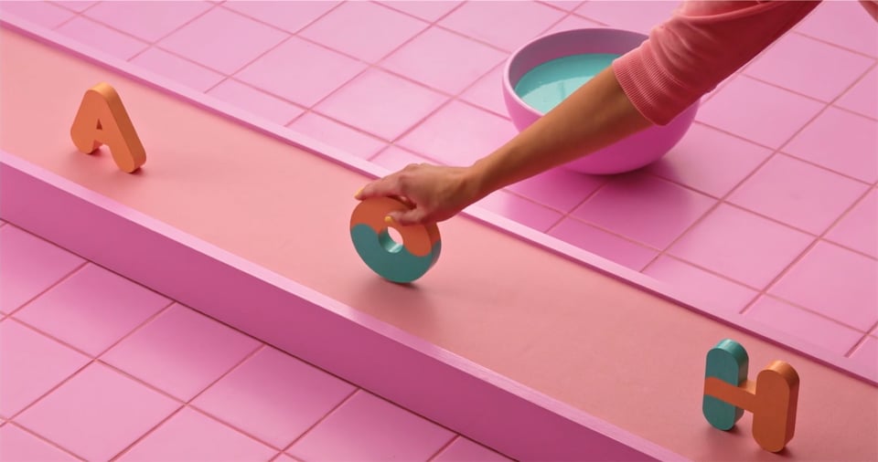
My friends over at FontWerk have just released a new typeface called Hamster and the promotional video for it is just fantastic. Did they actually really make physical characters and then dip them in paint? Who even knows what’s real anymore? I don’t mind either way. I love it.

Oh, by the way, a quick word on any potential nepotism: I know I say “my friends” a lot, and I guess it wouldn’t be unfair of someone to say that I often promote stuff by folks I know. But the thing is, I know a lot of lovely people in the type / design industry, and their stuff inevitably comes across my radar as a slightly larger blip. So, yeah, there’s inevitably going to be a bit of favouritism, but I’ve decided to stop worrying about it and love the bomb.
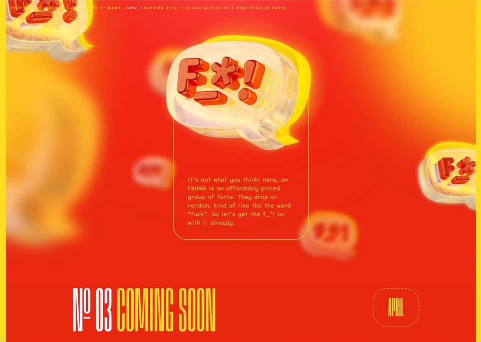
Hey, speaking of friends and, er, bombs, I’m going to talk to you about Ty Finck again. I talk a lot about Ty, but the man is just so goddamned prolific. He recently released a site called F-Bombs and a few days ago he dropped (get it?) the latest one. It’s a great idea: split up some typefaces into a couple of weights and styles, bundle them up with weights and styles from other typefaces, and sell ’em for peanuts.

My friends (oh, there I go again) at Smashing are offering a discount on their membership programme — the aptly named Smashing Members — to 5 subscribers of this newsletter, so email them at hello [at] smashingmagazine [dot] com with the subject “upgrade membership Elliot” and they’ll sort you out.
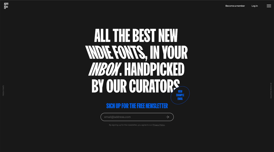
From friends to people I don’t actually know… Fresh Fonts! A lot of people out there will tell you that if you’re trying to build your newsletter, it’s not a great idea to link out to other newsletters. I say: who cares? I’m a recent subscriber to Fresh Fonts — who’ve just released their new website — and I can’t recommend their newsletter enough. I’ve got a feeling you’ll like it, too. (Just don’t unsubscribe to my one in the process, will you?)

Oh yeah, more “competitors” I probably shouldn’t link to, but totally will: Proof & Co. recently published their 2022 Annual Report and 2022 Almanac. Both look like a super interesting read: the annual report is a “deep dive into the world of independent typography” and the almanac a “complete digital ‘desk reference guide’ to all the typefaces from independent foundries and designers released in 2022”.
Similar thing from Zeta Fonts: they’re about to publish their annual Type Trends report. Sign up (as I have done) to hear about it when it’s released. I think their last one was one of the first things I mentioned in this newsletter, wasn’t it?
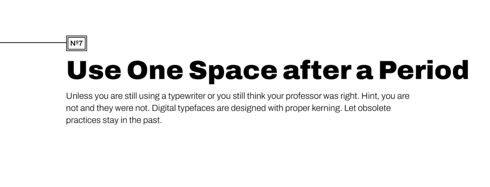
Speaking of manuals, Mike Mai has created a very concise and straightforward typography manual that I think many people will find pretty useful. As I said to folks participating in my workshop (oh, by the way, you can register your interest for the next one I’m doing in October by replying to this email), it’s really nice to cover the basics again through someone else’s eyes. Even if it just reinforces what you already know, I personally find it inspiring to see how someone else views and approaches “the easy stuff” because most of the time they’re coming at it from a different angle to me.

Codrops have been creating some beautiful animations with typography. However you feel about scrolljacking, this is a great little playground and a showcase of all the cool things we can do with type online these days.
Oh, you made it this far? Nice one! And thank you. You might’ve noticed I’m trying a different thing with this issue: I’m not titling each section, I’m not adding an image for everything, and I’m working a bit more “prose” in there, too. I’ve tried the title-less version before and honestly I can’t decide which format I prefer, except that this way feels a bit more… natural? Let’s see. I’d love to know what you think!
You just read issue #12 of Typographic & Sporadic. You can also browse the full archives of this newsletter.