Aaaaaaargh! Oh, don’t mind me, that’s just the sound of blind panic setting in while I attempt to finish every single illustration in my book before the school holidays are over. But there’s nothing like a looming deadline to prompt some intense procrastination, is there? So please join me in a bit of typographic distraction...
First up, I’m going to sneak in one of my own links — hope that’s alright. I’m really excited to be partnering up with I Love Typography to teach a Mastering Web Typography workshop for ILT Academy at the end of September. Over a weekend (2 × 4-hour sessions), we’re going to deep dive into fluid type scales, variable fonts, colour fonts, OpenType, and the most modern CSS for getting the most out of type on the web. If that sounds like something you’d enjoy — or something a friend or colleague might enjoy — please email academy@ilovetypography.com to book a place!
The other day Jake told me that he was on the cusp on launching a newsletter, but it turns out he was being modest. Make Type Work is way more than just a newsletter, and looks set to be a fantastic typography resource. How to choose fonts for Responsive User Interfaces (pt. 1) has some great advice in there.
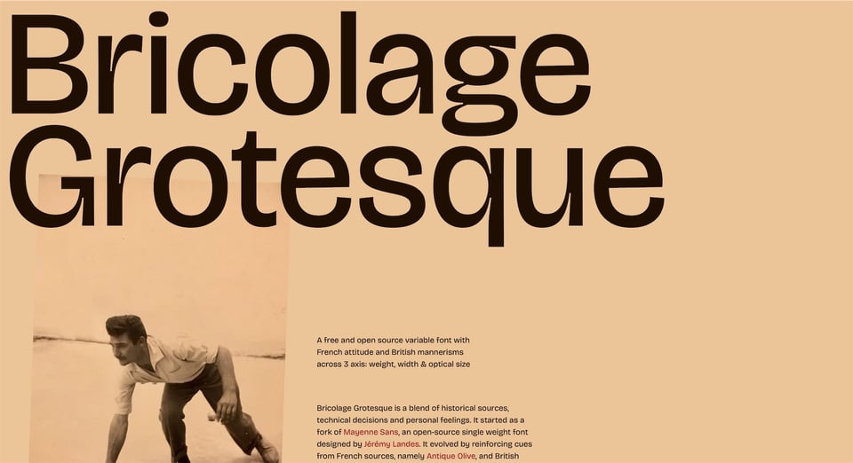
While browsing Google Fonts via the “newest” filter yesterday, I was happy to see a new typeface by Mathieu Triay pop up. I’ve been following Mathieu’s work for a few years and was a big fan of his sadly short-lived sci-fi magazine Visions, for which he created a bespoke typeface based on 1970s sci-fi covers. Anyway, this new one, Bricolage Grotesque, is quite beautiful. “It started as a fork of Mayenne Sans, an open-source single weight font designed by Jérémy Landes. It evolved by reinforcing cues from French sources and British sources: the compressed weights lean more towards the anxious and wonky tones of Grotesque Nº9 and the regular weights have a bit more of Antique Olive's relaxed and confident attitude. The smaller optical sizes become more neutral and reflective of contemporary sans serifs, notably through the use of exaggerated ink traps.” Interestingly, Mayenne Sans went on to become the hugely popular (IMHO) NaN Jaune.
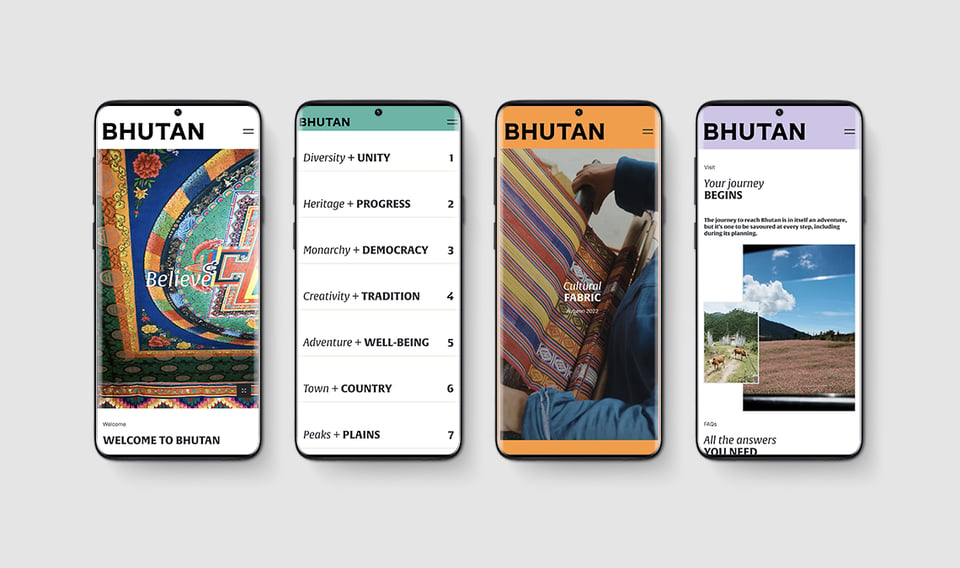
Back in 2014, my wife I visited Tibet — don’t worry, I’m going somewhere with this — and one of the people we met on that trip had arrived via Bhutan. Everything he said about the country sounded absolutely amazing and it’s been on my want-to-go list ever since. Now there’s another reason: the entire country has just been rebranded by MMBP & Associates, using TypeTogether’s Alverata type family, designed by the late Gerard Unger. The foundry have published a detailed case study that I’m sure you’ll enjoy.
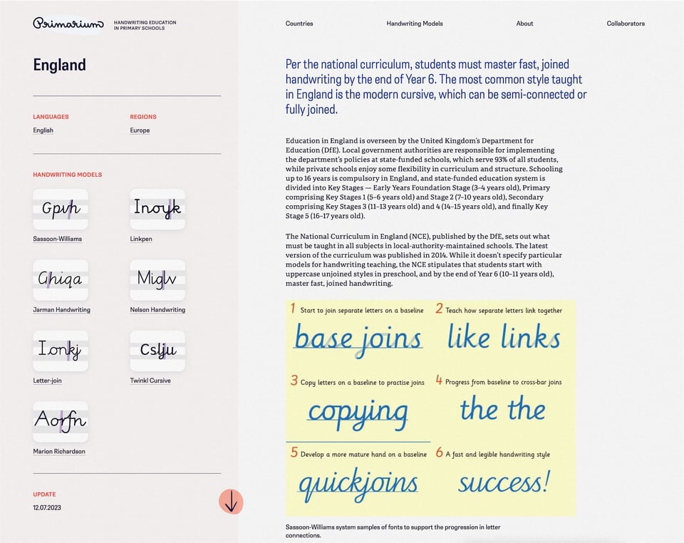
Speaking of TypeTogether, did you see that they launched their Primarium research project into the school handwriting systems of the world? I mentioned this in a previous issue when it was announced in an earlier form, but it’s now out there for all to see and it’s fascinating.
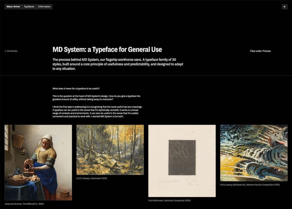
I love glimpsing into the processes behind creative projects, and this one has been on my list to share for a while (so comes with a this-is-not-news caveat): Rutherford Craze’s write-up on the creation of MD System. The depth here is pretty impressive (as is the typeface, of course).
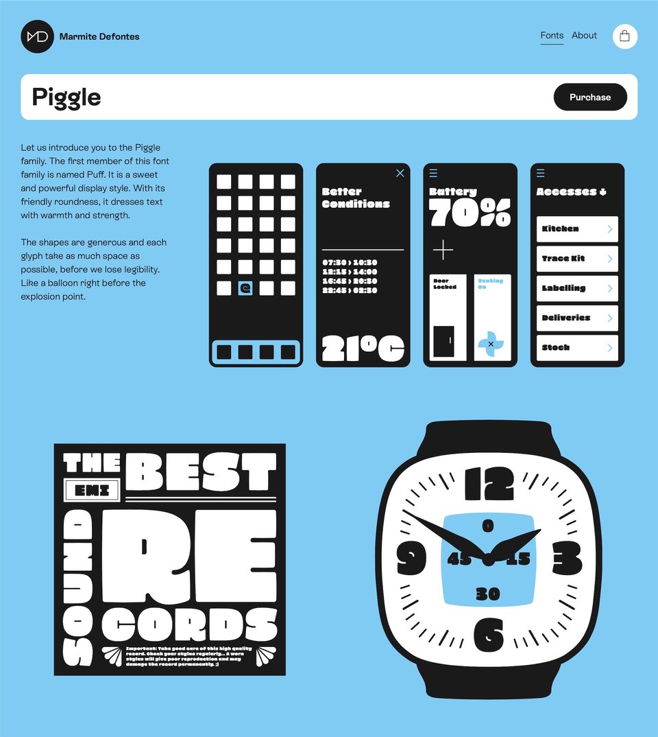
From one MD to another: a new foundry called Marmite Defontes from designer Guillaume Berry. I love the playfulness here in both the type and the website. (I think I found this one via Francis Chouquet, by the way, whose newsletter, The Typochondriac Weekly, I’m really enjoying.)
Is it me, or have there been a load of new foundries popping up recently? Hey, I’m not complaining.
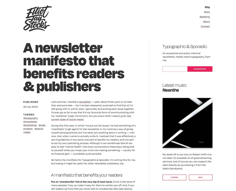
Mind if this issue’s last link is one of my own? I recently wrote up a manifesto for this very newsletter. “Manifesto” is too grand, really, but the blog post is effectively a set of guidelines in two parts: one part to benefit you, dear readers, and one part to aid my own publishing process. I talk a bit about why I don’t look at unsubscribe data and do my best to respect your inboxes.
Related to that, I’ve been investing more and more time recently into making more of a plan around the newsletter and how it ties into some other exciting projects I’m going to be announcing over the next few months. Oh, was that another little tease? Yes, I think it might’ve been! Meanwhile, hope you’re having a great summer and managing to be more productive than me.
You just read issue #17 of Typographic & Sporadic. You can also browse the full archives of this newsletter.
