Weird times at the mo. As part of the big tech industry cutbacks, which I’m sure you’ve heard about, I’m no longer contracting for Google Fonts — for now, anyway. On the one hand, it’s come at the perfect time because it’s finally allowing me to spend some solid daylight hours breaking the back of two very big projects — which I’m itching to tell you about, by the way, and will do very soon, because they’re both 100% typographic in nature — but on the other… well, there’s that whole earning money thing, isn’t there? And I’m really good at filling my time with projects that rarely make any money.
That said, this project (the newsletter) brings me a lot of joy. There’s something about this new creative outlet that I’m particularly enjoying at the moment, although honestly I’m struggling to articulate exactly why that is. Is it that writing issues of this newsletter feels more like composing a postcard than a blog post? Is it the sense of a more immediate connection to you folks? Is it that I essentially get to brain-fart my way through all of my recently saved typographic links for the benefit of like-minded type nerds? Oh, speaking of which…
Rosetta have published an online book called Legibility: how and why typography affects ease of reading, written by Mary C. Dyson and María González de Cossío, and although I haven’t made my way through the whole thing yet, it seems like a great resource.
So good to see this new initiative from Flavia Zimbardi called Women in Type, Stronger Together, which she talks in about in the latest issue of her newsletter, Contraforma, and also in…

… a new live stream series from FutureFonts called HyperTalks! Yes, as you can see, the first one has already come and gone, but you can watch it back on YouTube. So many great talks in one session! And I thoroughly enjoyed watching Rutherford Craze talk about gradients.
Rosalie Wagner decided to open-source Borel — un système typographique pour l'école primaire — which was her research project at ARNT. With my eldest daughter currently deep into her cursive handwriting education at school, this is of special interest to me. (See also: TypeTogether’s fascinating research into handwriting systems of the world.)

More French font fun for you: Blaze Type have launched a book on type design called How To Design Fonts? and you can get the print-on-demand physical version via Lulu, or the PDF version direct from Blaze Type.
From one foundry publishing cool things to another: Zeta Fonts have now published their 2023 Type Trends lookbook as a free-to-download PDF. I’d feel slightly weird pasting in the direct URL here, so that link should instead take you to the latest issue of their newsletter.

One for you type designers out there: an in-browser tool for deriving your font’s vertical metrics from your sketches. A super handy resource suggested by Viktor Baltus during his Type Design Class (which I’m currently taking).
I realise that directing you to a piece of my writing from my own newsletter is somewhat self-indulgent, but I recently published a blog post about my new logo, created by Emma Luczyn, and figured you might enjoy it. Feel free to skip to her awesome timelapse video if you want — no judgements here.

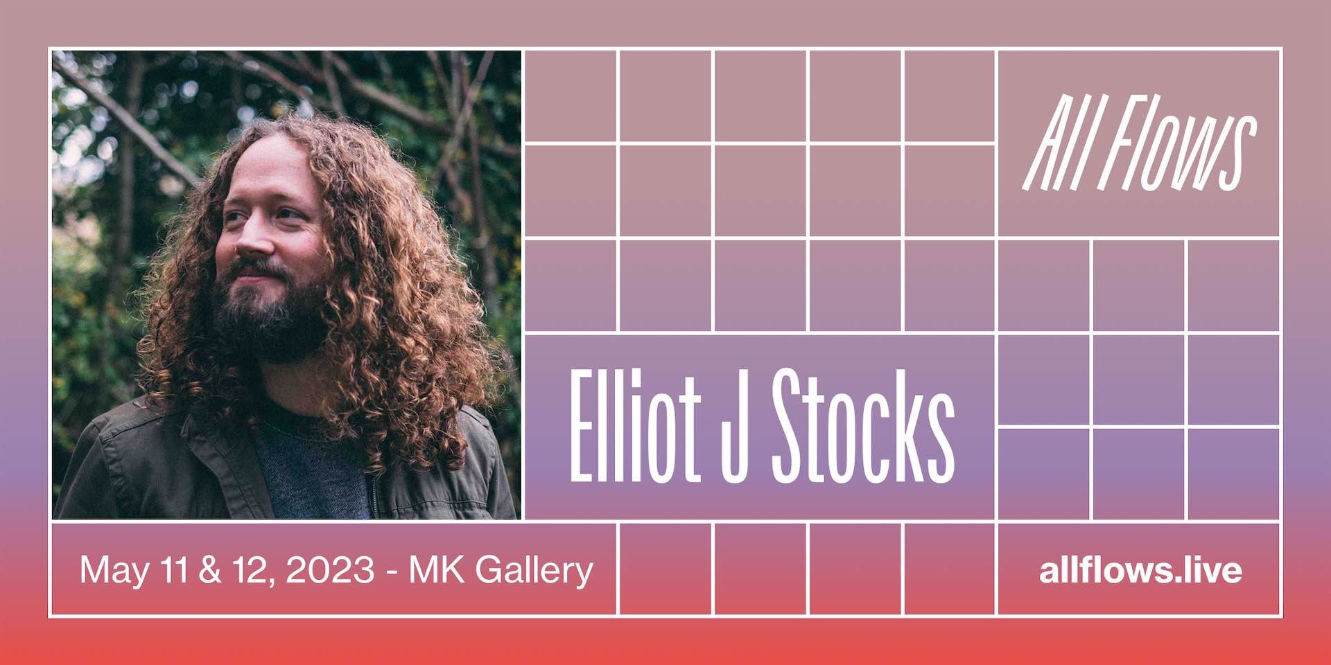
11th hour shout to AllFlows, which I’m speaking at tomorrow afternoon! Anyone here coming along?

A parting thought: I’ve always hated bold italics (did you know they only really existed once word processing software made both a “b” and “i” button available?) but I embolden the primary links in this newsletter, and I also italicise book titles, so it’s resulted in a few uses of bold italics in the text above. It makes me feel a bit dirty. I’d love to know your opinion on it.
You just read issue #13 of Typographic & Sporadic. You can also browse the full archives of this newsletter.